

Open the explore page. Scroll for thirty seconds.
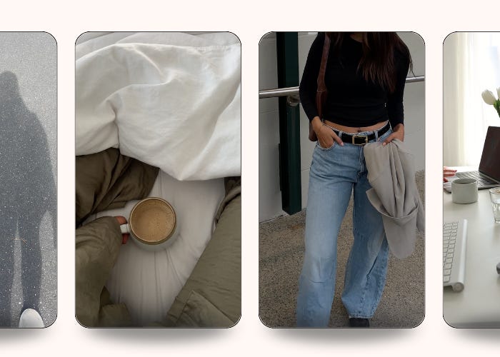
You’ll see the same brand five times. Different names, different products, different industries - but the same warm beige. The same minimal serif logo. The same one-take shot in golden hour.
Clean girl. Old money. Coastal grandmother. Quiet luxury. The aesthetics get named, adopted, exhausted, and replaced. And the brands built entirely on each one get replaced with them.
Most of these brands missed something important. They didn’t have an identity. They had an aesthetic. Those are not the same thing.
Aesthetic is the surface. The fonts, the filters, the camera angles, the color story. Something you can describe in a moodboard and replicate in an afternoon.
Identity is the substance. The perspective, the voice, the values, the things the brand says no to. What’s left when you remove the aesthetic.
The reason every wellness brand looks the same right now isn’t conscious copying. It’s that they all reached for the same moodboard. Soft. Earthy. Minimal. Beige. That mood board is freely available and infinitely reproducible. Strip it away and most of these brands disappear.
Here’s a way to find out which one you’ve built. Take any brand you admire. Imagine all their visual cues are gone — the logo, the typography, the color palette, the photography style.
Would you still recognize them?
For Liquid Death, yes. You’d know it from the voice alone. For Patagonia, yes — the perspective is unmistakable from the first sentence. For Duolingo, the answer is obvious before the owl ever shows up.
For the average aesthetic-forward brand on your feed, no. The identity is so dependent on the visual layer that removing it removes the brand.
If aesthetic is what something looks like, identity is what it means. It’s made of four things, none of them visual.
A perspective. Liquid Death’s angle is that bottled-water marketing is absurd, so it commits fully to absurdity.
A voice. Not a tone-of-voice doc. The Wendy’s Twitter account had a voice before it had a strategy.
Values, including the ones you say no to. Patagonia says no to growth-at-all-costs, and that no shows up in every campaign whether or not it’s named.
A worldview. Aesop sells soap, but the brand sells a relationship to language, literature, and ritual.
Humans pattern-match on personality far more reliably than on palette. A brand can change its wardrobe every season without losing recognition. It cannot change its personality without becoming a different brand entirely.
A vibe is not a voice.
Marq’s State of Brand Consistency study found that brands with consistent visual presentation see revenue lifts of up to 33% over inconsistent counterparts. Aesthetic earns the recognition. But identity is what people remember when the look has moved on.
The brands that last past the trend cycle built something underneath the aesthetic. Something that can wear new clothes without losing itself.
Your aesthetic is what people see first. Your identity is what they remember.
Build both. Never confuse them.
Packsia is an aesthetic & authentic stock footage platform - like having thousands of ready-to-post videos in your pocket.
Curated by our team and proven to perform, our exclusive library of trending videos are designed to elevate your content, marketing, ads and more. With hundreds of clips uploaded weekly, you'll never run out of content again.
Use the code HELLO30 for 30% off your first month, or try for $5.

No posts
Comments
Nothing yet. Say the first thing.
Sign in to join the conversation.