
You’ve probably heard it by now: with the rise of AI, taste is suddenly the most talked-about skill for designers.
Everyone’s saying it: “Taste is what will separate you.” “Judgment is the new craft.” “AI can’t replicate good taste.”
There’s a lot of advice about this on the internet. What I’m sharing here is what actually worked for me as someone who’s more product-focused than art-school trained. Less philosophy, more practice.
With vibe-coding tools making it easier than ever to ship, we’re seeing an explosion of interfaces that all look… identical.
Tools like v0, Lovable, and Bolt generate usable screens in seconds, but they all lean on the same Tailwind primitives and shadcn components. When everyone pulls from the same building blocks, everything converges toward the same aesthetic.
What used to count as “good design” has become the default baseline. And when the floor rises, the ceiling for standing out rises with it.
There was a time when “make it look like Apple” was the benchmark. That’s not the case anymore. The gap between functional and exceptional is wider than ever. And what bridges that gap isn’t the tool. It’s the judgment behind it.
In my words: taste is your ability to tell what’s good, what’s great, and what’s not good enough. It’s the sensitivity to notice the small details that separate “good” from “exceptional.”
Here’s how I think about the levels:
Mediocre – Technically “works,” but feels careless
Good – Functional and reliable; nothing more, nothing less
Great – Polished, intentional, and well-crafted
Exceptional – Memorable; it makes you pause
Iconic – Defines a new standard others will copy
Different people will draw these lines differently. That’s fine. The point is: can you see the difference at all?
Let me show you what I mean. Here are three pricing pages from video recording tools:
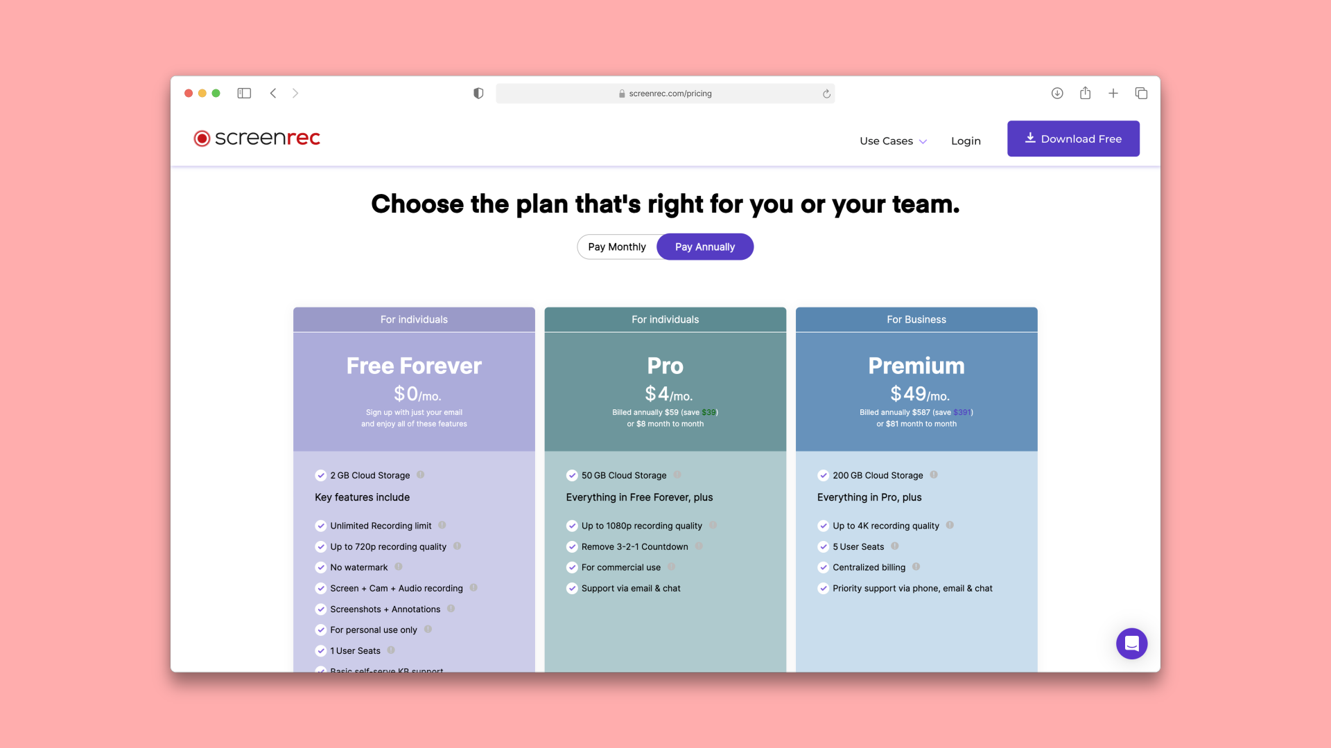
ScreenRec: Mediocre
It works. But it feels rushed, unpolished. No clear hierarchy, no focus. The color palette is all over the place—purple, teal, blue with no strategic purpose. Light text on pastel backgrounds likely fails contrast ratios, making it hard to read and meet accessibility standards.
Nothing guides your eye. All three plans feel equally weighted, so there’s no visual pull toward a recommended option.
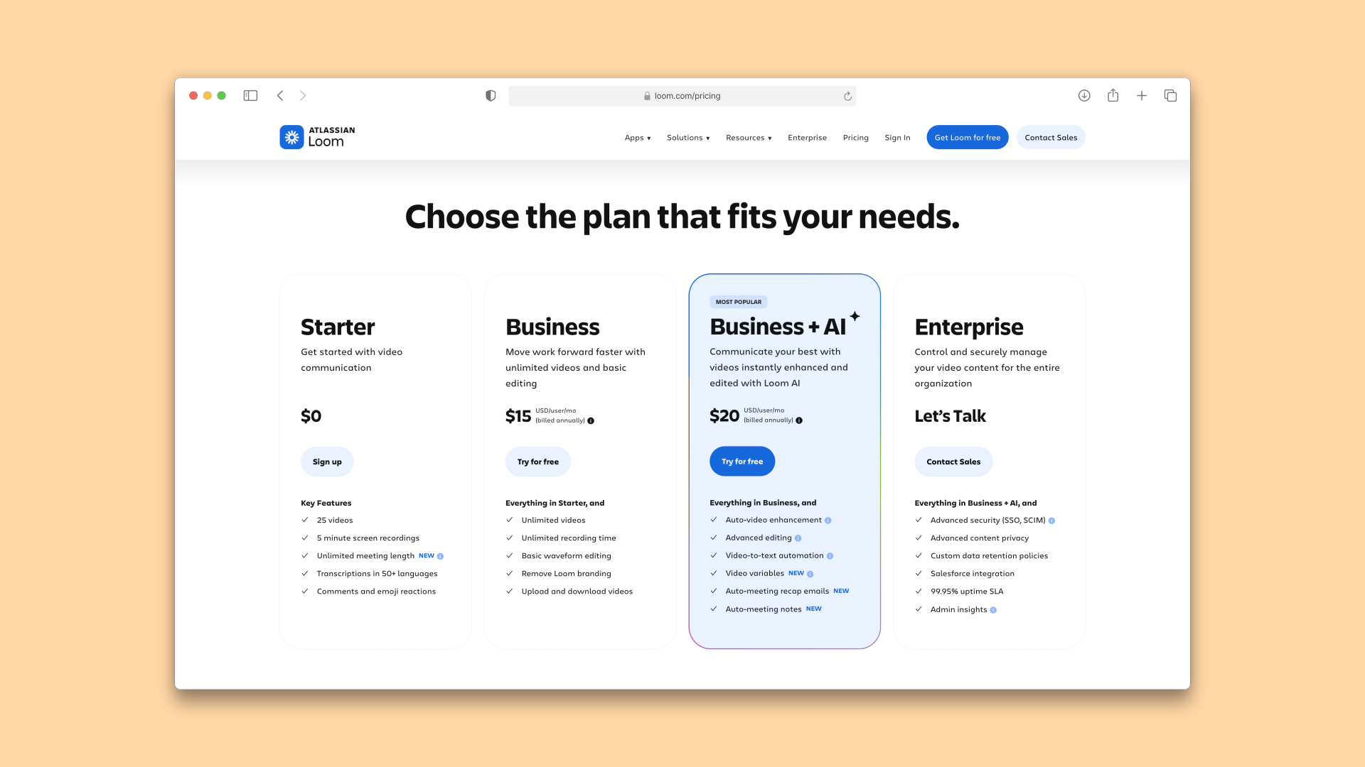
Loom: Great
This is solid. Clear visual hierarchy, good use of color to guide attention to the primary CTA. Polished execution of a standard pattern. Nothing groundbreaking, but it does the job well.
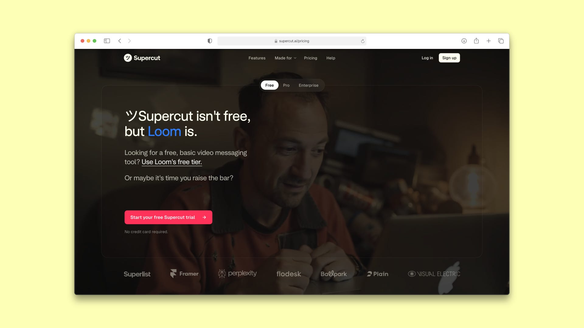
Supercut: Exceptional
This one makes you stop. They don’t have a free tier—and they know Loom is their main competitor. Click “Free” and it redirects you straight to Loom’s site. Diabolic? Yes. Memorable? Absolutely.
It’s a bold, confident move that reinforces their positioning: “We’re not competing on free. We’re premium”. The design itself is clean and focused, but what makes it exceptional is the attitude. It takes a standard pricing pattern and injects personality and conviction.
You remember this. That’s the difference between great and exceptional.
If you can spot these differences and consistently create at the higher levels, you’re already ahead of AI-generated slop.
Look, developing deep, authentic taste through years of cultural immersion is valuable. But if you’re a founder, PM, or designer who needs to ship quality work NOW, you don’t have decades.
Now this may seem obvious, but the fastest way to train your eye is simple: expose yourself to the best work, then deconstruct it.
Think about it like this: You might be the top student in your high school and think you’re the best. Then you get to Harvard and realize what “the best” actually looks like. Your entire benchmark resets. You need to see the best to know what the best looks like.
Here’s my tactical approach if you’re just getting started: intentionally study the best examples of exactly what you’re designing. You get context for what you’re building right now, and your pattern recognition sharpens in the process.
This is what I mean:
Designing pitch decks? Study the top pitch decks.
Building mobile screens? Browse top mobile UI libraries.
Creating logos? Explore the best logos in your category.
Ideas don’t just magically appear when you stare at a blank canvas. Your brain needs quality input to generate quality output. Google Images won’t cut it.
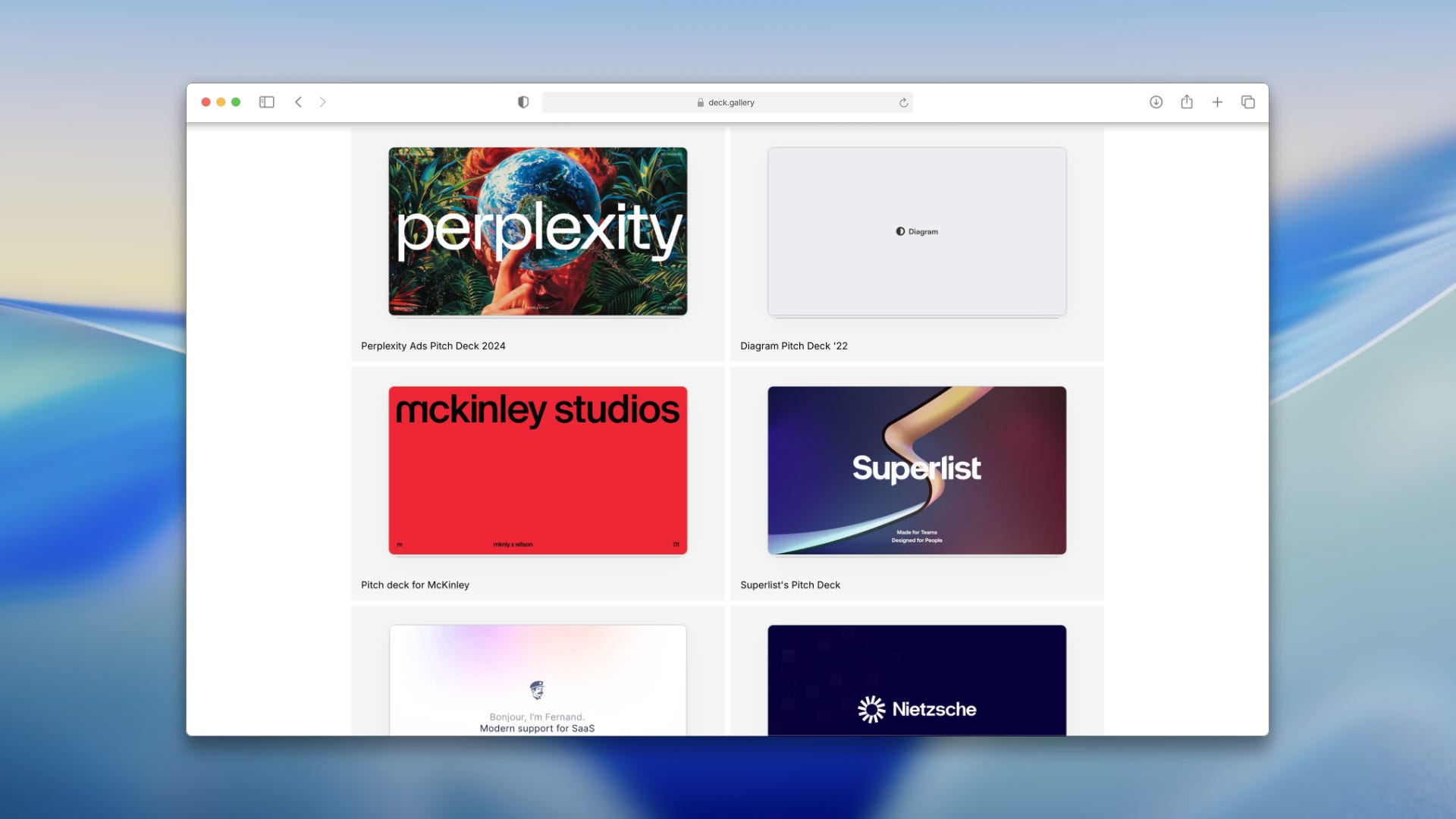
Example: Let’s say you’re building a new pitch deck. Instead of just diving in, spend 30 minutes studying 20 pitch decks on deck.gallery from startups that successfully raised funding.
Once you do this (once you see enough examples and truly study them), your brain will automatically start giving you ideas of what may or may not work. You’ll develop an instinct that can’t be fully explained, but you’ll know what feels right.
Even if you don’t have years of practice building pitch decks, within 30 minutes of studying the 50 best examples, you’ll have enough context to build yours with confidence.
This isn’t about copying. It’s about compressing years of exposure into focused research sessions, aka curation. You’re training your eye faster by being intentional about what you consume.
Here are some of my go-to resources to get you started on specific things:
General Inspiration:
UI (Web & Mobile):
Websites & Landing Pages:
Slide Decks:
Visual & Brand Identity:
Pro tip: Follow designers who are actually producing quality work and pushing boundaries on Twitter/X. You won’t find them on LinkedIn. This is where you find what top-tier designers are tinkering with. (I’ll share my full list of designers and creators to follow in a future post.)
The hack I shared will get you moving fast. But there’s a deeper level worth discussing: long-term, authentic taste that doesn’t come from online sources alone.
Taste is pattern recognition developed over time. Your eye gets trained through repetition and reference. Developing taste is an act that requires effort and intention, not mindless media consumption.
Think about Perplexity launching with Instrument Serif. It made sense for them: fresh, sophisticated AI vibe. Then every AI startup copied it. Now it’s slowly losing its uniqueness.
This is what happens when you consume from the same sources as everyone else and never develop your own point of view.
Here’s how to avoid that:
Be intentional about what you save and why. Building taste isn’t about saving more references—it’s about refining what you notice. Don’t just pin something because it looks cool. Ask yourself: Why does this resonate with me? What about this feels right? When you understand your own taste, you can apply it deliberately.
As you save things on the internet, start incorporating the physical world. Pull out your phone and capture whatever catches your eye; it can be a well-designed menu, an interesting signage, color palettes in nature, cool packaging at a grocery store.
But here’s what matters most: your taste only gets better when you actually create. You’ll produce bad work initially—everyone does. But repetition builds instincts. That’s how you develop taste that’s uniquely yours. And this takes time.
Build a living library, not just a Pinterest board you never look at, but a collection you return to, study, and evolve. Digital and physical. Make it personal and uniquely yours.
We’re already seeing AI tools learn personal preferences. Claude learns your writing voice. Midjourney learns your aesthetic. Your intuition and taste are the context that guides all of this. It’s entirely possible we’ll see AI design tools that learn YOUR specific taste—upload your mood board, and it generates designs matching your aesthetic.
The bar keeps shifting. Today’s “good taste” becomes tomorrow’s overused template. Once AI generates it at scale, it gets diluted fast. Start building your visual library today. Your ability to recognize quality is what will separate your work from AI-generated slop.
Next up: I’ll show you how to organize these references so they don’t disappear into a black hole. (Spoiler: Chrome bookmarks aren’t the answer)
Thank you for reading,
Liked this post? Support my work by sharing this article with others who might like this
No posts
Comments
Nothing yet. Say the first thing.
Sign in to join the conversation.