
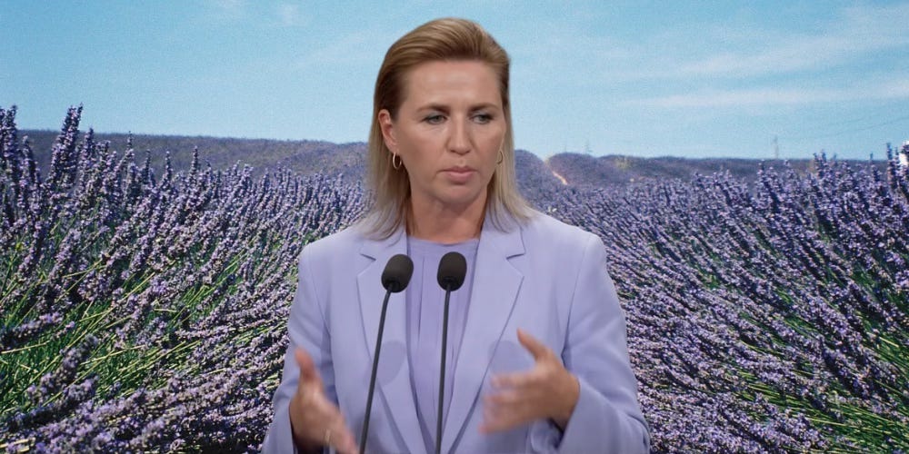
On the 28th of August 2024, primeminister Mette Frederiksen stepped up to speak at a press conference, announcing a rotation of ministers in the Danish government. She was wearing her hair combed back tightly, but loose, so that her highlighted tips just about touched her shoulders. She was wearing a classic suit, the blazer a was little cinched at the waist but otherwise loose fitting, a pleated blouse with a boatneck, all of it in a color you might describe as periwinkle(Very Peri if you’re Pantone), a pastel lavender, thistle, violet, lilac, it was light, it was fresh, it was calm, it was… trendy?
The newspapers and social media comment sections of this tiny country spilled over with comments, essays, praises and analyses reviewing her new hairstyle (she used to pull her hair back tightly in a low chignon, and the highlights seemed new, too!). To my surprise, no one seemed to take notice of the fact that our head of state was styled in a way that you might do if you’re a guest at a nice spring wedding with a pastel theme.
As a woman, there’s nothing new about having your looks scrutinised by anyone and everyone - and as a woman in power, Mette Frederiksen is destined to be even more scrutinised for her looks than her male peers. This, though, also presents the possibility for women to be more communicative with how they dress.
In high school, I remember a teacher telling me something like
“Everything is a text, a poem, a building, a painting.
And since everything is a text, everything can be read.”
Those works really stuck with me, and as a fashion and color nerd, I dare to say that Mette Frederiksens monochromatic periwinkle wedding guest outfit is a text, that no one bothered to read.

Now, I’d like to start putting the obvious interpretation of this text on the table, before we delve deeper: Mette Frederiksens goverment is a middle government, red and blue make purple, and so, purple is an obvious choice for a woman in charge of a middle government. This could be the entire interpretation, and maybe it is. And maybe she just wanted to freshen it up, take that middle of the road-purple in a more feminine direction, younger, trendier?
NO WAY!
Sorry for yelling there, but a woman wanting to look more feminine, younger while already navigating a world made by men, for men, populated by powerful middle aged men in black and navy suits? This would only have her be taken less seriously than being a woman already does. There’s a different explanation.
To understand the choice of this outfit let’s first take a little tour around suit-city to understand why she’s wearing a suit, before we delve into the lavender fields of color analysis.
The suit as a masculine outfit had its beginnings in the 19th century, the dawn of what was called “The Great Male Renunciation” - a societal movement over a longer period of time, in which men’s dress became less ornate and flamboyant, partly initiated by the English dandy Bo Brummell(below). Before this, men had been dressing with color, frills, lace and embellishment, but slowly, the masculine ideal turned to the subdued. Pants, a shirt and a jacket; and details, if any, would be discrete.
“Menswear doesn’t shout - it whispers, and you have to lean in to hear it”
- Avery Trufelman, Articles of Interest podcast, episode 10 about Suits
The suit allowed men to blend in, it was a way of conforming, uniformity, being part of a larger group. Having focus be on your looks would be more and more considered as something flamboyant and feminine. This happened as the introduction of the suit had men (considered “the rational sex”) abandon their claim to be beautiful hence only useful, letting the frivolities of fashion be left to women (“the irrational sex”).
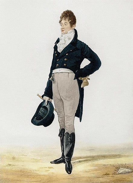
Bo Brummell, one of the first men to wear the suit as a common everyday outfit and somewhat a catalyst for “The Great Male Renunciation“
Since the notion of being associated with femininity and flamboyance is out of the question for men, and men historically having been the people who hold power, what is a woman to do, when dressing for the job of prime minister in this day and age?
In the 1970’s and 1980’s the power suit emerged on the fashion scene as women’s place outside the home, working and being in more powerful societal positions becaming more of the norm. Pants, blazers, big shoulderpads, suits saying
“I am a working woman outside the confines of the home, hear me roar!”
Power emanated from these suits, mimicking this uniform of masculinity. Has any other article of womens clothing ever had a name with “power” in it, other than the suit? I don’t think so.
It has also been obvious, when having a quick glance over women in power or seeking power in this century, that the power suit is a staple in their wardrobes.
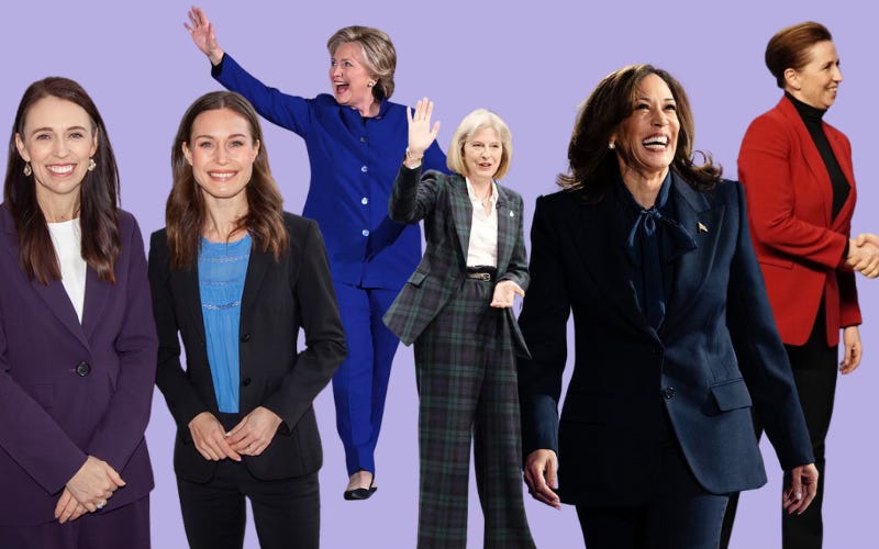
Jacinda Ardern, former prime minister of New Zealand - Sanna Marin, former prime minister of Finland - Hillary Clinton while running for US president - Theresa May, former prime minister of the UK - Kamala Harris while running for US president - Mette Frederiksen, prime minister of Denmark.
Now; these “power suits” have also often mimicked the color choices of common menswear - blacks, navy, mainly dark colors.
Or a color that would exude power and potency in some way or another - red, dark purple or fuchsia, to put forward a message of passion, straight forwardness, stateliness, loudness.
So the pastel purple choice of Mette Frederiksen - a choice she has kept making during the foreign policy crisis the country is facing with Trumps idea to buy Greenland, a Danish colony - is poignant.
Why is someone who is having to stand up to a bully, someone you’d expect to exude power and toughness wearing a color that radiates… softness?
Purple dye has been associated with nobility, power and opulence for thousands(litterally thousands) of years so bringing the darker version of this color into politics is quite called for.
But another common connotation for purple is also spirituality, a connection between earth and what is beyond. Édouard Manét called violet the true color of the atmosphere, “fresh air is violet” he said. And the impressionists decided that purple was the color of the shadows, as it was on the opposite side of the color wheel of yellow, the color of the sun.
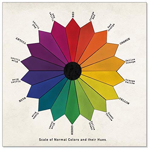
But pastel purple, periwinkle, or however you choose to call it, has a softer quality to it. It’s the kind of color that would be nice to have on your bed linens. Calming, cool, inviting.
In recent years, pastel purple has had a surge in popularity in design and pop culture. Pastel purple slowly entered pop culture and fashion during the late tens, after millennial pink’s claim to fame, and in 2022 Pantone declared “Very Peri” the color of the year, a soft, light blueish purple.
Their choice was made upon their analysis of the zeitgeist: A color that would hold us, keep us safe, after the scary times of covid isolation. A color in which we could nestle during transformative times, changing times. The blueness and the red undertones would be energetic and encourage creativity and expression.
Not long after Very Peri became the talk of the town, the trend forecasting agency WGSN’s Coloro declared “Digital Lavender” color of the year in 2023, a softer, lighter blue purple than Very Peri.
Of Digital Lavender, their analysis of the times, told them that we needed a color referencing stability, serenity and escapism. A symbol of cautious optimism, hope and balance in times of crises. A sensorial shade calling for holistic wellbeing, inspiration and creativity.

WGSN Coloro’s visualization of their trend color “Digital Lavender“
As for the pastel choice, they said:
“Pastels are often used as they speak to tranquillity, peace and have an ethereal nature.”
This surge in pastel purples in popular culture most definitely has to have affected Mette Frederiksens choice to wear the color - availability and the trends of the time also greatly affects the wiggleroom you have, when you dress. So that’s probably part of the reason, too - the periwinkle suit is simply available.
Looking beyond this, there’s an appealing quality to WGSN’s analysis of pastels: they are used to induce tranquility.
I do believe this played into Mette Frederiksens choice: taking a powerful and noble, deep and cool color as purple and turning to its pastel version - it talks of an understated power and security.
Wearing it to a press conference about great changes in government, the subtext of her periwinkle suit, might just be
“I might talk about something chaotic in a time of turbulence right now, but actually, I’ve got this, you guys really need to chill out.
This is completely peaceful and stable, I’m balanced and calm, I have a direct connection to the universe.
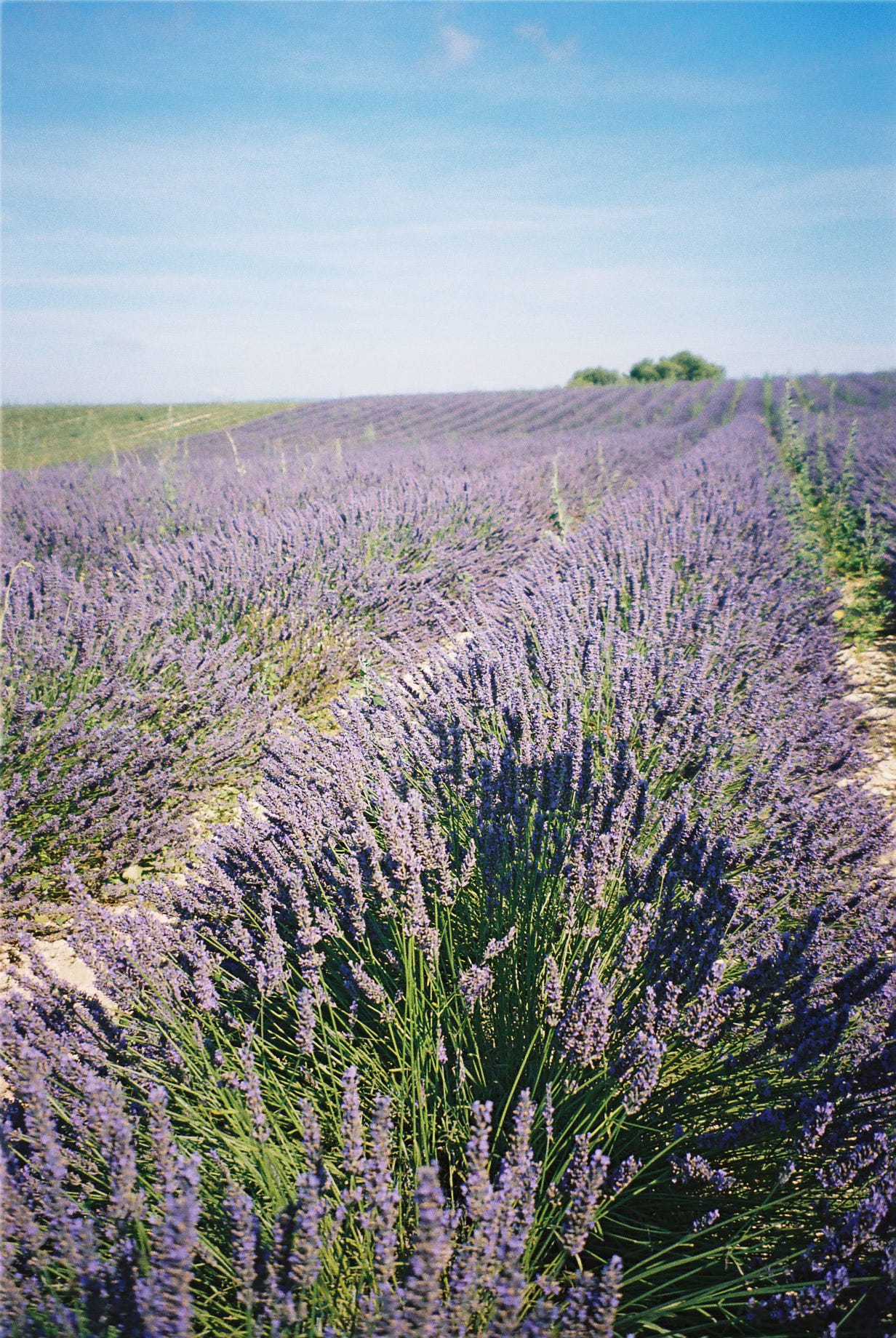
Can you smell the lavender? Because you should, that’s how calming all of this is to me.”
Did your shoulders also just drop, thinking of the soothing smell of lavender fields? Mine did, and I think this is the point of the periwinkle suit. What Mette Frederiksen is trying to do with her wedding guest attire is to manipulate the chaos of this situation of turbulence and crises and big changes.
Dressing in such a downplayed manner turns the situation on it’s head, and gaslights us into thinking that maybe all this isn’t so horrible, maybe we don’t need to be so critical.
Her periwinkle suit is whispering to us:
”Maybe you guys need to chill.”
Dressed: A History of Fashion Podcast interviewing fashion historian Lydia Edwards about her book How To Read a Suit:
https://www.iheart.com/podcast/105-dressed-the-history-of-fas-29000690/episode/how-to-read-a-suit-an-249537182/Avery Trufelman’s podcast, Articles of Interest, about suits
https://99percentinvisible.org/episode/suits-articles-of-interest-10/Kassia St. Clair’s book The Secret Lives of Colour
Comments
Nothing yet. Say the first thing.
Sign in to join the conversation.