
Current levels of wealth inequality may not represent historic highs, but evidence points to a forty-year trend of increasing inequality across much of the Western world. This article briefly examines the United States and the United Kingdom to demonstrate this pattern.
In the United States, there has been a sharp rise in upper-income share of aggregate wealth since the 1980s — while the share of wealth owned by middle and lower-income families has declined:
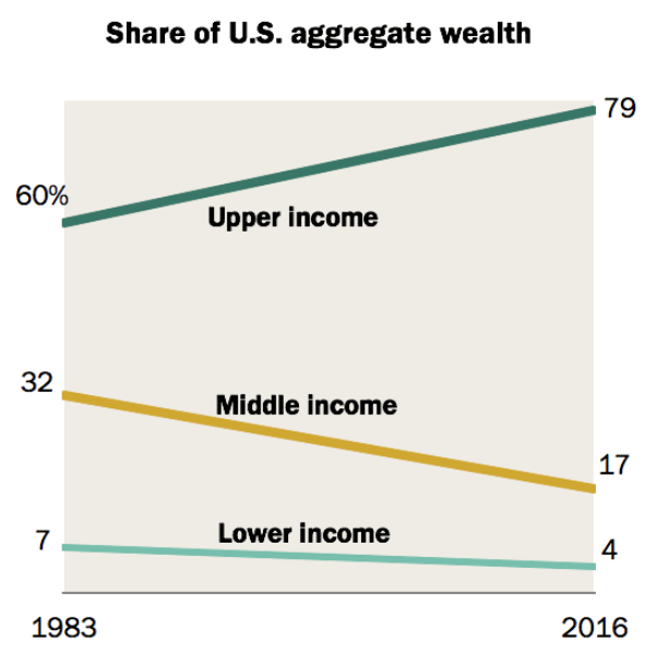
Source: Pew Research Centre
A similar pattern is visible in Britain. The chart below shows that the share of property owned by the top 10% (the orange line) has increased since the 1980s, while the share owned by the rest (the green and red lines) has dipped or stagnated:
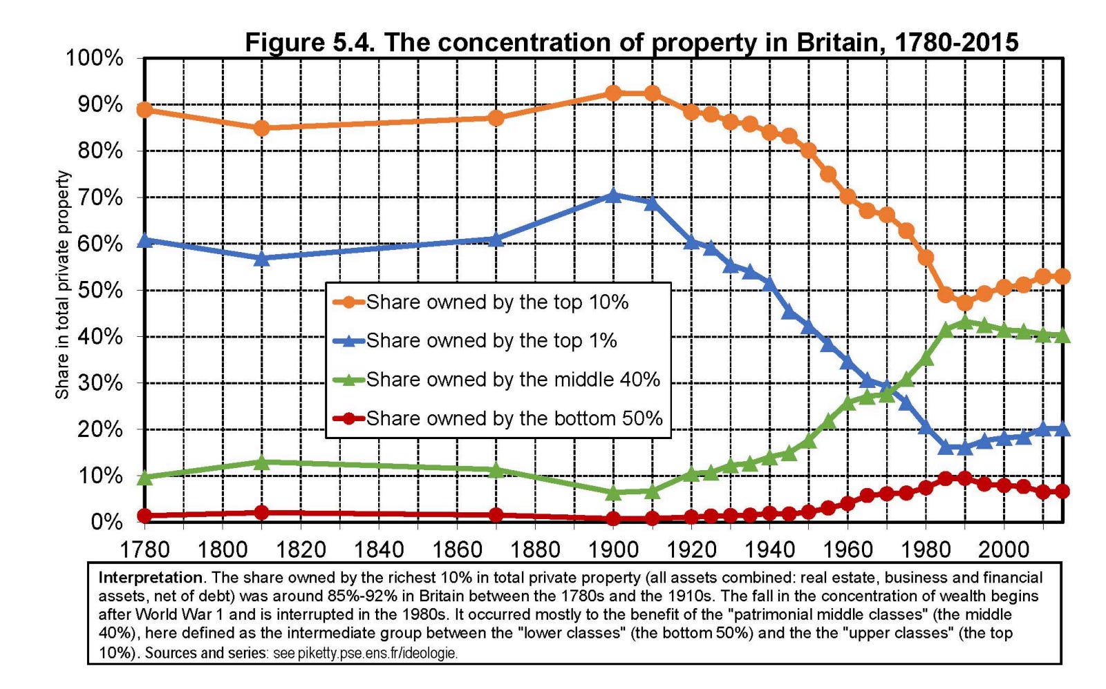
Source: Institute for Fiscal Studies
The Gini coefficient, which measures income inequality on a scale from 0 (perfect equality) to 1 (perfect inequality), reflects the same clear trend from the 1980s. In the UK, however, it has levelled off somewhat since 2010:
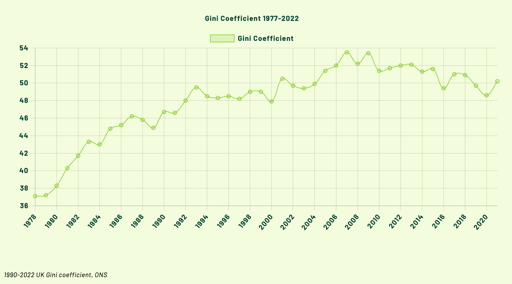
Source: ONS
It’s important to distinguish income inequality from wealth inequality. The chart below shows that average wealth at the very top of society in the UK has continued to grow significantly throughout the 2010s:
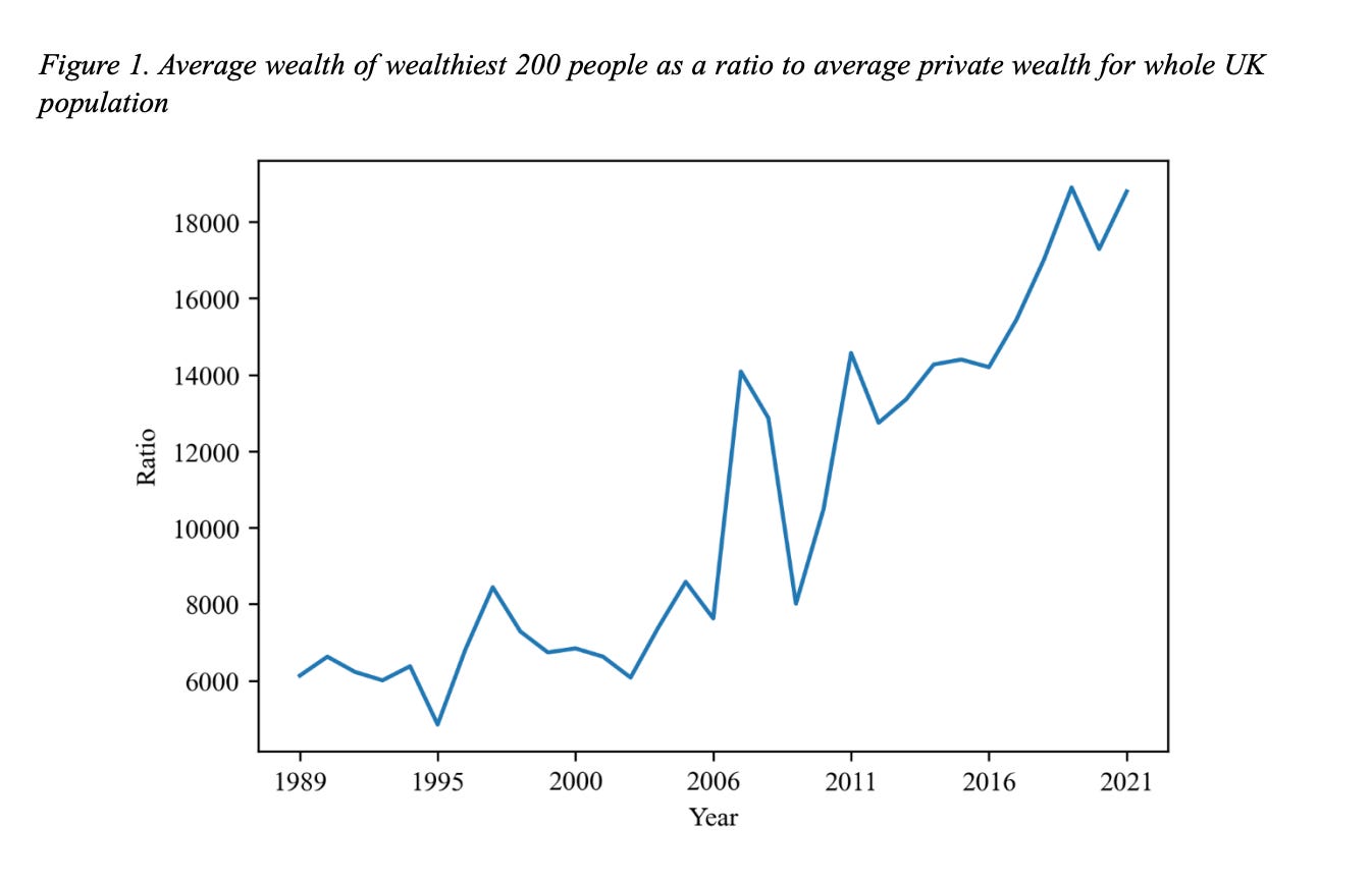
Source: University of Greenwich
The same trend holds in the United States. The Gini coefficient for the US has shown a steady rise in inequality since 1980:
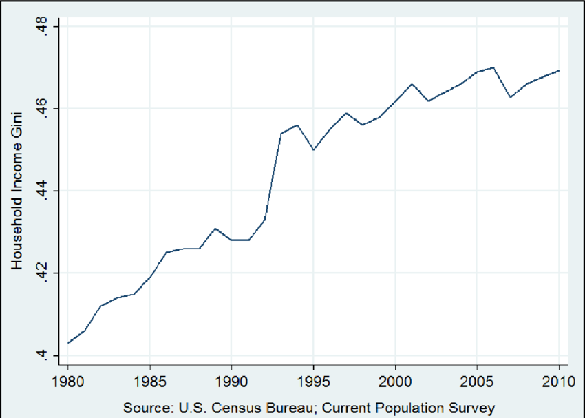
Source: U.S. Census Bureau
And wealth concentration among the top 1% has increased particularly sharply up to 2015:
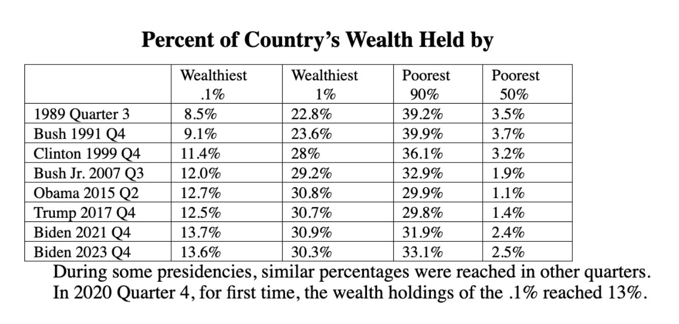
Source: Federal Reserve Board Figures
In The Spirit Level (2009), Richard Wilkinson and Kate Pickett identify various social impacts of inequality, including poorer health outcomes, higher crime and violence, education failings, and weakened social cohesion.
Regardless of your political perspective, recognising this trend may help explain why society today feels less fair than it once was.
No posts
Comments
Nothing yet. Say the first thing.
Sign in to join the conversation.