
I should disclose upfront that I have never owned a Ferrari. I am also 99.99999% certain I never will—they are, to put it mildly, somewhat outside my price range. I have, however, driven one—a Ferrari 308—and been a passenger in several others, including a Ferrari 488 GTB driven up the hill at considerable speed during a decidedly soggy Goodwood Festival of Speed in 2016. I have also visited the factory in Maranello a couple of times for work, and eaten in the Ferrari restaurant there (I still have, somewhere in my house, a bag of Ferrari sugar I kept as a souvenir. I was tempted to pocket a Ferrari-branded knife as well, but thought better of it). Needless to say, while Ferrari ownership might be a nigh-impossible ambition at this point, I have still managed to carve out a small place for myself on the peripheries of its fandom.
I mention all of this, dear reader, not to establish credentials or humblebrag but to be honest about my relationship with a brand that means something—genuinely means something to me—before I say what I’m about to say: The Luce is a brave, bold, and exquisitely designed car. It’s just not a Ferrari.
When Ferrari recently unveiled their long-awaited first fully electric car—a collaboration with Jony Ive and Marc Newson’s LoveFrom studio—the internet reacted as the internet normally does by hating on the new thing. No surprise there. The mockery was instant, comprehensive, and often very funny—T.C. Sottek, my former colleague at The Verge, called it the “Subaru Baja of Ferraris,” which is still my favorite. My entire Threads “For you” feed was wall-to-wall Luce ridicule for a solid 48 hours, which, now that I think about it, might be the most fun Threads has ever been.
Yet the bigger problem for Ferrari was that it wasn’t just the usual shit-posting and the normal suspects in car journalism dissing the Luce. The wider financial press ran informed, critical pieces about what a potential disaster the Luce represented for the Ferrari brand, a point driven home by the fact that Ferrari’s stock dropped by more than seven percent on launch day. Everyone, it seemed, had an opinion.
And yet most of them were decidedly missing the point.

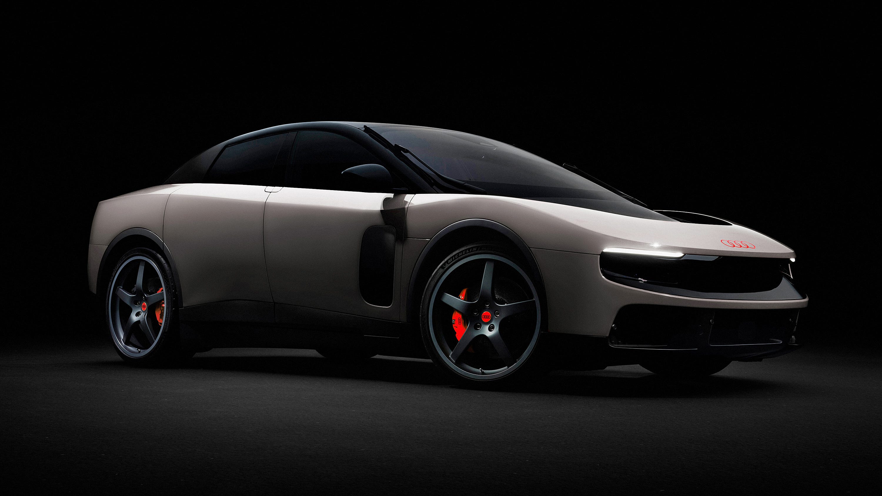
Because the Luce isn’t badly designed. It’s an extraordinarily well-designed electric car, especially the interior, which I think is stunning. It’s just designed for the wrong brand of car. When I first saw the teaser photos of the interior, I thought it looked decidedly Porsche-like: the simplicity of the lines, the intrinsic functionality. But now, seeing the whole car—the long, uninterrupted flow of the seamless windshield; the flush surfaces with rear-opening Rolls-Royce-style suicide doors; the absence of any visual noise; the way the body swells seamlessly over the wheel arches with minimalist simplicity—it’s clear this visual brevity doesn’t belong to Ferrari or Porsche; this is a perfect Audi—a literal, millimeter-perfect expression of Vorsprung durch Technik.
Which makes perfect sense when you consider the person behind the design of the Luce. Jony Ive has been explicit, for years, about his reverence for Dieter Rams—the German industrial designer whose “less, but better” philosophy became the philosophical backbone of Apple’s design language during its most consequential decade. Ive wrote the foreword to the 2011 Rams monograp As Little Design as Possible—a more public declaration of admiration than most designers ever make. The lineage feels direct and unambiguous, and, in my view, is unquestionably German, with roots stretching back to Bauhaus.
When it comes to cars, Audi has been speaking that design language for decades too. Their DNA is rooted in the same tradition that produced Dieter Rams and, by extension, everything Ive has ever made. Vorsprung durch Technik isn’t just a tagline at Audi; it’s an aesthetic philosophy. Their cars are designed to look like they were engineered from the inside out, form following function with the obsessive precision of a well-run factory floor. Though not all their designs are successful, they are undeniably Audi, and when they work, boy do they work. The Luce doesn’t look like it belongs in that tradition by accident. It looks like it was made for it. But don’t just take my word for it.
Using Ferrari’s press photographs as the base—and Audi’s R26 and the Concept C as my reference—I turned the Ferrari Luce into an Audi using Photoshop (all Photoshop, no AI). I replaced the Ferrari badging with Audi's four-ring logo on the hood and even the brake calipers, as well as swapping out the classic Ferrari donut-shaped rear lights on the Luce and replacing them with a rectangular linear design from the Audi Concept C. For the interior, the obvious change is the red center of the steering wheel with the Audi logo, but this also appears on the key fob down below—it's very subtle.
Once the work was done, the transformation felt, frankly, reassuringly inevitable. The proportions were right. The character was right. The emotional register—sophisticated, controlled, a little cool—was right. To use the phrase in the Steve Jobs sense: it just works. The car morphed seamlessly into the Audi identity like a T-1000.
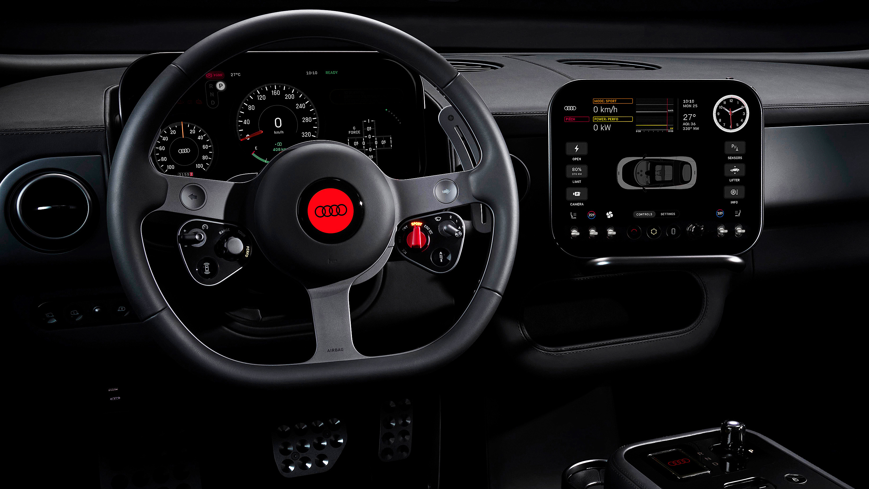
The interior, for what it’s worth, I genuinely love. The Braun-esque steering wheel with its deeply analogue instrument cluster, the discrete side-mounted swiveling screen (Ive’s explanation of its functional logic to Cleo Abram is genuinely informative), the absence of the repeating screens that have colonized the dashboards of virtually every modern electric car—and petrol models too, for that matter—is considered and restrained, and not only reminiscent of Ive’s work for Apple, but for Linn hi-fi too. It’s the cockpit of a car designed by people who think about objects for a living, not people late-braking to hit an apex.
None of this is to say I don’t understand why Ferrari created the Luce. Their customer base is not a large one—only 13,752 cars sold in 2024, with 81% of buyers already existing Ferrari owners and nearly half of those owning multiple Ferraris simultaneously. These are people who know exactly what a Ferrari is supposed to feel like. They didn’t buy one because it was restrained and practical; they bought one because it wasn’t. Ferrari’s identity is purely emotional, aggressively Italian in a way that has very little to do with subtlety or understatement. By contrast, the Luce speaks another design language altogether, which makes it clear that Ferrari are looking way beyond their current customer base. The fact that Marques Brownlee and Cleo Abram were among the first media given access under embargo tells you exactly who Ferrari are pitching this to: not the 48% of buyers who already own multiple Ferraris, but someone who doesn’t own one yet.
As Ive himself put it in his sit-down with Abram: “Ferrari doesn’t need to do this. This is a controversial and extremely risky project because of the degree of innovation.” He’s not wrong. I found that self-awareness—from the designer, at the launch, about the thing he’d just designed—somewhat surprising yet admirably candid. It tells me something important about where this car sits: it’s an experiment in creative courage by people who are very good at what they do. It just happens that what they do, and what Ferrari’s customers came for, are, perhaps, entirely different things. Time will tell.
Yet from a design standpoint, from a purely creative point of view, I can’t help but think that if Audi had commissioned Ive and Newson’s LoveFrom studio to create the German equivalent of the Luce, the reaction would have been very different: I suspect it would have been universally praised, at least from the creative and design community.
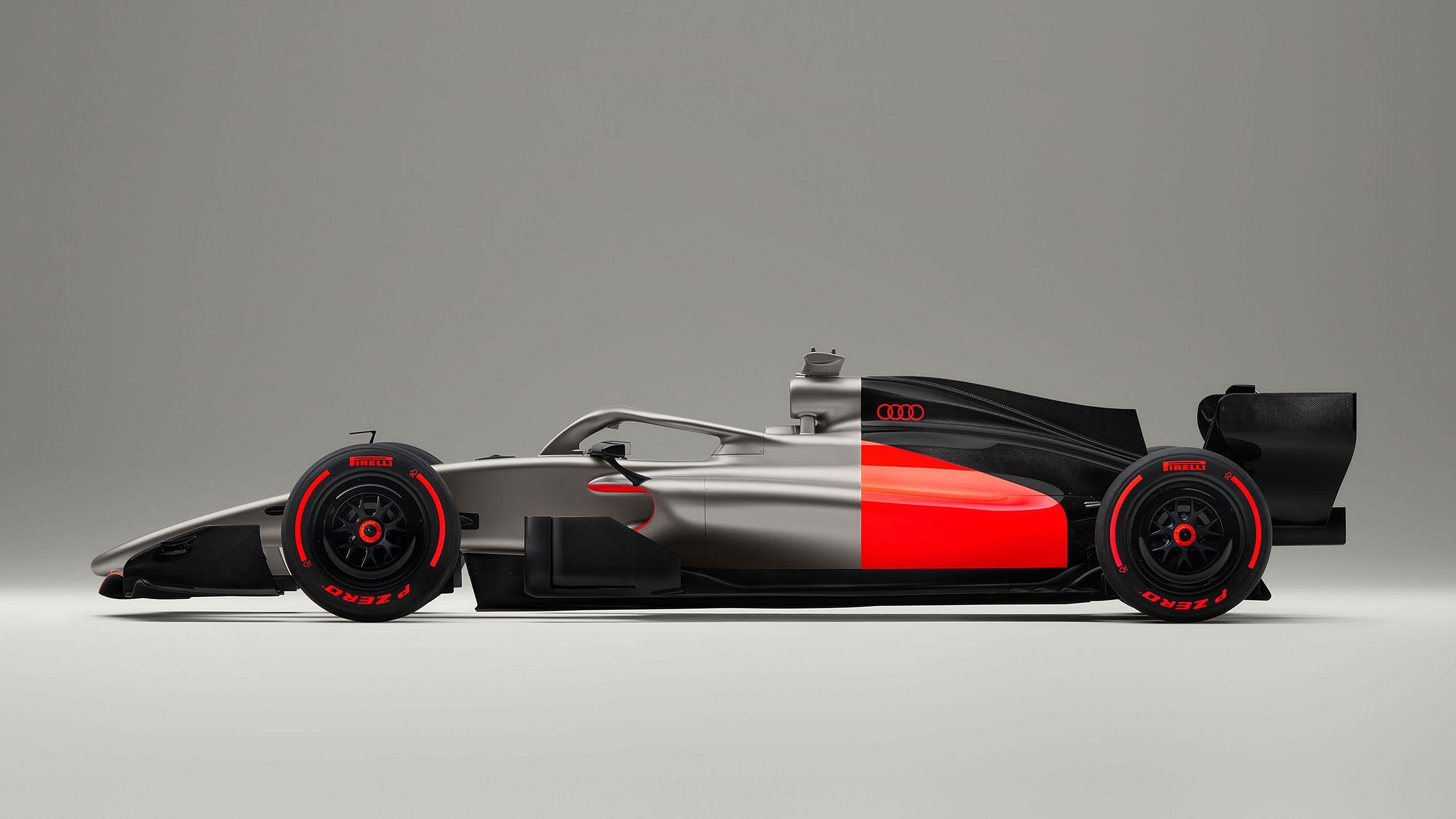
As for me, an Ive-designed cutting-edge Audi is a remarkably compelling idea. Just look at the gorgeous R26 Formula One car, which may be decidedly midfield in the races at this stage of the season but is, to my mind, the most beautiful car on the track: black, silky titanium silver, and that searing red—minimal, composed, unmistakably itself. There is nothing easy about making something look this simple, and I suspect Audi’s designers worked very hard to make it look entirely effortless.
Which is, when you think about it, very Apple, very Jony Ive, and exactly how the best design is supposed to work.
Comments
Nothing yet. Say the first thing.
Sign in to join the conversation.