
Continuing my series about the sorts of things I see and consider buying when out and about. This series is in answer to those of you who asked for more information about my thought processes when out hunting for stock, or pieces for my collection. You can read the first in the series here, and the second here.
A Victorian Enamelled Glass Vase
I’ve always been one to go my own way, even if that means I’m going against prevailing tastes. “I love Victorian enamelled glass”. There, I’ve said it. Everyone thinks I’m crazy. ‘Overdecorated’, ‘too much’, ‘like something a granny would have..’, ‘kitsch’, and even ‘crap’ - those are the sort of statements thrown at me when I buy it. It’s certainly out of fashion, whatever. Do I care? No.
In fact, bargains can frequently be found in Victorian glass - those of you who are kind enough to pay me for passing on my experience and knowledge can read about one in my last article for paid subscribers.
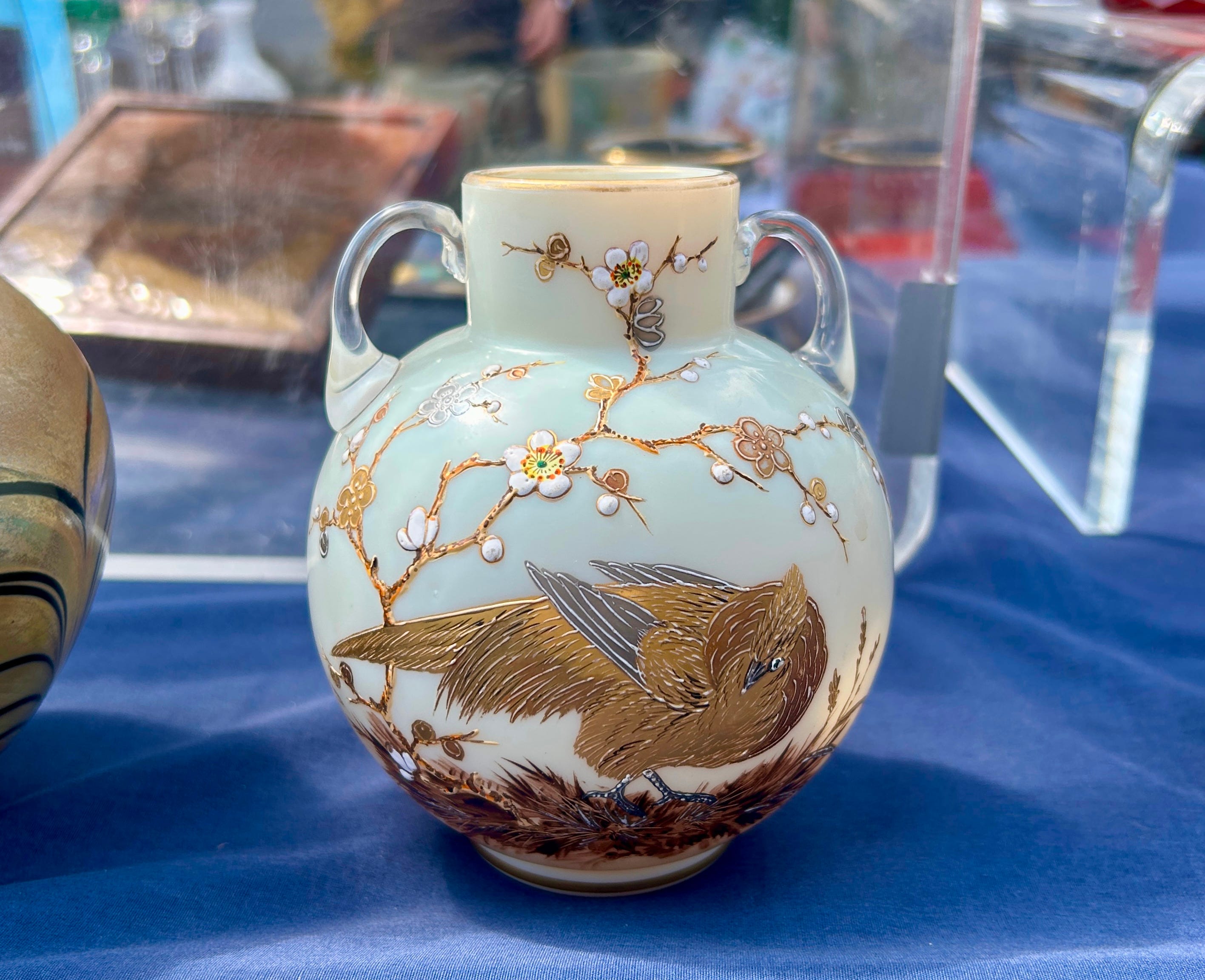
I think it’s great stuff, and totally undervalued on the market right now with prices starting at literally a couple of pounds. I have a large-ish collection of lower-mid end pieces that inhabits my mantelpiece at home, which can’t have cost more than a £150-200 in total. So I was delighted to find this charming vase at a flea market in Berlin last weekend.
Like so many, the body is opaque to give a plain canvas for the hand-painted enamel design. And what a charming design - a bird rests on the ground beneath cherry branches. Look at the quality of the bird, perfectly proportioned with highly detailed feathers picked out in raised gilt enamels. The cherry blossoms are also in raised enamels, even undulating to reflect the natural curve of the petals. And the ground, strewn with leaves is also detailed and well-painted. The colours are harmonious, and I like the satin finish white body and colourless handles - it’s a little gem.
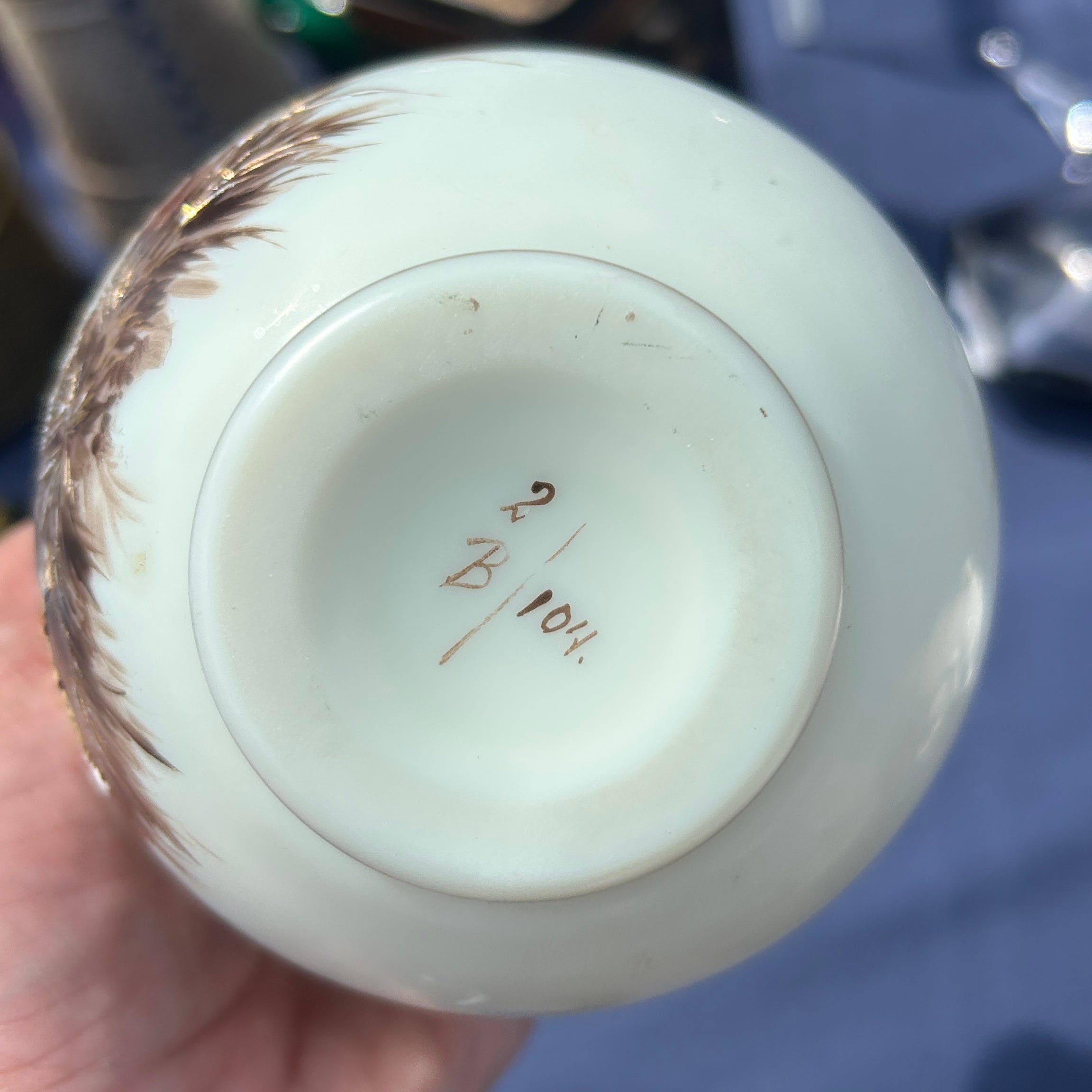
The entire design gives off a strongly Japanese feel but I don’t feel it was made there, primarily because it’s glass. Much of this sort of enamelled glass was made in Bohemia (roughly today’s Czechia), England or France, and I feel that this one is Bohemian. Looking on the base, we see numbers and the style indicates that this was made by Harrach. Harrach, or Harrachov, were founded by 1712 in Nový Svět, Bohemia, and grew to become one of the largest producers of glass for export across the world during the 19thC. They produced wayyy more glass than previously thought, and attributions for many designs are being changed to them as more is uncovered through research. I’d put this one at the 1880s-90s when they produced and exhibited a large range of Japanese inspired designs and designs featuring birds.
Let’s look a little closer. The gilt rim is worn, but that’s not unusual. I have plenty of vases where that has happened, and I’ve never been tempted to have it put back on. Partly due to the cost, and partly because the new gilt may well look too bright and brash upsetting the balance. There’s also a little wear to the raised enamel in the upper areas, probably from cleaning dust off over the last 150ish years. The head is a little odd too - yes, I realise it’s meant to be cocked, but this cock almost looks like it’s had its neck broken! It’s also too small compared to the body.
I had to ask the price, because nothing on this stand is ever labelled. €95, with €90 being the best price. The experienced seller knew it was a good quality piece. But that’s all it is - good quality, not the best quality. I don’t remember seeing it in Jan Mergl’s excellent book on Harrach, but that only generally tends to show the best designs anyway. The design is not quite quirky enough for me to add to my collection, and if it’s not quirky, it has to be very inexpensive for me to buy it. I’d have bought this one to sell, and I doubt I could ask much more for it. It’s about the right price.
DIDN’T BUY
A Carved Stone Eagle
As regular readers know, I’m a big fan of Inuit sculpture, produced in the snowy wastes of the Canadian Arctic from the mid-20thC onwards. You can read about it here, and here. I always pick it up when I see a piece, as it’s still considered a niche that little is known about, so bargains abound. I also love it! It’s usually the stone used that identifies it from 50 yards away - it’s either in green tones like this one, or else in grey tones. Then there’s the polished finish and the stylisation, with typically rounded forms that are quite different from those abstracted figural forms from the Shona movement of Zimbabwe.
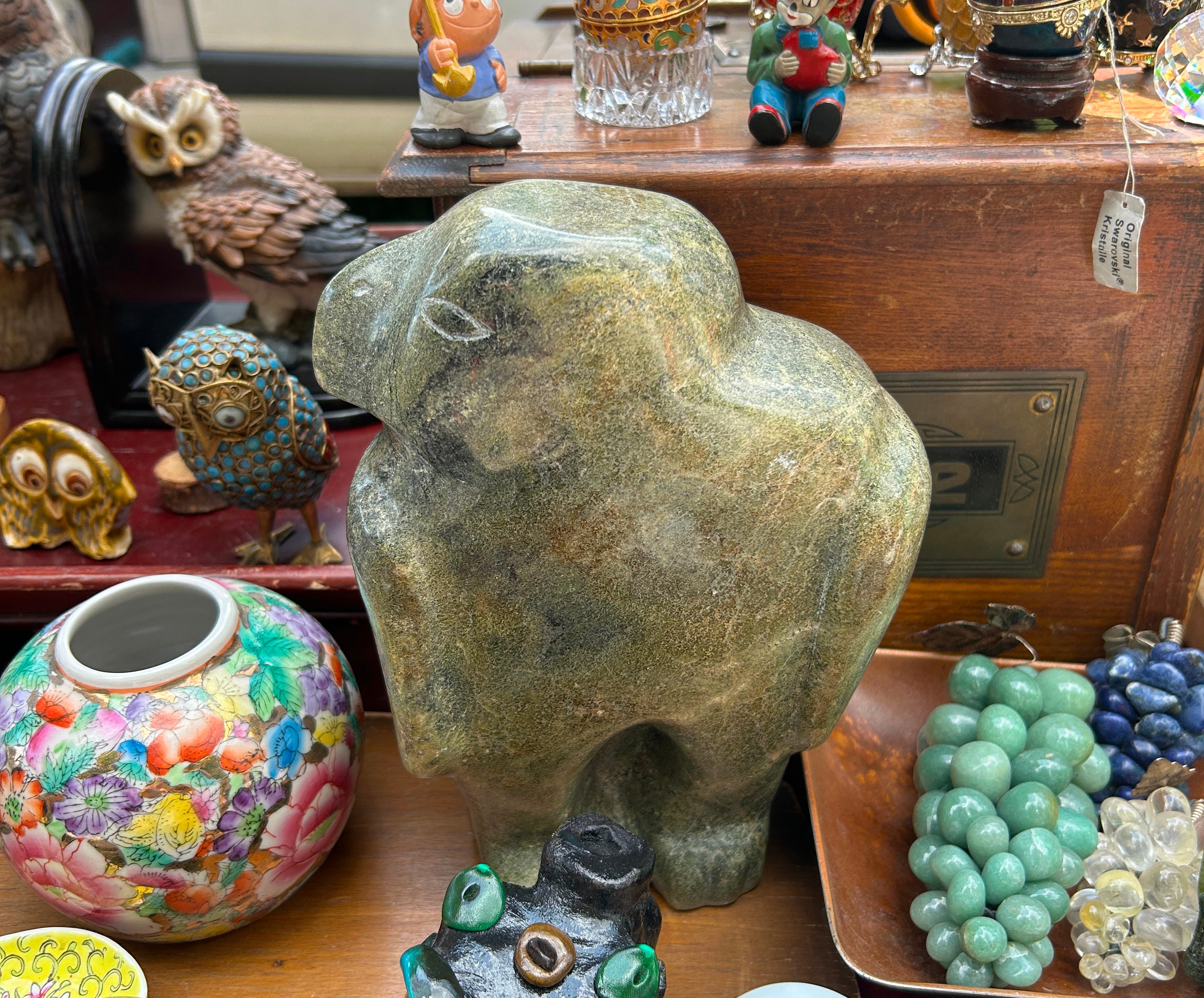
This one was a big one too, at around 10 inches high. I always look for stylisation and abstraction when I look properly first. This was good at first glance, suggesting the power of the eagle in the weight, and showing him posed as if perched, with more than a little of the ‘hieroglyph’ about his profile. He has visual presence.
Many Inuit pieces are marked on the base with scratched-in numbers or symbols that often represent the artist - for me, that’s half the fun. Using online databases, it’s like cracking a code! Picking this one up not only revealed the enormously heavy weight, but showed that someone had stuck some felt to the base to protect whichever surface he had perched on. I could peel it off in the hope of finding something, but not until I had paid the €120 asking price.
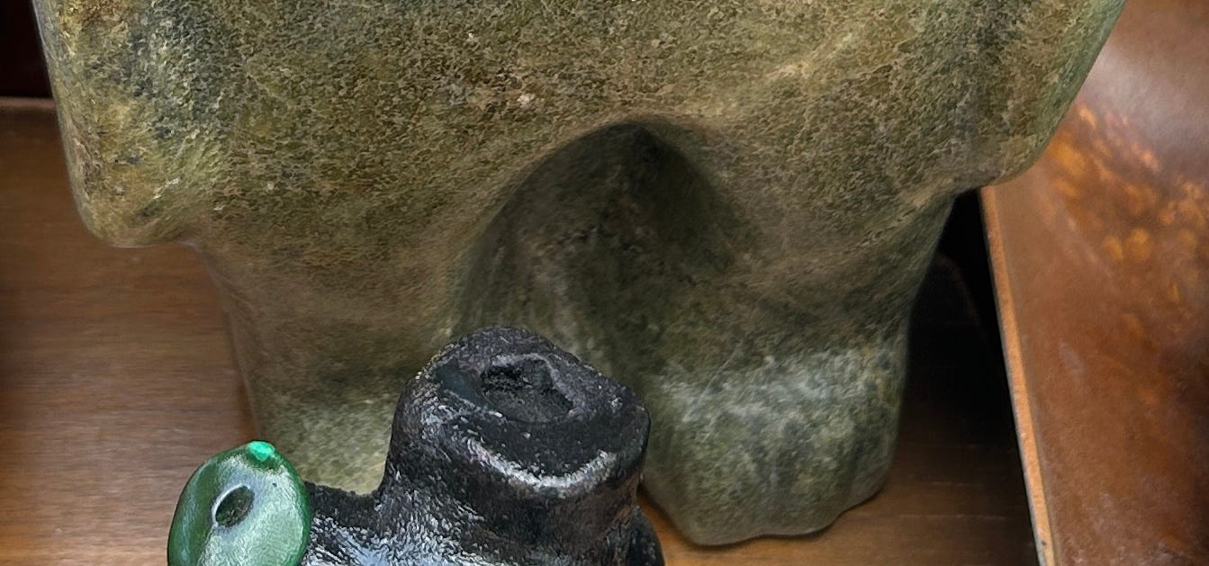
Holding him in both hands, my second glance began to take him to pieces. Yes, there’s some pleasing stylisation but he’s overall a bit, well, blobby. Amorphous. Undefined. Lumpen? The stylisation could almost actually be laziness from the sculptor. Yes, I couldn’t do any better myself for sure, but all of this just didn’t do it for me. The wings at the back had three feathers carved in, but these were also a little blobby. It just lacked the intended stylisation, thought and skill I like to see. The form almost looks too ‘human’. Could he be a transformation sculpture where human and animal attributes were combined? I doubt it and, if so, I think that’s accidental. Then look between his equally lumpen legs - the sculptor left the stone in between. I’d have preferred to see it removed and rounded to give him more of a perched bird look.
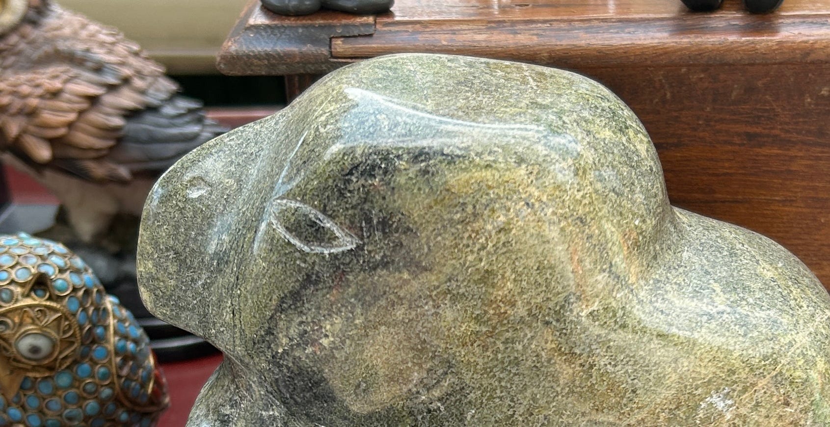
And then to the head. Again - lumpen. The beak isn’t defined and the head doesn’t have the visual impact, expressiveness, or character I’d like to see. The lack of detail doesn’t work because the head doesn’t ‘say’ anything. Compare him to the bird by Johnny Meeko I bought here. And then on to the eyes. Eeek. Urgh. Shakily delineated, they are very simply scratched in and still lighter in tone.
I do think he’s Inuit, but he may also be from the Pacific North West - he looks a little like an element from a totem pole carved there. But the stone isn’t the dark grey or black Argillite stone typically used there, and is much more typically Inuit in colour. Condition wise, he’s excellent, with no scratches or chips and a good high polish finish.
I think he’s an intentionally large piece made to take advantage of the rise in demand for higher end tourist souvenirs. Someone would see the prices being asked for the work of known or leading Inuit sculptors, and then see this huge lump - probably priced for much less. If they were less aware, it’d seem like a bargain. And that’s what I think happened. He was bought back as an affordable souvenir that seemed like a bargain at the time. But he’s not a bargain for me.
DIDN’T BUY
A Victorian Inkstand
My flight back from filming the Antiques Roadshow at Bangor Castle in Belfast the weekend last was cancelled, and that allowed me to trawl Belfast’s charity shops with two colleagues and friends. Most charity shops now have someone to help them, or else resort to Google Images to help them price things up. But every now and again, something slips though, so it’s always worth checking.
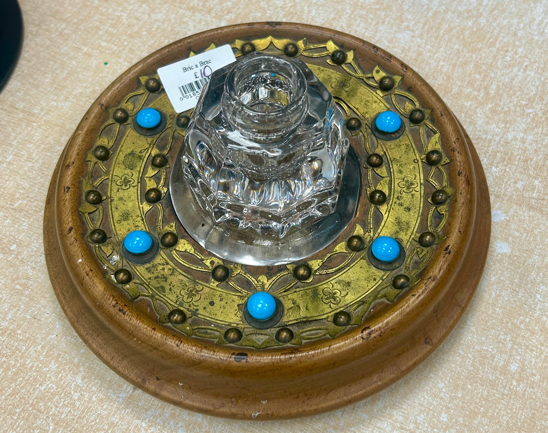
In the first shop we went into, I spotted this in a cabinet. As a long time collector and aficionado of vintage and antique fountain pens and writing equipment, my eye went straight to this inkstand and inkwell. The wooden base appears to be made from mahogany. I don’t think it’s walnut, but it seems to have faded or else been a much lighter mahogany to begin with. And just look at the brass detailing! Three rings of die-stamped brass have foliate forms or hand-incised foliate details. They’re comparatively thick, too, so aren’t thin like foil. Evenly placed around the central ring are six turquoise domed cabochons set into mounts which lift the design and contrast against the golden yellow of the brass perfectly. It’s mounted on three mahogany bun feet, which are all still present. The entire effect is rich, detailed, and typically High Victorian and, although turquoises were used earlier it probably dates from sometime around 1880-1900. I think it also has kind of an Arts & Crafts (dare I say Celtic?) feeling to it, in a way, which further ties it to that period.
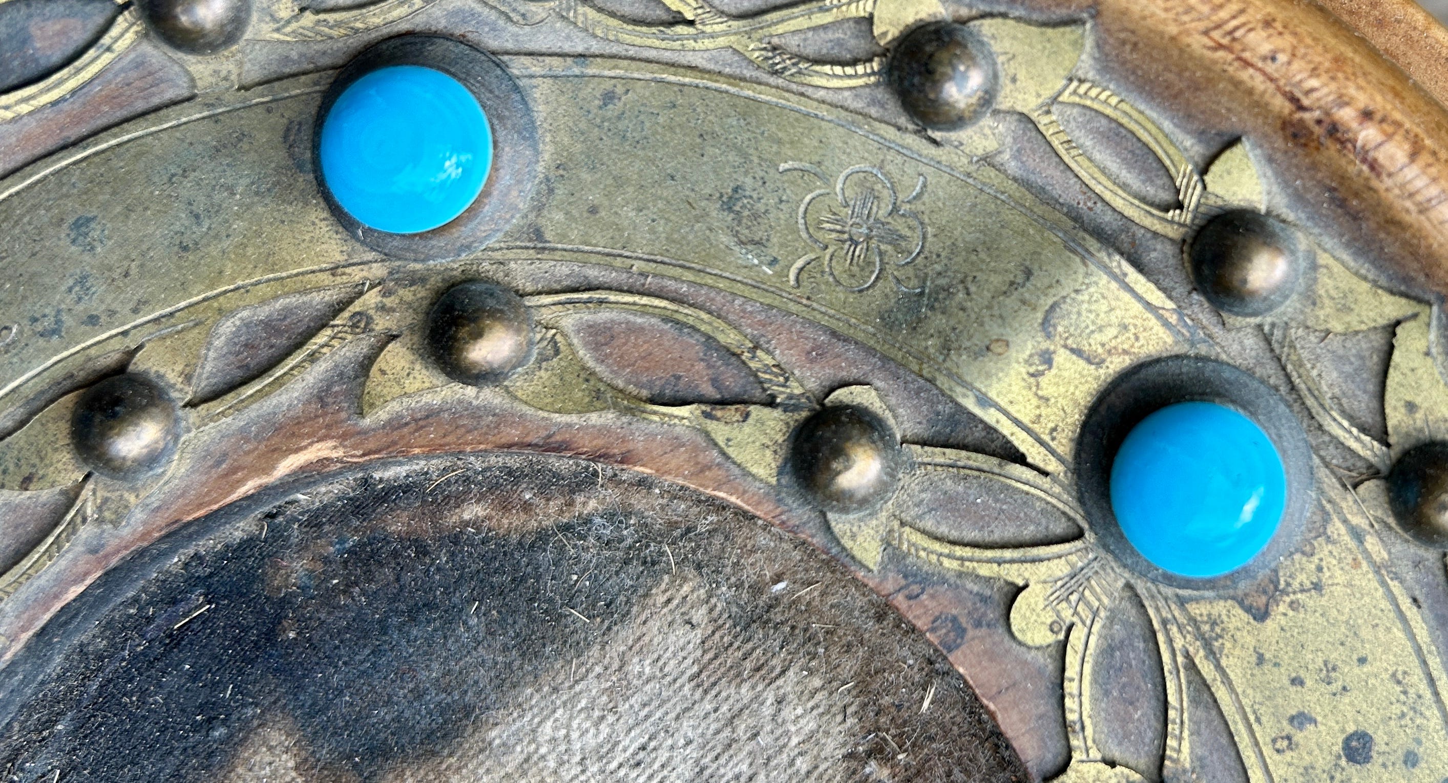
But let’s take a closer look. Looking at the turquoises, the striations and different colour tones tell me that they’re not real turquoise stones, but glass. Although the brass bands have been applied well, they weren’t applied perfectly when it was made, and there are three raised areas. Also, the inkwell doesn’t fit the circular recess perfectly and doesn’t have a lid, meaning the ink would dry out. Picking it up, the edges of the facets are rounded and smooth in my hand, rather than sharp, indicating it’s pressed glass, not cut glass. Although it’s roughly of the period, I think it’s a replacement. Looking underneath, the original velvet is both worn and stained with ink.
And then the question, which is all-important in today’s market - what do you do with it?! Inkwells are hardly practical items today are they? But the price - £10. Gosh. Bob’s your uncle, Fanny’s your aunt, and I handed a crisp tenner over. In my carry-on bag it went on its journey home with me.
DID BUY
To clean or not to clean?
The wood is faded, has blotches of ink staining, and dusty deposits around the brass detailing, and the brass is tarnished. But my instinct is always NOT to clean. I prefer the patina of ages and cleaning or restoring any one bit would upset the balance of the piece. To clean and restore it fully and properly, I’d need to remove the domed pins holding the rings in place, sand the wood, stain and wax it, and then clean all the brass and put the entire thing back together. I’d then need to replace the velvet. Stop! Not only is that an awful lot of work, but it’s fraught with risk, expensive, time-consuming and, quite frankly, rips the soul and history out of it. It would make it less, not more desirable, to buyers.
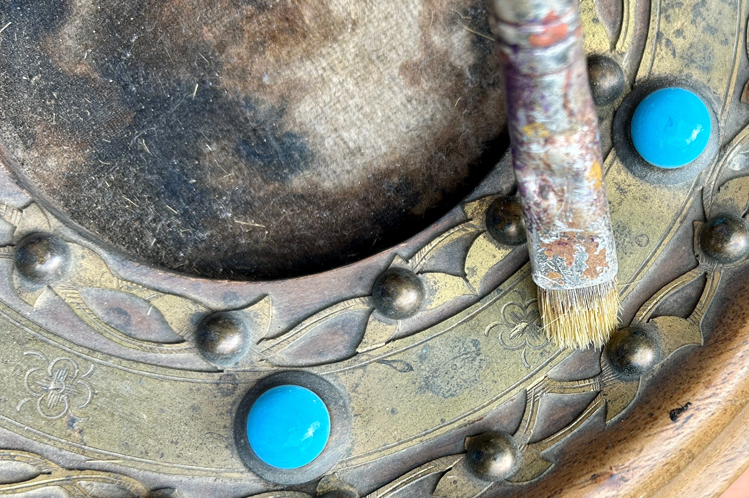
What I did do, however, was to give it a vigorous dust with a shorthaired paintbrush to remove any loose deposits, then I applied some ‘Restor-a-finish’ (magic stuff, that) to bring up the colour of wood a little. As the colour is even around the body, I’d think it was a lighter mahogany to begin with, rather than having been faded by the sun.
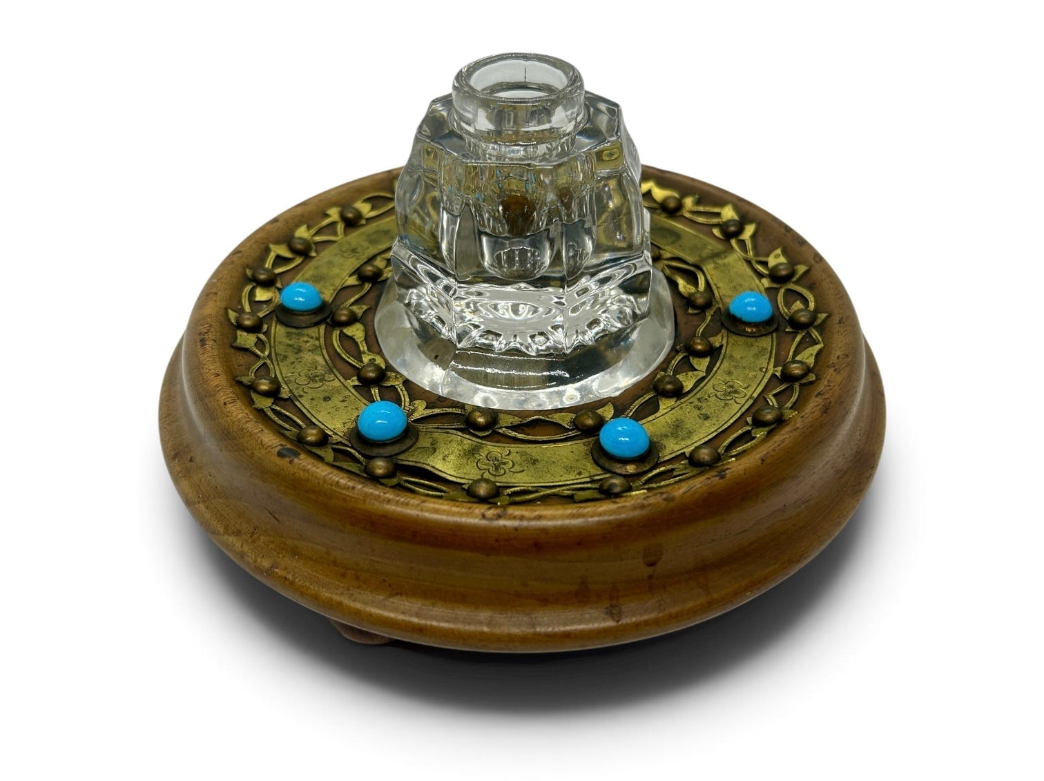
So now it’s ready to sell. As is. I won’t even replace the inkwell as it fits visually, and just about fits the recess. My feeling is that it should sell for around £40-60 or so in an online auction, but we’ll see. It’s perfectly decorative piece that harks back to a grand Victorian’s desk in a gentleman’s library, but it’ll probably sell to an inkwell collector. Or else it could be yours if you’d like it. Let me know!
No posts
Comments
Nothing yet. Say the first thing.
Sign in to join the conversation.