
Here we are in the World Cup. Great, isn’t it?
I can’t just enjoy it, can I? No. No, I need to start picking apart the kits, deciding the patches are in the wrong positions, pointing out mismatching baselayers…
And what about the crests? The team badge is going through something at the moment.
Maybe it always has been. I remember once being ever so politely put in my place by John Devlin - yeah, that John Devlin - when I suggested the crest is the most important identifying element of a team on a football kit. He quite correctly argued that that is, in fact, the colour of the shirt, particularly in the case of the first-choice - “Home” - outfit.
But the crest is surely second - I’m certain John would agree. So why is it treated with such disrespect?
Not only is it dwarfed by the main sponsor in club football, it tends to have equal billing to the “manufacturer”’s logo on the chest, though that is often repeated on the sleeves - or they have further technical sponsor branding - and it’s now even smaller, in the Premier League, than the secondary sponsor on the left sleeve and the competition patch on the right.
This doesn’t seem right to me. On the subject of billing, Nike stand out as the exception that proves the rule in generally ensuring that when logos are centralised, their “Swoosh” plays co-headline/main support to the headlining crest, although Corinthians are currently being wronged in this regard by the US supplier. As something of an aside, England in their recent friendly against New Zealand had crest, Swoosh, match detailing and squad number, in that order, all along the centre line. It was a lot, and it remains to be seen if the Numberbellies can end 60 years of hurt this summer, but New Zealand’s look - which has been commented on - is a prime example of something I’ll get to shortly.
Personally, if the crest is centralised, I think the said manufacturer’s logo should be placed on the, in effect, vacated left breast. Belgium went with this look at Euro 1984, while so many will unnecessarily have this detail positioned on the right breast. Folks, the heart is in the middle, so there’s justification for placing the crest there, and the world will keep turning if a cat, say, finds itself where we suppose the organ to be.
That said, the Belgians were part of one of the greatest crest desecrations, when the adidas(’d) Trefoil was put on the left breast at Italia ’90, relegating the association marking, on both shirts, to the right.
I don’t know how they got away with it but France’s oversized crests on their Euro 2024 shirts were wonderful, and how things should be, but instead we had an apparent reduction of the size of the Olympique de Marseille crest in 2025-26, thankfully rectified with the new design on the new design. Incidentally, I now believe that to be a wonderful club badge and I have little time for anyone still criticising it.
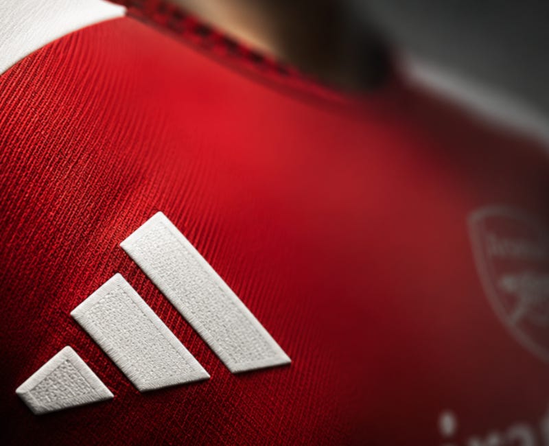
But size isn’t everything. While it was laughable how diminutive crests could look when adidas enlarged their 3-Bar logo in 2024 - think Mick Fleetwood and Sam Fox hosting the Brit Awards in 1989, with the opportunity for further parallels in terms of comparative delectability - another issue is contrast.
Crests often have so much detail, or are so outline-based, that if one were to squish one’s eyes, they become barely discernible. Not so with that 3-Bar, eh?
Take a look through Celtic’s first-choice kits this century, for example. It’s the oldest trick in the book, when it comes to the Glasgow side, to go some way to justify a new hooped release each season by alternating whether the crest and supplier logo appear on green or on white. Of course, the supplier logo - currently the dastardly 3-Bar - will change colour in order to contrast, for maximum visibility, as will the Celtic crest.
Imagine I’ve placed a certain Anakin-and-Leia meme here. No, the green-with-white Celtic crest does not change to white with green when placed on the green hoop. It stays predominantly green.
And this is a recurring issue. Remember New Zealand against England? A silver fern on a white shirt is a flawed combination, so if the Kiwis do switch to black - as the internet largely suggests they already have - I, for one, would understand.
One way of offsetting the lack of contrast to the crest would be to reduce the contrast of the supplier mark, as has been achieved with an outline-based and non-contrast (to the shirt)-fill on last season’s Glenavon Away. So, again, it’s not about how big it is; it’s what you do with it that counts.
But generally, the approach taken prioritises the supplier branding. Even Peru’s famous diagonal sash makes way for the 3-Bar on the South Americans’ current primary design! A great shirt, but that’s telling.
Using Olympique de Marseille as an example once again, their recent(ish) AFCON-inspired shirts saw their own crest - the outgoing version - barely even being able to be made out on the Algeria version. Scandalous.
Also warranting mention is West Ham United’s take on the “out” phenomenon (“blackout”, “whiteout”, “blue-out”, “red-out”, etc.), whereby the Hammers had their crest and Umbro chest logo rendered in a non-contrast fashion on their 2023-24 Away, but had the fullest of full contrast applied to the sponsors, making what could have been a gorgeous shirt - it had claret neck and cuffs - essentially a distraction-free ad for Betway, and, to a lesser extent, JD Sports. West Ham may have made up for it last season, but it was recently repeated in La Liga’s retro weekend - it turns out I’m now so old that “retro” now means throwing back, or faux-ing back, to an earlier point in my own adulthood - with Club Athletic (Bilbao). That said, Kutxabank is part of the club identity, with Bohemian FC getting a pass for their parallel too.
All in all, it’s actually staggering that Puma managed to place team names writ large on the front of Third shirts in 2021-22 but crests aren’t being made big enough and obvious enough as a matter of course.
Some more examples to take a look at:
The 2025 Belgium Away shirt, the 2025-26 Milan Away, the 2025 Inter Miami Third, the Palermo 2025-26 Third (arbitrary trim contrasts but the crest doesn’t?), the 2025-26 Arsenal Home, the 2026-27 Arsenal Home, the 2025-26 Altrincham Home, the 2025-26 CP Cacereño Third, the 2024 Jamaica Away and, perhaps the most egregious of all, the 2025-26 Leyton Orient Third. Even great shirts like the Manchester City 2010-11 Third and - the daddy - the 1988-91 West Germany Home see crests arguably playing second fiddle to manufacturer markings when it comes to where to position elements, a sponsor with the former and the famous ribbon with the latter. The Germany 2018 Home fixed the ribbon issue through flipping it, but a cover version can never better the original - the damage had been done.
Anyway, now you’re cursed like me. You’ll notice them all the time now. Sorry, not sorry. Maybe if more people were as upset about it as I am, something would change. We might have more kits like the Chelsea Fourth (FA Cup) kit of 2019-20, which the upcoming Real Madrid 125th-anniversary release is believed to be an example of. There is hope.
JayThose who wish to support this Substack may donate here, and details about the writer can be found here.
This post is public, so feel free to share it.
No posts
Comments
Nothing yet. Say the first thing.
Sign in to join the conversation.