

Dear Investors,
I almost didn’t send this one.
Not because there was nothing to say - because there was too much. And because the thought I keep circling feels reckless to put in writing while the whole street uncorks champagne.
I’ve had these 10 charts fanned out for 48 hours now, landing every time on the same cold spot at the base of my spine that won’t warm.
Let me tell you how this letter is built, because the shape is the argument.
It comes in two halves that barely speak to each other. The first 5 charts are the ones you already know in your sleep - glowing green on every screen, making this feel like the safest morning in a generation to be long.
They are loud, everywhere. And I’ve come to believe they are a decoy.
Because somewhere around the fifth chart, the floor quietly gives way.
That’s where the letter turns, where the PRO section opens, and where these numbers stop being a scoreboard and start becoming a map - a map of something the first 5 charts are working very hard to keep you from seeing.
In 20 years I can count on one hand the times surface and substance pulled apart this violently. And every time, the surface stayed beautiful right up until the instant it wasn’t.
So here’s my promise.
Against each of the first 5 charts I’ll drive a stake into the ground - a question I refuse, on purpose, to answer in public. Every one gets pulled loose below the line, in PRO, because that’s where the actual money in this analysis is buried.
Read only to the paywall and you’ll close the tab certain I mailed you a victory lap. I didn’t. I mailed you a warning wearing a party hat.
The value was never in the noise up top. It’s in what the noise is straining to hide.
Let’s walk into the party together.
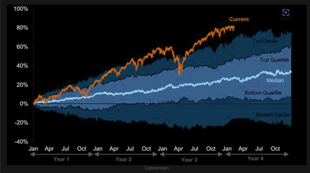
Look at that orange line.
That’s us - this cycle, right now - and it hasn’t merely won. It has climbed where the air goes thin and few of us have ever stood.
It’s threading the Top Decile of every 4-year path the market has drawn in nearly a century, up around +80%, while the median cycle at this same point has barely dragged itself to +30%.
And that’s what makes my hand drift toward the seatbelt, not the flute.
I’ve met the previous tenants of this penthouse - their names read like famous last words: the run into 1929, the melt-up into 2000, the everything-rally into late 2021.
Each felt, in its moment, like a permanent plateau. Each was, in the rearview, the distribution phase - the quiet reel where confident money slides its shares to enthusiastic money and lets itself out the side door.
The tape has never been shy about what follows.
Those 3 tenants were each escorted out by a crater: the Dow shed -89% into 1932, the Nasdaq -78% into 2002, the S&P -19.4% across 2022.
The relationship underneath is stubborn - the higher above the median path you begin, the thinner the reward the next 12 months will pay. Extraordinary returns have never been a promise of more; they’re the tripwire before the opposite.
First stake, left standing: if we’re already in the top decile of 100 years of outcomes, what’s left to harvest up here - and, more unsettling, who is still buying at this altitude?
I know the answer. It belongs downstream, in PRO, where it stops being a curiosity and becomes the whole thesis.
Here’s the chart nobody frames for the wall.
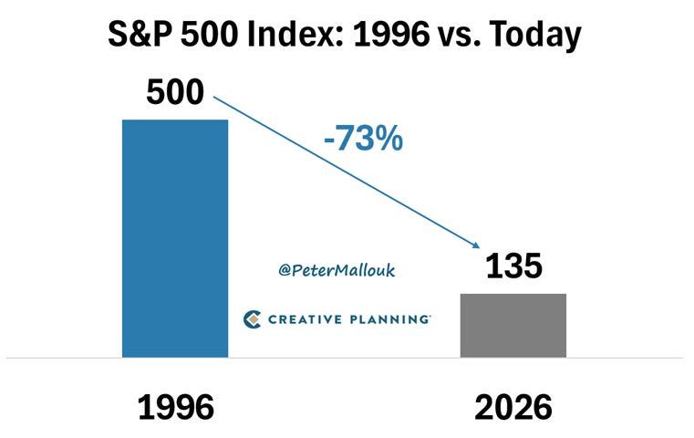
Of the 500 companies that made up this index in 1996, only 135 are still standing in it today - a -73% attrition rate.
Nearly 3 of every 4 have been swallowed, spun off, shrunk, delisted, or simply erased.
I think this dismantles a story we tell ourselves.
We say “the S&P 500” as though it were a single living organism faithfully compounding our savings for decades. It’s nothing of the sort.
It’s a survivorship machine - winners stapled to the front, losers slipped out the back, the index handed a medal for a ruthlessness we’d never tolerate in our own book.
I’ve watched this reel before.
The Nifty Fifty were the “one-decision stocks” you were supposed to buy once and cradle forever - and when that cohort cracked, the S&P fell -48% into October 1974, the untouchables leading the way down.
That’s the correlation I want you to feel in your gut, because there’s no tidy coefficient for it: a book of unassailable winners has never once correlated with safety. It correlates with fragility.
Second stake, planted beside the first: if the index only ever wins by endlessly replacing its casualties, how safe is a portfolio built entirely from today’s untouchables?
I won’t answer here. I’ll answer below the line with a single number about concentration - one I suspect will change how you look at your largest position for good.
This is the chart I wish someone had pressed into my hands on my first day.
It takes the market’s real, after-inflation return and cuts it into generations - and read in order, those blocks don’t hum. They lurch.
From 1928 to 1948, investors earned a real +0.6% a year - 2 decades of sprinting to stand still.
Then 1949 through 1968 roared to +12.7%.
Then, cruelly, 1969 through 1984 collapsed back to +0.5% - 15 more years of nothing.
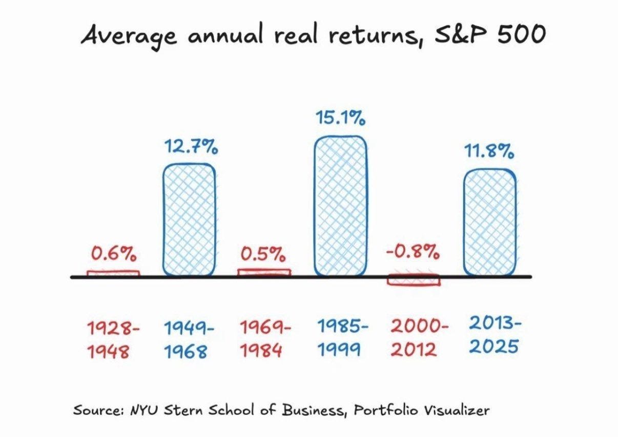
Then the great feast: 1985 to 1999, a blistering +15.1%.
And then the hangover the feast had pre-ordered - 2000 through 2012 came in at -0.8%, an outright real loss smeared across 13 years.
Which lands us here: 2013 through 2025, another feast, +11.8% a year.
Feel the rhythm? Feast, famine, feast, famine, feast.
And catch the cruelest detail - the great decades don’t fall from the sky; they borrow from the one after. That late-nineties blowout began with stocks cheap and ended at the richest multiple ever printed.
The most dependable relationship in this trade is that your starting valuation runs inverse to your next 10 years of real return; rich beginnings have explained roughly half the variance in where investors end up.
And we are sitting, right now, deep inside a +11.8% feast that has run without a real break since 2013.
Third stake, a plain question you already half-suspect: which block does 2026 onward most resemble - the opening of a feast, or the top of one?
I’ll tell you which one I think we’re in, and what it means for your money, once we’re through the paywall. It’s no accident this is the last chart before the turn.
And here the temperature drops a few degrees - while the crowd stands transfixed by equities, the largest and most patient buyer alive has quietly turned its back on the party.
In June, China’s central bank bought 480,000 ounces of gold - its 20th consecutive month of accumulation, and its largest purchase since October 2023.
It isn’t the size that keeps me up; it’s the choreography.
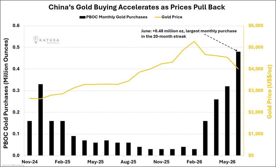
The PBOC didn’t chase gold while it ripped. It’s leaning on the accelerator now, into a pullback, buying harder precisely as the tape gets cheaper - a sovereign deciding it wants less paper and more metal, and is content to be paid to wait.
I’ve stared at flows for 20 years, and here’s the one thing I’ve never witnessed: a real bull market dying while the largest, slowest, most price insensitive money on earth was accelerating its purchases of the asset on the other side of the trade.
The correlation runs one way - official sector buying leads the multi-year gold trend, it doesn’t trail it.
Central banks bought a record 1,000-plus tonnes a year through 2022 and 2023, and across that window gold marched from roughly $1,600 to north of $4,000 - a 2.5x move.
When the whale speeds up, the trend has rarely been close to finished.
Fourth stake, the one that itches under the collar: what does the most price-insensitive buyer on earth understand that the equity crowd doesn’t - and why is it buying this dip?
I know exactly what it’s staring at. It’s a chart I refuse to show above the line, because it’s the beating heart of the PRO section.
And here’s the very dip that whale is so happily swallowing.
Gold has bled to $4,077, off -2.37% on the session, down nearly $99, sliding off a shelf that sat near $4,200 only days ago.
Watch nothing but this 3-day tape and you’d swear it was broken.
But look hard at what’s selling it.
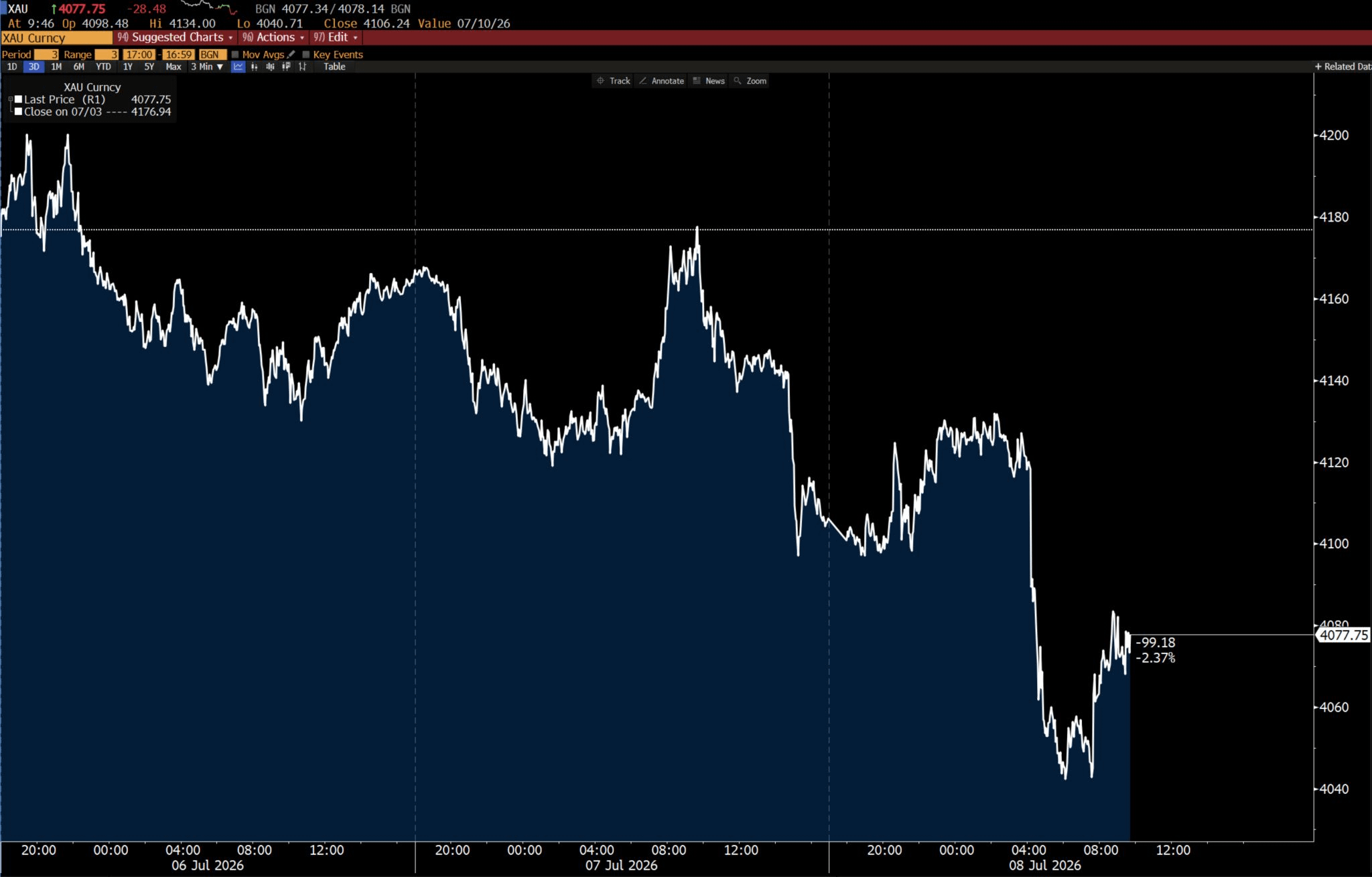
The 2 forces pressing gold into the floor are the mere threat of higher for longer rates and the fear premium of a costly, grinding conflict - the 2 things a debt-soaked superpower cannot afford to sustain, and therefore the most temporary pressures in the book.
Just the mechanical trade doing its job: gold runs inverse to real yields at a correlation near -0.8, and inverse to the dollar almost as faithfully.
I’ve sat through this movie twice in this cycle alone - gold fell -19% in 2020 to about $1,680, and roughly -45% across 2011 to 2015, from near $1,920 to around $1,050.
And I still feel 2022 in my body: the dollar index up about 8% on the year and 19% higher at its peak, the euro cracking parity, dollar-yen tearing to 152 - and gold wobbled through all of it and printed new highs anyway.
Each “the trade is dead” drawdown was, in time, bought back to fresh records by the buyer we just met.
Fifth stake - the hinge the whole letter swings on: if the metal is being force sold by fears the system can’t afford to keep alive, while the world’s most patient money buys every ounce it’s handed, then who, precisely, is on the wrong side of this trade?
And here the free half ends.
Everything above was the decoy - the loud, green, comforting surface. Below is the map.
Cross the line and I’ll pull all 5 stakes out of the ground at once.
Two simple paths below - Yearly to begin, Lifetime to never look back.
[🎁 #7 BONUS if you become a PRO today]


Comments
Nothing yet. Say the first thing.
Sign in to join the conversation.