
For years, I walked around convinced the world would be unlivable within a decade. What I didn’t realize is that the science never actually said that. In fact, thanks to the technological advances of modern society, we’re safer from climate risks than ever before. If I’d seen just a few of these charts back then, they might have eased my anxiety or at least pushed me to think more critically. I’ve gathered them here so you can share them with anyone you know who’s struggling with climate anxiety today.
This is my first paid subscriber-only post, and I want to say how grateful I am to the 1,300 of you who’ve joined me here already. Paid subscribers make this newsletter possible. For $5/month you’ll get access to this post and all future subscriber-only work. If that’s not doable for you right now, message me I’ll happily share this one with you for free.
Natural Disaster Deaths Have Never Been This Low in History
This first chart comes from Alex Epstein (check out his Substack, Energy Talking Points). It shows that even as CO₂ levels have risen, climate-related disaster deaths have plummeted. The reason isn’t less extreme weather events—it’s better protection. A century ago, storms struck with little warning and few options to escape. Today, with modern infrastructure, early warning systems, and gas-powered cars, people can evacuate quickly and survive.
Drought Deaths Are at an All-Time Low
Despite the fear-mongering of food shortages caused by climate change, drought deaths have also plummeted. Thanks to modern technology we can irrigate land and fertilize crops, making harvests far more reliable. And when severe drought does cause shortages, we can ship in food and sustain populations that, just a few centuries ago, would have been left to starve.
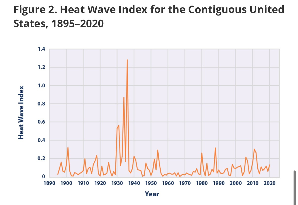
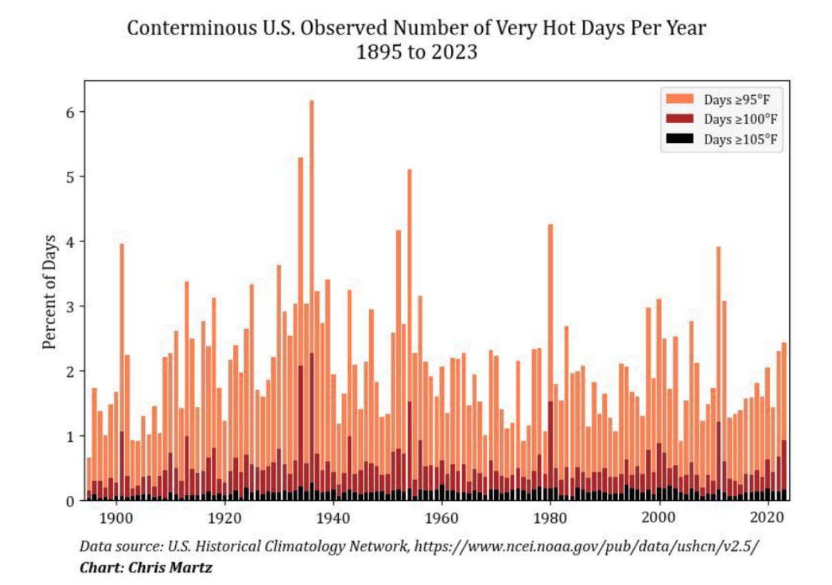
Heat Waves Were Far Worse in the 1930s
Back when I struggled with climate anxiety, every heat wave terrified me. I assumed each one was proof of climate change. But the record for the most intense heat waves still belongs to the 1930s. That fact alone runs counter to the narrative that every new heat wave is unprecedented.
More CO2 has lead to ‘Global Greening’
When I was in the climate movement, I had no idea there was an unintended positive consequence of all this extra CO₂, and that’s global greening! We’ve seen parts of the planet get up to 15%–50% greener thanks to more CO₂ in the atmosphere.
It makes sense because CO₂ is a plant food, and commercial gardeners will even pump CO₂ into their greenhouses up to levels of 1200 ppm because the plants love it. For context, we’re at 420 ppm in our atmosphere now.
Hurricanes Have Not Gotten Worse
Despite the fear-mongering every hurricane season, major hurricanes (Category 3 or above) have stayed steady since the 1980s. You’d never know this based on how the media covers hurricanes each year.
Flooding has also not significantly changed.
Climate scientists have low confidence that flooding magnitude and frequency has changed due to climate change. Despite devastating events like what we saw this past summer in Texas, flooding has also remained steady. There is variability from place to place and every year but there is no upward trend.
Forest Fires Are Significantly Lower Than They’ve Been in the Past.
Forest fires are down in the U.S. from their historic highs of the 1930s. But most media sites don’t give that historical context, instead they’ll start the chart in the 1980s or the 2000s to show an increase. But when we zoom out you can see that the levels of forest fires we see today are not historically unprecedented and in fact they used to be much, much worse! We need our government to focus on forest fire prevention, like controlled burns, instead of fear-mongering about climate change.
Antarctic, Arctic and Greenland Ice Sheets Have Increased
Despite fearful predictions that Antarctica would be ‘ice-free’ decades ago, the Antarctic, Arctic, and Greenland ice sheets have shown a lot of variability over the years. After decreasing in the early 2000s, these ice sheets are currently growing or have remained steady. This shows that the relationship between rising CO2 emissions and the ice sheets is not as straightforward as climate scientists once predicted.
Climate Scientists get their predictions wrong all the time
The scariest scenarios from climate scientists have not panned out. Just look at how wrong climate models were about the heat of the corn belt. The red lines in this chart are the temperature increases climate models predicted. The blue line is the temperature increase that actually occurred. As you can see it’s much lower than the scientists said it would be.
Next time you see a scary prediction in the headlines, remember that the models aren’t always accurate and the person writing the piece probably doesn’t know what they’re talking about.
I hope seeing these charts has calmed some of your fear around the future of the planet and the dangers of climate change. Climate change is completely survivable and something we can adapt to.
Shoutout to Matthew Wielicki, Alex Epstein, and Roger Pielke Jr. who are huge inspirations for me and have done a lot of the original work that inspired this piece. Give their Substacks a follow!
No posts
Comments
Nothing yet. Say the first thing.
Sign in to join the conversation.