
I was having dinner with a group of friends a few weeks ago, catching up on work, when I mentioned a recent project I had wrapped. A friend asked, “Okay, but can you get real art with fewer zeroes?”
And yes, you can. It requires a little more looking and taking the time to understand what you are actually buying. At this price, you are often choosing between small original art, vintage works with very little information attached to it, a limited print by a working artist, or something larger that comes with a practical catch. It may need framing, stretching, or a little imagination to see what it could become. For me, the search and possibility is part of the fun.
If you are part of Collector’s Circle, you know What I’d Buy is my monthly edit of works you can actually buy now, with context on the artist, why I think the work is interesting, and how it could live in a space.
What I’d Buy From Summer Group Shows
·
Jul 30

Summer group shows are categorically fun. Caught somewhere between the end of the spring solo season and the Fall openings, summer show are looser with galleries bringing together artists who might not otherwise share a room. They test new names, pull out smaller or stranger works, and take chances they may not take in serious buying season.
Today’s free post is a peek into that series at a more accessible price point, with room studies and the practical details worth knowing before you buy.
Let’s get into it.
Ultramarine tempera and ink on paper
27.5 × 19.5 inches
From the NeoMythology series
The colors in this work stopped me in my tracks. The juxtaposition of the classical Greek subject with the loose strokes and dripping paint make it feel equally modern.
Blue Tears is part of Craioveanu’s NeoMythology series, where Greco-Roman figures show real, raw emotion. Typically these subjects are shown regal, otherworldly, and unencumbered by the struggle of daily life. Craioveanu reshapes that narrative, using color and gesture to bring urgency and vulnerability back into the image.
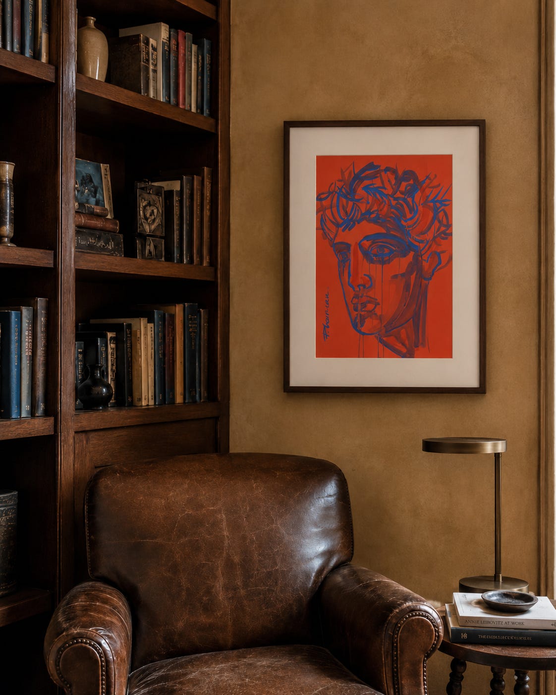
Framing
A generous mat gives the work more scale and gravitas, while the slim dark-walnut frame keeps it feeling modern and connects back to the wood elsewhere in the room.
Placement
This space is serious and fairly formal. The classical subject fits that mood, while the loose lines, dripping paint, and bold color introduce something less expected.
Color palette
The warm, earthy tones in the room give the orange and blue somewhere to land and are the focal point of this space.
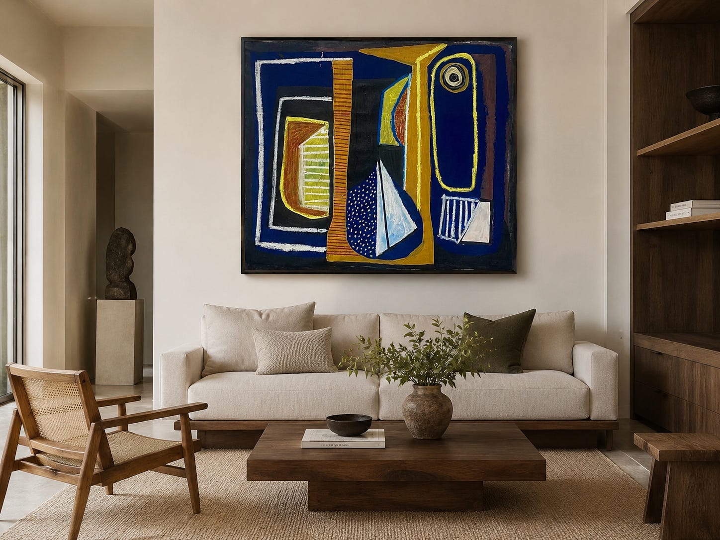
Acrylic on canvas
55 × 50 inches
Abstract art is often treated as the easy option for any space and often used when you can’t find anything else to fill a wall. I think that completely oversimplifies an art form rooted in interpretation, emotion, and real skill.
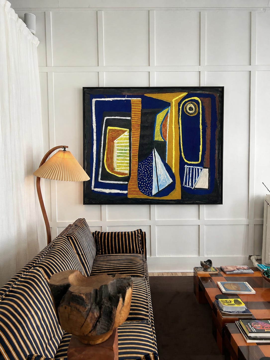
Avalon 81 by Robert Langley is a piece that stops you in your tracks and has much more to offer than a pretty painting used to fill a wall. The graphic nature of the piece feels like jazz to me with a bit of improvisation, held together with control of the color, composition, and movement.
The dark border gives the work the structure it needs, while the shapes inside are open enough to be anything and everything.
I see a windowsill on the far right. The sun rising and a sailboat in the stars in the middle. A face looking back at me. A banister at the top of the stairs on the far left. Someone else will find something completely different based on their own experiences, narratives, and worldview. That is the magic of abstract art and part of why it is so easily misunderstood. The meaning is what you make of it.
Avalon 81 is also special because it is a large-format original that can hold a room for an incredible price. The only caveat is that the work ships rolled, so you will have to find a framer who can stretch the canvas onto stretcher bars and then decide if you want to frame it or not. More on that below.
Framing
For canvas works, if the edges are clean (i.e. painted), you can leave it unframed. If you were to place it in a more formal space or wanted to give it a more finished presence, I would recommend a float frame with a quarter-inch gap between the canvas and the frame. Here, I chose a dark wood similar to wenge or ebony to echo the darker border of the painting.
Between stretching and framing, you would likely spend more than the cost of the artwork itself. In this case, I think it would be worth it and still a steal.
Placement
This work is large enough to fit as a centerpiece on a large wall as shown here. The space is designed to feel both inviting and elevated and the painting adds energy and interest without disrupting the calm.
Color palette
The darker tones in the painting stand out against the bright white wall and connect back to the deeper colors elsewhere in the room. The mustard, pale yellow, and blue keep the composition bright enough without feeling to heavy, keeping the colors in balance.
Original collage made from hand-painted paper on cotton paper
8.3 × 11.7 inches
What I love about collage art is that the process stays visible. You can see the imperfections, the cuts, the seams, and the changes in material rather than having them disappear beneath a finished image.
Em Kay says of her work, “What ultimately draws me in are the spaces that emerge in between the negative shapes that were never planned.”
That sense of discovery is what makes this piece work. The painted paper gives the work movement, while the white space gives the composition balance. The shape feels architectural or like an object that is familiar but you can’t name. The uncertainty of material and form is what gives the work its teeth.
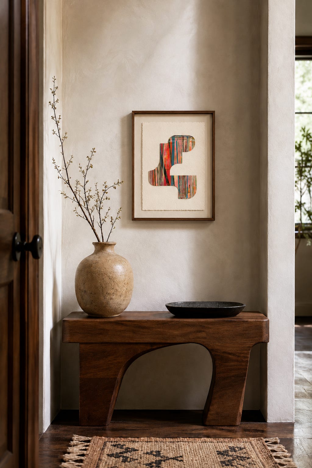
Notes on the room study:
Framing
Since the artist created so much white space around the collage by design, I would skip a traditional mat and frame the full work without an additional mat. That said, if the paper has enough weight in person, I would consider float-mounting (where the paper sits slightly above a mat) so the edges remain visible and the texture becomes part of the full work.
I chose a slim walnut frame to echo the wood tones elsewhere in the space without competing with the color and texture of the work.
Placement
At about the size of a piece of paper, this is a small but mighty work. It needs a place where the scale feels intentional, like a nook, a small wall between rooms, or a tightly edited gallery wall. The mix of modern curves, patina, and playful furniture makes the collage feel like a punctuation point rather than the center of the room.
Color palette
This is a great piece to add color to your walls if you want a pop of color, but still want to keep it more minimal. There is enough of a saturated palette with the pinks, blues, corals, and green that add energy without overwhelming the space.
Vintage watercolor on paper
14.75 × 12.25 inches
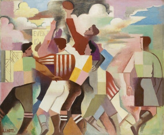
Laure Noetzin-Azam is a French modernist artist who trained under André Lhote, an influential Paris-based Cubist painter and teacher. Lhote was known for his emphasis on structure, encouraging artists to understand how a painting is built before deciding how to work in it. Noetzin-Azam takes cubist principles, but loosens them.
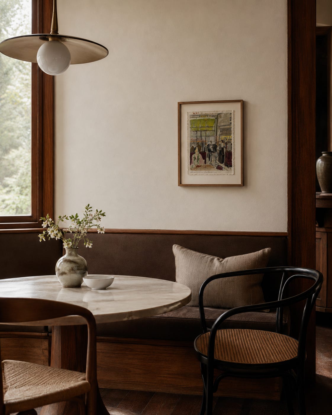
In this café scene, you can see how Noetzin-Azam organizes the room into simplified planes in the background, but in the foreground the focus is the woman eating alone. Her pale pink top, floral scarf, and more casual posture separate her from the darker, more formal figures behind her. There is something unsaid about who she is and why she is there that makes me want to know more.
This is the type of piece I could see myself finding while traveling and then thinking about once I got home.
Thankfully we have the internet.
Framing
The condition report notes some wear and perforation along the edges. I would lean into this history and imperfection by float-mounting the work so the full piece is visible. Additionally, given the age of the work, I would use museum-grade, UV-filtering glazing to protect the watercolor and paper from further fading.
For the frame itself, I chose a warm wood frame to connect with the shelving and table. A curved wood profile would play well with the curves of the table and chairs if you wanted to push it in a more modern direction.
Placement
I love this at the kitchen table, but could also see it above a reading nook. In this particular space, I love it off-centered with as a counter point to the art on the shelf and gives the dining room a more grounded feel. Honestly, I can’t fully explain it, but the whole combination feels like ease personified.
Color palette
The watercolor keeps the color soft enough to work with many rooms. This piece is more about the style and story rather than matching the room’s color palette.
Laure Noetzin-Azam | Paris Café Scene, $455
Oil on paper
8.3 × 11.7 inches
I love the beautiful, ethereal world Egyptian artist Hanan Ramadan creates. Ramadan’s work moves between abstraction and figuration, often featuring female figures to explore themes of vulnerability, strength, and transformation. This work feels as though it were plucked from a memory or dream.
The color and composition have so much depth and warmth that they make me want to cozy up with the art. Because it is painted in oil, the surface will have even more texture and feeling in person than you can see online.
Framing
This is another smaller piece, but because the composition is busy, I would opt for a large mat to really help focus your eye on the art.
The frame itself here is a thin metal frame to create tension with the textures in the space. If you were to choose wood, I would keep the frame thin to offset the thicker mat. A hot tip is to make sure the frame and mat are different sizes to give your eye a clear place to land.
Placement
I love this in a more intimate room given the context of the piece. I’d place this over a dresser, in a bathroom, or over a small console. The dreamlike setting feels better suited to a private space than a larger, shared room.
Color palette
I would place this in a moodier room with darker woods, earthier colors, and layered textures. It could still work in a brighter space, but I would want enough texture and contrast around it so the painting feels connected.
Hanan Ramadan, This Lake Is Not Water, $255
As you can see, there is a lot more to just a pretty picture. There is the frame, the placement, and the story. Together, they can make your home feel more connected and considered.
This post includes affiliate links. If you purchase something through one of them, LOTA may earn a commission at no additional cost to you.
Already thinking about your own wall? The Art Style Quiz is a fun place to start.
The room studies were designed using AI tools. I provided the details around framing, scale, and placement. Where an existing interior was used for a mockup, I credited the original source beneath the image. The goal of these studies is to highlight the variety of spaces and styles this art can live in and the power of framing, placement, and context.
Comments
Nothing yet. Say the first thing.
Sign in to join the conversation.