
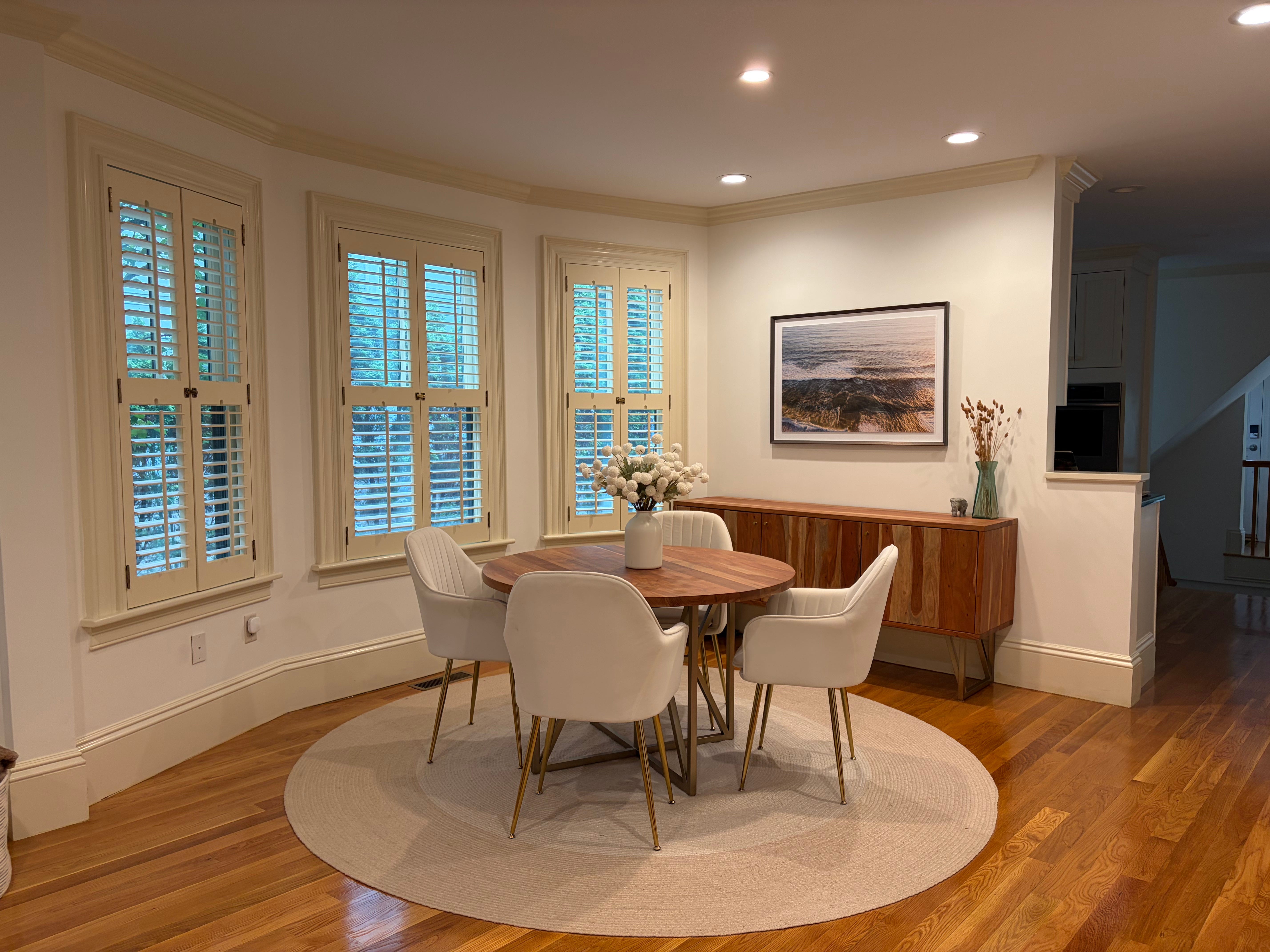
I get a lot of questions about where to start with art collecting - what to spend, what size to look for, where to even begin. One recent client is a perfect example of how you can start small, make a big impact, and continue to hone your style and taste along the way.
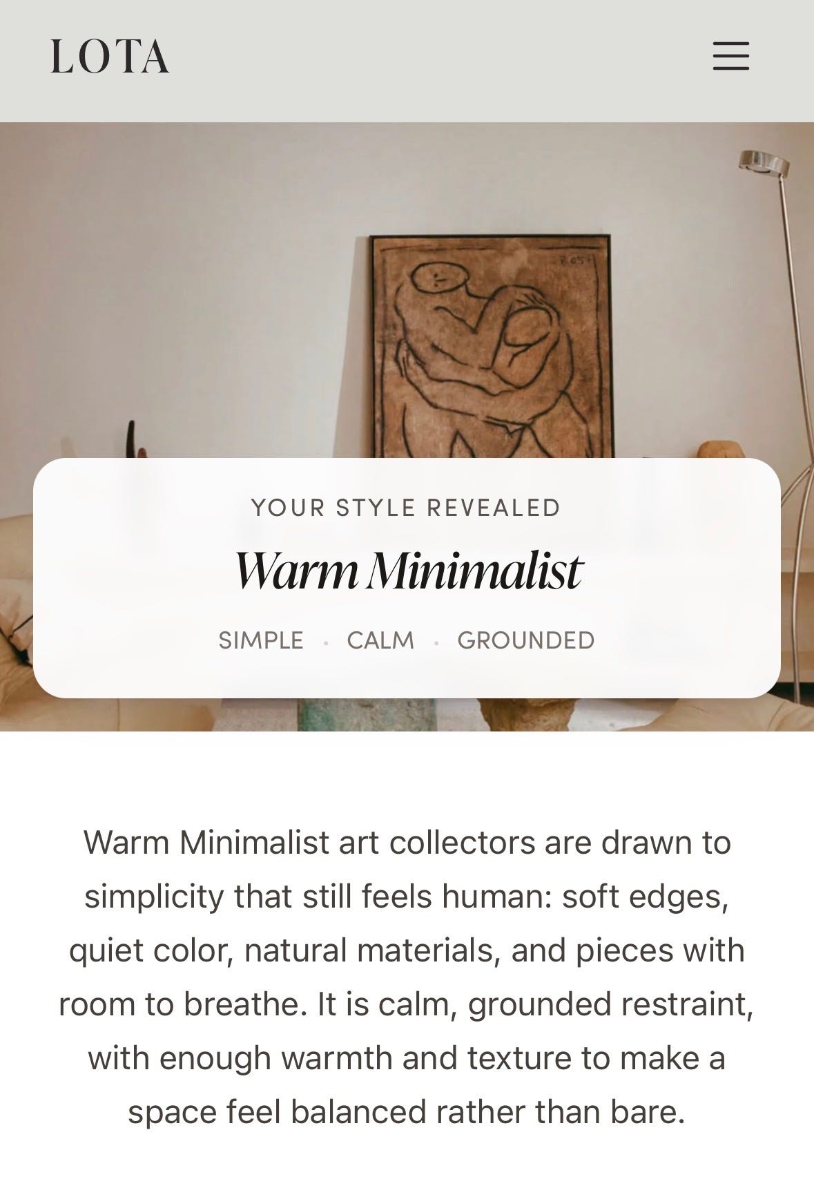
This client has a stunning classic colonial home outside Boston with bay windows, crown molding, and warm wood and furnished in a much more modern, minimal way. She came into Art Office Hours after taking the Art Style Quiz where her style was given an initial name, Warm Minimalist.
When we met, she knew she wanted nature photography that fit her style, but once we started looking at work together, what she responded to was more specific - hazy light, muted blues, deeper greens, soft pinks, water, and landscapes that felt organic and abstract rather than literal.
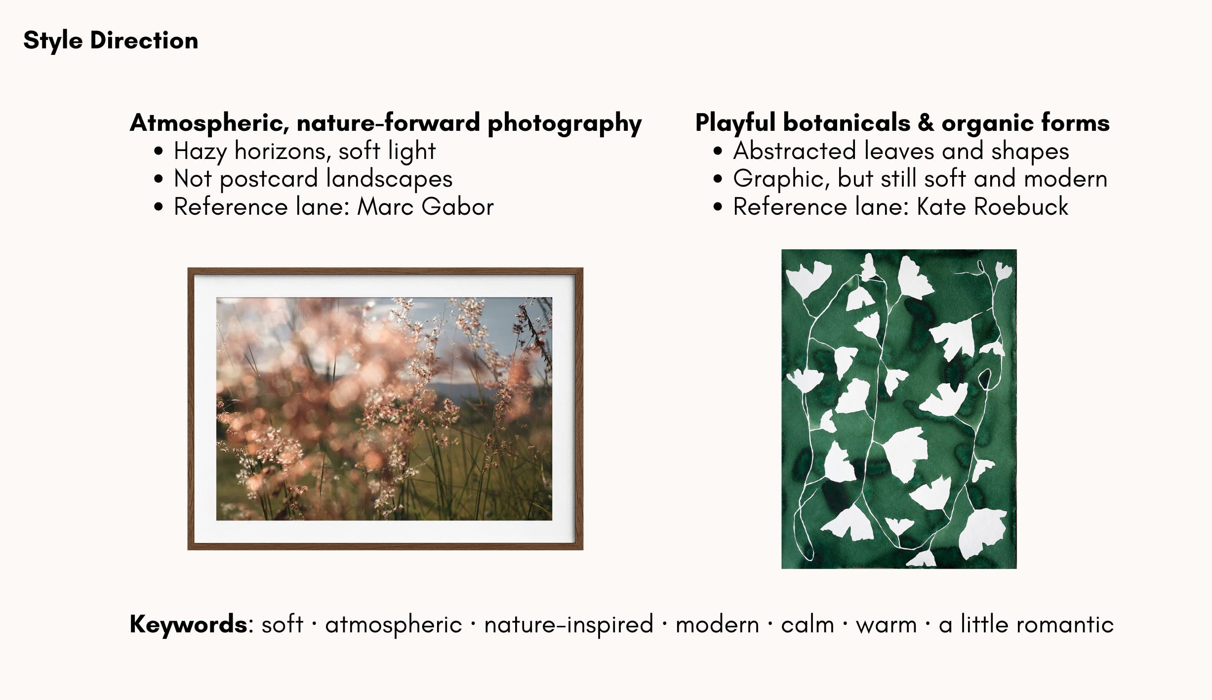
After Art Office Hours, she received a full plan with the suggested directions, artists within budget, recommended sizing, and framing advice—everything she needed to go bring her vision to life. I shared two directions with her in the recap. The first was nature-forward photography filled with soft light, a sense of place, but nothing too postcard or just a standard landscape. The second direction was botanical and organic work that felt graphic but still loose and modern. The through line was calm, warm, nature-inspired, and a little romantic.
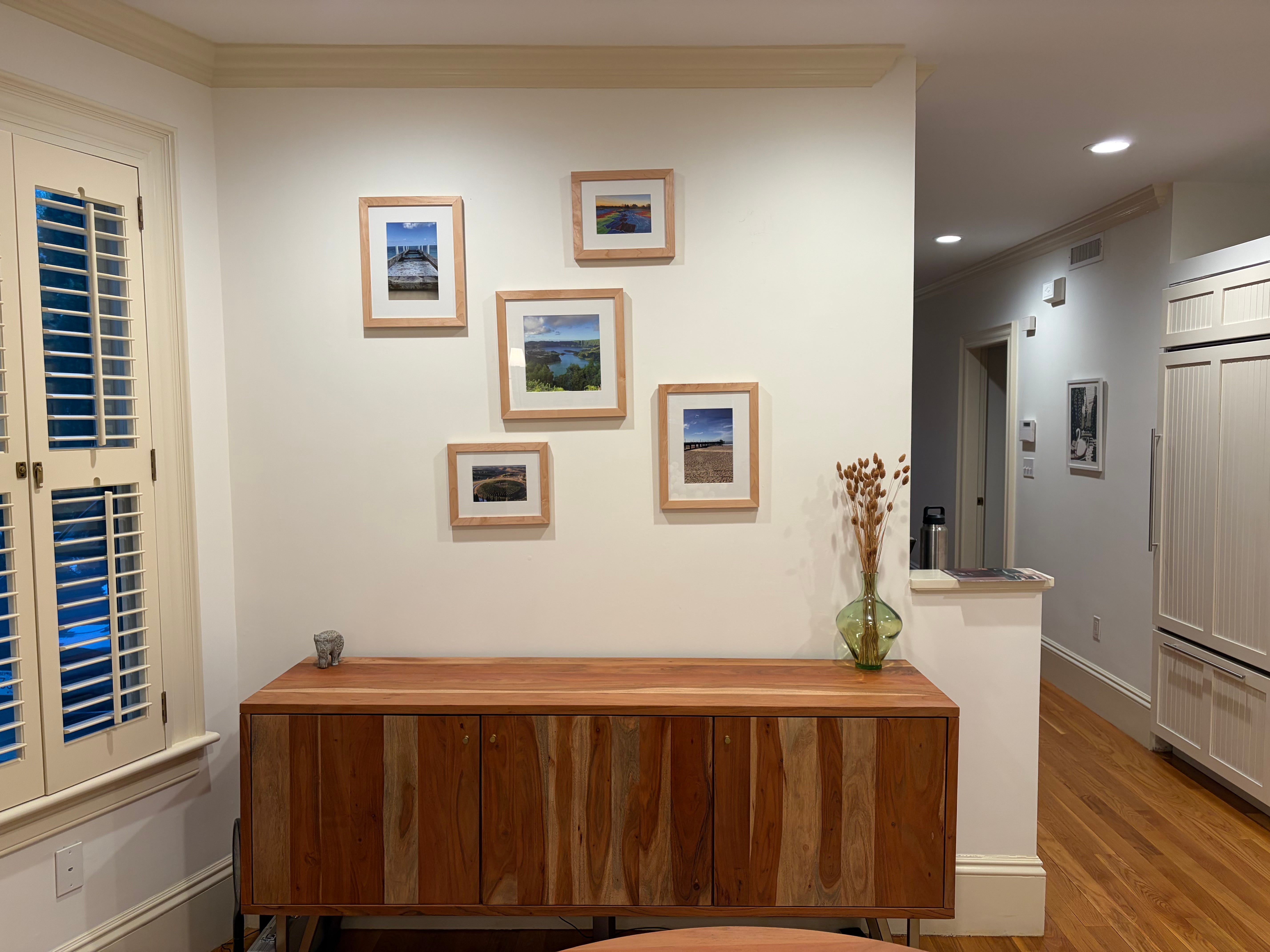
The bigger shift I suggested was scale - moving from the gallery wall to one large piece. The dining room is one of the first spaces you see when you walk in, and the client imagined it as a place for late-night dinners and game nights. They wanted the art to bring energy, still tap into nature, and have real presence.
Anchoring the space with a single piece of art would give the sideboard more weight and set the tone for the room. The gallery wall read more like a pass-through, while offering one singular point of view made the space feel more inviting and grounding.
Armed with the plan, the client decided to go with Lou Mora, one of the artists I had shared with her. Mora is a commercial and fine-art photographer who captures the in-between moments of landscapes in the most beautiful way.
The work she chose is recognizably the ocean, but there is no horizon line or obvious scenic view. The light is soft and the movement from the waves that are forming and crashing gives the work the energy the client was looking for.
They framed it in dark walnut and float-mounted against a white mat. What I love about float mounting is that it allows you see the full piece, but the white mat around it still gives the work a moment to breathe. When all the elements are taken together, the art shines.
If you look closely, the shifts from where the client started are subtle, but significant. The original grouping of five frames included several ocean scenes, but none had the same level of depth and at the smaller scale there was nowhere for the eye to rest. The larger work takes a similar idea and gives it more tension, movement, and presence. Ultimately, it changes the mood of the room.
Here are a few other works with the same mix of movement, hazy fields, and natural references that I love.
Notes on sizing and framing:
For one artwork above a console, sofa, or other piece of furniture, aim for the finished framed work to be around 70–80% of the furniture’s width. This creates a clear relationship between the art and what sits below it.
When framing photography, a mat can go a long way. It gives the image breathing room and can add the extra inches needed to make a smaller (and often more affordable) work fit the scale of the space.
When installing art above furniture, aim for roughly five to eight inches between the top of the furniture and the bottom of the frame. This is one of the rules I see broken most often, usually because you’re trying to align the art with something else in the room - a windowsill, a light switch, or the natural sightline. But the artwork and furniture should read together first.
Here’s a post from last year that goes deeper on framing:
Over the next few months, I’m going to answer a few art questions here. One wall, one frame, one piece you already own, one decision you keep circling. What are you wondering about? Leave it in the comments. I’ll work through it in an upcoming post.
Artwork by Lou Mora. Photos courtesy the client.
Comments
Nothing yet. Say the first thing.
Sign in to join the conversation.