
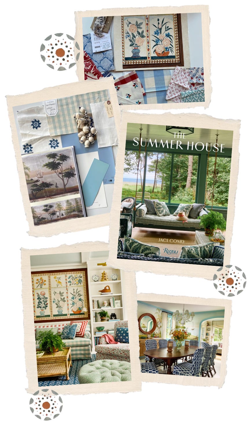
I had the pleasure of revisiting our Maine project recently when I received a copy of Jaci Conry’s new book, Summer House. It brought me back to the early stages of the design, thinking through what the house needed, and how much we reshaped along the way. A few weeks ago I asked my Instagram followers to write in any questions they had about the project, and I’m excited to dive into everything here.
As I started writing, I realized there was much more to say than would comfortably fit in one note, so I’ll be sharing this in two parts, starting with first impressions of the house, the floor plan, and the entry. I also did a little shopping and put together a small collection of pieces inspired by the project - shop everything here!
Often with projects, before we ever think about furniture, we spend a great deal of time working through the bones of a house: adjusting layouts, rethinking openings, and considering how each space needs to function. This project required a close look at how the house was organized: how spaces connect, and where small architectural changes could make a meaningful difference. The architectural work is something we often can take on entirely in-house, and it’s one of my favorite parts of the process.

Q: How do you know what the possibilities are from the bones of a house?
This is my favorite question I got when I shared that I would be diving into the specifics of the renovation of this house in Maine. I wouldn’t say that I know what the possibilities are from walking through a house. When I’m there in person, I get an inkling of what is good about the house and what is possible. During my first visit to this house, I loved that it wasn’t too formal. There was something very easy about the architecture, but the spaces unfolded onto one another in a way that was not quite right, and I couldn’t put my finger on exactly why.
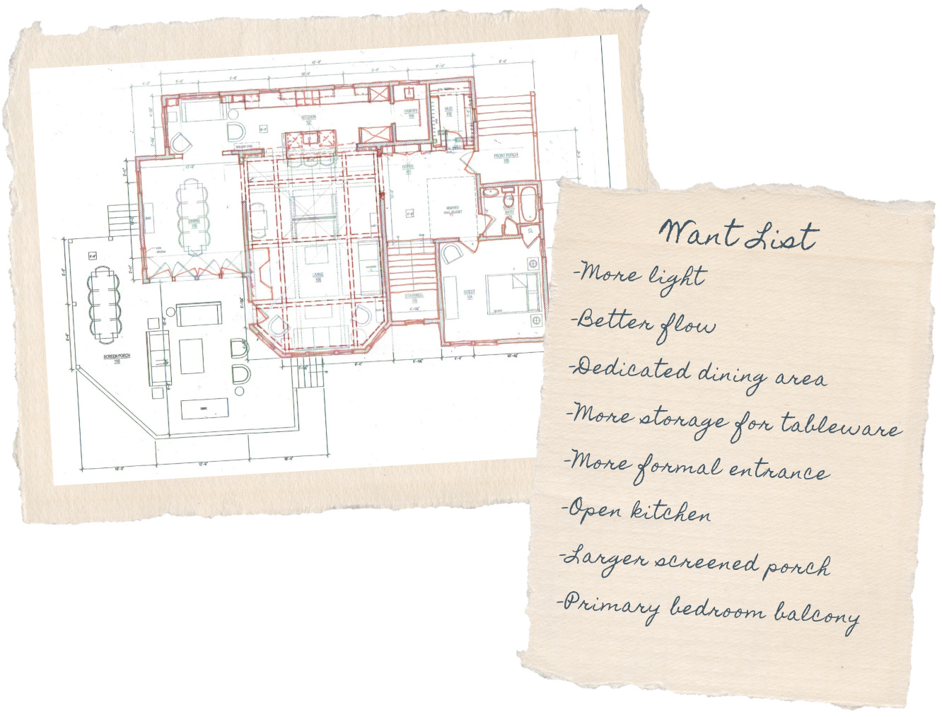
I come away from that type of visit with a list of wants, knowing that I’ll work out the real possibilities on the drafting table. There are a few basic spatial “rules” that I have learned from taking a few classes, a lifetime of reading all the tips and tricks I could get my hands on, and from doing this for a while. But I think beyond that, for some of us, there is an innate understanding of how space works and how the eye interprets it. We can feel when a cased opening is too big for the space it opens onto, and we know when creating an axis or focal point will help focus the room for the people who are enjoying it. Maybe we can’t articulate it on a first visit, but a study of plans and photos will give it away. A beach house like this one is a destination, and is meant to be a place to escape to and congregate within. With that overarching goal in mind, we began to re-work the floor plan, ultimately resulting in the below red-line drawing of the first floor.
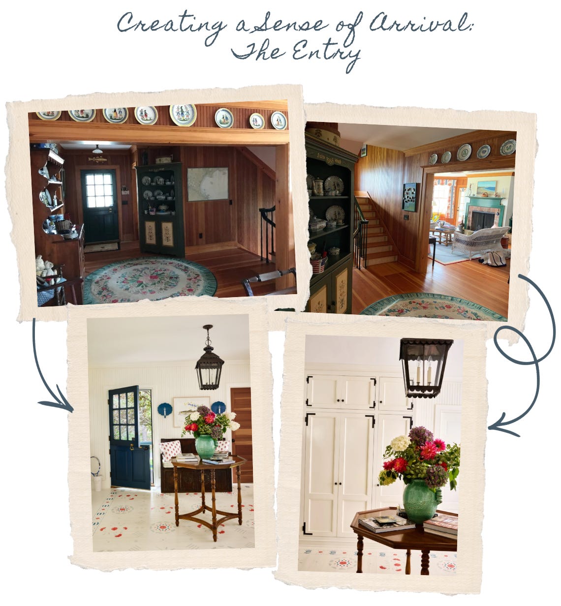
Originally, the entry functioned more as a pass-through space. While that made sense for a shingle-style house on paper, in reality it felt dark and a bit forgotten. For a summer home, where people are traveling from far away, that first moment matters. We wanted the house to greet you with a sense of cheerful ease - something that immediately signals you’ve arrived somewhere special, a place meant for gathering and unwinding. To do that, we began reworking both the structure and the feeling of the space. We removed a small vestibule that led into a guest room, significantly expanding the footprint, and added built-in cabinetry to accommodate all the practical things that accumulate in a summer house - sunscreen, towels, bug spray.
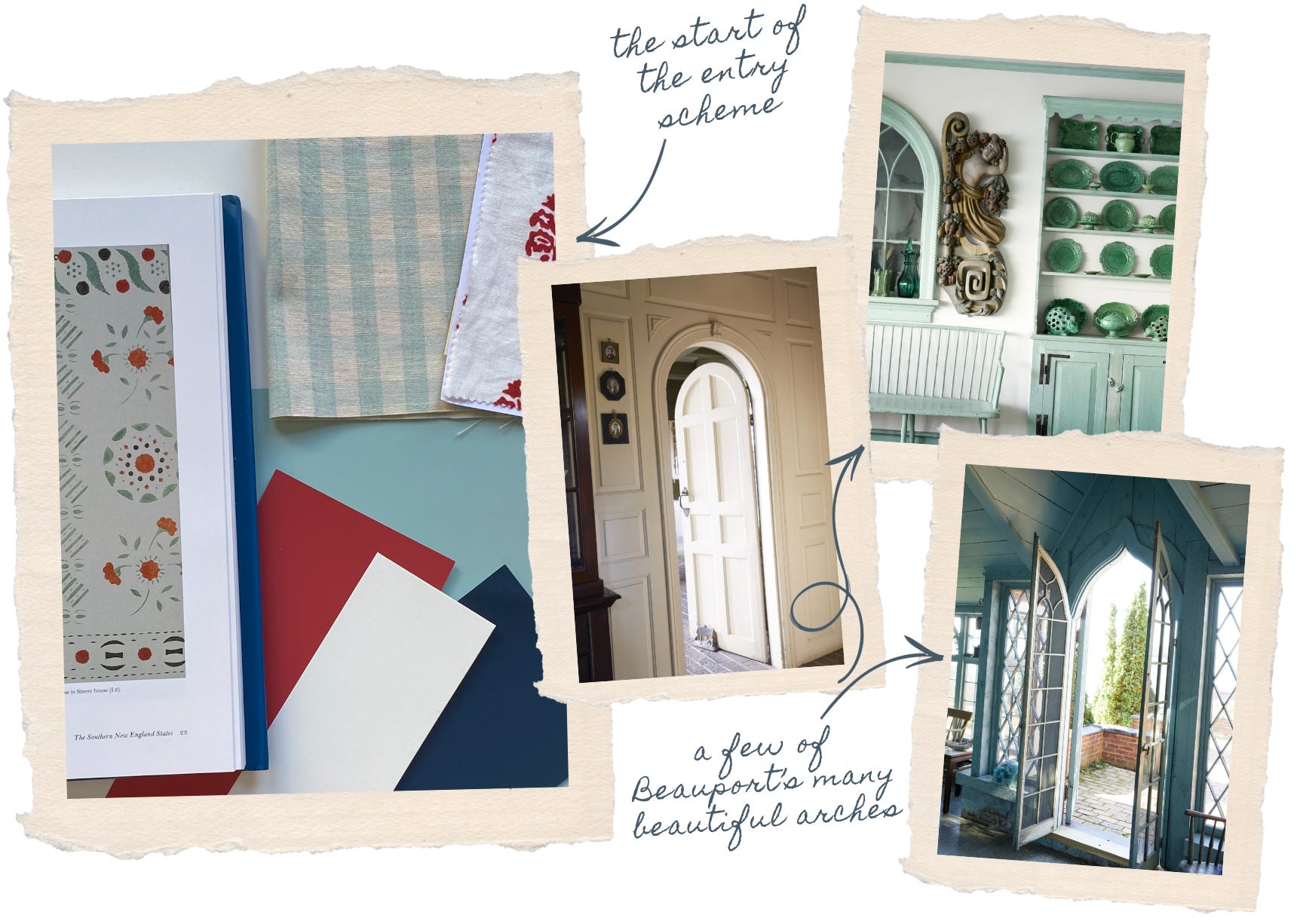
There’s a balance I think about often in spaces like this: how to give a room definition while still allowing it to feel open and expansive. Floors are a great, and often overlooked, decorative element - what you do with them can either expand or contract the space to the eye. We found an early 19th century wall stencil in this book and because I wanted to open and brighten the entry, applied it to the floor in an intentionally oversized scale, which helped both stretch the room visually and counteract the original darkness.
At the same time, we were thinking about how to introduce a bit more personality into the architecture without losing its sense of ease. The clients were very drawn to Beauport - a shingle-style house that is unique for its kind in its layered, eclectic, and highly personalized interiors. Frederic Magazine captured it beautifully here. There are moments where the architecture surprises you, particularly in the use of arches and irregular openings. We pulled from that idea here, introducing subtle arched case openings to give the spaces more character while still maintaining a sense of restraint.
We painted the existing Dutch door a deep blue and updated the hardware, creating more contrast and visual interest in the space. The detailing throughout, including the surface-mounted HL hinges on the cabinetry, is simple and utilitarian, but rooted in the language of the region. That balance between simplicity and personality became an important thread as we designed the rest of the home. We wanted the spaces to feel grounded, while still allowing for a sense of charm, playfulness, and celebration - from that first moment of arrival all the way through the house.

Q: What historical references did you use for this project?
As I mentioned, our client was really inspired by Beauport and sent me a book from her visit there which served as the jumping off point for a few concepts throughout the house, like the paint color for the kitchen cabinets. She also was hoping for a bit of a “Gloria Vanderbilt moment,” with gingham used throughout the house. We carried that idea through the first floor in varying scales and colors, allowing it to appear in different applications and forms from room to room. It’s one of those elements that adds personality and continuity at the same time: playful and fresh, yet entirely fitting for this home.
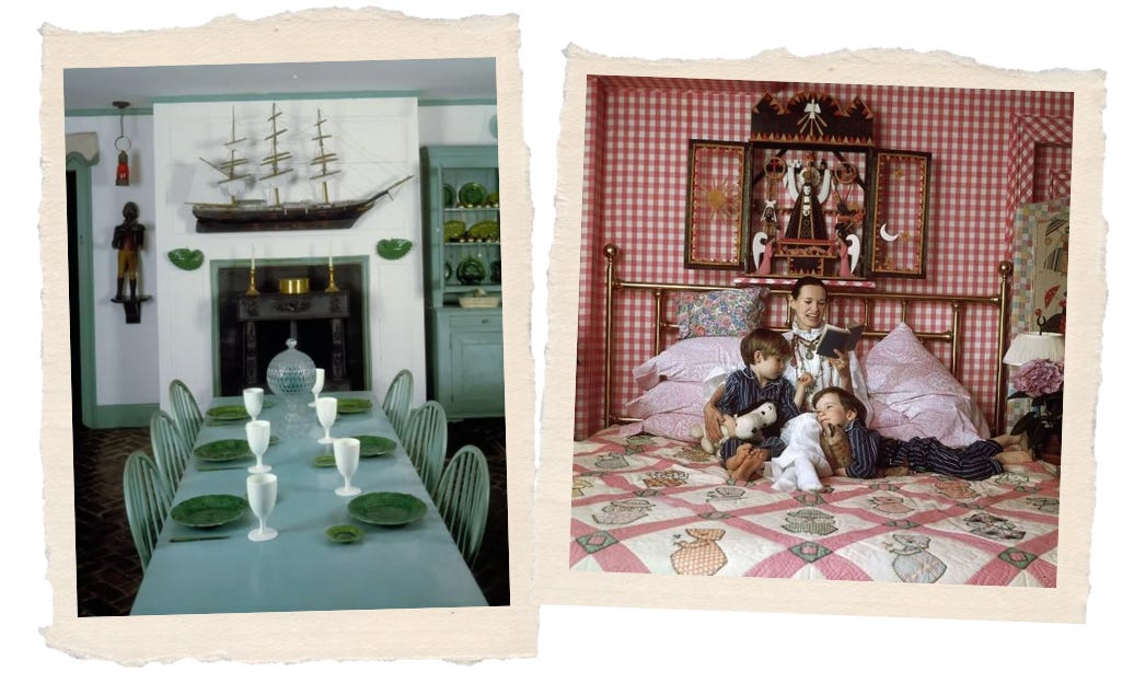
I did a lot of internet digging (since we were under lockdown for a good portion of the time I spent designing this house) and was very inspired by the late 18th and early 19th century New England homes featured in Folk Art Murals of the Rufus Porter School and American Wall Stenciling, 1790-1840. I think we imagine these homes having really muted, muddy palettes, but that wasn’t actually the case. Like the historically accurate homes in Colonial Williamsburg, many of the images of these homes were refreshingly vibrant. My reading about Rufus Porter informed the wall mural in the dining room, by Connor Owens of S.O. Beaux Arts.
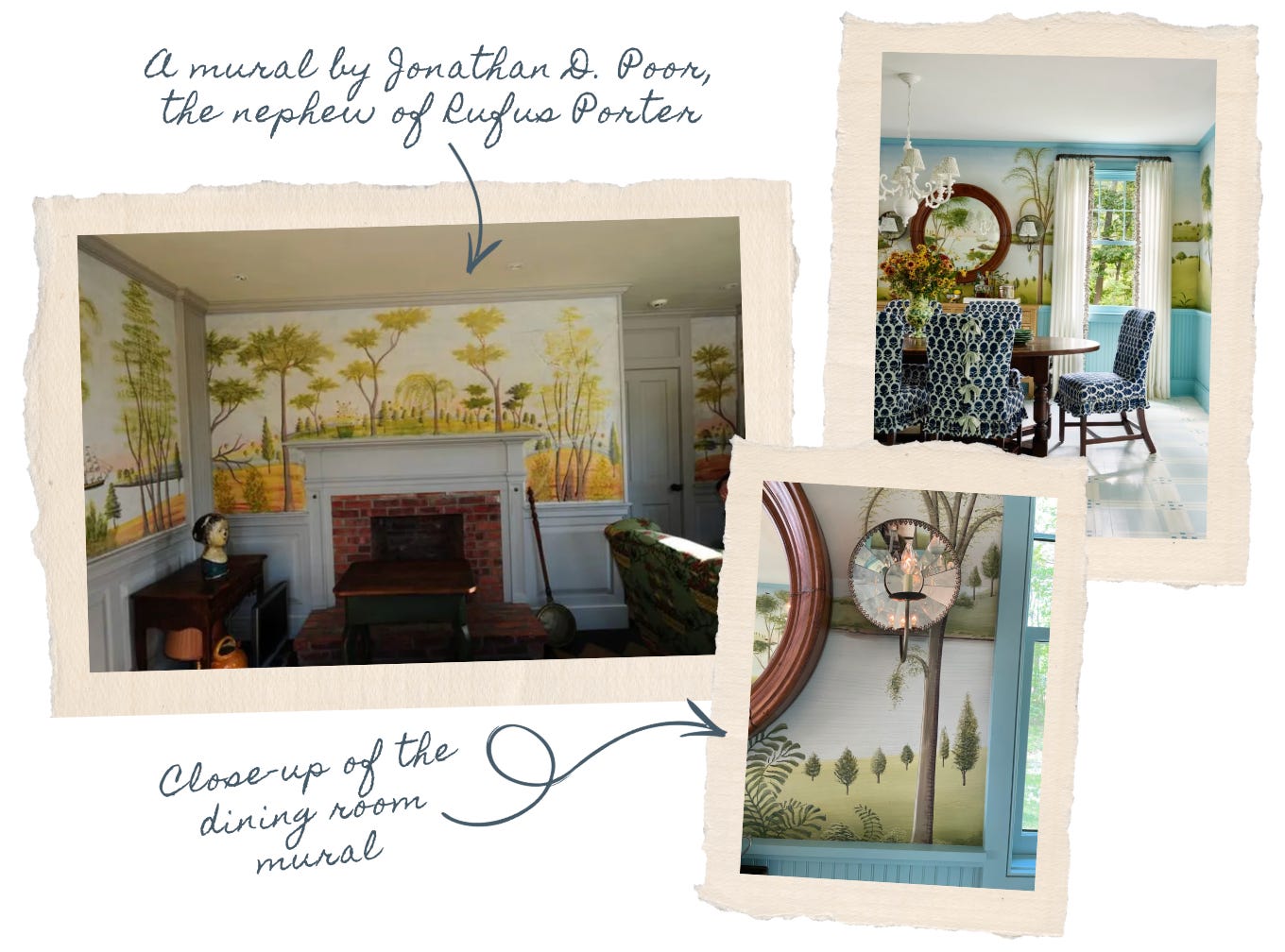
There is a lot more to this house that builds on these early decisions - how the kitchen and living room came together, the defining of the dining room and keeping room, and how the porch ultimately became one of the most used spaces in the house. I’ll get into all of that, along with the rest of your questions, in Part II.
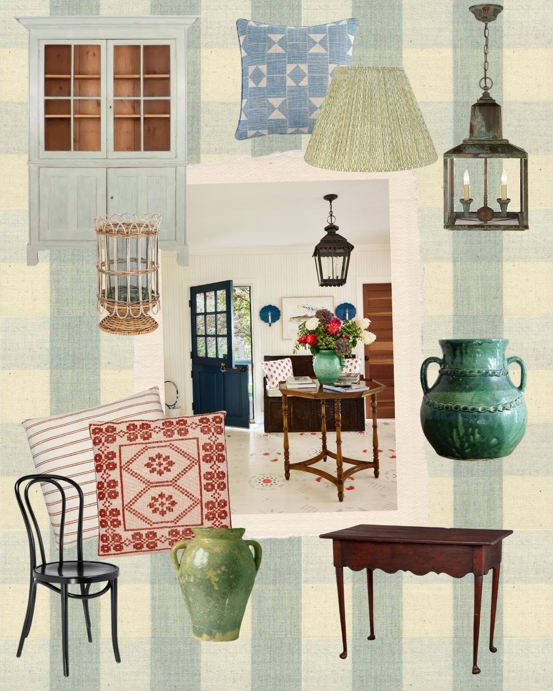
Linking the Maine-inspired shopping edit again if you don’t feel like scrolling back up- just a handful of pieces that echo the same mood and sensibility of the house. Enjoy!!
X Lilse

No posts
Comments
Nothing yet. Say the first thing.
Sign in to join the conversation.