
I have a natural draw to color in the summer. The way it sits on lightweight fabrics like cotton voile or a silk linen blend or on various permutations of terry feels dynamic and more textured than when it’s on wool or heavy silk or even jersey cotton. How it pairs with summer neutrals like beige and white or gold never reads harsh, and it looks great with a screen printed graphic tee (summer bread n butter), or some kind of print —
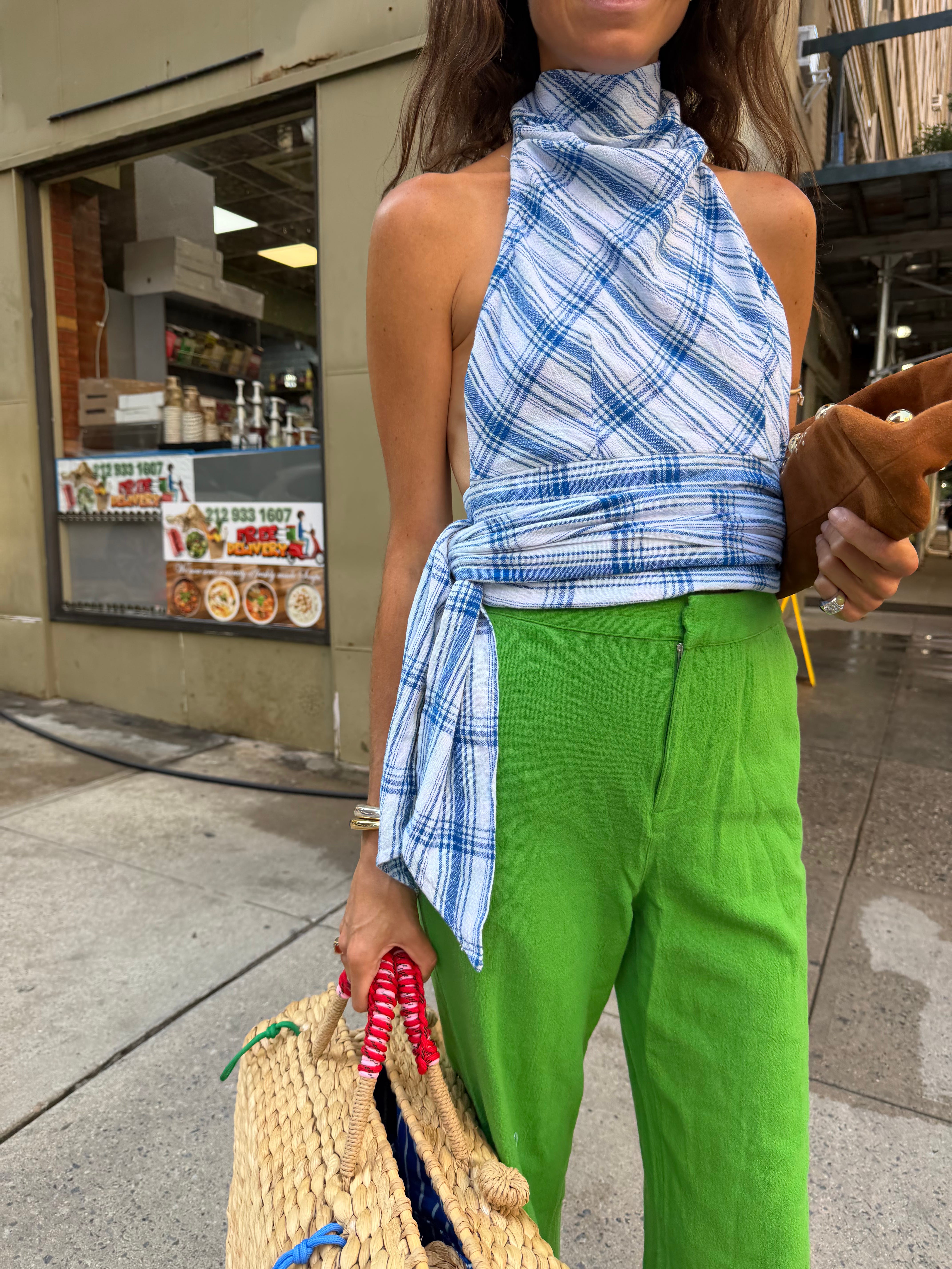
But what I’m finding with this summer is that the colors I’m into are the same ones I pinpointed at the end of last winter as closing, seasonal heroes. Which no doubt means I’m going long on them.
The tableau includes: yellow, purple, green and orange.
With important infusions of baby pink as a highly specific, seasonal neutral-pairing. That’s the vibe! And the whole story. But it’s more nuanced than you think. Below, ways to wear each color with some words on nailing the right shade, determining which silhouettes on your outfit are best served in color and more generally speaking, what makes them good.
The shade of yellow is neither pastel nor electric — it’s more muted, not quite grainy mustard, but closer to it than submarine. Maybe the appropriate comp is a yellow cab. In our first rendering, it’s styled with a graphic tee that rans a pretty complete complete primary color spectrum —
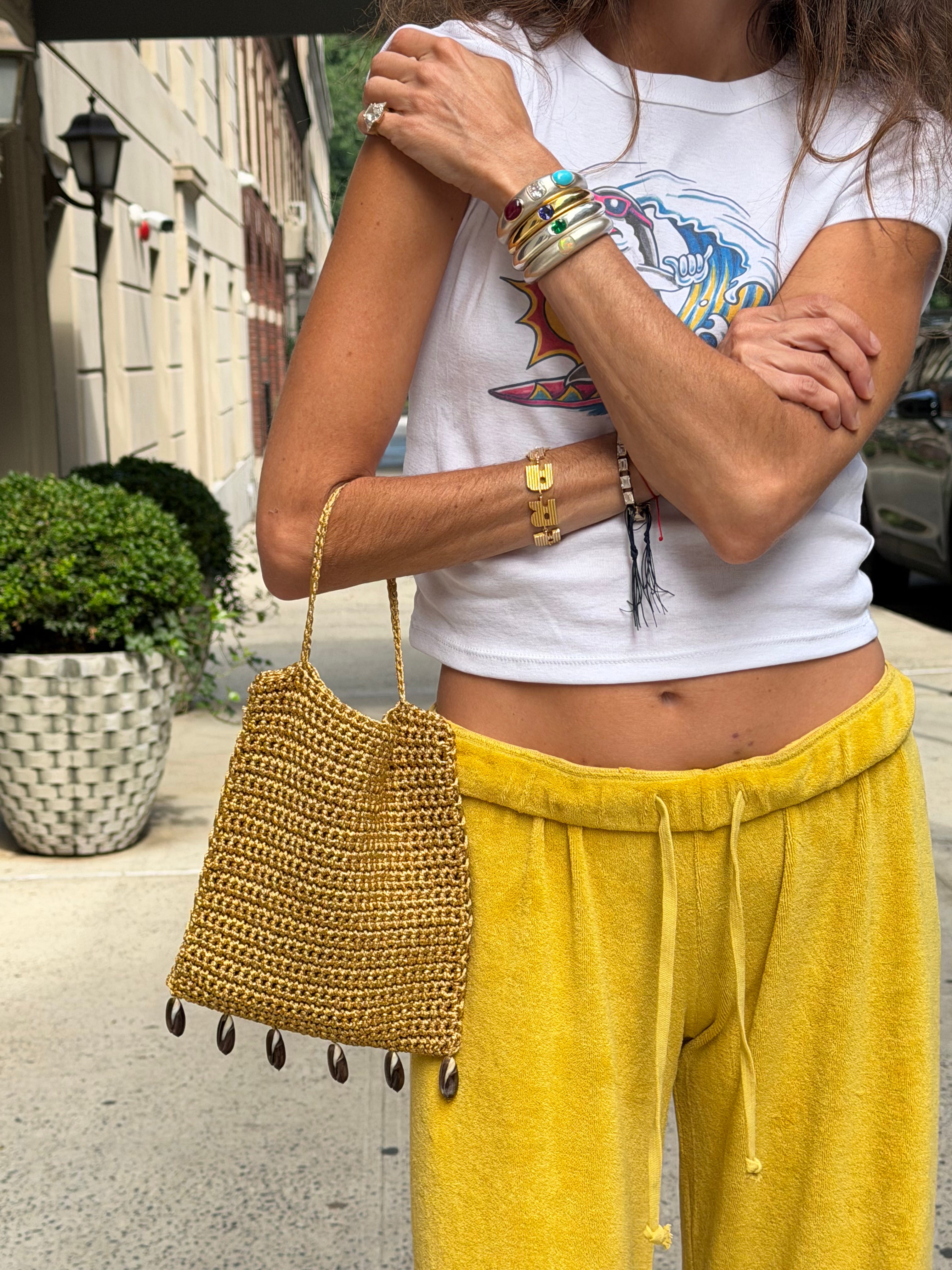
My preferred pairing does indeed lean on a range of warm reds and cool blues, less hot on orange (another one of our colors) for the yellow but do like it with green or purple.
Best silhouettes for the color are casual: surf shorts (e.g. from Madesome), the pictured terry pants. Tie dye shorts as seen below, cotton bandana —
With this one, the accessories bring a lot of anchoring with the green tourmaline stones against fine silver contrasting the yellow/orange, and the black drop connecting to the sunglasses for a bit of weight.
Papal! Or close to it. Something between royal and platypus-like (do you remember the fuschia beanie baby!). Great with yellow as mentioned above, in subtle doses like this —
Pairs well with green too, especially when by design —
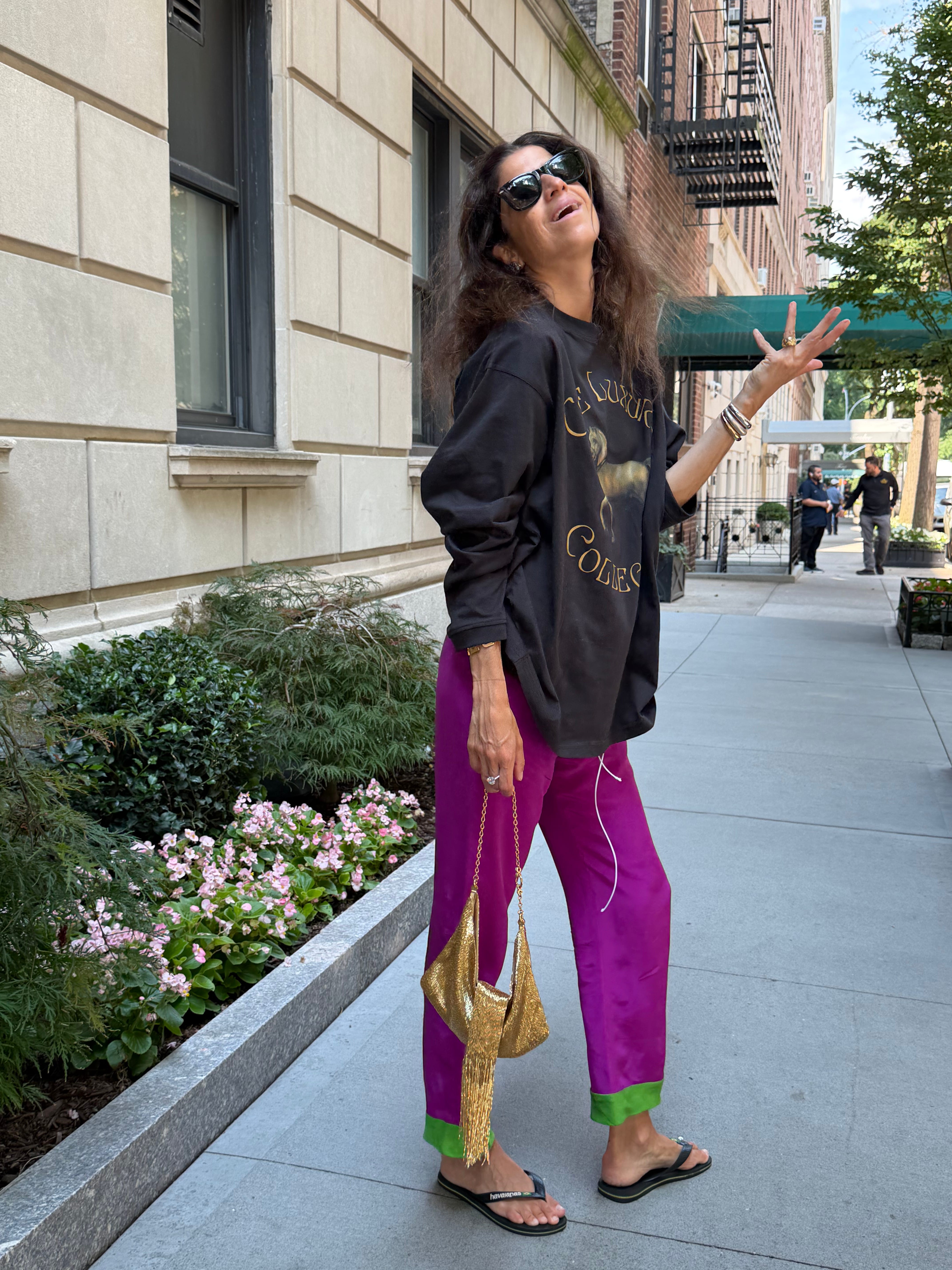
And because it is such a strong and powerful color, it’s best served styled with casual accouterments — an oversize graphic tee to bring more texture and conversation to the outfit (the washed black tones down the color), or with a hodgepodge of different ideas, as seen in the first demonstration. Pajama pants (Petite Plume, hard recommend), but a fancy gold chain belt (yellow in conceit), a polka dot cotton-voile button down styled casually with an evening bag and flip flops (more yellow).
My preferred way to wear is with competing personality pieces to even out and raise the vibe of each component of the complete look.
The color of nature! Fertility! Grounding! Money! It’s also just calm on the eye. Shade is particular here in that it’s not chartreuse, or pistachio, or lime. It’s more like a washed forrest green —
Kind of literal when styled with brown, but it works if you throw in a few curveballs: a satin counter color bag, jewelry with competing character traits, maybe you’ll go for a belt.
Cool with washed black, which seems to be a theme — it’s like the muscle relaxer for all these colors, and adds a dose of cool/rock and roll when color often feel a bit preppy or cutesy.
The most precarious of the range because the shade of color is sooooo specific. You don’t want to err too far on the side of pumpkin spice, !Happy Halloween!, etc etc. But a straightforward orange — think mid-way through cooking a beefsteak tomato — is indeed the appropriate color on one hand,
But on the other, we’re talking about more like a melon than we are a straight-up orange.
Turquoise contrast in bag and bangle but I did also do this to demonstrate how good it could be when the two shades of orange come together AS ONE.
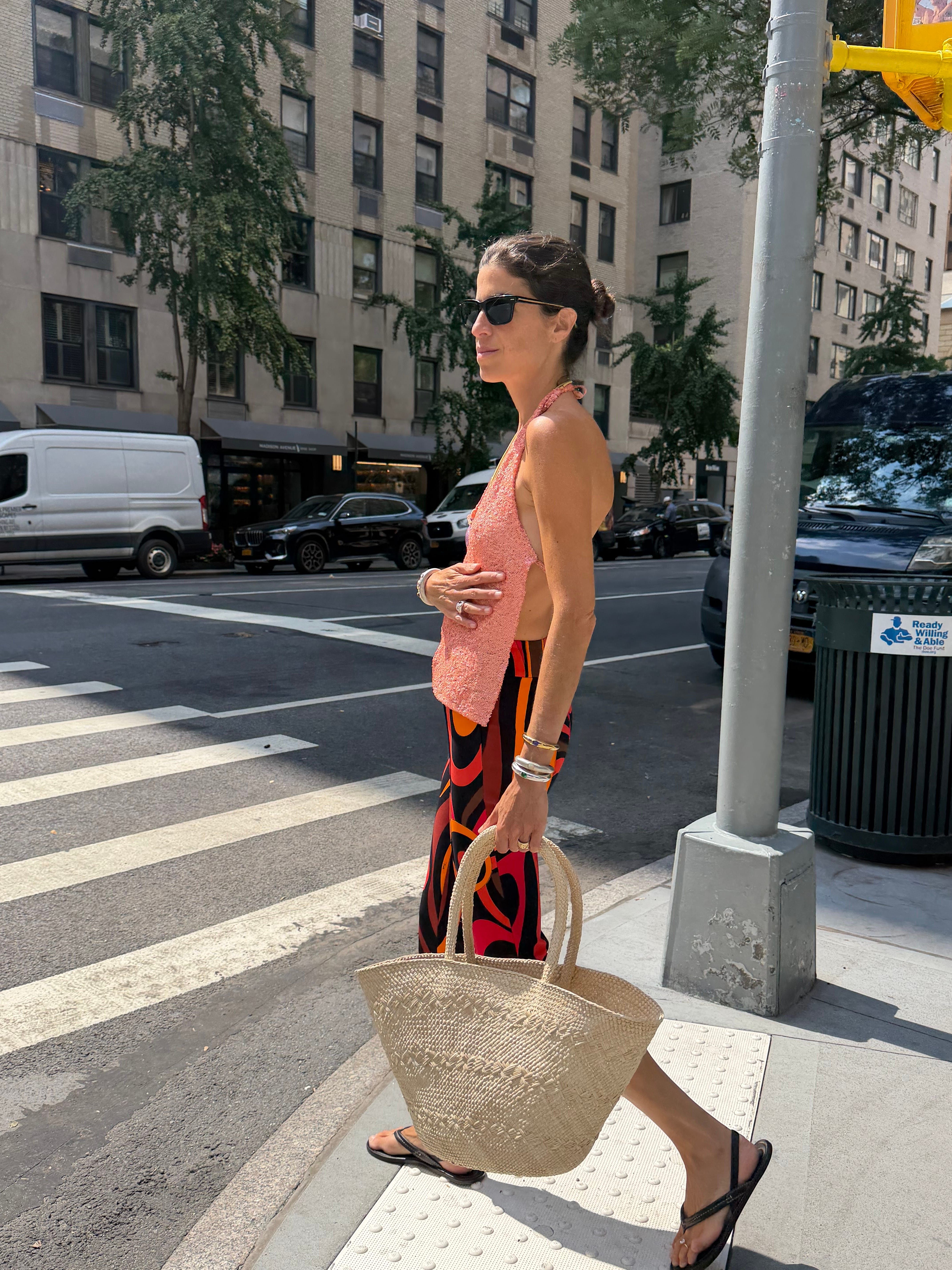
The post’s piece de resistance! And also where I leave you for you today. I’m going on vacation tonight, so nothing new from me next week.
See you back here in August!!!!!!!!!!!!!
Love,
Leandra
Comments
Nothing yet. Say the first thing.
Sign in to join the conversation.