
There are two things I have frequently, and openly, detested. The colour grey, and polka-dots. The last few months have proven me a major hypocrite.
Polka-dots have come a long way, in my eyes at least, from their long-held association with the prim, lacquered femininity of the 1950s housewife.
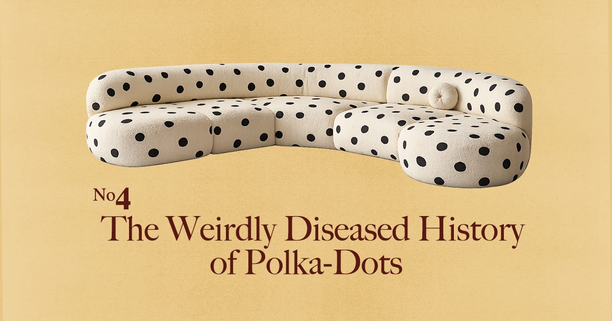
I know I’m not the only one with the sudden interest. High street shops are stocking all-things polka, the girls are getting dots in their manicures and versions of the pattern are getting plastered onto vases, tables, wallpapers and candelabra.
Whilst their aesthetic revival is interesting enough on its own, the real surprise lies in the pattern’s history itself — which, as it turns out, is far stranger than the dots would have you believe.
If we look back to the middle ages, my aversion (correction: previous aversion) to polka-dots feels justifiable. Hand‑made spots on fabric are recorded in Europe from the Middle Ages, but they were visually associated with the pustules and rashes of leprosy, syphilis, smallpox and plague.
These were not, of course, the crisp, evenly spaced dots we recognise from mid‑century dresses, but irregular, hand‑worked speckles that crawled across the cloths like a rash. In a world before industrial printing and the sewing machine, you simply could not achieve the kind of regimented, mechanical polka dot that only really appears with nineteenth‑century textile technology. Visually, they were scattered, uneven “moons” and blots: hand‑dabbed circles that swelled or faded at the edges, clumping together in some places and thinning out in others.
Of course they looked like the very illnesses people feared most.
The Industrial Revolution broke that visual contagion loop. Once mechanised weaving and roller printing entered the scene, mills could place each dot with millimetre‑perfect regularity, turning what had been a rash of marks into a perfectly drilled regiment of circles.
And his new way of printing on fabric was cheap.
Before mechanised textile production, every decorative element had to be woven, embroidered, block-printed, or painted by hand. Labour was the expensive part. Once roller printing arrived, thousands of yards of fabric could be printed quickly and consistently by machines, driving costs down and making patterned textiles accessible to a much broader market.
Working‑ and lower‑middle‑class women could suddenly buy dotted calicoes and muslins off the bolt, andpeople who had never been able to afford “fashion” before, suddenly did.

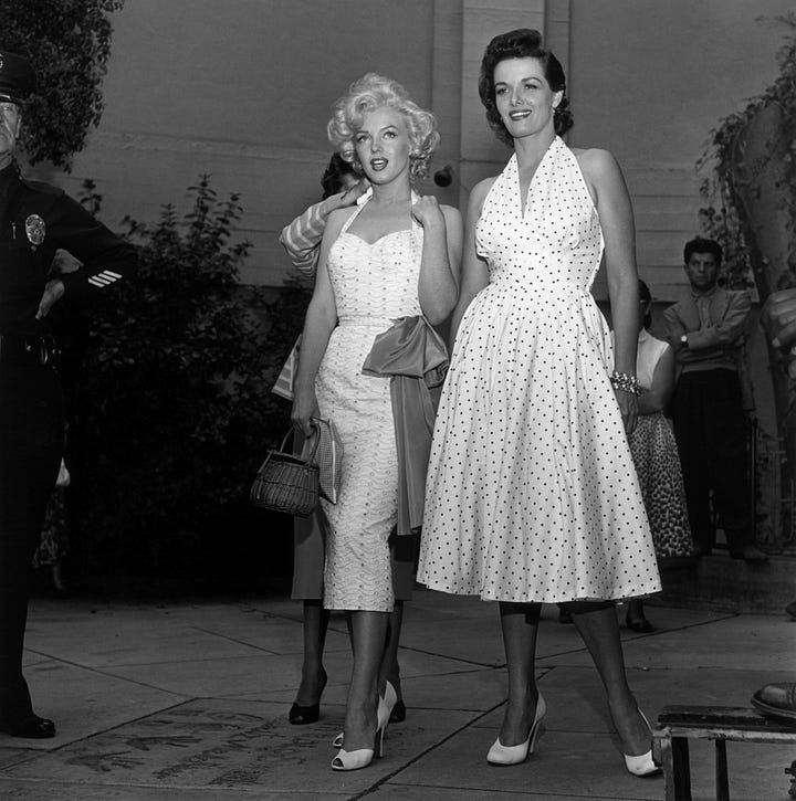
Once polka-dots hit the mainstream, their connotation began to change. By the 1950s they had become what I had always associated them with: a visual shorthand for cute, wholesome, sometimes slightly coquettish womanhood in American popular culture.
Centering the polka-dots purely on American culture is, obviously, limiting. Polka dots had various other associations, such as the ‘lunares’ of Spanish flamenco dancer dresses, or their use in African traditions to signify magical potency or male virility.
Arguably, the Japanese have been using versions of the popular pattern since much longer than westerners, through techniques like shibori tie‑dye, which produce repeated small circles on cloth and appear on some traditional garments.
I’ve never liked the phrases quiet luxury or old money. One insists that truly luxurious things should be discreet. The other is essentially a rebrand of class snobbery.
Good riddance.
As those trends lose their grip, so too does the idea that fashion must be tasteful, restrained and permanently dressed in shades of oatmeal. Back come the bows, the leopard print, the polka dots and all the other things fashion spent a decade insisting were too loud.

Polka-dots also come back with the surge on femininity (bows, lace, ballerina shoes), but do so with a reclaimed sense of empowerment. I no longer read it as representative of the 1950s oppressive womanhood, but as a reclamation of playfulness.
For all my initial attempts, the dots have been difficult to avoid. They’ve appeared on the runways of luxury fashion houses, in the wardrobes of celebrities, across TikTok manicures and, inevitably, on the shelves of Zara.
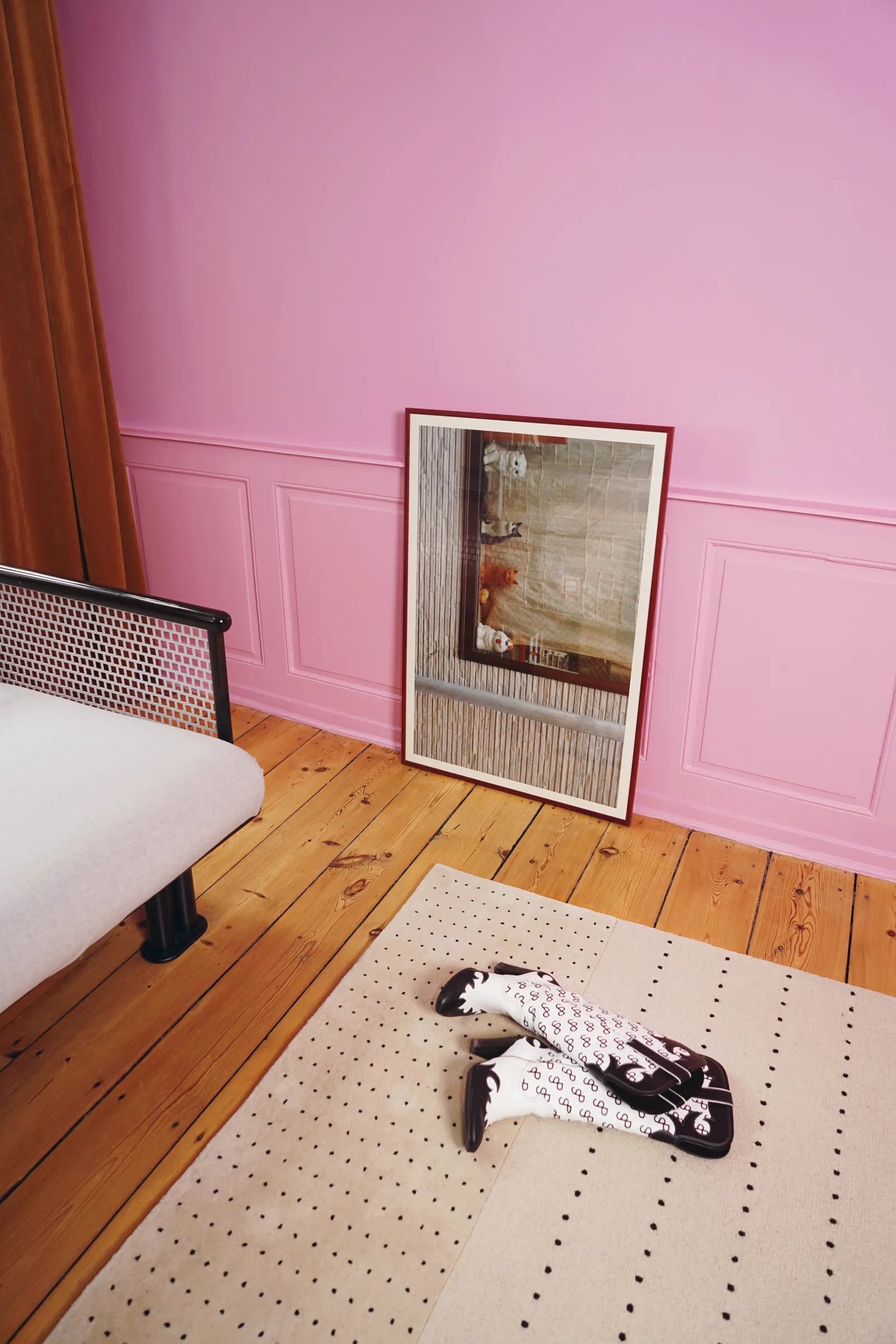
The trend has not remained confined to wardrobes. Polka-dots have also begun appearing throughout the home, from lampshades and upholstery to ceramics, wallpaper and lighting collections. After years dominated by minimalist interiors, designers have increasingly embraced the pattern as a way of introducing playfulness and visual interest without committing to full-blown maximalism.
The dot, it seems, has escaped the housewife dress and made its way onto the dining table.
I still believe there is such a thing as good polka and bad polka.
A brown halter top with blue polka dots? Excellent. A bright red dress covered in large white ones? Usually a cause for concern.
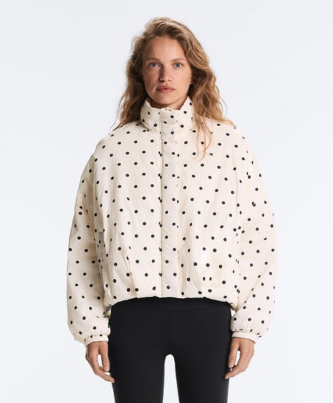
For me, it isn’t just about colour. I firmly believe there is such a thing as a dot that’s too big. Smaller dots tend to feel more contemporary, less tethered to the pin-up silhouettes and housewife dresses that dominated the pattern’s mid-century heyday. They’re easier to wear, easier to style, and generally less likely to make you look as though you’ve wandered out of a retro-themed costume party.
Then there’s the spacing. Too much distance between the dots and the pattern starts to look accidental, as though somebody ran out of ink halfway through printing it. Pack them closer together, however, and the effect changes entirely. The pattern feels sharper, stranger, and far removed from the neat, cheerful polka dots of the 1950s.
Not all dots are created equal.
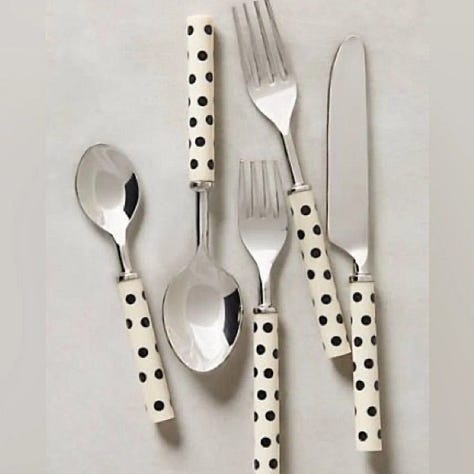
Some of my favourite finds of the polka-dot craze include this jacket by Oysho, this fit by Molly O’Halloran, or Anthropologie’s crescendo dot flatware.

Comments
Nothing yet. Say the first thing.
Sign in to join the conversation.