
First and foremost, please know that I am not hating on teachers. I am a teacher, and I am well aware that we get enough hate already.
Teachers are underpaid, under-resourced, over-scrutinized, and somehow still expected to transform a beige room containing 31 mismatched chairs and one dying pencil sharpener into an inspiring educational sanctuary.
I’m not mad at the teachers, not even a little bit. I’m mad at the internet.
More specifically, I’m mad at the corner of the internet that has convinced teachers that a “good classroom” must have:
a theme
twelve coordinated bulletin boards
three alternative seating zones
an affirmation mirror
a neon sign
individually labeled containers for every object ever manufactured
and enough laminated décor to survive a minor flood
So with love in my heart and a staple remover in my hand, I would like to discuss a few classroom-design trends that I simply cannot support.
During my first years of teaching, I went absolutely feral over my classroom. I spent hours searching Pinterest and hundreds of dollars I couldn’t afford. I printed, crafted, cut, laminated, labeled, rearranged, color-coordinated, attached things to other things, and took so many photos that I promptly uploaded to Instagram.
Here’s the proof:
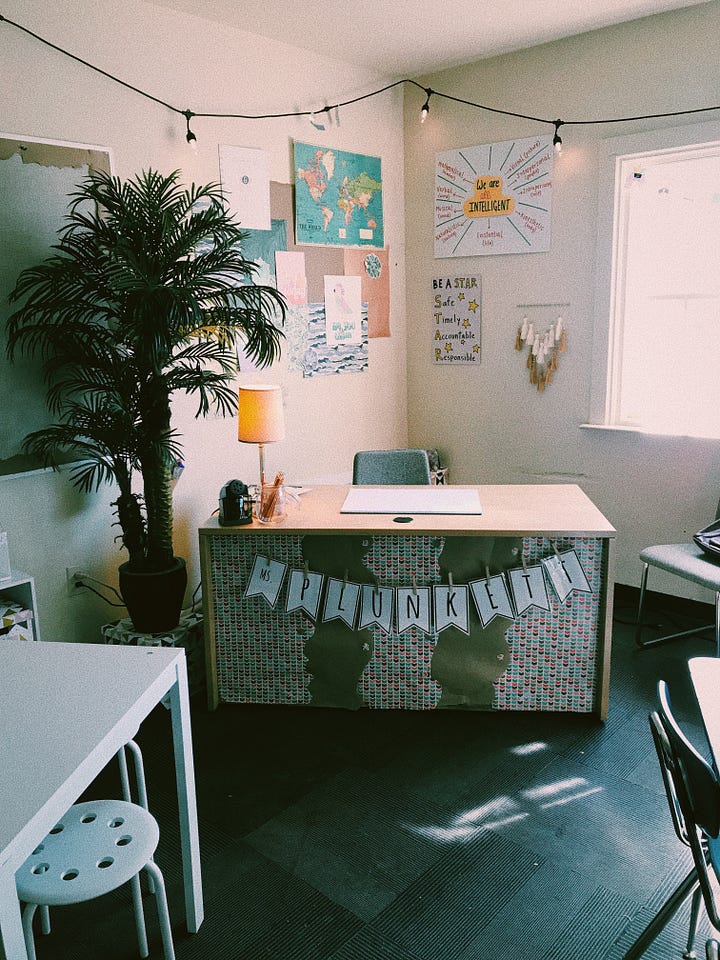
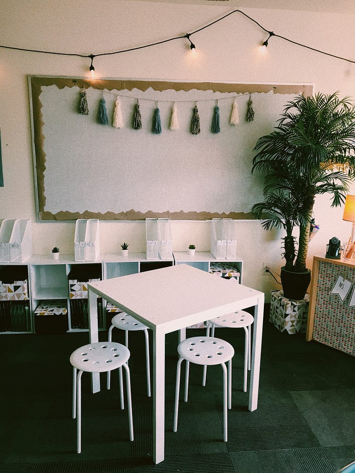
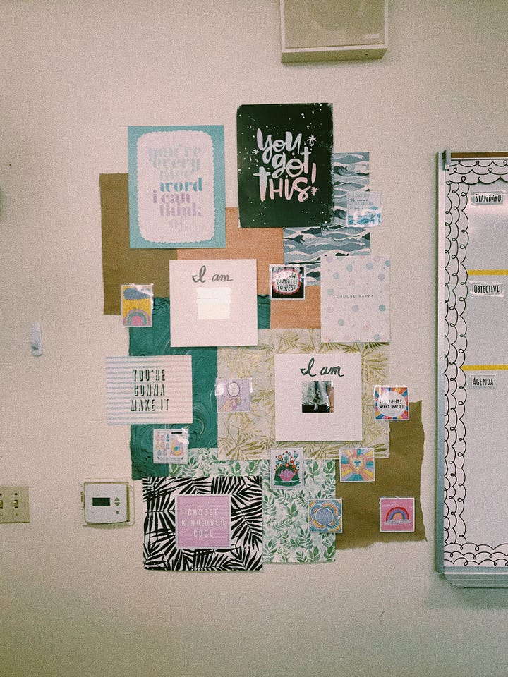
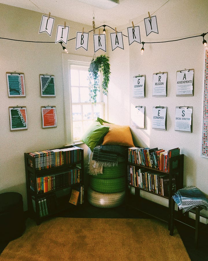
I wanted my classroom to look cute! Functionality, adaptability, and responsiveness were secondary concerns.
And omg it looked SO cute! For like, a week.
Over the next several weeks, things fell off the walls, supplies went missing, posters were torn, and flexible seating was eliminated because I simply couldn’t handle the debates over “who got to sit on the bouncy ball.”
Now I can see the glaring problem…I was focusing on everything instead of the right things.
That experience (and everything I learned afterward) is a huge reason I created Calm by Design: a guide to building classrooms around function, inclusion, sensory needs, student development, and what teachers can actually maintain (while also maintaining sanity).
It used to be $30 in my Etsy shop, but now it’s free here (scroll to the bottom of this article for the download). I’m not here to gatekeep and truth be told, I’ve seen far too many “Retro Sunshine” classrooms and high-priced decor packs for sale on my feed recently.
Anyway, as I’m sharing more opinions that nobody asked for, let’s go over some of my biggest classroom-design pain points.
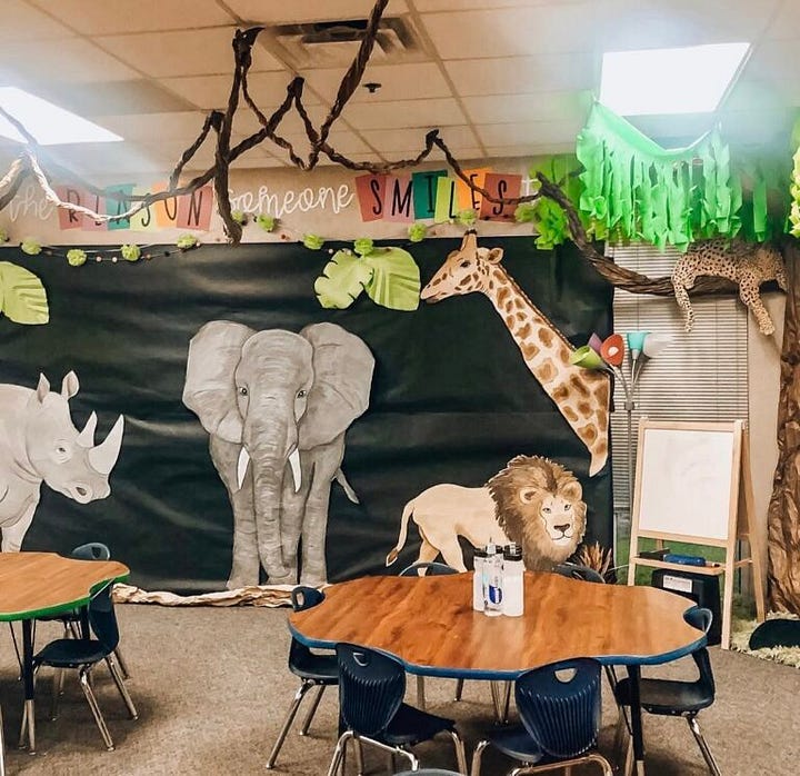
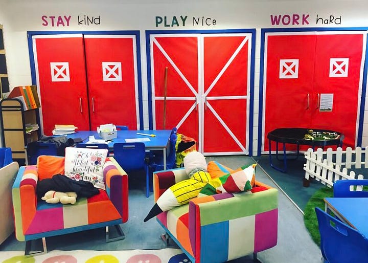
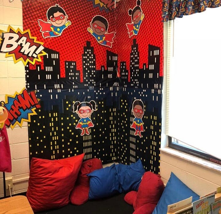
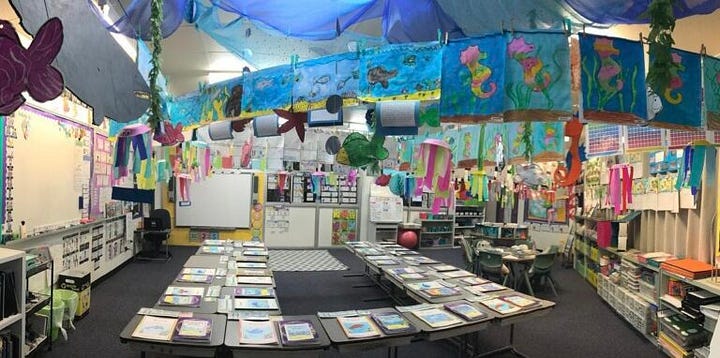
Sorry for all the exclamation points, but this is one that I want to scream from the rooftops.
Your classroom is not a baby shower or a birthday party. It does not need to be “Boho Rainbow,” “Groovy Smiley Face,” “Under the Sea,” or “Farmhouse Chic,” which IMO is a particularly odd aesthetic for a room containing a projector and a Chromebook cart.
Cohesion creates calm and a few recurring colors or natural materials can create warmth, there’s no denying that. Yet there is a difference between visual cohesion and turning the entire room into a branded immersive experience.
Themes are not inherently evil or problematic, but they often end up encouraging us to make decisions based on whether something matches rather than whether it helps.
My top tip to create visual cohesion is to choose a small, flexible palette and let the room develop around the students.
You can start with what is already there. Use neutral backgrounds when possible and add color through books, student work, natural materials, textiles, plants, and a few intentional accents.
A classroom absolutely can (and should) feel coherent without looking as though it has a sponsorship deal.
Also…
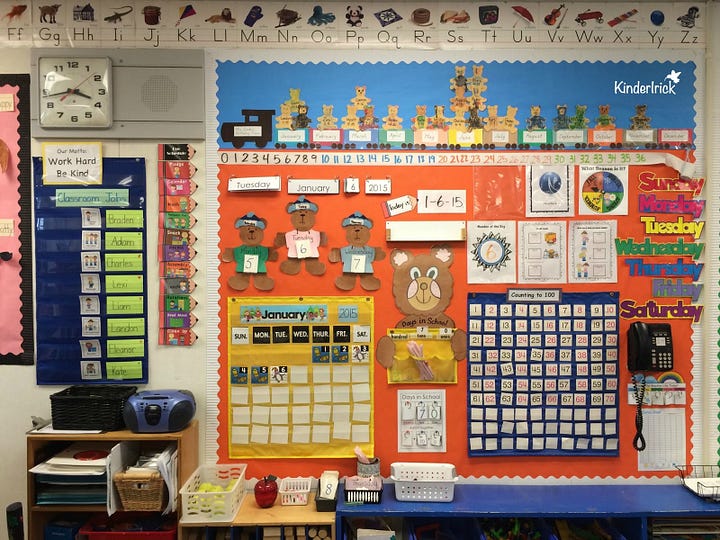
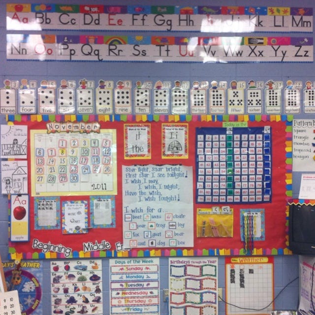
Lovingly and respectfully, do either of these walls feel calm to you?
I’m really not trying to be a hater here because I know the intentions are positive and pure (and lord knows I had at least 25 posters stapled to the walls of my first classroom), but a certain point, the walls are simply no longer supporting instruction.
Classroom displays can be useful, for sure, but when every surface is covered, students must constantly filter relevant information from visual noise. This can be particularly demanding for children who are easily distracted, anxious, autistic, have ADHD, or just process sensory information differently.
Also, from a practical standpoint, every item on the wall becomes something the teacher must print, prepare, hang, repair, update, remove. It’s just doing too much and we don’t have time for the constant maintenance.
Start with the most essential of materials, leave lots of blank space, and slowly add what is essential.
In my current classroom, I’m starting the year with a visual schedule, a birthday poster (because we have a special birthday ritual my students will never let go of), and a handmade cursive alphabet. THAT’S IT.
Blank space allows the eye to rest, gives meaningful displays more impact, and creates room for students to contribute to the environment over time.
Prioritize:
information students currently use
student-created work
anchor charts developed during instruction
visuals that increase independence
materials that are legible from where students sit
I will eventually be posting curricularly-relevant anchor charts and academic material, but it can all be rotated. Your walls won’t enforce the rules, routines, or prove that learning is happening. You do that.
Furthermore…
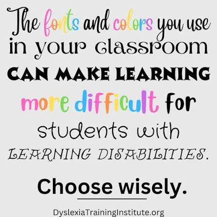
Don’t get me started on the FONTS…the bubble letters, the curly handwriting, or the drippy melting crayon. It’s my personal haunted house.
Decorative fonts may seem harmless, but classroom text has a job…to be read.
This is especially important for emerging readers and writers who are still learning consistent letter formation. Think about it…if our classroom presents six different versions of the letter g, a student still learning to read or write is going to be very confused about how to recognize or form that letter.
I recommend using clear, familiar, sans-serif fonts such as Arial, Helvetica, or even Comic Sans if you must.
Also, don’t forget make the print large enough to be read by the child sitting farthest away.
Accessibility is more important than whimsy.
And a hot take I’ve gotten pushback on before…
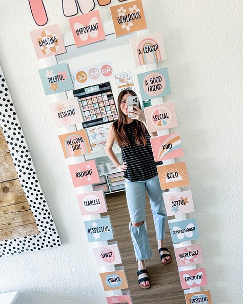
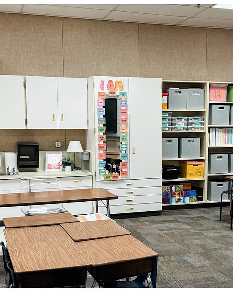
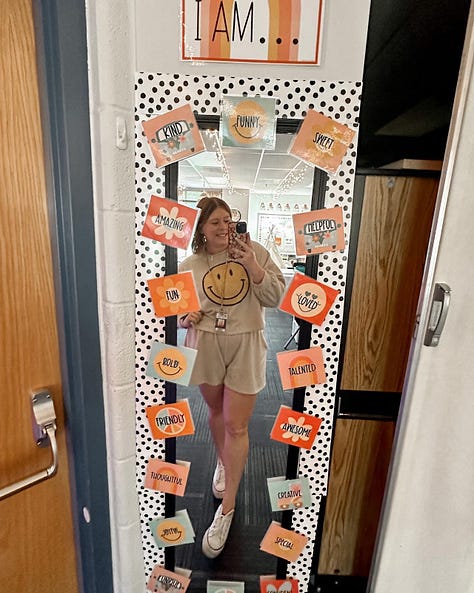
I get the intention and agree that positive self-talk can be powerful. Affirmations are absolutely worthy of being taught.
Yet I remain unconvinced that we need to install a permanent mirror in the middle of the classroom to accomplish this.
I tried it, but I was shocked to discover that not a single one of my students used it to look deeply into their own eyes and declare “I am resilient.” It became our de facto makeup counter.
This makes sense to me now. Mirrors attract attention…that is one of their central features.
Teach affirmations directly and model realistic self-talk such as:
“This is hard, but I can take it one step at a time.”
“I made a mistake, and I can fix it.”
“I don’t understand this yet.”
You can also use a handheld mirror for a specific activity and then put it away or ddd affirmations to restroom mirrors or another space where looking at oneself is already part of the environment.
We can teach the skills without installing a tiny self-service distraction kiosk.
Another hot take…
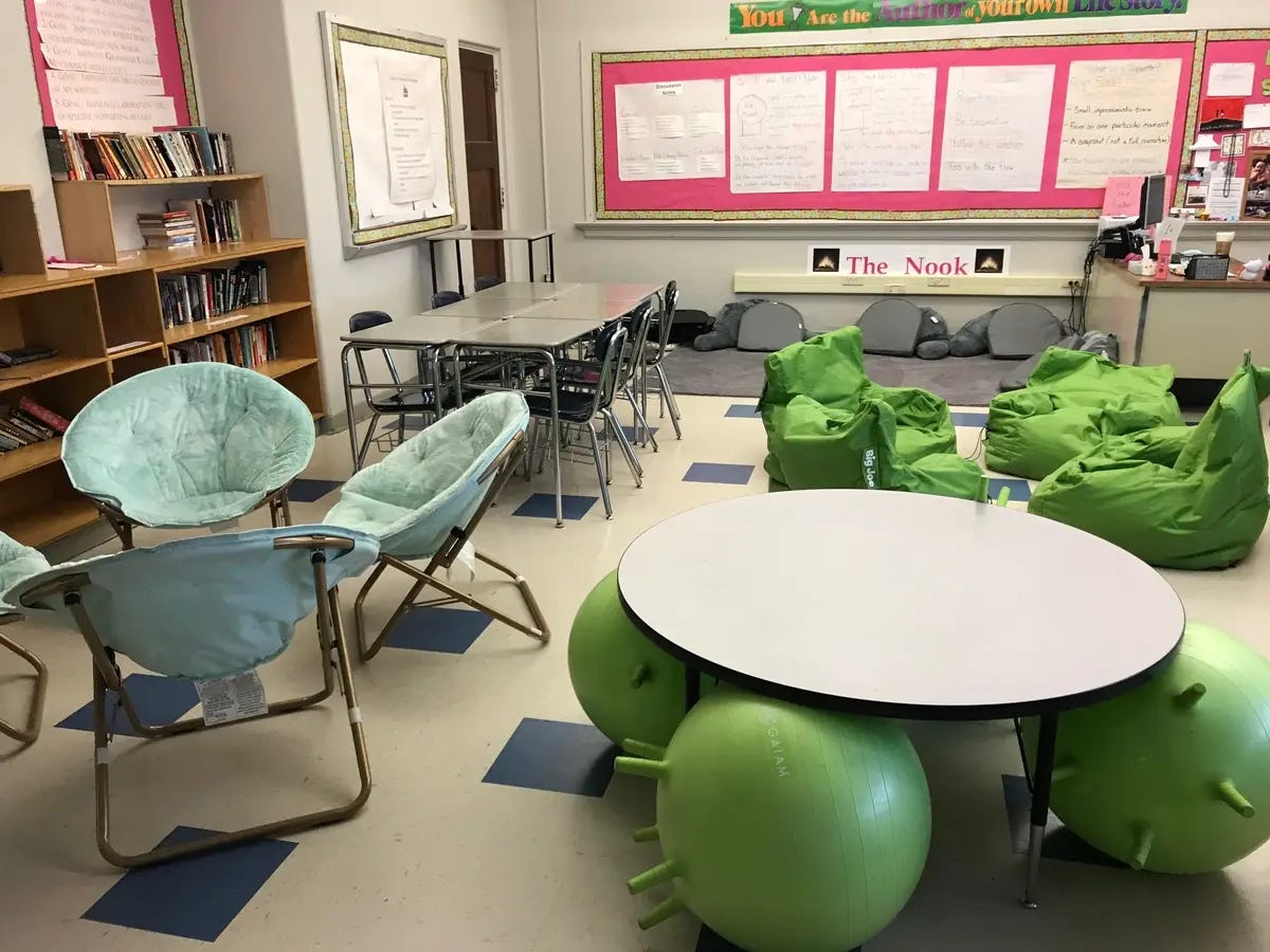
I’m against flexible seating, but I am against purchasing eight different categories of novelty furniture before knowing whether any of it will help the children in the room.
Wobble stools, floor cushions, standing desks, beanbags, scoop chairs, balance balls, lap desks, rocking seats, and low tables can all serve a purpose and I use several of them in my own classroom. However, if provided before true need or rules of use are established, they can also create:
arguments
distraction
storage problems
tripping hazards
unclear expectations
student inflexibility (as in “ I refuse to do anything unless I’m sitting on a bouncy ball”)
Comfort, choice, and movement all matter, but they need to coexist. Students also need stable work surfaces, clear pathways, appropriate posture options, and enough room to complete actual tasks without tripping over a refurbished, pillow-stuffed canoe.
Have a few kickbands and wobble cushions at the read, and then observe your students before adding more.
Ask:
Who benefits from this?
What need does it meet?
During which activities will it be available?
Can students use it safely and independently?
Where will it live when it is not being used?
Am I prepared to clean it?
Flexible seating should solve a problem, not become one.
One more…
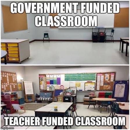
Teachers are routinely (even if not directly) encouraged to furnish their classrooms with their own money.
Social media and the expectations influencers often create are hugely responsible for this. Online, we may see the finished room, but we don’t see the credit-card balance, donated labor, or brand partnerships.
Honestly, this is an equity issue. Teachers shouldn’t have to bankroll their classrooms and the quality of a classroom environment shouldn’t depend on a teacher’s disposable income.
Before buying literally anything, ask:
Do we already own something that could serve this purpose?
Could the school provide it?
Could it be borrowed, donated, thrifted, or repurposed?
Will it meaningfully improve student access, comfort, independence, or learning?
Will I still want to manage this object in February?
Before adding something to the room, you should be able to answer two questions:
Why is it here?
and
How will students use it?
My point here is not that there’s something wrong with beauty, personality, color, or joy in a classroom. Of course, children deserve spaces that feel warm and cared for.
However, beauty is secondary to function. They can coexist, but it’s best to prioritize the former.
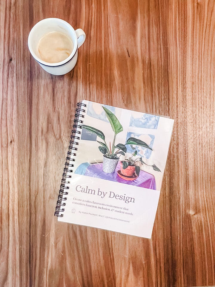
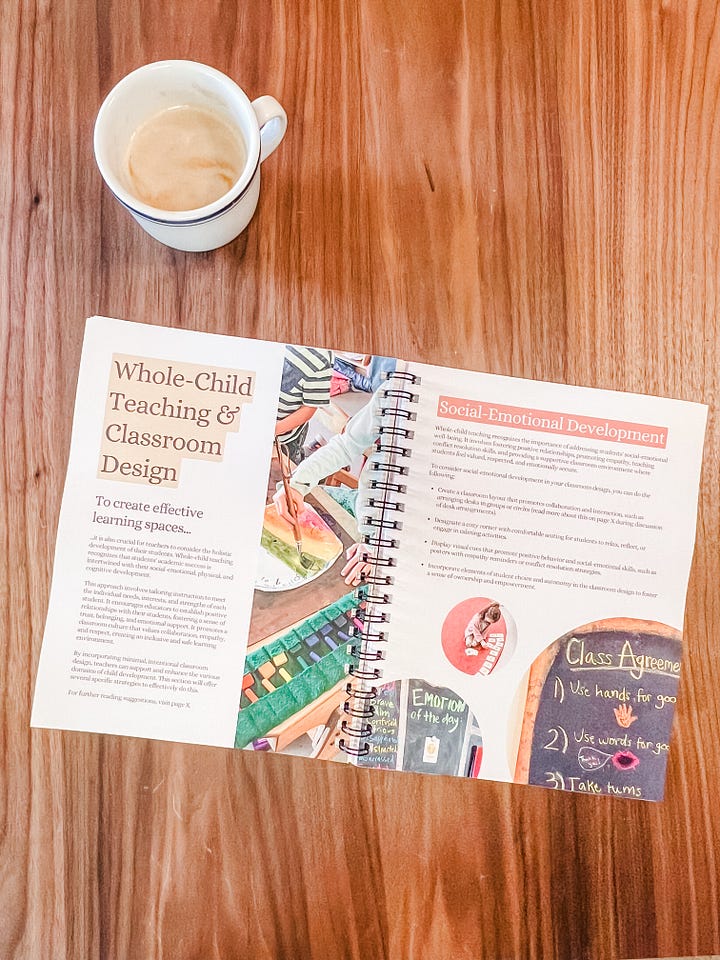
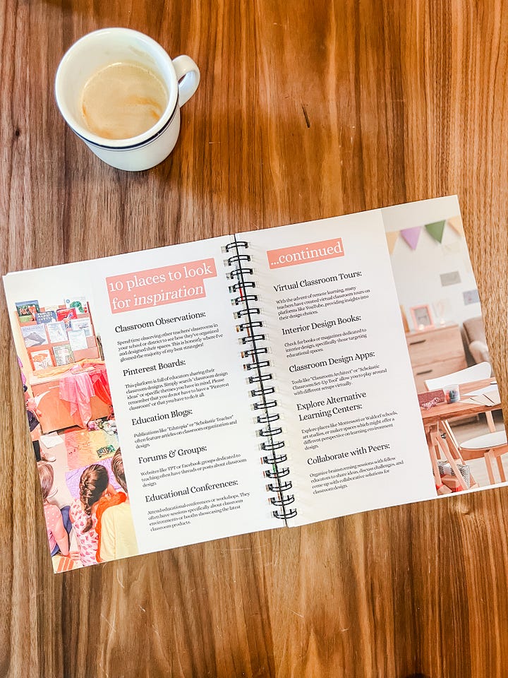
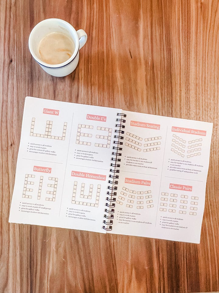
It would be deeply unfair for me to criticize your affirmation mirror and then abandon you with a roll of double-sided tape, so I am giving away my Calm by Design classroom workbook for free. It’s 70 pages of guidance, recommendations, photos (many of my own classroom), ideas, and more.
It will help you think through:
how you want students to feel in the room
your classroom mission, vision, and values
student and accessibility needs
layout and movement
lighting, sound, color, and other sensory factors
seating arrangements
realistic budgeting and sourcing
what to keep, remove, move, or reconsider
The goal is not to create my ideal classroom, but to help you create a space that works for your students, teaching style, resources, and actual life.
Please know that I support you, I believe in you, and I am BEGGING you from the bottom of my heart to use no more than two fonts <3
No posts
Comments
Nothing yet. Say the first thing.
Sign in to join the conversation.