
It’s approximately one thousand degrees outside as I write this, which feels like an apt metaphor for how my book research is going: hot, sometimes rather challenging, and yet I keep going back for more.
I recently visited the Ingalls Library at the Cleveland Museum of Art, part of my ongoing mission to hunt down resources within my region. The materials I’m researching for my book aren’t exactly rare… it’s just a matter of knowing where to look. (Also: saving those research funds for when I really need them.)
In my quest to uncover reader commentary in journals and magazines, I’ve learned that summarized tables of contents aren’t always accurate. Letters from readers were considered front or back matter, not highlighted features. Because of this, I go straight to the source.
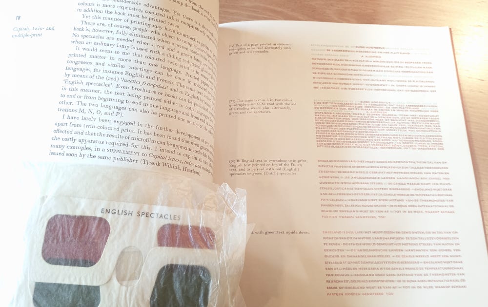
The question of “is it there?” brought me to the Ingalls specifically because of Typographica (New Series), the UK journal launched in 1960 under Herbert Spencer’s direction and published by Lund Humphries. This was the series that followed Spencer’s original, with two issues per year (June and December) until the end of 1967. Typographica, as the title implies, was dedicated to typographic experimentation and graphic design. I’d found a note somewhere alluding to commentary in the journal — some publications use that term for reader letters, while others use it for opinion or critical essays. The note was worth investigating, I thought, especially since the complete New Series (and one issue of the Original Series) were not far from home and within a world-class art museum.
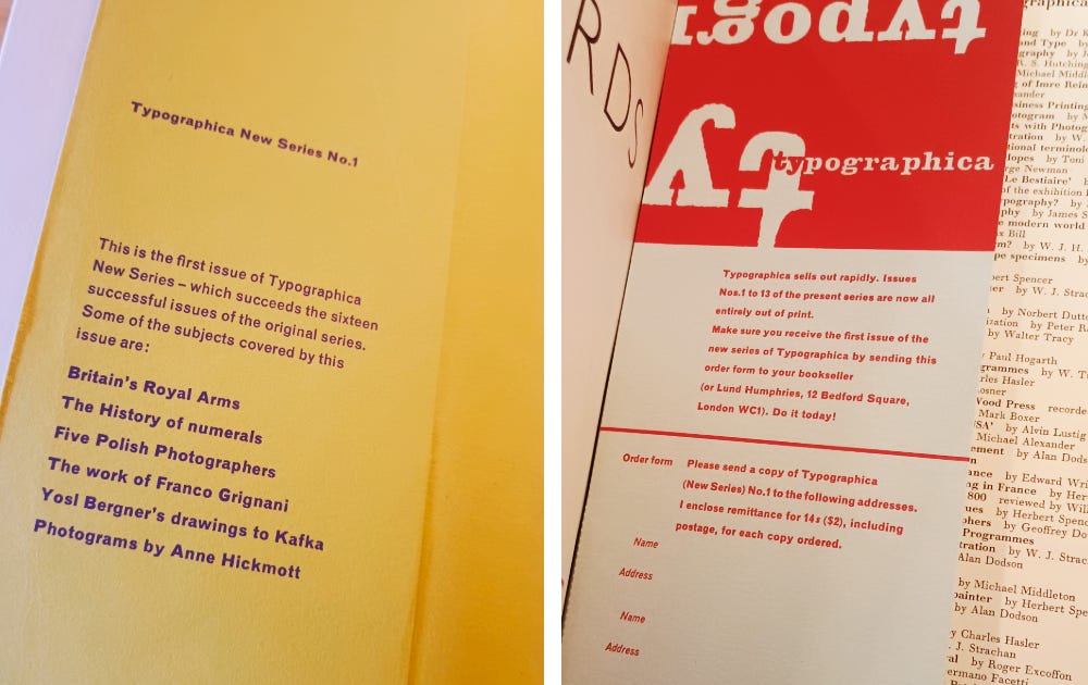
So as not to keep you all in suspense: Typographica did not include reader letters. The commentary within its pages was the journal itself. I have a few more observations about this, but for now those are collected in my book research notes. That said, I have never paged through a journal quite like this one. Typographica, where have you been all of my designerly life?
The paper stock for the covers and interior pages was high quality, with a subtle texture and weight. It was just enough for its reader to feel like they’ve got something special in their hands. The publishers eventually moved to glossy pages, but the typographic aesthetic held steady throughout. Each of the 16 New Series issues held a small number of articles (the aforementioned commentary, it seems) alongside a few understated ads from companies like Monotype.
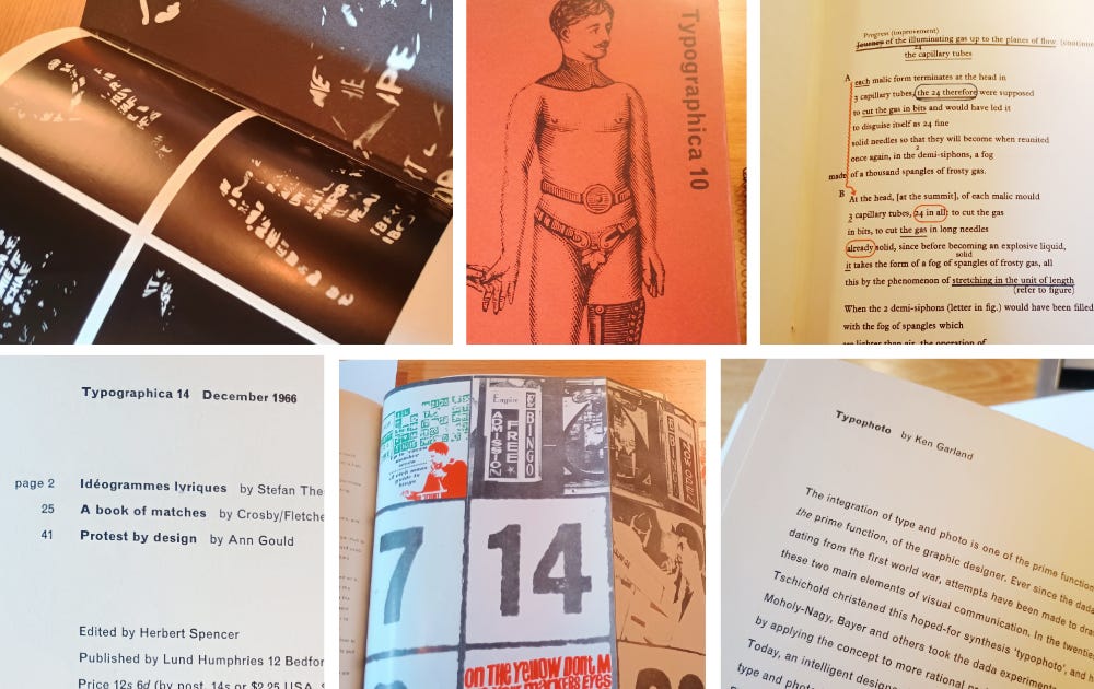
Though my venture to the Ingalls didn’t yield the book fodder I wanted, sometimes the chase is the reward. I’ll take a beautifully designed dead end over a mediocre lead any day. Preferably, somewhere air-conditioned.
Til next time.
This post is public so feel free to share it.
No posts
Comments
Nothing yet. Say the first thing.
Sign in to join the conversation.