
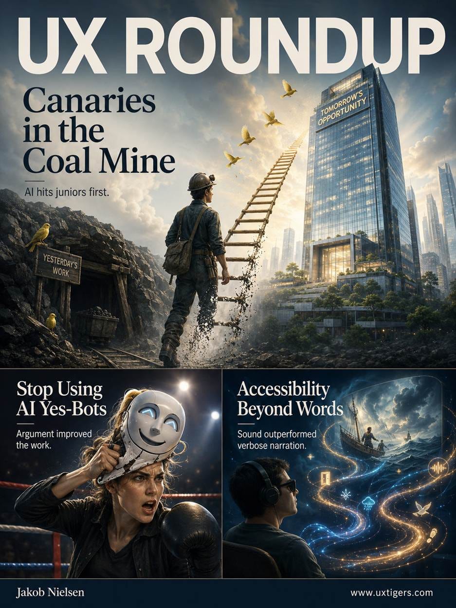
Summary: AI spending growing 75% per year at the median firm | An AI agent that argued back against design ideas helped designers improve | A design is a hypothesis: try to defeat it | AI can generate superior accessibility when it prioritizes communication density over narrative completeness | Skeleton screens buy patience, not speed | Checkout design dials the pain of paying up or down
UX Roundup for August 17, 2026 (GPT Image 2)
Ramp is a major issuer of company credit cards and has been tracking how businesses use them to pay for AI subscriptions.
The following chart shows monthly AI spending per employee at American companies over the last 3 years (August 2023 to July 2026), plotted on a logarithmic scale.
Fluctuations aside, the logarithmic scale makes the trend unmistakable: relentless exponential surge in corporate AI spending. (Exponential growth is a straight line in a logarithmic chart.)
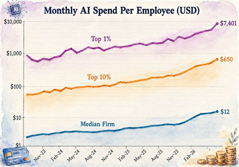
Spending on AI is growing fast. Note the logarithmic scale to show these exponential growth curves. Data: Ramp AI Index.
For the median firm, the growth rate over the last 3 years was 75% per year. Today, the median AI spending in American businesses is only $12 per employee per month, not even enough for a puny “Plus” subscription to ChatGPT (currently $20/month). And note that the definition of median implies that half the companies spend less. Clearly, American business has barely pulled out of the AI driveway. But usage is indeed growing fast: if the same 75% annual growth persists, the median firm will reach that Plus tier by mid-2027 and the full “Pro” tier ($200/month) by 2031.
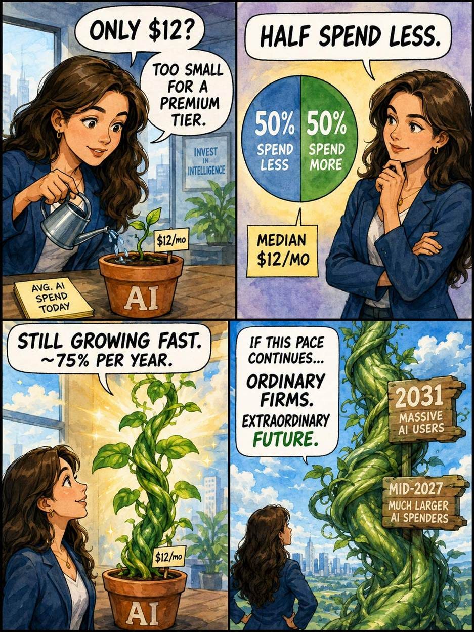
The median American company spends pocket lint on AI today, but AI budgets are growing fast. (GPT Image 2)
The upper echelon spends much more: the top decile currently spends $650 per employee per month, with a 124% annual growth rate, meaning it will reach $1,450 per employee per month in a year and $36K by 2031.
The very top percentile of American companies currently spends $7,401 per employee on AI each month, with a slightly smaller growth rate of 109% per year. If the trajectory continues, their monthly per-capita bill will hit $15K next year and nearly $300K by 2031.
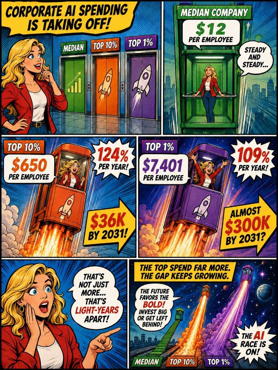
Spending is vastly higher in the top 10% of companies, and already an almost astronomical $7,401 per employee per month in the top 1% frontier companies. Growth rates are higher at the top than in the middle, so the AI-pilled companies will separate even further from the pack in the future. (GPT Image 2)
Are the 2031 numbers realistic? Given that superintelligence is expected by then, it’s quite plausible that the most aggressive firms would spend several hundred thousand dollars per employee on AI every year. After all, AI will be an immense force multiplier by then and will also have made society filthy rich, meaning that employees in companies with heavy AI use might see their compensation double. If you spend, say, $200K on an employee’s salary, it would make sense to spend at least that much on the AI-fueled productivity that justifies the paycheck.
That said, $300K/month = $3.6M/year, an AI stratosphere likely reserved for a select handful of elite firms (dare I say Moonshots). Thus, my prediction is that the growth rate will bend at the summit but keep climbing (likely steepening) at the base.
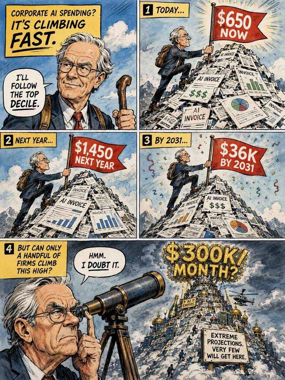
Very few companies will reach the peak of $300K in monthly AI spend per employee, but if you want to be an AI-First company, do budget for $1,450 in monthly AI costs per employee next year and $36K by 2031. (GPT Image 2)
In a new Carnegie Mellon experiment, a deliberately antagonistic AI agent pushed 45 design students to rethink and refine their work far more effectively than solitary self-review. The agent surfaced the widest range of conflicting stakeholder perspectives and drove designers to generate, and discard, the most ideas.
Cast your own AI in explicit adversarial roles: I supply 6 below, with ready-to-paste prompts.
Boxers pay sparring partners to punch them: the blows sting, but they expose weak spots long before a real opponent can exploit them. Designers now have a tireless sparring partner on tap, yet most use it as a cheering section.
AI readily flatters you, but you gain more from critical feedback. (GPT Image 2)
Today’s AI assistants are yes-bots: across 11 leading models, Myra Cheng and co-authors showed in Science that AI affirmed users’ actions 49% more often than humans do, leaving users more convinced they were right. A design review that produces nothing but praise has found nothing. Howard Ziyu Han and Nikolas Martelaro from Carnegie Mellon University’s Human-Computer Interaction Institute built the opposite: an AI agent whose only job is to argue with the designer. Their new experiment shows that the arguing pays off.

An AI agent can be honest and direct in its feedback on your design, but you have to prompt for such directness, since AI otherwise tends to be sycophantic and will say you did a good job, even when you didn’t. (GPT Image 2)
Han and Martelaro interviewed 6 professional public-sector designers (averaging 13.5 years of experience), then distilled their advice into an agent living inside a Miro whiteboard. As a designer sketches, the agent monitors the board and the think-aloud audio, then fires off 4 pushback points: sticky notes pairing one specific stakeholder group with one blunt objection to the current proposal. No compliments. No suggested fixes. The system prompt orders the model to be adversarial (the professionals insisted that constructive conflict needs bite), following the theory of agonistic pluralism: sustained disagreement surfaces assumptions that comfortable consensus buries.
But the designer stays in charge: he or she tags each point as useful or not, discards the duds, and marks a Consensus zone the agent must leave alone plus a Command zone that invites extra punishment. A second round of 4 points then concentrates its fire where the designer aimed.
The experiment: 45 interaction design students (15 per condition) redesigned a city’s 311 website. (“311” is the standard US channel for reporting non-emergency civic problems, such as potholes, graffiti, and illegal dumping, to city hall; the UK’s council reporting portals and China’s 12345 hotline are rough equivalents.) It’s a properly wicked problem where residents, city staff, and community groups want different things.
Everyone completed two design iterations, separated by one of three interventions: Self Reflection (unsupported review of your own proposal), Stepwise Guidance (a written walkthrough of the constructive-conflict framework), or the agent. The clever bit: the written guidance mirrored the agent’s system prompt, isolating what live opposition adds on top of the thinking framework itself.
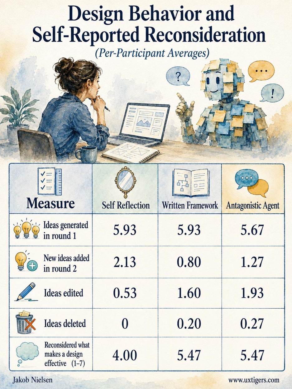
The round 1 row is the sanity check: all three groups banked the same number of ideas within the margin of error, because the interventions only happened between the rounds. Every difference below that row is a treatment effect. And the treatments delivered: both conflict conditions beat unsupported self-review on reconsideration and on editing (large effects), with agent participants editing 3.6x as many ideas as self-reviewers.
What about self-reviewers adding the most new ideas in round 2? Their edge over the agent group was not statistically significant, and even taken at face value, a mere 2 additions are small potatoes next to the bank of roughly 6 ideas everyone carried in from round 1. At this point in the process, improving and pruning existing ideas contributed more to the final design than piling on new ones.
The most telling number is the zero in the deletion row. Not one Self Reflection participant deleted a single idea, or even rewrote one, despite explicit permission. Designers cling to their own creations (design fixation at work), and unaided reflection didn’t loosen the grip. The agent did: its group revised 6 ideas and deleted 4. One participant killed two gamification features after the agent warned that rewarding the most active reporters would turn the platform into a popularity contest.
(GPT Images-2)
Why did the paper version of the framework fall short of its interactive twin? Abstract tension paralyzes; concrete objections mobilize. The guidance group added significantly fewer new ideas than self-reviewers, and 3 of its 15 participants changed nothing at all; one explained that questioning whether stakeholders would approve “brought all those ideas down.”
The agent escaped the paralysis: its situated objections triggered ideas in direct response (one designer, told that seniors might not own smartphones, rerouted a chatbot to the city call center), while its group also discarded more ideas than any other. Generate-and-discard churn is what healthy iteration looks like, and only the agent group reported a significant shift in overall design thinking (5.33 vs. 3.60 for self-review).
The agent doubled as an interactive stakeholder checklist, raising every concern the other groups found plus objections (privacy fears about public tickets, resistance to automation) that neither reached. Participants stayed discerning: of 125 tags applied to pushback points, 50% were “useful” and 26% “not useful,” and 14 of 15 designers used the steering frames. They even enjoyed the fight (5.13 of 7), though one felt the agent had trashed everything he or she made. Steering keeps the emotional price affordable.
One null result matters: no condition made designers reframe the design goal itself. Pushback sharpened proposals without provoking radical rethinking.
The authors admit that, with only 15 participants per condition, their effect sizes are probably inflated; the participants were students on a 90-minute clock; only one adversarial tone was tested. Fine. The framework-versus-enactment control is elegant, and the key outcomes are behavioral (actual edits and deletions on the board), so the direction of the findings has teeth. (Also, the agent ran on GPT-4.1, already a museum piece. Current frontier models should argue better still.)
One risk deserves amplification: several participants felt more confident because their ideas had survived the agent’s assault. Don’t confuse the gym with the arena. Synthetic pushback is rehearsal, not user research. An AI can simulate objections; only real users and stakeholders can validate a design.
You don’t need a custom Miro agent to collect this payoff. The active ingredient is adversarial casting: assigning your AI an explicit conflict role before it reviews your design, instead of requesting generic critique (which yields polite mush). Copy the study’s mechanics too: demand objections without fixes, one stakeholder and one concern per point, and reserve the right to discard freely and to declare settled decisions off-limits.
Here are 6 roles to cast, each with prompt text you can paste:
Skeptical user: “Act as a skeptical user who sees no reason to change how he or she works today. Challenge every feature by asking why anyone would bother, and flag each spot where the effort you demand from me exceeds the benefit you deliver.”
Excluded stakeholder: “Act as a stakeholder whom this design overlooks or harms. Name who is missing from the thinking, speak in that group’s voice, and object to every decision that serves the primary persona at that group’s expense.”
Compliance reviewer: “Act as a strict compliance reviewer. Flag anything in this design that could violate privacy law, accessibility regulations, or consumer-protection rules. State each violation and its consequence. Don’t propose fixes.”
Operational critic: “Act as the overworked staff who must run this service after launch. Push back on every feature that creates support tickets, manual review, or duplicate work, and tell me where the volume will hurt first.”
Change-averse veteran: “Act as a longtime power user who has mastered the current design and resents this redesign. Attack every change that breaks his or her habits, hides a familiar function, or slows an expert workflow.”
Cost-cutting executive: “Act as a CFO hunting for reasons to kill this project. Challenge the business case for every feature: what it costs to build and maintain, and what revenue or savings it must produce to earn its place.”
Run two or three roles per review, matched to the project’s biggest risks, and rotate across iterations. Tag the objections, toss the misfires, and edit whatever survives contact.
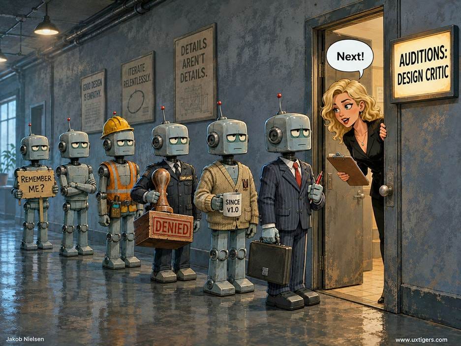
Depending on your project, you might want the antagonistic AI agent to roleplay as anything from the stakeholder who feels overlooked to the cost-cutting executive. (GPT Image 2)
A framework for thinking about stakeholder conflict helps; the same framework delivered as live opposition helps more, converting vague reconsideration into concrete edits and deletions. So stop letting your AI hold the pads and let throw real punches: cast it as a skeptic, an excluded stakeholder, or a hostile CFO, and let it hit your design where it hurts. Just remember what a sparring partner is for: surviving the gym proves you’re ready for the fight, not that you won it. The championship belt is still awarded in the ring, by real users.
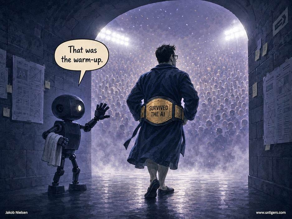
Sparring with the AI critic is only Round 1. It helps you get ready to meet the users. (GPT Image 2)
Today’s lesson comes from the philosophy of science. Karl Popper taught that a theory earns respect only by surviving honest attempts to refute it, and your design is a theory: a claim that this layout, these labels, and this flow will let people succeed. So run the class exercise. Step 1: prototype boldly, as if you’re right, so the claim is clear. Step 2: write down what users should accomplish and where you fear they’ll stumble. Step 3: watch 5 users try; grade the theory, not the participants. A design you haven’t tried to refute is a guess with good typography. Class dismissed; go falsify something.
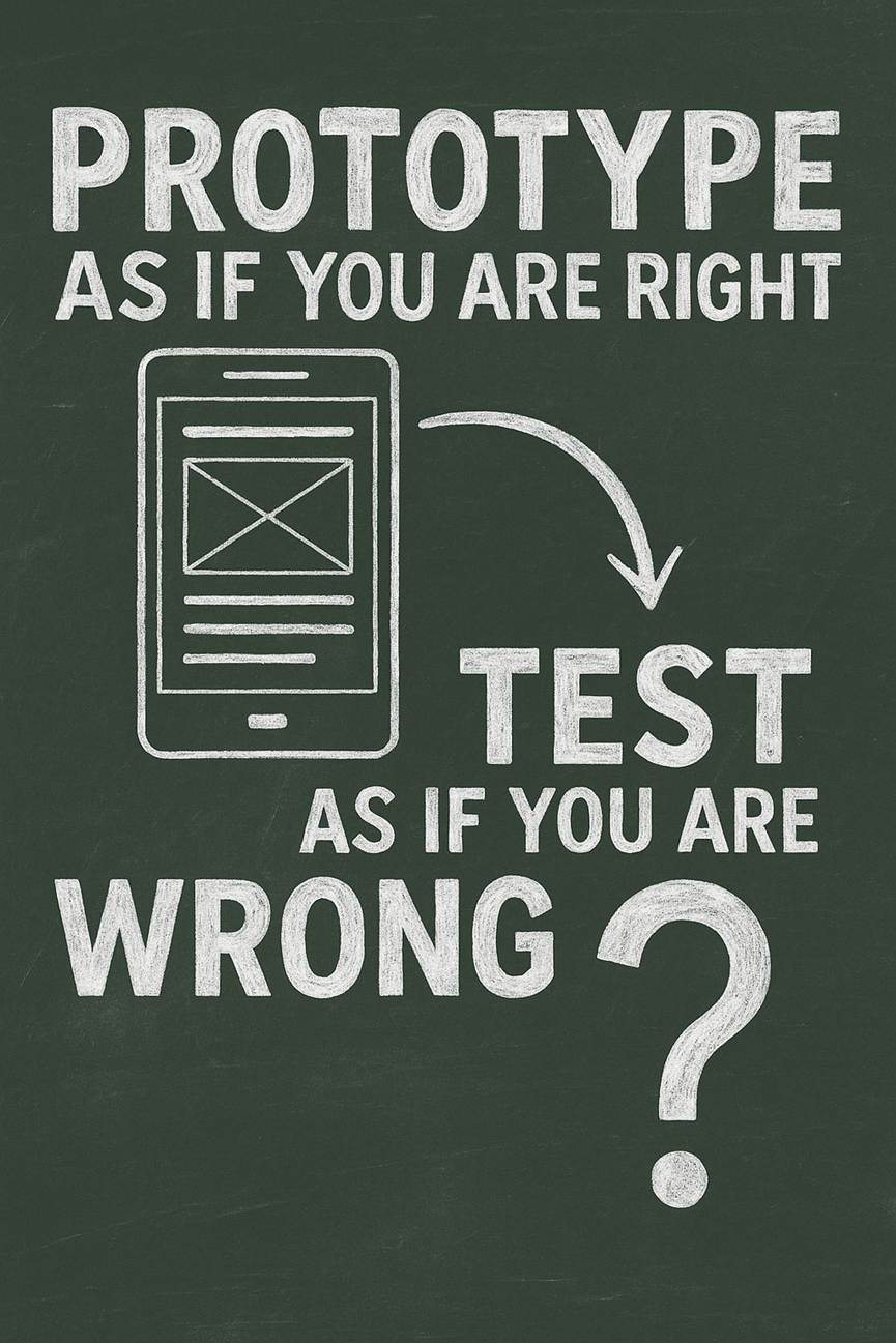
Tonight’s homework: 1 prototype, 5 users, 0 mercy for the theory. (GPT Image 1)
Stanford’s updated payroll analysis confirms that AI hasn’t dented overall employment, exactly as I predicted in 2023. But young workers in AI-exposed occupations now trail their less-exposed peers by a whopping 19%. New in this revision: AI substitutes for the codified knowledge taught in courses while complementing the tacit knowledge earned through practice. Plan your career accordingly.
Erik Brynjolfsson and colleagues at Stanford University have updated their landmark study Canaries in the Coal Mine with ADP payroll records covering millions of American workers through June 2026. (The full paper runs 140 pages, but the announcement delivers the gist.) Of the study’s 6 facts, 3 matter most for UX careers.
First, there’s still no evidence of economy-wide job displacement from AI. None. I called this in July 2023 in The AI Revolution Won’t Cause Mass Unemployment: the fixed-work fallacy remains a fallacy, because humans invent new wants faster than machines satisfy old ones.
Second, the calm aggregate hides trouble at the career ladder’s bottom rung. Employment of workers aged 22–25 in AI-exposed occupations now runs 19% below the trend line of their less-exposed peers. (The shortfall was only 15% a year ago, so it’s getting worse fast.) The gap opens through hiring: firms aren’t firing young workers; the job offers simply stopped arriving. Experienced workers show no comparable gap. (The authors stress that these are descriptive patterns rather than causal estimates. Fair. But canaries don’t wait for causal identification.)
The update’s most valuable addition explains the mechanism. Employment declined among young workers in occupations that rely on codified knowledge: formal, standardized, documented material of the sort taught through courses, textbooks, and written procedures. Exactly what AI is great at, and it’s far cheaper than humans. Meanwhile, employment increased among experienced workers in occupations that lean on tacit knowledge, accumulated through practice, mentorship, and repeated contact with real situations. AI devours what’s written down and amplifies what isn’t.
The career advice is obvious, and no different from what I’ve said before, but it bears repeating. In UX, book learning and course theory have always counted for less than practice; AI turns that slope into a cliff. Build real products. Learn from real users. Grow discernment and judgment, because anybody can prompt an AI for 10 design variations, but knowing which one to ship takes tacit skill. And sharpen your ability to persuade other humans, since stakeholders won’t convince themselves.
Applause for the Stanford team’s publishing model. AI findings have the shelf life of fresh fish, so the concept of a “paper” frozen in time is obsolete: a relic from the days when research findings were literally printed on paper. Online publishing with continuous updates is a far superior way of communicating research. Better still, the team posts the numbers behind the charts on a public dashboard, downloadable and refreshed monthly. Bookmark it.
Students starting college now will graduate around 2030 into a market shaped by superintelligent, agentic AI. My prediction: agents that chain codified tasks into complete workflows will push automation from entry-level tasks up into routine mid-level work, so the 19% gap will widen and creep up the experience curve. Beware the apprenticeship paradox: entry-level jobs were how juniors converted book learning into tacit skill, so when AI eats the bottom rung, companies must build deliberate apprenticeships or watch their senior pipeline run dry. If you’re picking a degree program, favor studio projects and internships over lecture halls.
AI didn’t burn down the job market; it removed the ladder’s lowest rungs. The higher rungs (agency and persuasion) hold firm and pay better than ever. Start climbing.


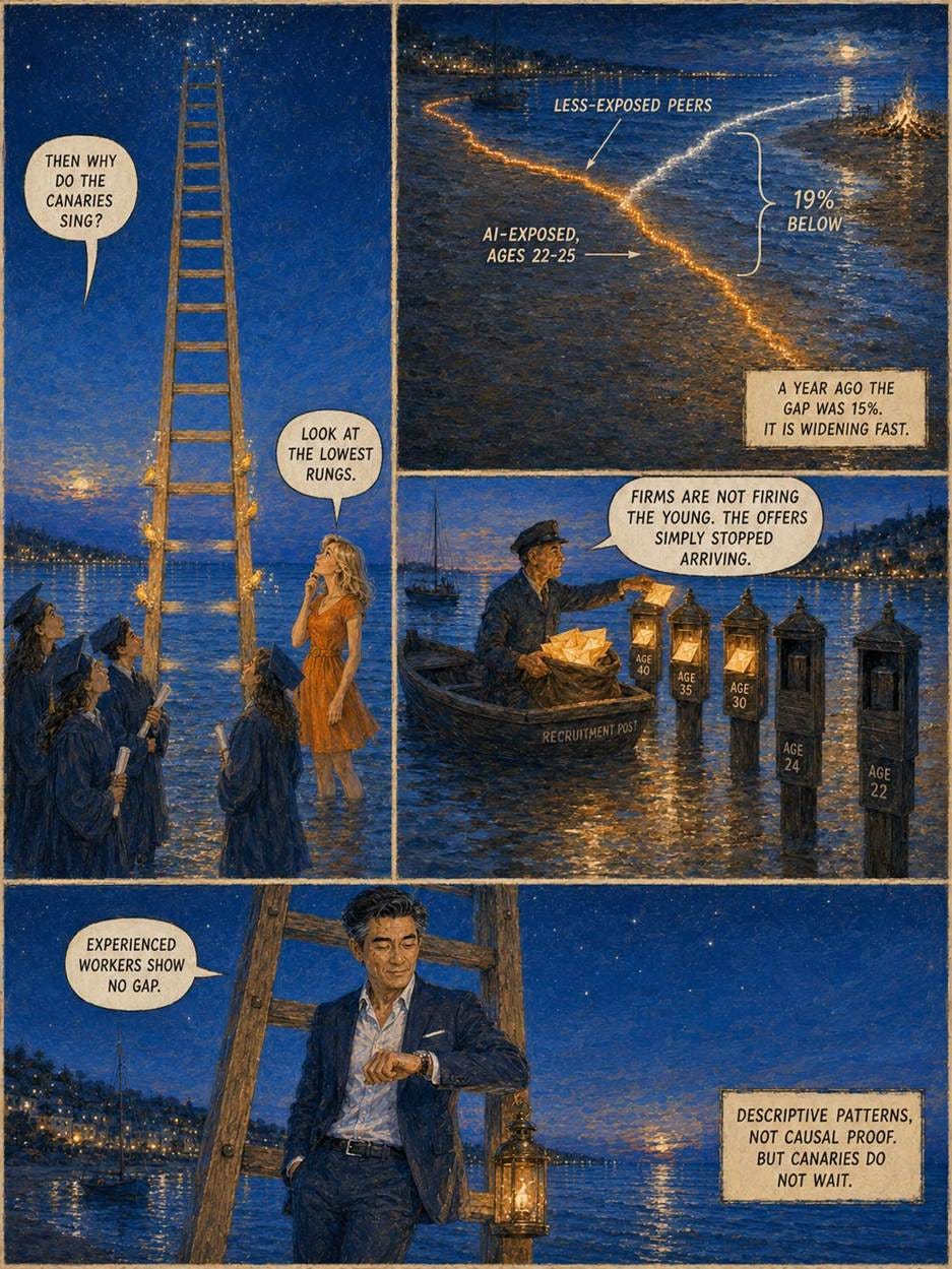
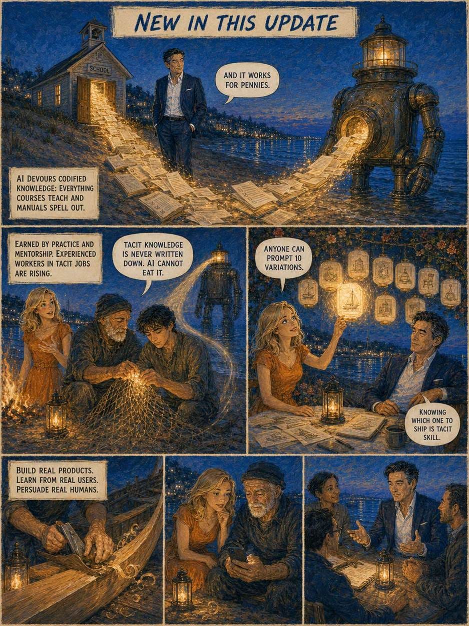
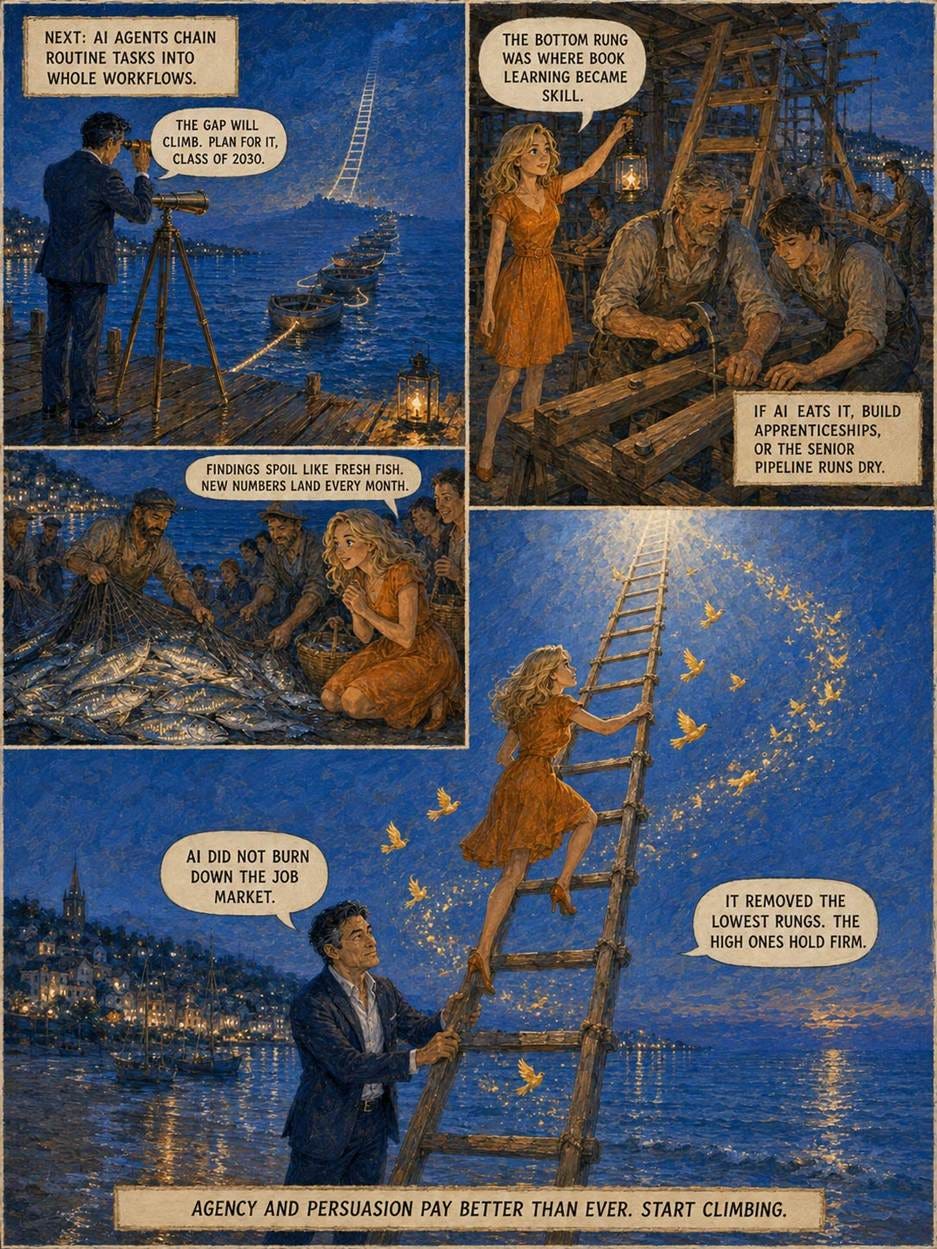
Alice and Zimo explain the new Stanford research in the style of a Scandinavian “blue hour” summertime evening.
Audio description (AD) makes film and TV accessible to blind and low-vision viewers by narrating the visuals during pauses in speech. Dialogue-dense scenes never come up for air. So visually impaired viewers miss the actions, movements, and facial expressions that carry much of the drama.
Shuchang Xu from Hong Kong University of Science and Technology and co-authors at Columbia University and the Universities of Stuttgart and Rochester attack this problem without adding words. Their Sonic Stage system, to be presented at the UIST research conference in November, uses an AI pipeline to reconstruct a 3D model of each scene that stays stable across camera cuts, then renders the visuals as sound. Dialogue is spatialized so each voice emanates from that character’s position: when the arguing woman crosses the room, her voice sweeps from your left to your right. Silent actions get generated sound effects, such as cloth rustling as the man removes his coat. And a single tap plays a short description tied to the current line of dialogue. Fully automated, at 8.2 minutes of computation per minute of video.
In a study with 12 visually impaired users, Sonic Stage crushed a state-of-the-art baseline that let users pause and hear descriptions of everything on screen. Recall of character movement: 86% with Sonic Stage vs. a dismal 18% with the baseline. Character position: 89% vs. 44%. Users also rated Sonic Stage higher on immersion, engagement, and enjoyment (all p < .01), and their exploration pauses shrank from 7 seconds to 3. (Caveats: clips under 2 minutes, and recall tested immediately after viewing. But differences this lopsided won’t flip in a bigger study.)
The baseline failed the way AI fails everywhere: verbosity. One participant nailed the describe-everything approach: “when everything is highlighted, nothing really stands out.” Long narrative text lowers usability for all users. Sighted users scan rather than read, as John Morkes and I first measured in 1997. Visually impaired users suffer more, because speech is serial and thus slower than scanning text: every surplus sentence steals seconds from the story itself. Translate, don’t narrate. Generative accessibility should transform inaccessible material into alternate representations suited to the user’s task and channel: spatial audio, sound effects, structure, or terse on-demand detail.
Apply the same standard to your own AI features. Score generated ALT text, video descriptions, and summaries on usability per second of user attention. A user’s blindness doesn’t change the fact that he or she wants ROI on time spent (let’s not say “wasted”) with your design. The most usable description is often no description at all: it’s a better representation.
My TV remote has 52 buttons. I use 5. The other 47 are button bloat that mainly makes those 5 harder to find. Every control you display charges users a scanning tax, whether they want the feature or not, so the kindest thing a designer can do is put the interface on a diet: make the essentials big and obvious, and move the long tail of rare functions behind a menu (or hand them to an AI assistant that accepts plain-language requests). You’re removing camouflage, not capability. Count what users actually press, then trim accordingly.
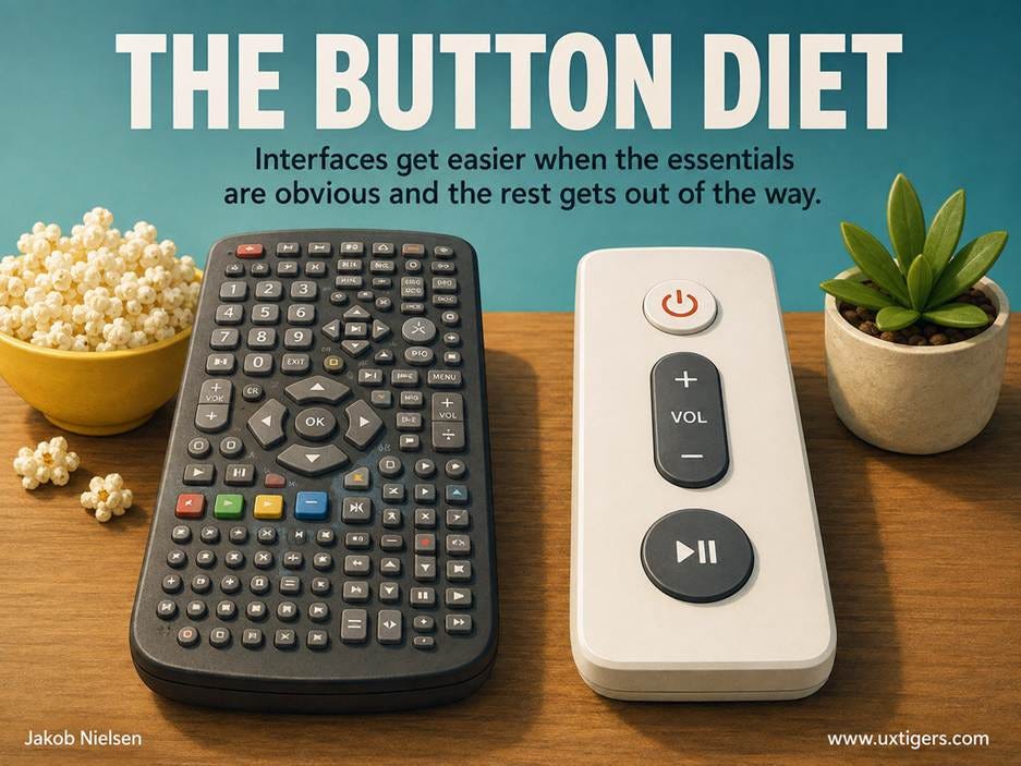
Left: the remote you own. Right: the remote you use. (GPT Image 2)
Definition: A skeleton screen is a placeholder version of a page, built from light-gray boxes and bars that match the size and position of the content that’s about to arrive. It appears instantly; real text and images then replace the placeholders piece by piece.
The name is anatomical. The page shows its bones first, and the downloading content puts flesh on them a moment later.
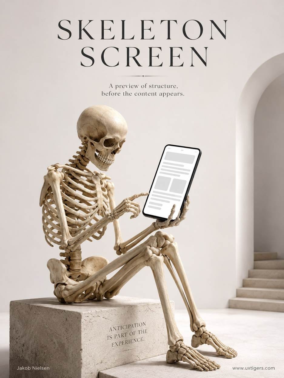
A memento mori for slow pages: even the most patient user prefers seeing the bones before the flesh arrives. Anticipation is part of the experience. (GPT Image 2)
Luke Wroblewski coined the term in a 2013 article while building Polar, a mobile polling app later acquired by Google. Polar’s spinners drew complaints about sluggishness, so his team swapped them for instant placeholders that filled in as data arrived. Wroblewski defined the pattern as “essentially a blank version of a page into which information is gradually loaded.” Facebook’s news feed soon made the shimmering gray boxes famous, and today you’ll find skeletons in YouTube, LinkedIn, and half the apps on your phone. Rarely has a design pattern spread so far on so little evidence. More on that below.
Three response-time limits have governed interface design for decades: 0.1 seconds feels instantaneous, 1 second preserves the user’s flow of thought, and 10 seconds is the limit for holding attention on the dialogue. (Robert B. Miller published these numbers in 1968; I repopularized them in my 1993 book Usability Engineering. Good findings age better than I do.)
A skeleton screen exploits the first limit: even when the content needs 3 seconds, the structure can render in a tenth of one. Thus the system responds instantly, and only the flesh is late.
The second mechanism is attention. A spinner is a clock, and watched clocks run slow. A skeleton points the user at the destination instead: he or she starts parsing the layout, so part of the wait turns active rather than passive.
Third, stability. Content drops into reserved slots instead of shoving the page around while the user tries to read it: the jump-and-reflow jank that Google has measured as Cumulative Layout Shift since 2020.
Note what’s absent from this list: actual speed. Skeleton screens manage perception, not performance. The bytes arrive no sooner.
Tempting, then, to rip out every spinner tomorrow. Resist. In 2017, the agency Viget tested a simulated page load on 136 people, comparing a skeleton, a spinner, and a blank screen. The skeleton lost on every metric: perceived duration, subjective ratings, and task time. A year later, Bill Chung ran his own experiments and found skeletons beating spinners and blanks, but by a slim margin, and only when animated with a slow, steady left-to-right shimmer. Pulsing and rapid motion made waits feel longer.
Both studies relied on small samples and static splash-screen mockups rather than Wroblewski’s true gradual loading, so treat the numbers as directional. But the direction is clear enough: this pattern is no cure-all, and the details decide whether it helps or hurts.
The worst failure is the mismatch: a skeleton promising 3 tidy articles that then delivers an ad, a banner, and a different layout. That’s pure layout whiplash. A breached psychological contract is more infuriating than the incompetence of a spinning wheel. Nearly as bad is the full-page skeleton that blocks until everything has loaded. That’s a spinner dressed up in a bone costume.
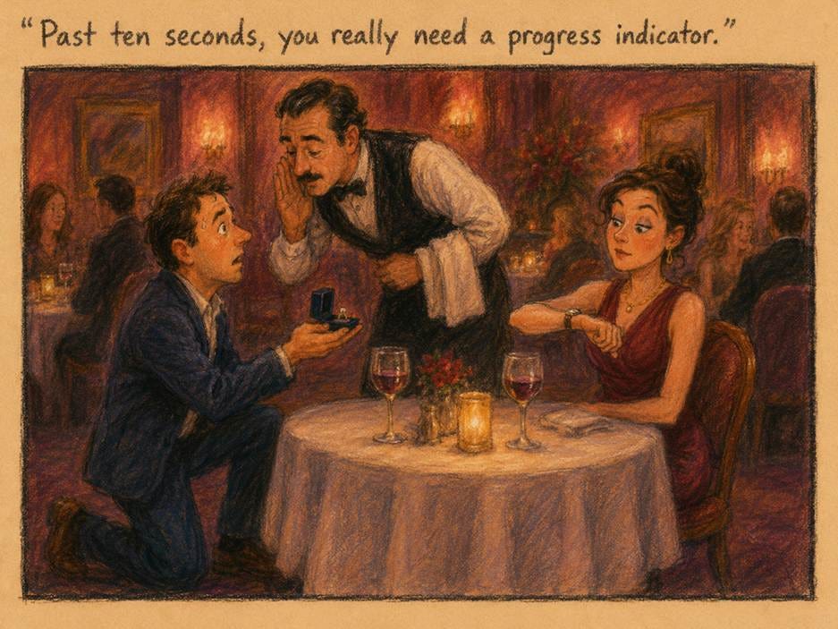
Reserve skeletons for waits of roughly 1–10 seconds. Under 1 second, show nothing, because a flickering skeleton is pure noise. Past 10 seconds, switch to a percent-done indicator.
Match the final layout box for box. Same slots, same sizes. If you can’t predict the post-loading layout, use a spinner to avoid layout whiplash.
Replace each placeholder the instant its content arrives. Text first, images later. Never hold finished content hostage to the slowest element on the page.
Animate with a slow, steady left-to-right shimmer. Chung’s data says pulsing and rapid motion backfire.
Keep the bones few, pale, and quiet. A handful of low-contrast shapes is plenty; a detailed gray replica merely adds visual noise.
Test perceived speed with your own users. Facebook’s success didn’t transfer to Viget’s 136 participants, and it may not transfer to your product either. Watch users, not demos.
Handing over money triggers genuine discomfort, and the payment interface controls the intensity. Cash stings, cards numb, one-click anesthetizes. Every checkout has a pain dial, and ethical designers set it deliberately instead of quietly turning it to zero.
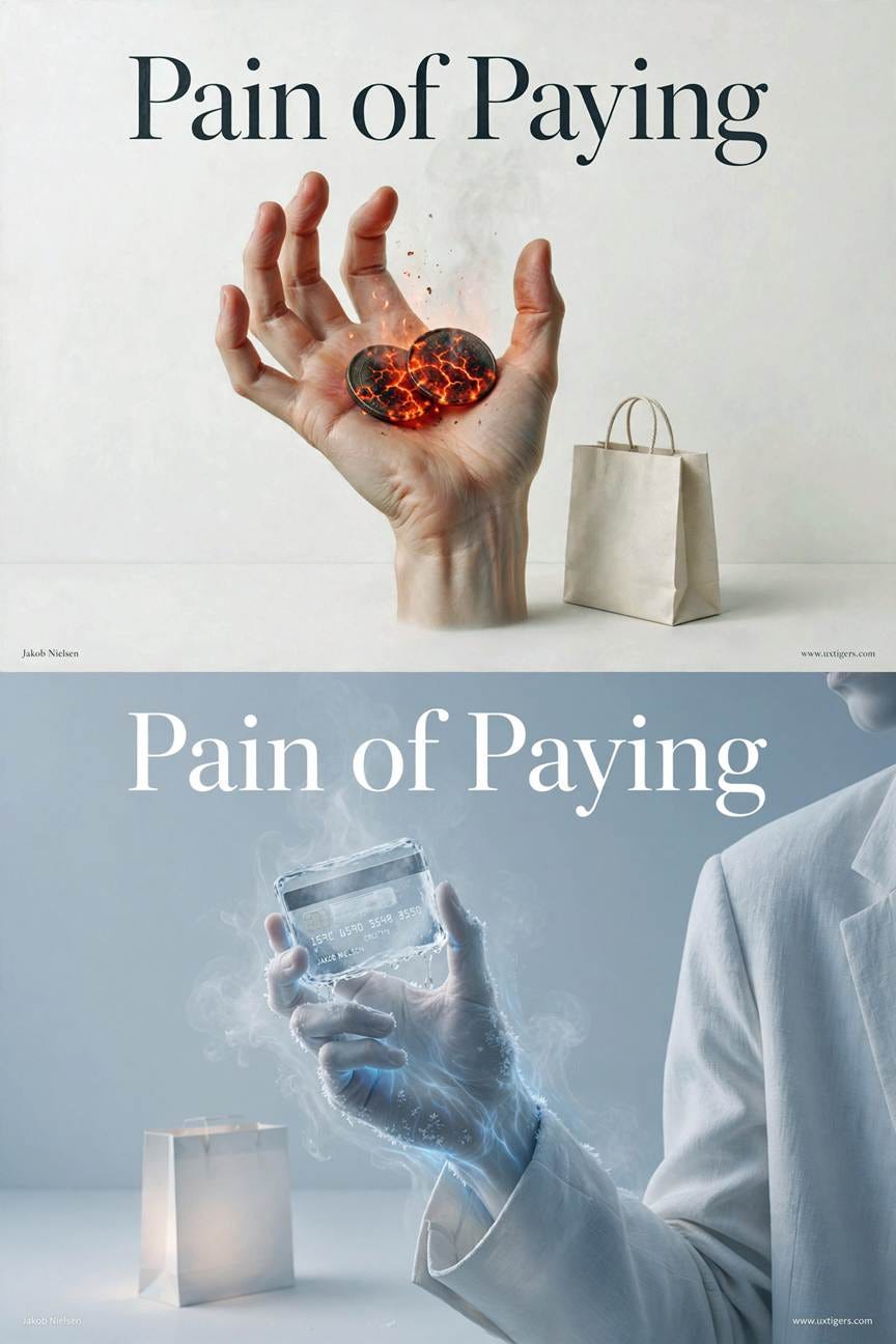
Parting with actual cash burns the hottest, whereas paying with a credit card numbs the pain of paying somewhat. (Muse Image)
Definition: The “pain of paying” is the negative emotional response that accompanies parting with money. Its intensity depends less on the amount than on the payment’s form, timing, and visibility.
This is more than a metaphor. In a 2007 brain-scanning study, Neural Predictors of Purchases (PDF), Brian Knutson of Stanford and co-authors watched shoppers decide inside an fMRI machine: excessive prices activated the insula, a brain region associated with aversive experiences, and that activation predicted who would walk away from the purchase. Prices can hurt before the wallet even opens.
The term comes from Ofer Zellermayer’s 1996 doctoral dissertation at Carnegie Mellon University, bluntly titled The Pain of Paying. Drazen Prelec of MIT and George Loewenstein of Carnegie Mellon then built the theory in their 1998 Marketing Science paper The Red and the Black: Mental Accounting of Savings and Debt. Their signature example is the taxi meter: each visible tick charges a small fee and a small jolt of displeasure, souring the very ride you’re paying for. The paper’s central idea is coupling: the more tightly a payment is linked in time and attention to the consumption it buys, the more it hurts.
Decoupling is why credit cards feel lighter than cash. And the effect on behavior is enormous. In sealed-bid auctions for real tickets to a professional basketball game, Prelec and Duncan Simester found that people instructed to pay by credit card bid up to 100% more than people paying cash; they published the result in 2001 under the title Always Leave Home Without It. Same tickets, same market value, double the willingness to pay. That’s not a rounding error; that’s a design variable.
Once you accept that payment friction is a dial rather than a fixed cost, two legitimate design moves appear.
Turning the dial down, honestly. Some pain is pure waste. Prelec and Loewenstein showed that people prefer flat rates and prepayment even when metered pricing would cost less, because a prepaid vacation is consumed “as if it were free” while a running meter poisons every minute. So offer flat-rate plans where usage anxiety kills enjoyment, let people prepay experiences, and remove ceremony from trivially small transactions. Nobody needs a three-screen checkout for a $2 parking fee. The ride-hailing pattern of ending a trip with no visible payment moment is the taxi meter turned inside out, and riders love it.
Turning the dial up, on purpose. Pain is also information: it’s the sensation of a budget noticing. Spending notifications, running cart totals, and confirmation steps for large amounts restore the awareness that frictionless payment strips out. These are spending speed bumps, and users increasingly ask for them. A bank that pings you 2 seconds after each charge is selling you back your own pain of paying, and it’s a fair trade.
The trouble starts when designers turn the dial to zero and hide the knob. Stored cards plus one-click ordering plus buy-now-pay-later plus in-game gems form a four-layer anesthetic: no wallet, no ceremony, no present-tense cost, no recognizable currency, and, once the layers stack, no single moment at which a person can feel the money go. Casinos pioneered this with chips; game publishers merely digitized the chip. Auto-renewing subscriptions add the final trick of removing the payment moment entirely, so the charge lands while attention is elsewhere.
Does frictionless checkout raise conversion? You betcha, which is why it spread. But revenue extracted under anesthesia converts poorly into loyalty: it returns as refund demands, chargebacks, angry app-store reviews from parents, and legislation. (Regulators on both sides of the Atlantic now treat some of these mechanics as consumer-protection problems, and they aren’t wrong.)
The antidotes are straightforward: receipts that arrive instantly, totals in real currency next to any token price, renewal warnings before the charge, cancellation that takes as few clicks as signup, and user-set spending caps.
Match friction to stakes. One tap for a $3 purchase, a deliberate confirmation with the full amount for a $300 one. Uniform frictionless is a choice, and it’s usually made to serve the seller, not the user.
Show a running total in multi-item flows. The cart is a taxi meter that users deserve to see; hiding the subtotal until checkout is meter tampering.
Price in real currency at the point of spend. “950 gems ($9.99)” keeps tokens from laundering the cost.
Notify at the moment of the charge. A push notification within seconds beats a PDF statement in 30 days by exactly the amount of pain it preserves.
Offer flat-rate and prepaid options where a running meter would poison the experience, and disclose plainly when the flat rate costs more.
Announce renewals before they bill. An email 7 days ahead with a one-click cancel converts silent churn-in-waiting into informed consent.
Let users set their own speed bumps. Spending caps, cool-down timers, and purchase confirmations are self-control tools; make them first-class settings, especially in games.
Make canceling as easy as buying. If the pain you removed from purchase reappears, multiplied, at cancellation, you’ve built a trap, and users will call it one.
The pain of paying is the nervous system’s invoice, and every checkout design either delivers it, delays it, or destroys it. Removing pointless friction is good UX. Removing the user’s awareness that money is leaving is not; it’s just sedation with a conversion metric. So set the dial honestly: quiet where the stakes are trivial, audible where they’re not, and always with the knob in the user’s reach. A customer who felt every dollar and paid anyway is worth 10 who wake up wondering what happened.
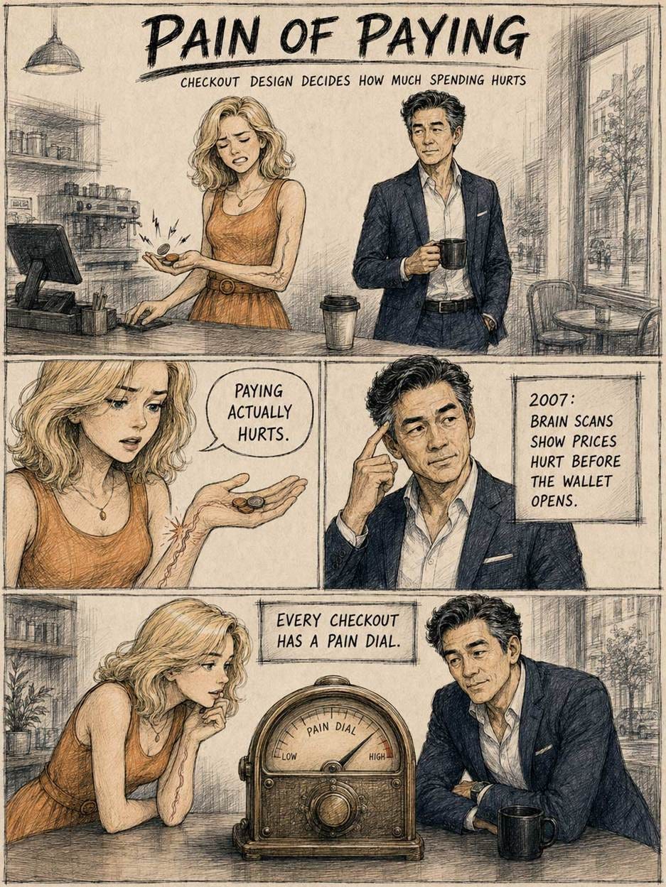
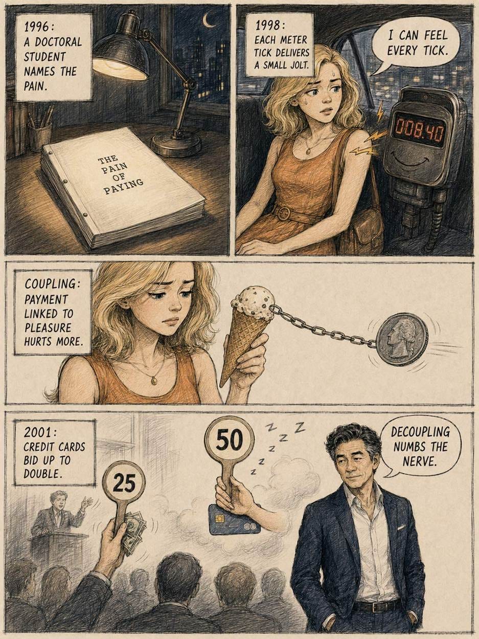
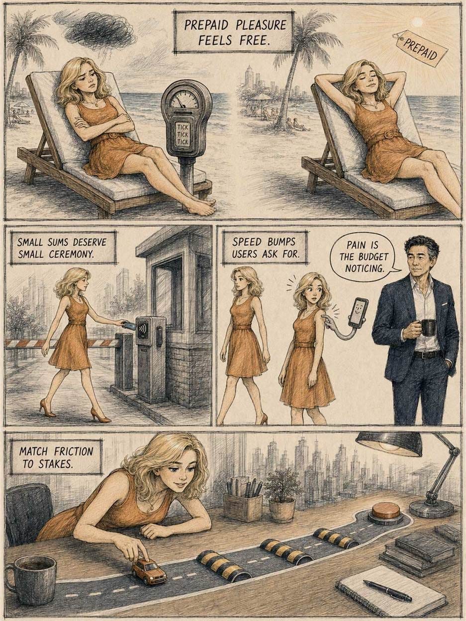
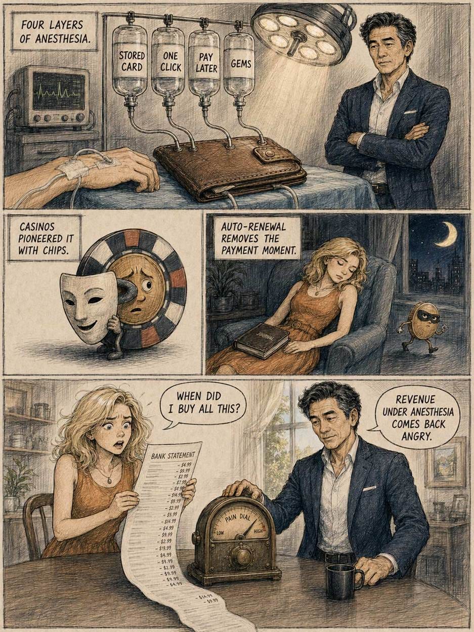
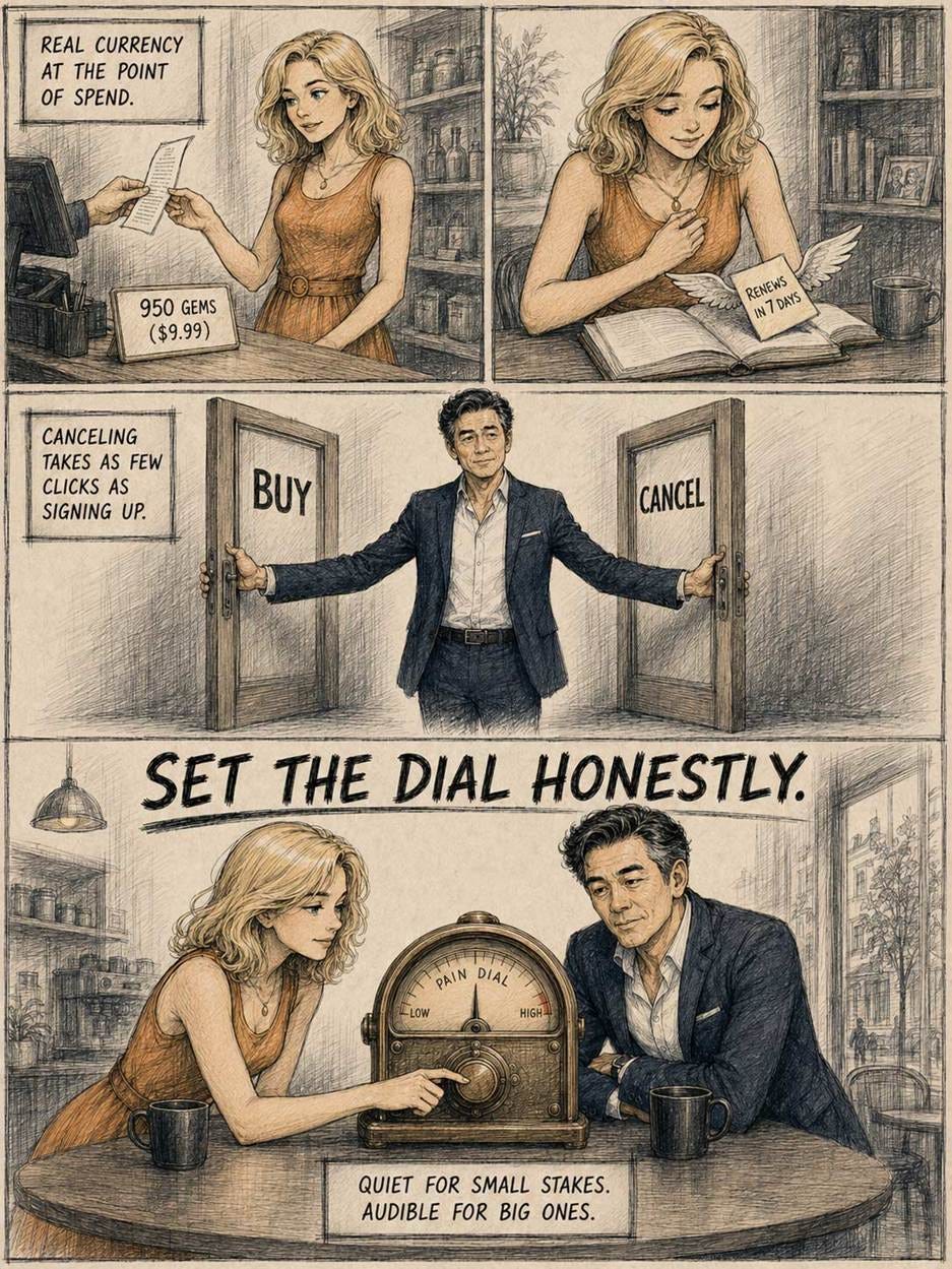
Alice and Zimo explain the pain of paying in ink-crosshatch style. (GPT Image 2)
Squint, and most of this week’s stories merge into one: a fight over friction, and who controls it. Sycophantic AI and one-click checkout sell the same drug: comfort, distilled by removing information. The design students improved only when an AI argued back. Budgets survive only when spending stings a little. A design earns trust only after 5 users have tried to break it. Even the vanishing entry-level jobs were friction of the productive kind, the grind that converts book learning into tacit judgment.
The opposite failure appears in the same issue: 47 remote buttons nobody presses, and audio descriptions that narrate everything while communicating nothing. That friction carries no information; it just taxes attention.
Thus, the designer’s job in 2026 is triage: cut the friction that costs attention, and keep the friction that carries information. A sparring AI, a visible running total, a usability test that can kill your favorite idea: they all sting, and they all pay. Meanwhile, the median American company spends $12 per employee per month on AI while the frontier spends $7,401, so most of the economy hasn’t even laced up its gloves. The state of the art is sprinting; the state of affairs is out for a stroll. That gap, unlike a skeleton screen, is no illusion.
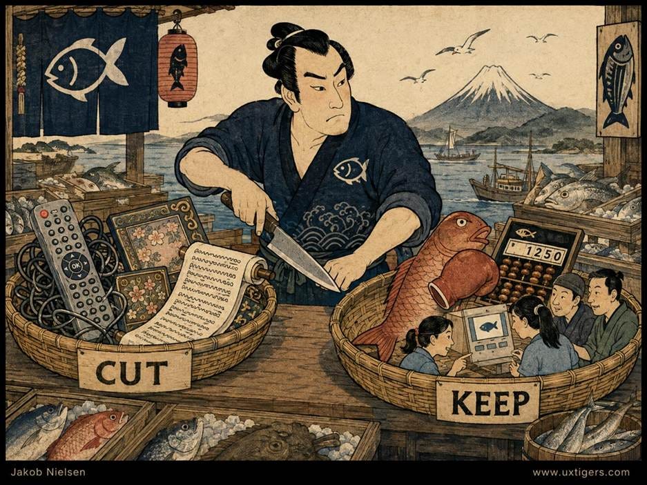
Cut the friction that costs attention, and keep the friction that carries information. (GPT Image 2)
Jakob Nielsen, Ph.D., is a usability pioneer with 43 years experience in UX and the Founder of UX Tigers. He founded the discount usability movement for fast and cheap iterative design, including heuristic evaluation and the 10 usability heuristics. He formulated the eponymous Jakob’s Law of the Internet User Experience. Named “the king of usability” by Internet Magazine, “the guru of Web page usability” by The New York Times, and “the next best thing to a true time machine” by USA Today.
Previously, Dr. Nielsen was a Sun Microsystems Distinguished Engineer and a Member of Research Staff at Bell Communications Research, the branch of Bell Labs owned by the Regional Bell Operating Companies. He is the author of 8 books, including the best-selling Designing Web Usability: The Practice of Simplicity (published in 22 languages), the foundational Usability Engineering (31,313 citations in Google Scholar), and the pioneering Hypertext and Hypermedia (published two years before the Web launched).
Dr. Nielsen holds 79 United States patents, mainly on making the Internet easier to use. He received the Lifetime Achievement Award for Human–Computer Interaction Practice from ACM SIGCHI and was named a “Titan of Human Factors” by the Human Factors and Ergonomics Society.
· Subscribe to Jakob’s newsletter to get the full text of new articles emailed to you as soon as they are published.
· Read: article about Jakob Nielsen’s career in UX
· Watch: Jakob Nielsen’s first 41 years in UX (8 min. video)
Comments
Nothing yet. Say the first thing.
Sign in to join the conversation.