
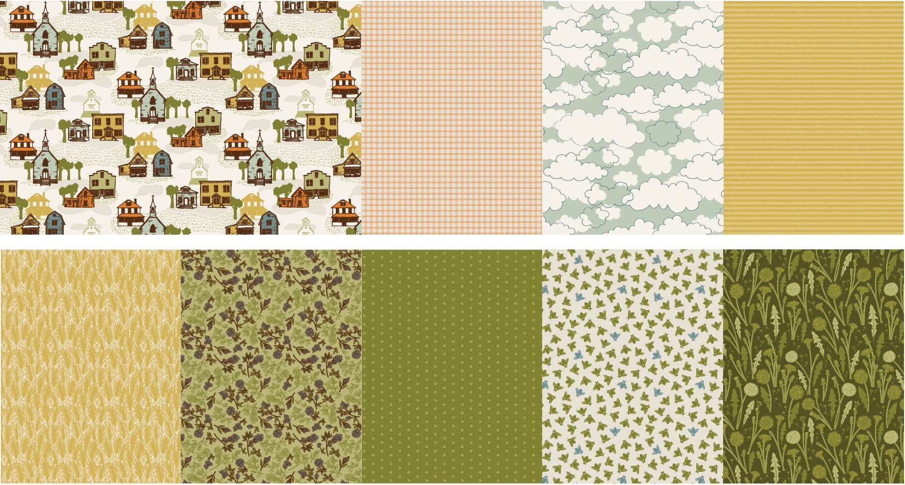
I developed the colour palette for Prairie Life by tweaking colours pulled from reference photos I took when I was visiting the town that inspired this collection last summer. It’s intended to feel nostalgic and calm.
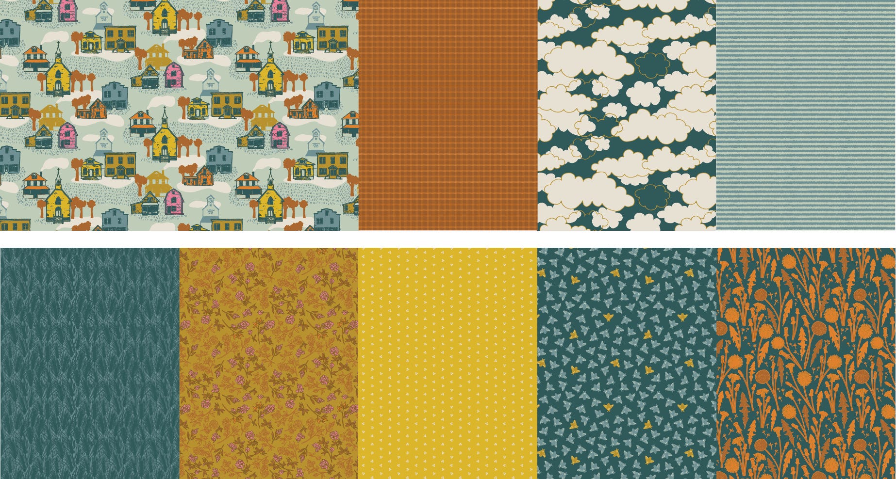
To contrast that, I wanted something darker and more vibrant for the second colourway. Each colourway has its own palette, but I kept a few of the colours consistent so patterns from both would play nicely together.
Here is the Prairie Life collection in the second colourway:
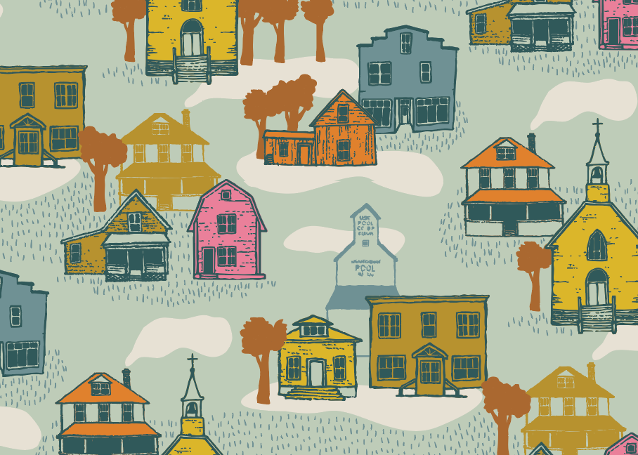
Small Town:
Grid Roads:

Big Sky:

Berry Picking:

Swaths:

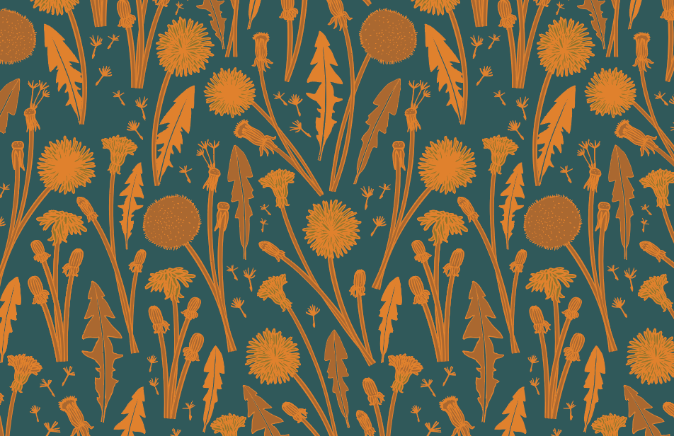
Dandelions:
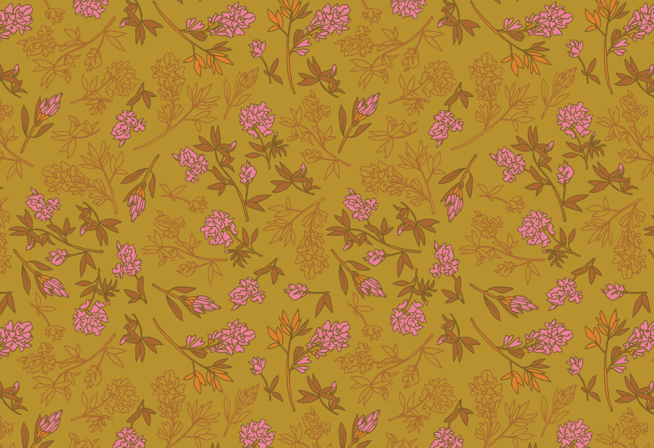
Alfalfa in Bloom:
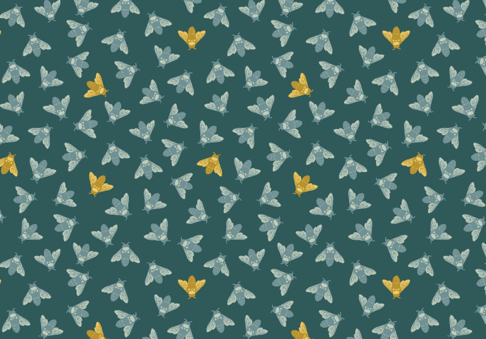
Busy Bees:
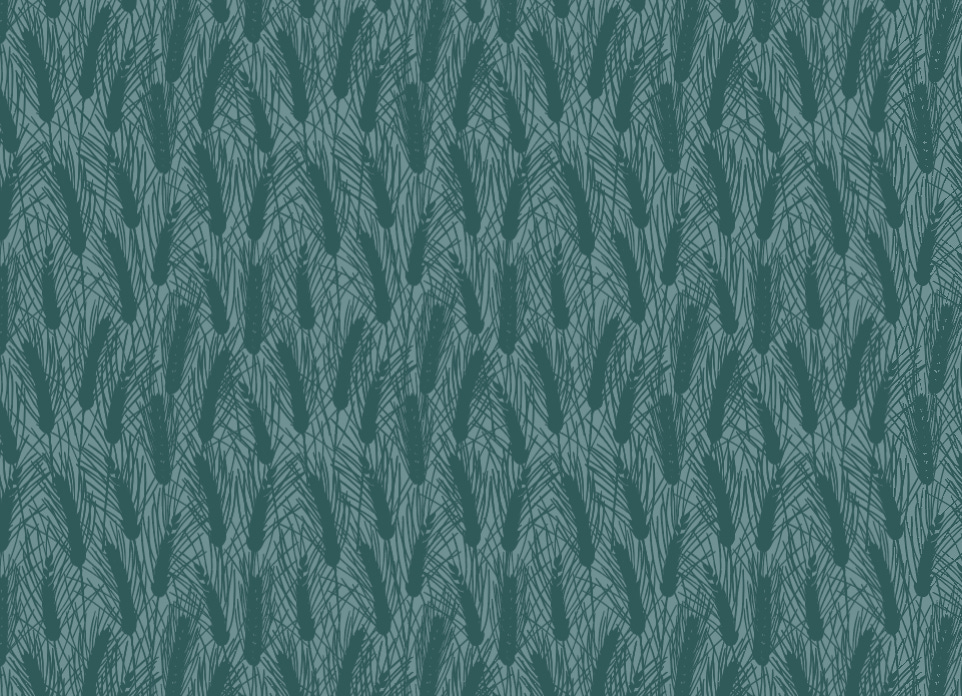
Bearded Wheat:
Comments
Nothing yet. Say the first thing.
Sign in to join the conversation.