
Are you into game design and want to discover more polished indie game user interfaces? You voted for this topic in the last article, so here we are with A look at 100% interface games!
In this article, we'll be analyzing 4 interfaces that inspire me, whether for their beauty, their richness or even their layout:
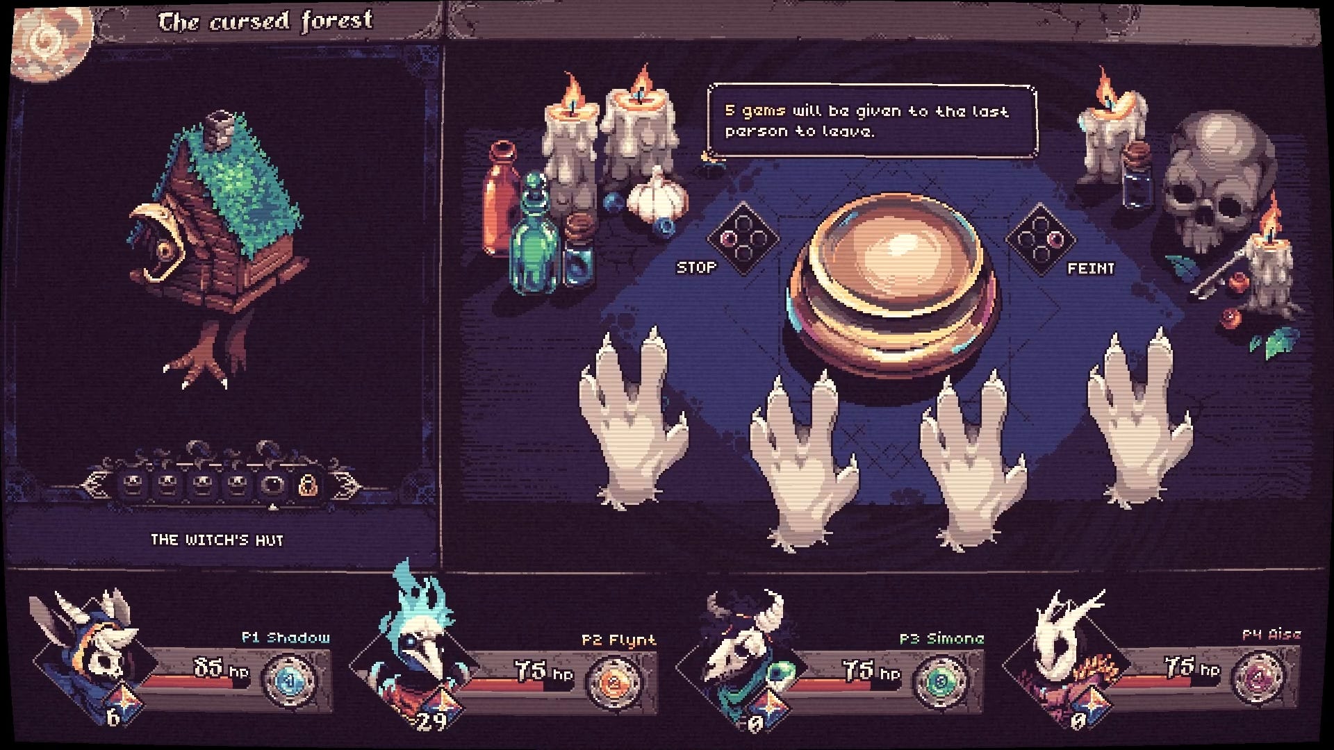
Balatro - the poker roguelike
In Other Water - an Artificial Intelligence guiding a stranded xenobiologist
Paper, Please - between duty and morality
Backpack Battles - UI as a constraint
Grab something to drink and open your wishlist page on Steam, because you don't want to miss these gems.
I've been writing about user interfaces for almost 2 years. I've been building interfaces for over 7 years. And when it came to defining what an interface is while writing this article, I drew a blank.
I did a quick search, “what is user interface design in video games? “ and the beauty of the Internet helped me find an answer:
UI design in video games refers to the visual and interactive elements that players engage with.
An answer that's wrong on so many levels. Let me explain:
Health bars are not interactive elements, but they are part of the user interface.
The user interface goes beyond visual elements alone, be they sight, sound or touch.
The user interface has a clear objective
So I turned the internets upside down, gathered sources, examined the various definitions and here's what I found:
User interface design in video games consists of elements that provide information about the state of the game and allow players to interact, ensuring that the interface is intuitive, accessible and aesthetically pleasing.
This definition is more generic and easier to understand. It also redefines the main objective of user interface design, by including the term “accessible”, which is very important to me.
If you need more advice on accessibility, my very first article talks about it: #1 - How to make our game colors accessible to everyone
If we take this Super Smash Bros Ultimate screen, by our definition, this is where the user interface is:

Which is not at all what you might think when you talk about “100% interface games”. In fact, if we talk in terms of % of screen space, there are practically no 100% interface games, because of white space (which is important, I've talked about it here).
But if we take this unknown game, called Balatro, we can see that the interface is almost everywhere.

I joke that Balatro isn't famous, the game has been a huge success since its release, I've personally played over 150+ hours of this incredible game. It's also a great source of inspiration for me when it comes to the game's feel.
Three things come to mind when you ask yourself why Balatro's interface design is so special:
It's simple - from layout to wording.
It's attractive - the visual style and colors are well designed.
And above all, it's juicy!
I'll concentrate on the last point - not that I'm not interested in the first two, but I have so much to say in this article, other games to present, and I wanted to keep it short.
Game feel (sometimes referred to as "look feel" or "game juice") is the intangible, tactile sensation experienced when interacting with video games.
If you don’t know the game, take a minute to watch this short trailer from Localthunk the developer.
Now let's analyze.
How everything is perfectly synchronized
How each animation is accompanied by a specific sfx
How these sfx are twiked according to their values
How cards react to mouse-over, when played, when adding score
How the game feels fast and responsive, yet complete at the same time
...
The list could definitely be longer, and I could dive into analyzing each item, but as always, I'm here to give you the clue so you can look for yourself.
Balatro is definitely the king of juice when it comes to independent games.
If you want to learn more about how it works, the best thing to do is download the trailer and play it in slow motion, analyzing how the sounds evolve and the animation speed of each element.
As a bonus, here's a video to show you step by step how to reproduce this sensation!
Let me introduce the 2nd game of this article, In Other Water.
Play as an Artificial Intelligence guiding a stranded xenobiologist through a beautiful and mysterious alien ocean. A non-violent sci-fi story, enter a world of wonder, fear and vulnerability, unraveling the history and ecology of an impossible planet. What will you discover together?
To be honest, I was fascinated by the design of this one.
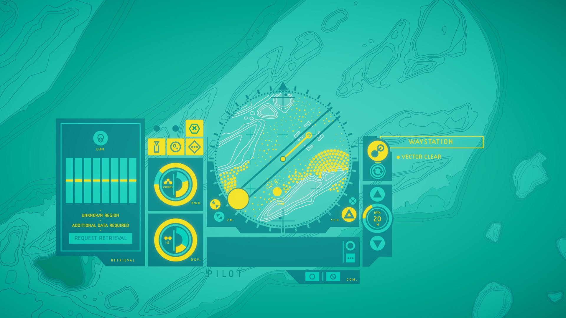
I think the use of a restricted color palette and the flat design, combined with the fact that it looks like a sci-fi interface of a spaceship, definitely made me fall in love.
Creating an interface that matches the atmosphere of your game really gives you a marketing edge. In this case, the pitch is about Artificial Intelligence, xenobiology and an alien ocean - all of which perfectly match the look of the interface.
One of the first pieces of advice I give to people wishing to make pixel art is to choose a color palette, an asset size and to be careful to keep the same ratio on each design.
Well, it's exactly the same here, with one palette, one style and one consistency throughout the game. Inevitably, this immediately gives a professional look.
If we had to pick out three tips for this game's user interface, they would be these:
Make the design of the game interface match the atmosphere of the game.
Fewer colors in our palette isn't a bad thing.
It's important to define a style and not mix everything up.
That's what we're trying to do with our game, Another Door. A lot of people talk to us about the colour palette and that's the first thing we chose when we started out!
Paper, Please is an excellent game released in 2013 (about 12 years ago, I feel old now) - which I didn't like myself, I tried it and... it wasn't for me.
If you take a look at the last review of the game (which are also extremely positive), you might find something like this:
“I let a terrorist through through border then was caught helping a resistance organization and was arrested after I shot the innocent people trying to cross the border. 10/10 game would recommend.”
And that is what the game is about: making choices. Choices based on your own needs and morality.
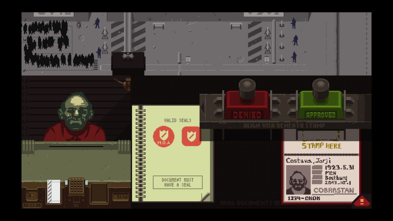
What remains from my brief experience is that interface elements play a central role in the game world. Instead of a "validate" button, we have a stamp. This stamp takes us directly back to elements of real life, just like the stamp we apply when entering a country's border.
In this interface, the UI isn't just a layer on top, a layer that allows us to perform actions and that needs to be as fluid as possible.
No. The UI is the game.
A little stamp gives an incredible sense of power and fear.
Have I made a mistake? Did I ruin an innocent life? Did I let a terrorist into the country?
Let's move on to the last game on this list, Backpack Battles. Part of the "Inventory Management Auto Battler" category, the use of the interface here is very interesting.
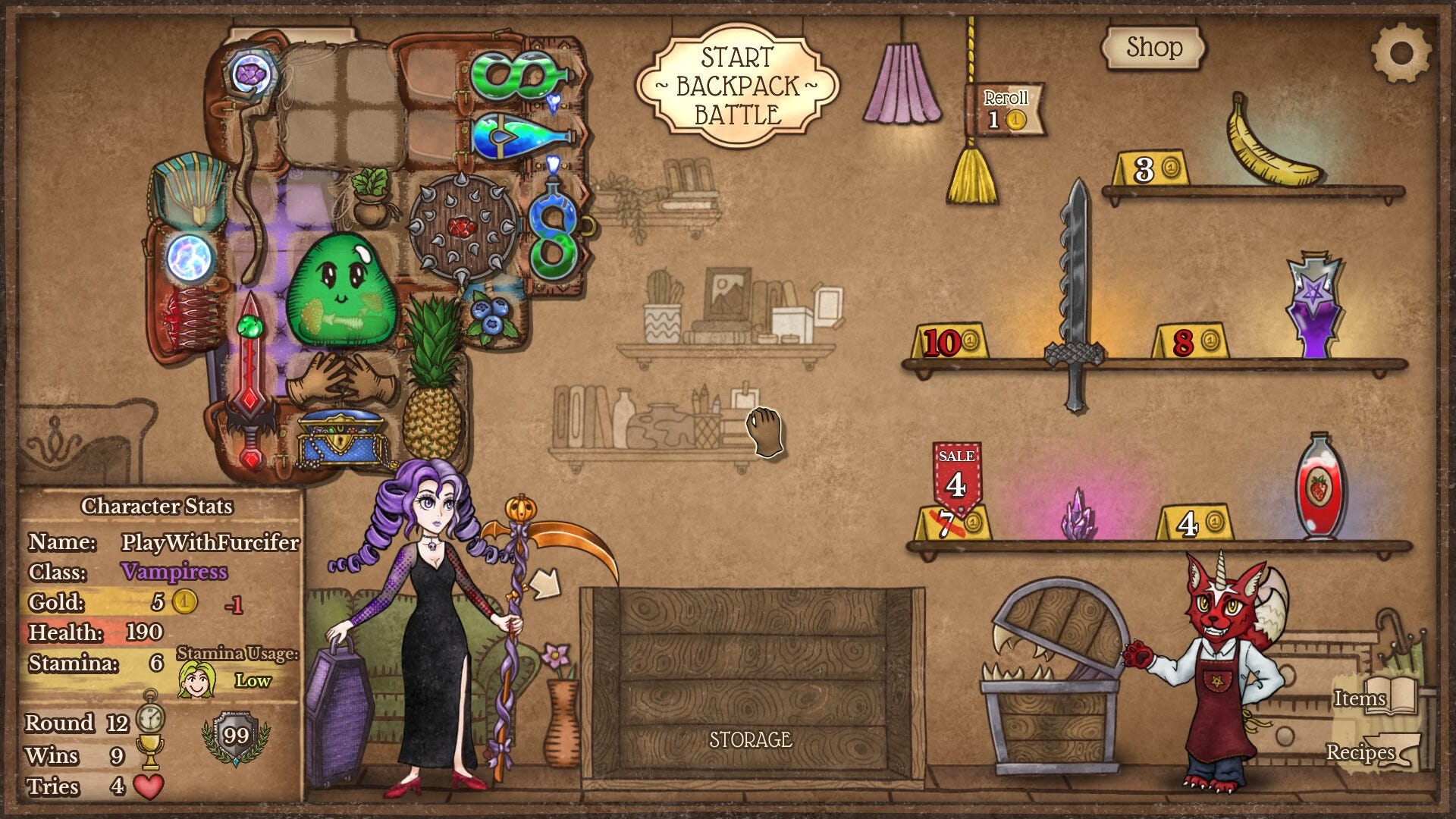
We're not faced with a story and interface elements that embrace it. We're dealing with an interface that imposes its own constraints!
In fact, the main principle of the game is to place items in your bag correctly to get the best result. Often we'll find ourselves blocked by a lack of space, and we'll have to be cunning to place what we want.
Here the UI design is more about the gameplay than the story.
Focus on 4 games with memorable UIs: Balatro, In Other Water, Paper Please and Backpack Battle. Whether it's for its game feel, its aesthetics, the fact that it embraces the story or rather the gameplay.
Turning your interface into something unique takes a lot of work - but it's bound to reward your game.
Here are 20 articles and over 30,000 words written sharing my knowledge of video games and their design.
My vision of the world hasn't changed and I still believe that education is a real world changer and should be accessible to as many people as possible, that's why I make all the newsletters I create on video game development freely available.
The financial aid I receive and which is coming to an end means that I need to find a source of income if I want to continue sharing and writing my articles as well as developing my first video game.
So I've decided to open up the newsletter to monetisation. To keep in line with my values and my idea of education, I've also decided to make all the articles, including the archives, freely accessible.
To sum up, what will this change for you? Well, nothing.
And nothing is mandatory.
Simply, if one day my articles have helped you, if you like reading me or if you share my vision of things, you can now support me via substack.
In exchange for your support and to thank you, here's what you'll get:
Future Game Discounts: Enjoy special discounts on my upcoming video games.
Early Playtest Access: Be among the first to playtest my new games and provide feedback.
If you want to support me and you can't afford a financial aid - feel free to share my article and the newsletter around!
It's a pleasure to write for you, take care.
Gitmoji - Keep your commit clean with an emoji guide.
Cursor.ai - If I don't think AI is going to replace me tomorrow, I can't do without it.
An interesting video - about how World of Warcraft icons are fading
A tutorial video - How to Set Up Steam Stats & Achievements in GameMaker
ShaderGlass - Overlay for running GPU shaders on top of Windows desktop.
Steam Revenue Calculator (chrome extension) - I still think about making one for Firefox, anyone is looking for that?
Polyglot Gamedev - Start localizing your game, using this human translated resource for the basics.
Wanderbots - Quick Reference Checklist For Contacting Content Creators.
25th ANNIVERSARY FINAL FANTASY IX - A website for the fan, I guess.
The Balatro Timeline - This is an account of everything related to Balatro development in chronological order
Steam reviews template - This little tool simplifies the creation of copy-pasta Steam reviews
KeyMailer, Lurkit, Press Engine - Three websites for developers who want to distribute their game
And that's it! I had a lot to share with you today.
Comments
Nothing yet. Say the first thing.
Sign in to join the conversation.