

There are three popular approaches to developing an Android application; you can use some cross platform framework like React Native, or you can develop a truly native application in either Java or Kotlin. In this article, we’ll explore why developing native applications in Kotlin is a great choice.
We’ll start by breaking down the difference of developing an application natively or with a framework, then we’ll explore why native development in Android is moving towards Kotlin and away from Java.
After we get an idea of why Kotlin is the go-to choice for android development, we’ll install Android Studio and develop two Android applications in Kotlin to see how they tick. A “hello world” style app where we’ll unpack the basics using a view approach, and a highly interactive app that will allow us to go in-depth with complex UIs and user interaction using the more modern Jetpack Compose approach.
Share this article with friends and colleagues
Who is this useful for? Anyone who wants to understand app development on the world’s most popular consumer operating system.

Android has been the most popular consumer operating system for nearly a decade. Source
Most of my articles are geared towards data science. However, as the industry evolves the practical application of AI in real products becomes an increasingly useful skill. I think this article is relevant to virtually anyone interested in making a substantive impact on the world through software development, regardless of your specific discipline.
How advanced is this post? This article is designed to be a first exploration into Android app development.
Prerequisites: None, though prior programming experience would be very helpful, especially if you’ve spent some time in some explicitly typed programming language (like Java), in doing web development, or preferably both.
The choice of developing an app with native tools or using a framework is a tricky first decision. It’s tricky because there’s not a correct answer, you can do virtually anything with either approach, and regardless of the approach you’ll likely find some inconveniences at some point based on your selection.
Basically, In app development there’s two schools of thought:
I can make an app once that runs everywhere
I can make an app that’s optimized for the device I’m developing for
For many applications, the first option is incredibly compelling. If you want to make an app that runs on both Android and iOS, it’d be nice if you could develop (and maintain) a single app that works on both types of devices. Frameworks like React Native and Flutter allow you to do just that.
The basic idea of frameworks is that they function as a layer of abstraction. You might develop your application in JavaScript for React Native, or perhaps in Dart if you’re using Flutter. The framework then compiles these into components which can be understood by Android and iOS.
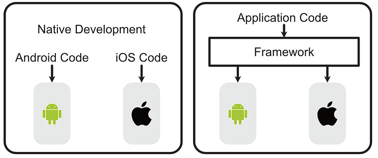
Native vs Framework based development. When using a framework you develop code for that framework, then the framework handles running that code on different device types. In native development, you develop separate applications for separate operating systems.
As you can see, there’s a layer of abstraction between the app you define and the app that actually runs on the device. This is both the blessing and the curse of frameworks.
If you’re building a simple web application, then it makes a lot of sense to use a framework. They’re as performant as native apps most of the time, require less effort to port to multiple device types, and might use approaches and programming languages that you’re familiar with outside of app development.
The abstraction of frameworks becomes less compelling if you need to interface closely with the device, however. Modern devices are complicated, and have incredibly complex APIs that are ever growing and evolving. Android and iOS devices have completely different operating systems that have different rules and constraints that a developer might need to account for.
If you have some functionality in your application that might require you to interact with a low level API on your device, perhaps to run some background task while the app is closed, interface with another device via bluetooth, do video encoding, or make some fancy widget on the OS’ main screen, you may be hard pressed to find functionality that implements that within the framework.
Cross platform frameworks do, generally, allow you to implement native modules, but these are native modules, meaning you have to implement them in the native language then bridge them with the framework. This is fine if 90% of the code can be within the framework. However, if you have an application that has a ton of OS specific functionality, the added complexity of a framework can be a big headache.
In the end there’s no one right answer. If you have a simple application that uses very little native functionality, then a cross platform framework might be a compelling choice. If your app requires heightened performance or OS specific functionality, native development may be a better choice. If you’re really serious about app development, it’s good to know both. In this article, we’re focusing on native Android development.
This one, based on my research, is not so nuanced. Native Android supports two languages; Java and Kotlin. If you can, use Kotlin. Kotlin is derivative of, similar to, and interoperable with Java, while being much less verbose and generally safer.
If you’ve ever programmed in Java, you might be familiar with its incredible verbosity. Here’s a data class in Java, for instance, which defines a User as a name and age.
public class User {
    private String name;
    private int age;
    public User(String name, int age) {
        this.name = name;
        this.age = age;
    }
    public String getName() { return name; }
    public void setName(String name) { this.name = name; }
    public int getAge() { return age; }
    public void setAge(int age) { this.age = age; }
    @Override
    public String toString() {
        return “User{name=’” + name + “’, age=” + age + “}”;
    }
}
And here’s the same data class in Kotlin
data class User(val name: String, val age: Int)Kotlin takes care of a lot of boilerplate stuff, like defining the constructor, getters, etc.
Java also has some safety concerns that some people care about. I’ll be honest, I’m a solo Python developer and cowboy coder; safety at the language level has never been something I’ve been highly resonant with. If you’re working on critical infrastructure in a large codebase, though, it’s nice for a language to help you avoid common pitfalls.
This Java code, for instance, doesn’t throw an error at compile time but does throw an error at runtime.
String name = null;
int length = name.length(); // ❌ Throws NullPointerException
In Kotlin, however, you’re forced to acknowledge that a variable can be null with ? , then do something if the value is null with ?:
var name: String? = null
val length = name?.length ?: 0
Kotlin has a few such implementation details which make the language more robust to common pitfalls. (Also, fun fact, ?: is known as an “Elvis” operator because, when viewed sideways, it resembles the top of Elvis Presley’s head)
Generally speaking I’ve seen consistent sentiment that Kotlin is superior to Java in many respects, and the sentiment that Kotlin should be adopted rather than Java in new projects seems consistent. For this reason (plus some spicy legal battles), Android has transitioned to a Kotlin first approach.
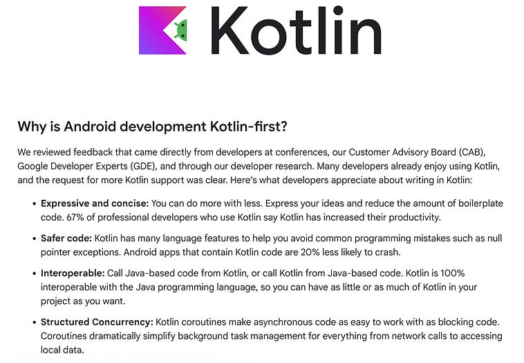
So, if you’re developing on Android, the only reason you should choose Java is if you’re working in a company that uses an overwhelming amount of legacy Java code. If not, you should probably use Kotlin.
Before we do anything, we’re going to need Android Studio installed. You can download Android studio here.
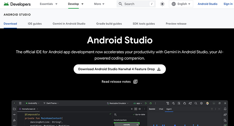
Downloading android studio, source.
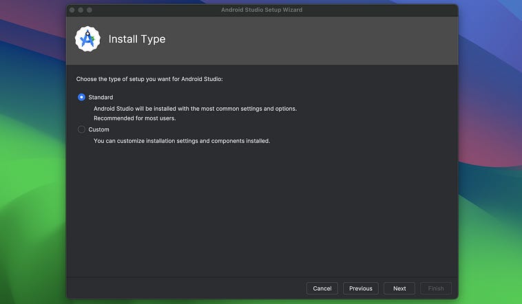
Once you download Android Studio, you should have access to an install wizard.
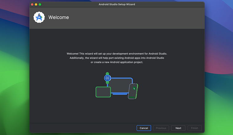
I just did the standard installation.
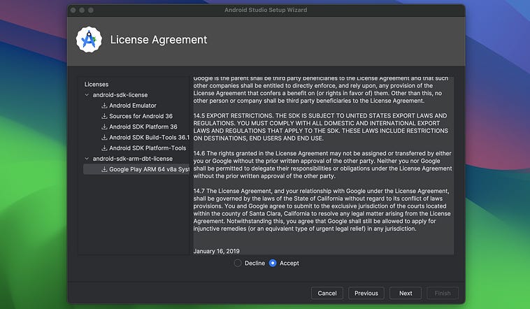
Then, once you agree to the licenses (you may need to aggrege to more than one)
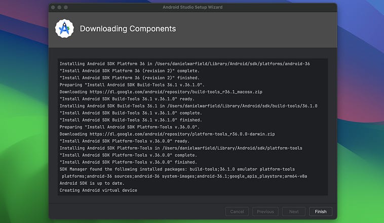
It’ll install everything.
Once it’s all said and done, and you open Android Studio, you should see something like this.
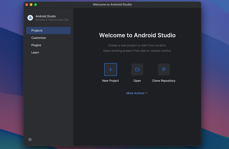
And, tadah, we can start playing around with Android app development! Before we do, though, let’s explore Kotlin by itself to get a feel for the language.
This won’t be an exhaustive exploration, but if you already have some programming experience this should teach you enough to have an idea of what’s going on in Kotlin. First we’ll setup a Kotlin project in Android Studio, then we’ll make a few basic Kotlin scripts.
Before we explore building an Android application, let’s get a handle of Kotlin in general. We can make a new project so we can start playing around.
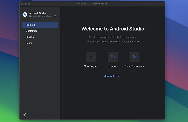
Click “New Project”
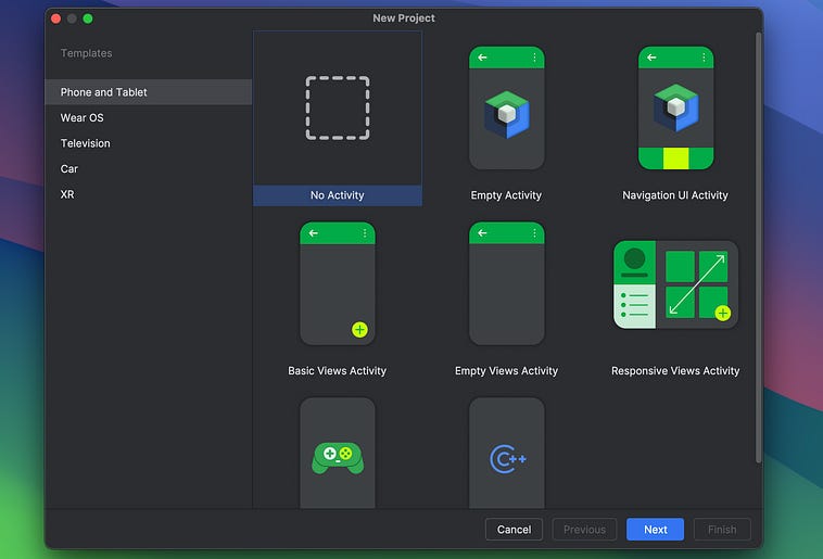
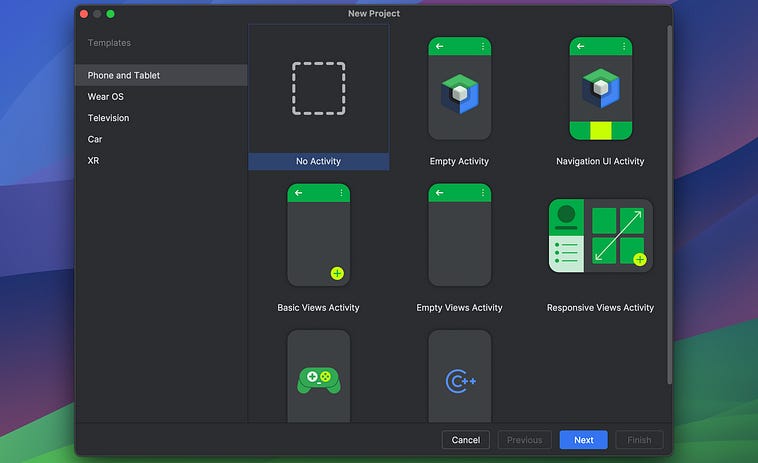
We’ll be prompted to select a template “activity”. An activity, essentially, is a single screen that allows for some type of functionality in the app. This is an app development specific concept which we’ll explore later. For now, we can select “No Activity”.
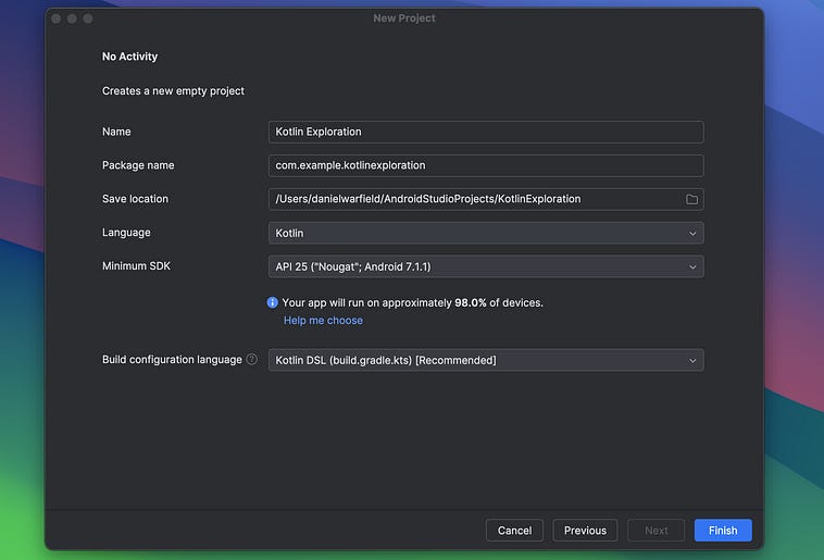
Now we can specify a Name for the Project and set the Language to Kotlin.
This will create an empty project that we can play around in.
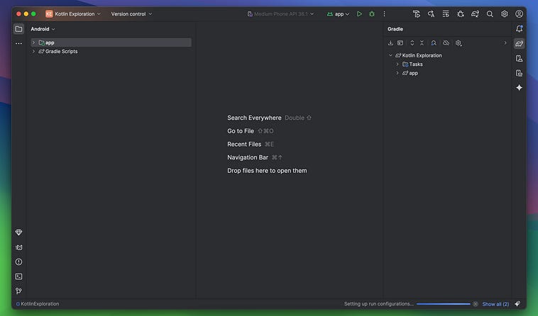
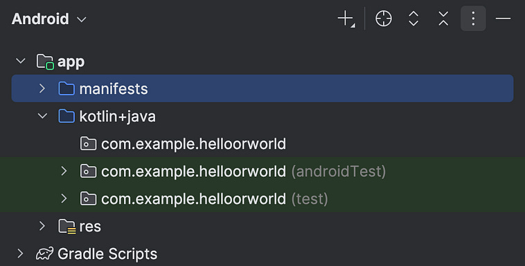
We’ll explore the folder structure of android projects in-depth. For now, though, we just need to look at the kotlin+java folder.
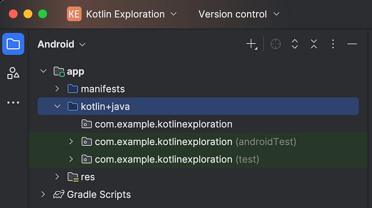
This folder contains:
com.example.kotlinexploration: The source code of an actual Android applicationcom.example.kotlinexploration (androidTest): Testing code, that can run on the Android devicecom.example.kotlinexploration (test): Testing code, that can run on your computer
We can play around with Kotlin in any of these, but for now we’ll use the first one. We can right click on com.example.kotlinexploration and create a new Kotlin file.
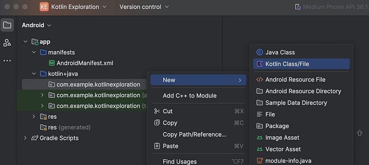
We’ll then make a new Kotlin file called helloWorld
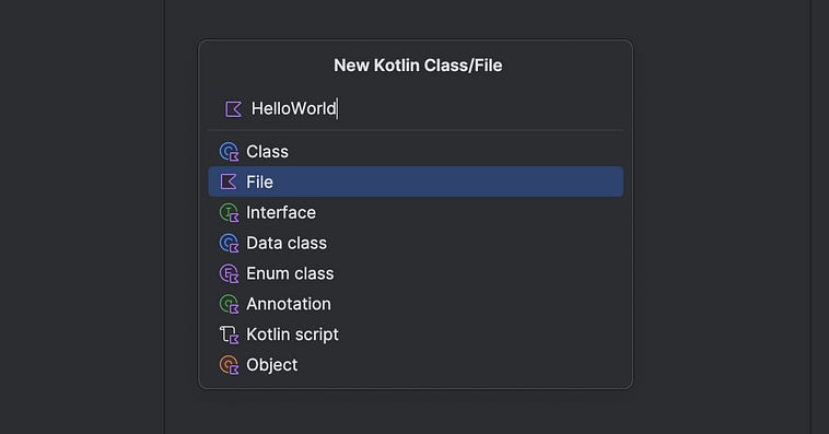
This will then open an empty Kotlin file that looks something like this
package com.example.kotlinexploration
We can then get our application to print out hello world via the following:
package com.example.kotlinexploration
fun main(){
    println(”Hello World!”)
}
We can run that code by right clicking and pressing the Run button.
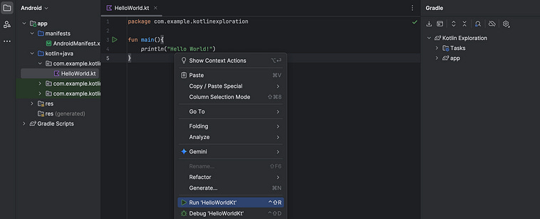
An output terminal should pop up, with the following content
“/Applications/Android Studio.app/Contents/jbr/Contents/Home/bin/java” ...
“Hello World!”
Process finished with exit code 0
Congrats, you just ran Kotlin code!
The most important thing in any programming language is to make variables. The second most important thing is to do things with those variables. The third most important thing is to see the result of what’s been done.
We can construct a variable using the var keyword, and then format that variable within a string by using $ followed by the name of the variable
fun main(){
    var name = “Daniel”
    println(”My name is $name!”)
}
My name is Daniel!In Kotlin, variables are statically typed and inferred, meaning kotlin inferrs the type of the variable upon creation and doesn’t allow you to change it later. Here, name is a string, based on how it’s originally defined, so I can’t go and set it to an integer later.
fun main(){
    var name = “Daniel”
    name = 0
}
Line 3: Assignment type mismatch: actual type is ‘Int’, but ‘String’ was expected.Kotlin has many of the usual suspects in terms of types. Strings, ints, floats, booleans, lists, etc. We’ll explore a few of them in this article.
As well as defining a variable with var, you can define a “value” with val. This is an immutable value that can’t be edited after it’s creation.
fun main(){
    val name = “Daniel”
}
If we do try to edit it, we’ll get an error.
fun main(){
    val name = “Daniel”
    name = “this throws an error”
}
Line 3: ‘val’ cannot be reassigned.Naturally, Kotlin allows us to do all the basic arithmetic one might expect from a modern programming language.
fun main() {
    val num1 = 3.1415
    val num2 = 69
    val res1 = num1 + num2
    println(”Result 1: $res1”)
    val res2 = num1 * num2
    println(”Result 2: $res2”)
    val res3 = num1 / num2
    println(”Result 3: $res3”)
}
Result 1: 72.1415
Result 2: 216.76350000000002
Result 3: 0.04552898550724638Functions are defined in Kotlin in the following way
fun add(a: Int, b: Int) = a+b
fun main(){
    println(add(1,2))
}3add is a single line function, allowing one to construct a function as being equal to some simple one-line expression.
main, as you might know from other programing languages, is itself a function. It accepts no inputs, and is used as an entry point in Kotlin to run your code.
We can define our own, more complex multi-line functions like so
data class ArithmaticResult(val sum: Double, val product: Double)
fun calculate(a: Double, b: Double): ArithmaticResult{
    val sum = a+b
    val product = a*b
    return ArithmaticResult(sum, product)
}
fun main() {
    val (s, p) = calculate(5.0, 10.0)
    println(”Sum: $s, Product: $p”)
}
Sum: 15.0, Product: 50.0Here, the function calculate takes in two inputs, a and b, and outputs the result of adding and multiplying them together.
Because Kotlin is a statically typed language, we need to specify the types of outputs we will be providing. We do that by defining the “data class” ArithmaticResult. This class contains a sum which is a Double, and a product which is also a Double.
when we call val (s, p) = calculate(5.0, 10.0), we’re unpacking the attributes of the resulting ArithmaticResult in order to the values s and p. If we wanted to be a bit more explicit, we could code the same thing like this.
data class ArithmaticResult(val sum: Double, val product: Double)
fun calculate(a: Double, b: Double): ArithmaticResult{
    val sum = a+b
    val product = a*b
    return ArithmaticResult(sum, product)
}
fun main() {
    val result = calculate(5.0, 10.0)
    val s = result.sum
    val p = result.product
    println(”Sum: $s, Product: $p”)
}
Here, we’re explicitly extracting the sum and saving it to s, and the product and saving it to p.
data classes, which we previously discussed, are a particular flavor of “class”, a class being that famous object-oriented paradigm of marrying data with some functionality.
Here’s a simple implementation of a box:
class Box(val width: Double, val height: Double) {
    fun area(): Double = width * height
    fun perimeter(): Double = 2 * (width + height)
    fun isSquare(): Boolean = width == height
    fun scale(factor: Double): Box = Box(width * factor, height * factor)
     override fun toString(): String =
        “Box(width=$width, height=$height, area=${area()}, perimeter=${perimeter()})”
}
As you might observe, a Box is defined as a width and a height , and has certain functions defined within it. You can calculate the area, perimeter, evaluate if it’s a square or not, get a new box that’s the same as if this box was scaled by some scaling factor, and turn the box into a string.
You might notice, the toString function has an override. This is required because every new class in Kotlin inherits from the Any class. This is an arbitrary class that defines some basic functionality that any class has. Turning the class into a String is one such piece of functionality. If we want to implement a custom toString function, we need to override the original defined in the Any class.
We can go ahead and do stuff with this class
fun main() {
    val box = Box(5.0, 3.0)
    println(”Attributes:”)
    println(”Width: ${box.width}, Height: ${box.height}\n”)
    println(”toString result:”)
    println(”$box\n”)
    println(”Function result:”)
    println(”Is square? ${box.isSquare()}\n”)
    println(”Function result:”)
    val biggerBox = box.scale(2.0)
    println(”$biggerBox\n”)
}
Attributes:
Width: 5.0, Height: 3.0
toString result:
Box(width=5.0, height=3.0, area=15.0, perimeter=16.0)
Function result:
Is square? false
Function result:
Box(width=10.0, height=6.0, area=60.0, perimeter=32.0)Here, you can see that because we implemented a toString function, each box instance is nicely printed out. We are computing things like area and perimiter each time those values are queried, though. If we wanted to pre-compute those values, we could do it at initialization like so:
class Box(val width: Double, val height: Double) {
    val area: Double
    val perimeter: Double
    val isSquare: Boolean
    init {
        area = width * height
        perimeter = 2 * (width + height)
        isSquare = width == height
    }
    fun scale(factor: Double): Box = Box(width * factor, height * factor)
    override fun toString(): String =
        “Box(width=$width, height=$height, area=$area, perimeter=$perimeter)”
}
Here, area, perimeter, and isSquare are defined as immutable attributes. We declare that they exist at the top of the class definition, then actually define their value within the init block.
Just like how Box inherits functionality from the default Any class, we can make a new class called Square that inherits from the Box class
class Square(side: Double) : Box(side, side) {
    val sideLength = side
    override fun toString(): String =
        “Square(side=$sideLength, area=$area, perimeter=$perimeter)”
}
Here, we’re saying that Square inherits from Box with the : symbol in the class definition, and that a Square is a Box where both width and height are equal to side.
Square, because it inherits from Box, Inherits all the same initialization logic and attributes like area, perimeter, and isSquare, while adding a new attribute called sideLength and overriding the toString function with one that’s more appropriate for a square.
Classes, and logic around classes, is a massive topic with a lot of subtlety. We’ll refine our understanding of this topic as necessary as we progress.
Similarly to other languages, if statements can be complex multi-line expressions
fun main(){
  val score = 85
  if (score > 90) {
      println(”Excellent!”)
  } else if (score > 70) {
      println(”Good job!”)
  } else {
      println(”Needs improvement.”)
  }
}
Good job!or simple in-line expressions used to, for instance, assign a value to a variable.
String hotString = if (temperature > 30) “Hot” else “Not Hot”Kotlin also has some pretty fancy functionality for multi-line if statements used in assignment. Notice how the value of the assignment is in the last line of each block, but other code is able to execute in the interim.
fun main(){
 val weatherDescription = if (temperature > 40) {
        println(”It’s extremely hot!”)
        “Scorching”
    } else if (temperature > 25) {
        println(”Warm day detected”)
        “Warm”
    } else {
        println(”Cool weather”)
        “Cool”
    }
    println(”Weather: $weatherDescription”)
}
Warm day detected
Weather: WarmKotlin has a very unique approach to scoping, which we’ll explore throughout the article. It can be counterintuitive if you’re not familiar with it, but very useful when developing complex apps.
When statements (which are similar to switch statements in some other languages) are a convenient way to chain numerous logical cases together.
val day = 3
when (day) {
    1 -> println(”Monday”)
    2 -> println(”Tuesday”)
    3 -> println(”Wednesday”)
    4 -> println(”Thursday”)
    5 -> println(”Friday”)
    6, 7 -> println(”Weekend!”)
    else -> println(”Invalid day”)
}
Also, like if statements, you can use when statements to do assignment.
val day = 3
val message = when (day) {
    1 -> “Monday”
    2 -> “Tuesday”
    3 -> “Wednesday”
    4 -> “Thursday”
    5 -> “Friday”
    6, 7 -> “Weekend!”
    else -> “Invalid day”
}
println(message)
Like other languages, When statements are functionally similar to If statements, but are a matter of convenience when many cases need to be covered.
Kotlin allows you to define either an immutable list, which can’t be changed after creation.
val fruits = listOf(”apple”, “banana”, “cherry”)
println(fruits[0])
println(fruits.size)
println(”banana” in fruits)
apple
3
trueor a mutable list, which can be modified after creation.
val numbers = mutableListOf(1, 2, 3)
numbers.add(4)
numbers.remove(2)
println(numbers)
[1, 3, 4]You might notice that we’re modifying numbers despite numbers being defined as a val . This might seem strange to some; as you might recall, we use val to set immutable values, while we use var to specify mutable variables.
If you’re familiar with lower level languages like C, you might know that the value numbers is actually a pointer to the list in memory, not the actual list itself. thus, even when we modify the values within the list, we’re not modifying the pointer to the list, which is what the actual value numbers represents. Thus, even though a list is mutable, we can assign its reference to an immutable val. This happens a lot in strongly typed languages, You might have an immutable reference to a mutable object. In other words, you can’t change which object a val references, but you might be able to change the data contained in the thing the val references.
We can iterate over lists element by element
for (fruit in fruits) {
    println(”I like $fruit”)
}
I like apple
I like banana
I like cherryWe can also add indexes into the iteration by employing the withIndex method.
for ((index, fruit) in fruits.withIndex()) {
    println(”${index + 1}. $fruit”)
}
1. apple
2. banana
3. cherryKotlin also has while loops, which one might expect.
var count = 3
while (count > 0) {
    println(”Countdown: $count”)
    count--
}
Countdown: 3
Countdown: 2
Countdown: 1If we want to do an iteration some number of times, or over some range of values, we can use ranges:
for (i in 1..5) print(”$i “)1 2 3 4 5 .. is the “range” operator, and allows you to specify a range of numbers between two numbers inclusively.
The range operator assumes an ascending order, but we can flip the order by using the downTo operator
for (i in 5 downTo 1) print(”$i “)5 4 3 2 1 If we don’t want the range operator to be inclusive (for instance, when iterating over indexes in a list based on the lists size). we can use the until operator.
for (i in 0 until 5) print(”$i “)0 1 2 3 4 You can also dictate the step size of a range.
for (i in 1..10 step 2) print(”$i “)1 3 5 7 9 A common application of iteration is to apply some function to each element in a list. This might be done for performing actions, filtering the list, or modifying the elements in that list. Each of these can be done with lambda functions, which are simply custom functions which one defines for the purposes of a single iteration.
val fruits = listOf(”apple”, “banana”, “cherry”)
fruits.forEach { println(it.uppercase()) }
APPLE
BANANA
CHERRYthe forEach function tells Kotlin we want to apply some function to each element in a list, and it (meaning “iterator”) is automatically assigned to hold the value of each element in the list throughout iteration. the function println(it.uppercase()), specified between the two curly brackets, is then applied to each element in the list.
If you weren’t happy with it, you can assign a variable name like so.
fruits.forEach { fruit -> println(fruit.uppercase()) }You can also use functions like forEachIndexed to do a similar thing, but specifying the name of both the index and iterable
fruits.forEachIndexed { index, fruit -> println(”${index + 1}. $fruit”)}If the llambda function returns a boolean function, you can use filter rather than forEach. This returns a new list, consisting of each element that evaluated as true.
val fruits = listOf(”apple”, “banana”, “cherry”)
val longNames = fruits.filter { it.length > 5 }
longNames.forEach { println(it) }
banana
cherryYou can also use map to return a new list that’s the result of applying the llambda function to each element.
val fruits = listOf(”apple”, “banana”, “cherry”)
val shout = fruits.map { it.uppercase() }
shout.forEach { println(it) }
APPLE
BANANA
CHERRYAs we discussed previously, explicitly handling null values is one of the things that makes Kotlin attractively robust.
By default, variables cannot hold null values
var name: String = “Daniel”
// name = null   // ❌ Compile-time error
To be able to hold null values, ? needs to be added explicitly.
var nickname: String? = “Dan”
nickname = null   // ✅ Allowed
In most languages, if a String was defined as null, trying to get its length would result in an error at runtime. However, ?. can be used in Kotlin to safely evaluate potentially null variables. If the variable exists, then the length will be retrieved. If the variable is null, the ?.length returns null.
var nickname: String? = null
println(nickname?.length)nullIf you’re trying to assign a variable that can be null, to a variable that can’t be null, you can use the Elvis (?:) operator to assign a default value for null
val length = nickname?.length ?: 0Typically, you must use these safe evaluators for varaibles that can be null, with a major exception being smart casting.
Take this code, for example. It doesn’t work because I can’t assign a String? to a String.
var nickname: String? = “Dan”
var notNullNickname: String = nickname
Initializer type mismatch: expected ‘String’, actual ‘String?’.However, if I create an if statement which checks if nickname is not null, then I can assign nickname as a string.
var nickname: String? = “Dan”
var notNullNickname: String
if (nickname != null) {
    notNullNickname = nickname
} else {
    notNullNickname = “was null”
}
println(notNullNickname)DanThis happens because Kotlin can smart cast null enabled variables intelligently based on surrounding logical components. Because I’m checking if nickname != null, it’s impossible for nickname to be null when I assign notNullNickname = nickname. Thus I don’t have to do any special null handling. This is called “smart casting”.
Now that we have a working understanding of Kotlin, we can start applying it to Android app development. We’ll be building a few simple apps throughout this article, but before that let’s take a moment to cover some fundamental Android concepts.
For those of you who know a thing or two about Android app development, we’re going to start our exploration by way of views, then move onto Jetpack Compose later in the article.
Possibly the most fundamental idea in Android is that of “Activities”. Loosely speaking, a single screen within your application. You might have several “activities” in your application, for instance:
a login activity
a content browser activity
a chatroom activity
Each Activity is a self-contained unit responsible for drawing its UI and handling user input.
A view is an atomic component within your app. Buttons, text fields, images, switches, progress bars; These are all “views”.
What characterizes a view is that it:
occupies some bounding box on the screen
knows how to draw itself
knows how to react to user input
It’s often useful to group these views together. For instance, you might imagine a chat app with a text field and a send button. For this type of functionality, “view groups” exist. A ViewGroup is a special kind of View that can contain other Views.
A fragment, is, essentially a reusable mini activity that can live within an actual activity. In other words, they’re like a window within your screen which can be re-used throughout the application.
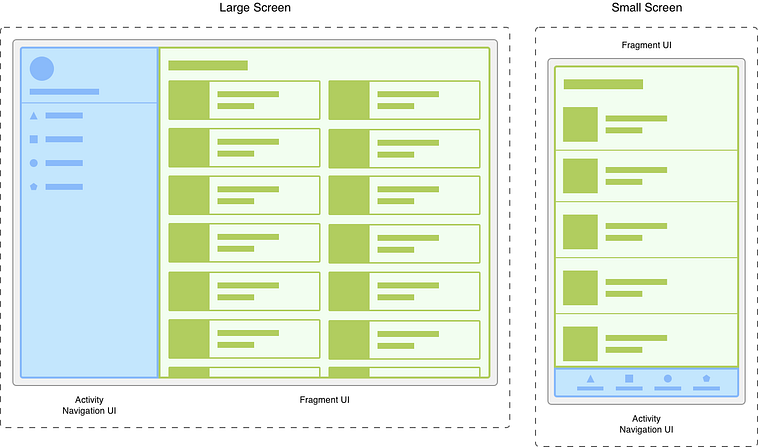
In this particular example, a scrollable content browser is implemented as a fragment within an application. This is useful because it allows app developers to implement this major piece of functionality in a way that can be copied throughout the application. Source.
A service is, essentially, code that you can register to the device that isn’t directly tied to your application. It’s used for tasks that need to keep running even when the user isn’t actively using your app, like:
Playing music while the user opens another app
Downloading files in the background
Syncing data periodically
Tracking location continuously
Activities, views, fragments, and services follow a “lifecycle”, meaning a they have a predefined set of events that can happen to them.
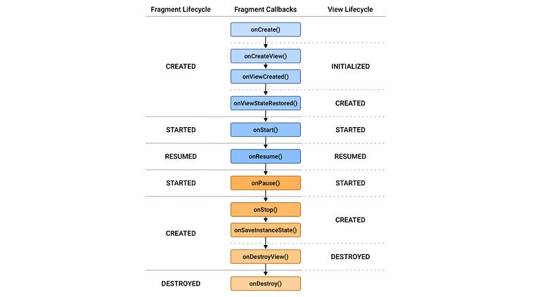
An example of callbacks which can be used based on the various states of both fragments and views. These represent the possible “lifecycle” of fragments and views. source.
It’s common to add listeners which execute functions at certain points within the lifecycle of a particular element.
Intents are like messengers within Android, allowing different pieces of an app, or even different apps, to communicate with one another. Generally speaking, intents are divided into two categories:
explicit intents: When you want to do something fully defined, like navigating from one activity to another activity within the same app
implicit intents: When you want to do something, like open a website in a web browser, but you’re not sure what the users default browser is.
There’s a lot more to Android development than what was just covered here, but I wanted to cover the lions share of the core ideas as simply as possible.
The best way to begin is by beginning. Let’s make a simple app! In doing so, we’ll explore some other core Android app development ideas as we go.
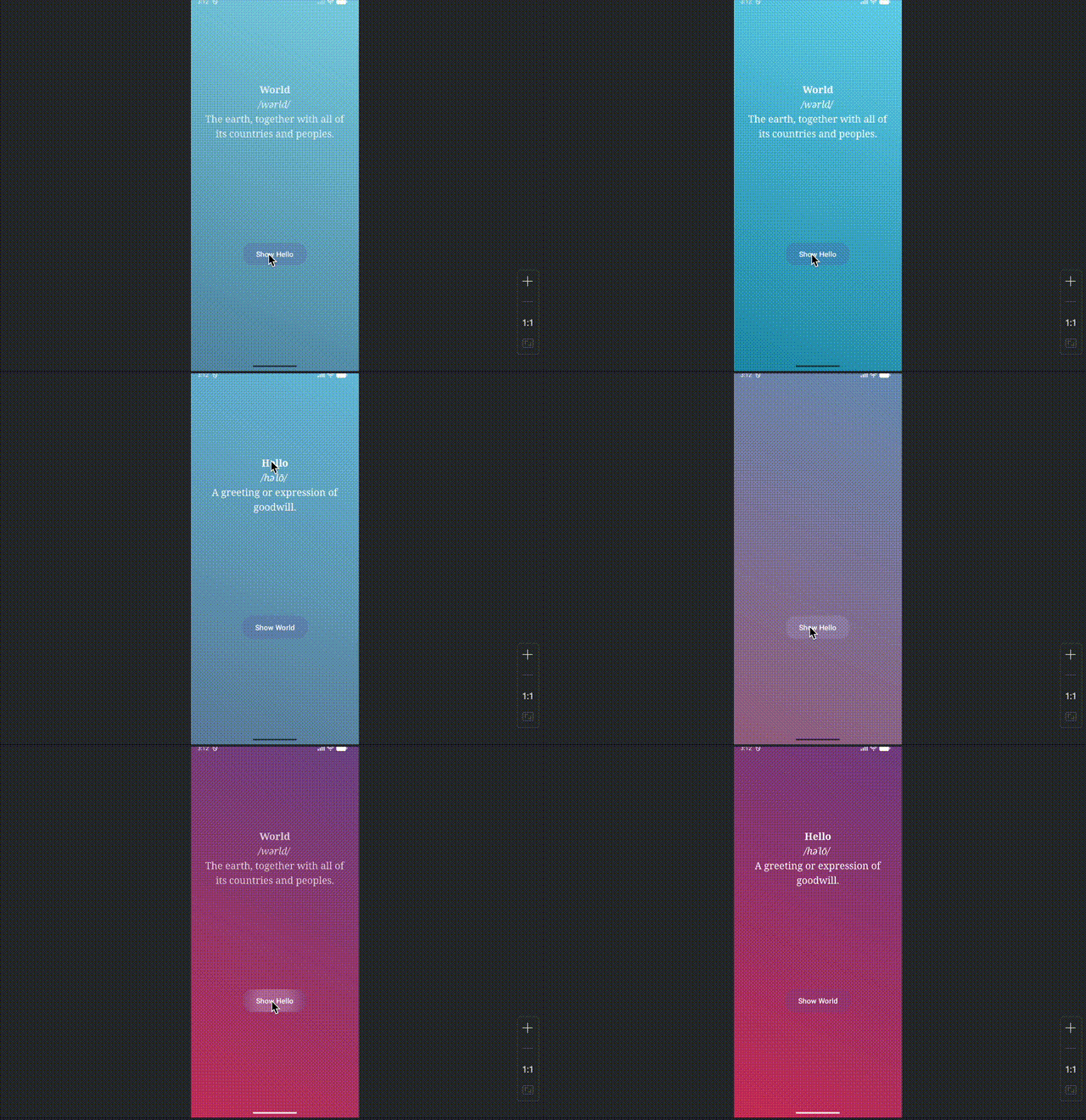
Let’s start with something simple, but not so simple that we can’t learn a thing or two. This app will consist of two screens; a “hello” screen and a “world” screen. Each screen will have the definition of its respective word, as well as a button to switch to the other word.
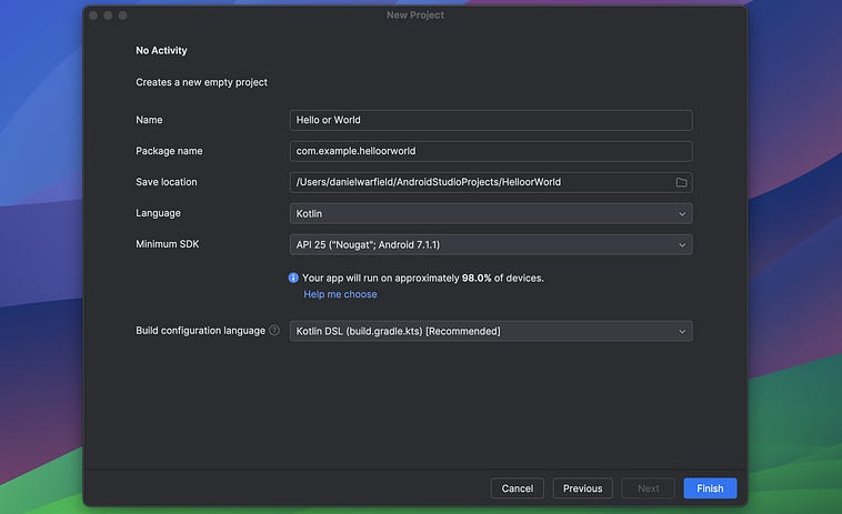
We’ll start by hopping into Android studio and making a new project. We’ll start off with a blank template (No Activity) for this one.
I called this project Hello or World in plain english. This defines the actual name of the app as it would appear on the app store. The package name and save location are automatically updated based on the name I specified. Otherwise I’m just using defaults.
We covered the folder structure of an Android project briefly, but now that we’re making an actual app let’s go a bit more in-depth.
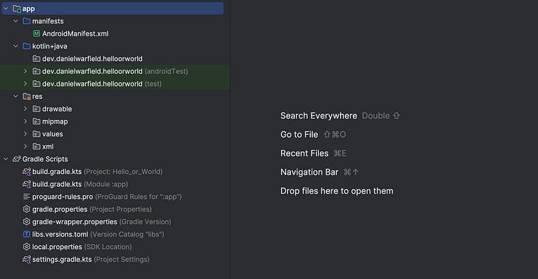
There are two folders in our project, the app folder and the Gradle Scripts folder.
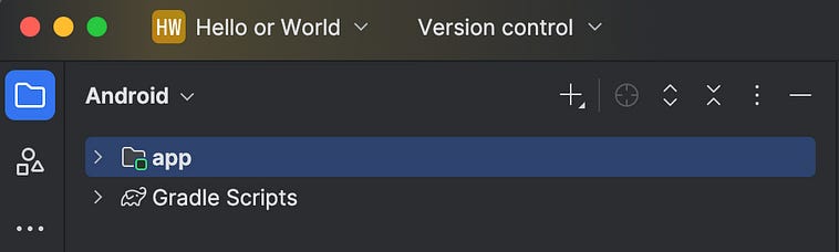
The app folder contains all of the code and assets used to define the app. The Gradle Scripts “folder” isn’t actually a folder at all, but a convenience of Android Studio. Gradle is the build system Android Studio uses to actually turn your code into a functioning app, and the Gradle Scripts “folder” contains the files one might need to access to configure how the app gets built. First, let’s unpack the app folder, then we’ll go back to exploring Gradle.
The app folder contains the following:
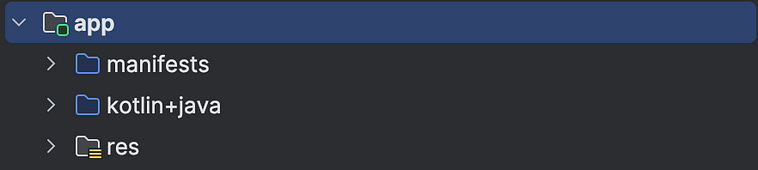
The manifests folder currently contains a single file, called AndroidManifest.xml
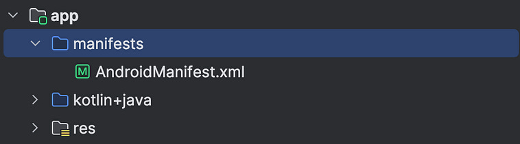
A “manifest” file contains key information used to register your application with the device. We can open up AndroidManifest.xml and see the following
<?xml version=”1.0” encoding=”utf-8”?>
<manifest xmlns:android=”http://schemas.android.com/apk/res/android”
    xmlns:tools=”http://schemas.android.com/tools”>
    <application
        android:allowBackup=”true”
        android:dataExtractionRules=”@xml/data_extraction_rules”
        android:fullBackupContent=”@xml/backup_rules”
        android:icon=”@mipmap/ic_launcher”
        android:label=”@string/app_name”
        android:roundIcon=”@mipmap/ic_launcher_round”
        android:supportsRtl=”true”
        android:theme=”@style/Theme.HelloOrWorld” />
</manifest>
The first line is probably the most complicated.
<manifest xmlns:android=”http://schemas.android.com/apk/res/android”
    xmlns:tools=”http://schemas.android.com/tools”>
This is boilerplate, and for the vast majority of apps will never change. This defines two namespaces android and tools. android exposes key android attributes like android:label , android:theme, and android:permission which is used later in the manifest. tools exposes fancy developer tooling that can be used in Android Studio.
Then there’s this, which is also provided by default.
  <application
        android:allowBackup=”true”
        android:dataExtractionRules=”@xml/data_extraction_rules”
        android:fullBackupContent=”@xml/backup_rules”
        android:icon=”@mipmap/ic_launcher”
        android:label=”@string/app_name”
        android:roundIcon=”@mipmap/ic_launcher_round”
        android:supportsRtl=”true”
        android:theme=”@style/Theme.HelloOrWorld” />
This defines the app-wide settings the application can use.
android:allowBackup - Lets the system back up your app’s data to the user’s Google account.
android:dataExtractionRules - Points to an XML file defining what data can be transferred or restored.
android:fullBackupContent - Specifies which files are included or excluded from full backups.
android:icon - Sets the main launcher icon shown on the home screen and app list.
android:label - Defines the app’s display name visible to users.
android:roundIcon - Provides a round version of the app icon for compatible launchers.
android:supportsRtl - Enables layout mirroring for right-to-left languages.
android:theme - Sets the global visual theme (colors, typography, style) for the app.
There’s a bunch of other things that could be added here, it’s worth giving them a skim if you’re interested. Besides application, there are several other tags that can be added to the manifest:
<uses-permission> - Declares what permissions your app needs (e.g., internet, camera, location).
<uses-feature> - Lists hardware or software features your app depends on (e.g., camera, GPS).
<queries> - Specifies which external apps or intents your app can look up or interact with.
<permission> / <permission-group> - Defines custom permissions that other apps must request to interact with yours.
...
That’s just a subset. There’s a lot. There’s too much to go through in depth, nor do I think it’s necessary. As long as you know what the manifest file is about, you can search for how “feature x” or “permission y” might be configured based on your specific needs. For now, it’s enough to understand that the AndroidManifest file is used to configure how your app interacts with the phone, which we’ll explore more later.
As previously mentioned, the kotlin+java folder is where our actual app code exists.
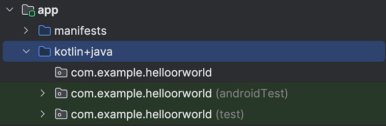
immediately, we have some strangely named folders. The name of these folders comes from a Java convention, where folders have a “reversed domain name structure”, for some esoteric reason I have no interest in understanding. Basically these are like a domain name but backwards.
helloorworld.example.com.com on the internet was defined from the word commercial, and is a web naming convention. However, in Java, this doesn’t have to be a valid url, it’s just for naming. The idea is that you might tie this to a url you have access to. For instance, I own danielwarfield.dev, so I might use
dev.danielwarfield.helloorworldIf I was google, and I was developing a series of android example apps, I might use something like
com.google.androidexamples.exampleapp1
com.google.androidexamples.exampleapp2
com.google.androidexamples.exampleapp3
The important thing is that, across all developers on the google play store, these are uniquely defined. You can name your app whatever you want when you’re developing locally, but when you publish to the app store there can never be more than one dev.danielwarfield.helloorworld. Google does enforce this upon uploading to the app store, so if I published an app like com.facebook.totalylegitapp facebook could then submit a complaint to Google and they’d take down the app, likely marking me as fraudulent in the process.
I can go ahead and change this to something like dev.danielwarfield.heloorworld by right clicking on the root folder appand clicking Open Module Settings
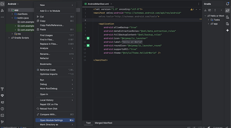
I can then navigate to the Default Config tab and change the Application Id
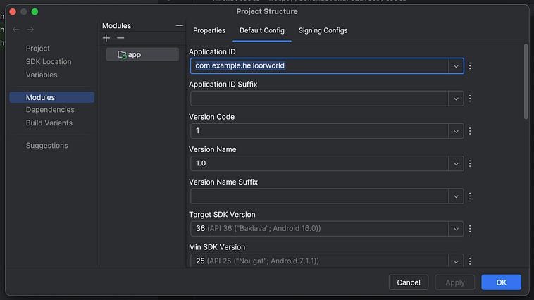
I renamed this to dev.danielwarfield.helloworld and… The folders didn’t change. Instead, this applicationId down in build.gradle.kts changed.
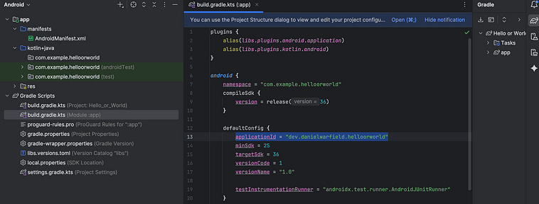
That’s because there’s actually two things that define the name of our app, the Package Name and Application ID. These used to be the same thing, but are now decoupled. Previously I was talking about how this reversed URL convention is important for ensuring that an app is unique on the app store. That’s relevant to the Application ID, which can’t be changed once an app is published. If you change the Application ID , you’re publishing a completely new app.
The Package Name, on the other hand, is for organizing your code. For instance, you might have different flavors of your app, like for free, paid, and debug. You could create different Package Names, but within the same Application ID
dev.danielwarfield.helloworld.free
dev.danielwarfield.helloworld.paid
dev.danielwarfield.helloworld.debug
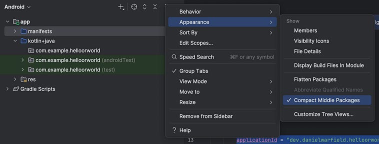
Despite the Package Name having no real bearing, it’s probably a good idea for us to rename it so it matches with the Application ID we previously defined. To rename our package, first click these three dots up at the top right of the file browser
Then, deselect Compact Middle Packages
This will allow us to see the entire folder structure without intermediary folders being collapsed.
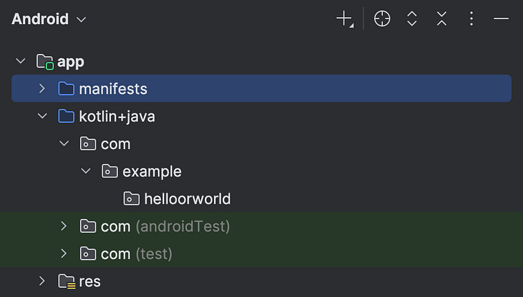
We can then right click on the com folder, select Refactor, then select Rename...
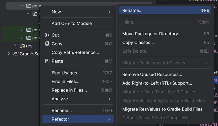
we can then click “All Directories”,
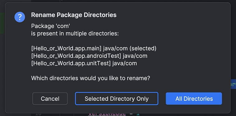
Then I’ll rename com to dev and press “Refactor”
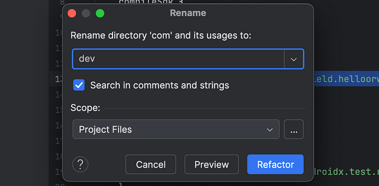
I’ll then do the same thing with example, renaming it to danielwarfield. I can then re-enable the Compact Middle Packages setting, and voila; our Package Name is renamed to be inline with our Application ID.
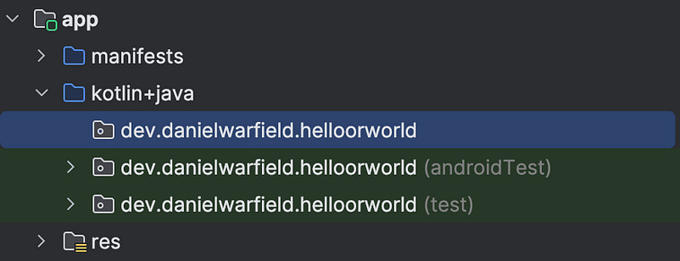
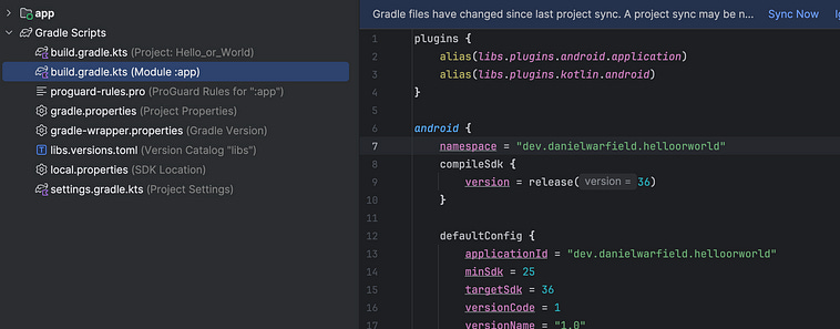
We don’t have any code, but if we did, using refactor would automatically update our code. It doesn’t automatically update our build script (which we’ll be exploring in a bit) so hop into build.gradle.kts (module :app) and update the namespace
I’ve noticed, when refactoring the app name in Android Studio, it’s pretty common for the change not to propagate to everywhere it’s supposed to. I recommend settling on a name ASAP so you don’t have to go around chasing this in a fully developed app.
Otherwise, there’s the resources folder. We don’t have to go through each of these one by one. Basically, the resources folder is where you put everything that isn’t code.
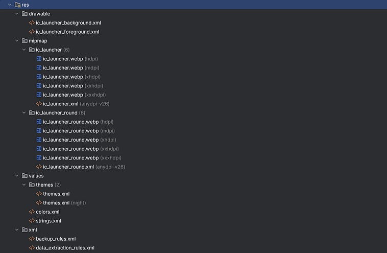
Some common subfolders are
layout/ — UI layout XML files (screens, fragments, dialogs)
drawable/ — Images, vector icons, and shape graphics
mipmap/ — App launcher icons (for different screen densities)
values/ — Shared definitions: strings, colors, styles, dimensions
menu/ — Menu XMLs for app bars or context menus
anim/ — Animation definitions (tween or frame animations)
xml/ — Misc configuration files (backup, data rules, security, etc.)
raw/ — Arbitrary raw assets (audio, text, JSON, etc.)
font/ — Custom font files
color/ — Centralized color resources
In terms of Gradle Scripts, it contains the following:
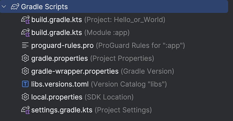
You’ll rarely if ever touch most of these files. The most common exceptions are:
build.gradle.kts (Module :app) - we already modified this one. This is used to Add dependencies, tweak SDK/versions
libs.versions.toml - used to manage library versions
I know that was a lot, but hopefully when you look at the project folder structure you have a much better idea of what is there and why it exists.
If we press the play button at the top of the screen
we’ll be prompted to configure our run. We can then set Hello_or_world.app as our target Module.
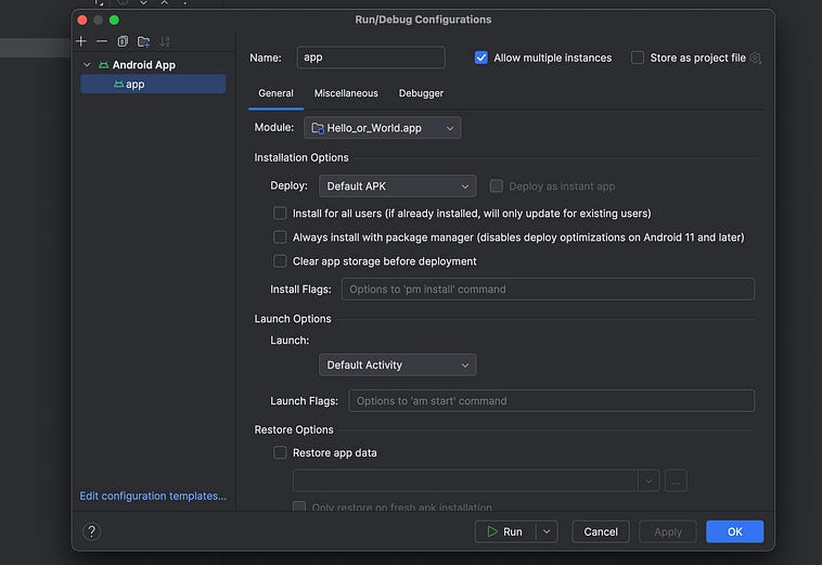
If we press “ok”, android will then build our app, spool up an android emulator, and attempt to deploy our app to that emulator. However, we’ll see an error saying that there’s not a default activity.
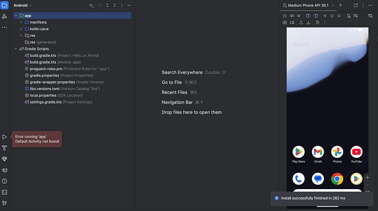
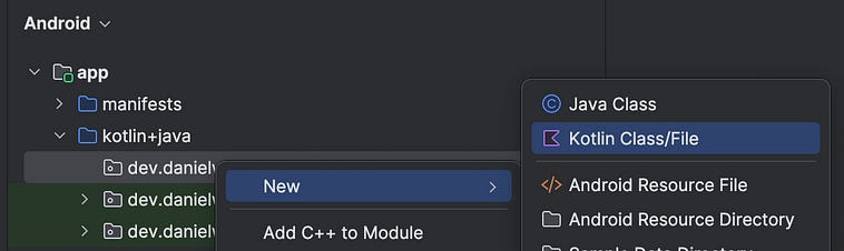
This is because we chose a completely empty project without any activities (screens) defined. We can create a simple default activity by right-clicking on our app folder (in my case, dev.danielwarfield.helloorworld) and creating a new Kotlin Class/File
We then want to create a new class called MainActivity .
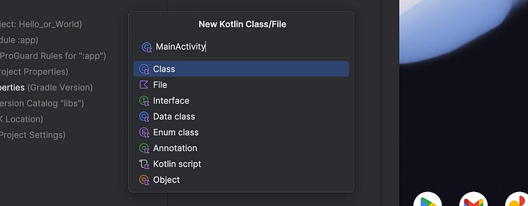
That will give us the following file
package dev.danielwarfield.helloorworld
class MainActivity {
}
We can change this code to the following (we’ll explore it line-by-line in just a second)
package dev.danielwarfield.helloorworld
import android.os.Bundle
import android.widget.TextView
import androidx.appcompat.app.AppCompatActivity
class MainActivity : AppCompatActivity() {
    override fun onCreate(savedInstanceState: Bundle?) {
        super.onCreate(savedInstanceState)
        // Create a TextView directly in code
        val textView = TextView(this).apply {
            text = “Hello World”
            textSize = 24f
            textAlignment = TextView.TEXT_ALIGNMENT_CENTER
        }
        setContentView(textView)
    }
}
and then hop over to our AndroidManifest.xml file and set this as the default activity.
<?xml version=”1.0” encoding=”utf-8”?>
<manifest xmlns:android=”http://schemas.android.com/apk/res/android”
    xmlns:tools=”http://schemas.android.com/tools”>
    <application
        android:allowBackup=”true”
        android:dataExtractionRules=”@xml/data_extraction_rules”
        android:fullBackupContent=”@xml/backup_rules”
        android:icon=”@mipmap/ic_launcher”
        android:label=”@string/app_name”
        android:roundIcon=”@mipmap/ic_launcher_round”
        android:supportsRtl=”true”
        android:theme=”@style/Theme.HelloOrWorld”>
        <!-- Adding the main activity to the application -->
        <activity android:name=”.MainActivity” android:exported=”true”>
            <intent-filter>
                <action android:name=”android.intent.action.MAIN” />
                <category android:name=”android.intent.category.LAUNCHER” />
            </intent-filter>
        </activity>
    </application>
</manifest>
This is the same as our original AndroidManifest.xml file, but with the addition of
<activity android:name=”.MainActivity” android:exported=”true”>
    <intent-filter>
        <action android:name=”android.intent.action.MAIN” />
        <category android:name=”android.intent.category.LAUNCHER” />
    </intent-filter>
</activity>
The first line
<activity android:name=”.MainActivity” android:exported=”true”>declares an activity (screen) in your app. Each activity must be declared, but usually it’s a one-liner. This one’s an exception because it’s the main activity. We define it as the main activity by giving it an intent-filter, which defines when and how this activity can be started.
We have two intent filters.
<action android:name=”android.intent.action.MAIN” />
<category android:name=”android.intent.category.LAUNCHER” />
the first line says “This is the main activity, start it when the app starts on its own”. The second says “allow this to be launched by clicking the icon on the home screen”. When you click an app icon on your home screen, Android registers an intent that looks like this:
action = android.intent.action.MAIN
category = android.intent.category.LAUNCHER
So, by setting our intent filters similarly, we thus make this the main activity that starts the app. You might be able to imagine other entry points, like clicking a notification, which might have other intents and thus could launch our app into other activities (aka other screens).
If we click run now, our app will launch.
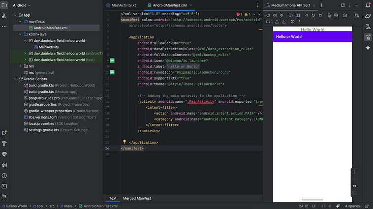
Take a moment to appreciate this. I know it’s been a lot to get to this point, but you just built an Android app! Also, you know a thing or two about how it got built! That’s no mean feat!
Along with the Hello World we want this bar to render, we’re getting Hello or World , which is the name of the app. This is happening because our default style, defined in AndroidManifest.xml has an app bar built in. We can change this line in the manifest file
android:theme=”@style/Theme.HelloOrWorld”>to this
android:theme=”@style/Theme.Material3.DayNight.NoActionBar”>Rebuild, and voila. No bar.
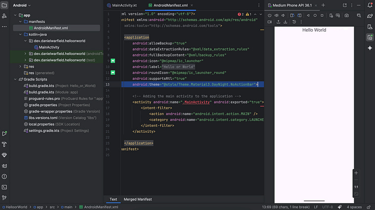
Alright, let’s take a look at our MainActivity and see how it ticks.
package dev.danielwarfield.helloorworld
import android.os.Bundle
import android.widget.TextView
import androidx.appcompat.app.AppCompatActivity
class MainActivity : AppCompatActivity() {
    override fun onCreate(savedInstanceState: Bundle?) {
        super.onCreate(savedInstanceState)
        // Create a TextView directly in code
        val textView = TextView(this).apply {
            text = “Hello World”
            textSize = 24f
            textAlignment = TextView.TEXT_ALIGNMENT_CENTER
        }
        setContentView(textView)
    }
}
First of all, we need to declare the package that this activity belongs to.
package dev.danielwarfield.helloorworldThen, we import a few necessities.
import android.os.Bundle
import android.widget.TextView
import androidx.appcompat.app.AppCompatActivity
Bundle is a lightweight key-value store built into Android. It’s critical because, at pretty much any time, Android can kill your app. For instance, when you switch apps or rotate your phone. Bundle allows you to save key values so that they can be recalled. It’s used all over the place in Android, including in the constructor for AppCompatActivity
AppCompatActivity is a modern and backwards compatible class for defining Activities, and it’s generally recommended over things like Activity. We’re using it to define the actual activity we’re creating.
Finally, TextView is a view (recall that a view is like an individual component in Android, like a button, image, slider, etc) that allows us to render some text onto the screen.
To actually create our MainActivity , we create a class that inherits from AppCompatActivity and then we override the onCreate function.
class MainActivity : AppCompatActivity() {
    override fun onCreate(savedInstanceState: Bundle?) {
When Android creates an activity, it calls the onCreate function and passes a Bundle. So we need to define it this way, weather we use the Bundle or not.
We then call the default constructor for AppCompatActivity
super.onCreate(savedInstanceState)and create our text view
// Create a TextView directly in code
val textView = TextView(this).apply {
    text = “Hello World”
    textSize = 24f
    textAlignment = TextView.TEXT_ALIGNMENT_CENTER
}
Here, we’re creating our TextView as a view that’s bound to this ,this being our MainActivity. When creating any view, a “context” is required, which gives the view access to key resources so it can function within the application. The MainActivity serves as this context, though there are other ways one can provide context to a view.
Once the TextView is created we can set key attributes. The less Kotlin-y way to do this might look like
val textView = TextView(this)
textView.text = “Hello World”
textView.textSize = 24f
textView.textAlignment = TextView.TEXT_ALIGNMENT_CENTER
However, Kotlin has this funky apply {...} syntax that allows you to apply several attributes without repeating the name of the thing. This is, essentially, the same code as the code block above. apply is an example of a “scoped function”. I don’t want to get caught in the weeds right now, feel free to read up on scoped functions if you’re curious. We might bump into more of them later.
Finally,
setContentView(textView)tells Android to display the text view as the content of the activity’s screen. This is all fine and dandy, but it’s not exactly how most developers would define a screen like this.
Typically, we don’t define the layout of views within the code of an activity. Rather, we create an xml file that defines the layout for the activity, and reference it in the code.
It’s customary to do that in a folder called layout within the res directory. First, right click on the res folder and make a new Android Resource Directory .
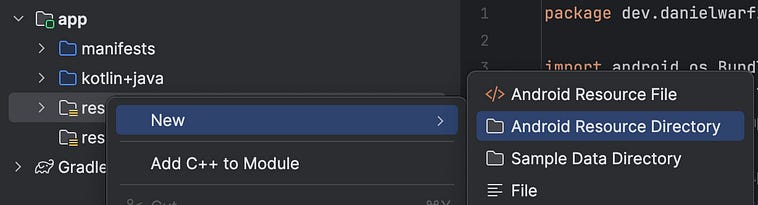
A dialogue box will appear. If we set the Resource type to layout
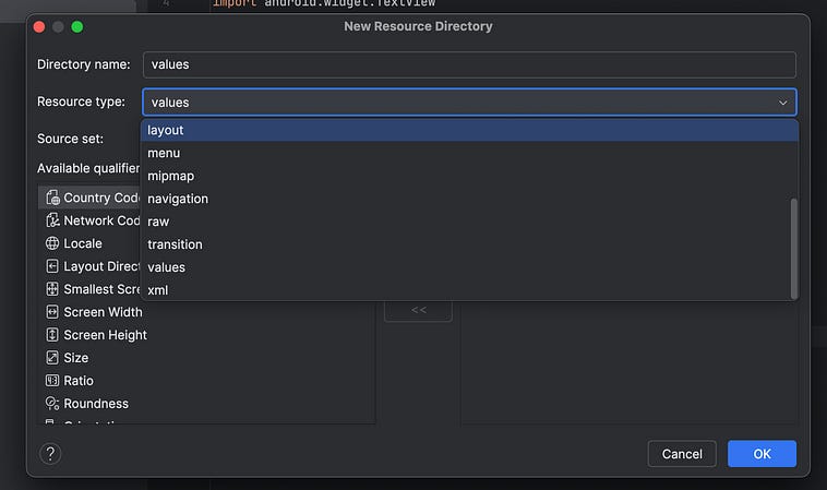
our directory name will be defined automatically.

Pressing “ok” then results in a new folder called layout, which we can define our layout files in.
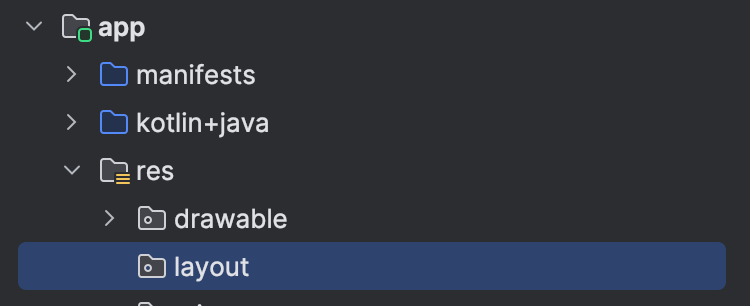
I’ll then right click the layout file, and create a new Layout Resource File .

We’ll then define the new resource file as activity_main.
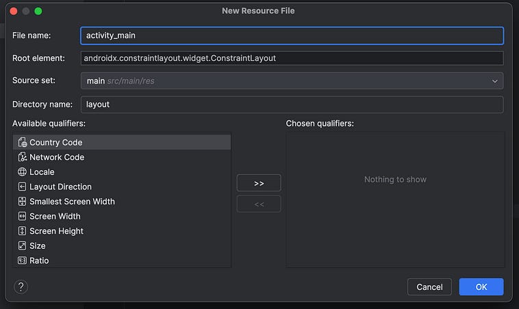
It’s customary for classes to be in upper camel case.
MainActivity
and for the layout file to be in reversed snake case.
activity_main
Why? I have no idea. When you press “ok”, you’ll see a lot of stuff happen.
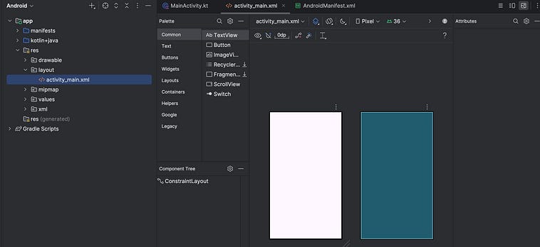
Android studio has a bunch of tools to help you work on styling. For me, these tools automatically opened in the design view
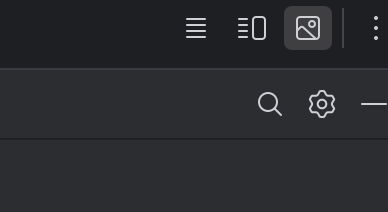
We’ll start by switching it over to split view.
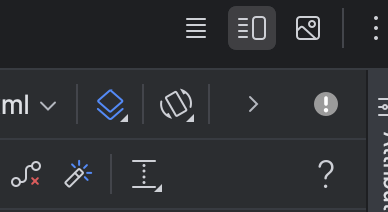
That will allow us to see the xml code and the resulting layout.
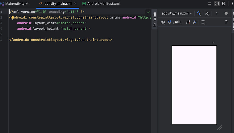
If we replace that code with this code (which has a textview, like in the simple activity we just defined)
<?xml version=”1.0” encoding=”utf-8”?>
<TextView xmlns:android=”http://schemas.android.com/apk/res/android”
    android:layout_width=”wrap_content”
    android:layout_height=”wrap_content”
    android:text=”Hello World”
    android:textSize=”24sp” />
We’ll see a preview pop-up on the right.
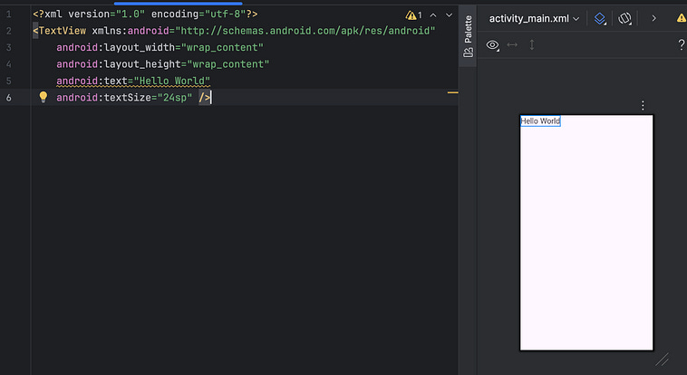
We’ll talk about the various approaches to defining layouts later.
We can now replace our MainActivity code with this
package dev.danielwarfield.helloorworld
import android.os.Bundle
import androidx.appcompat.app.AppCompatActivity
class MainActivity : AppCompatActivity() {
    override fun onCreate(savedInstanceState: Bundle?) {
        super.onCreate(savedInstanceState)
        setContentView(R.layout.activity_main)
    }
}
Run it, and get “hello world”, but defined by an xml defined layout.
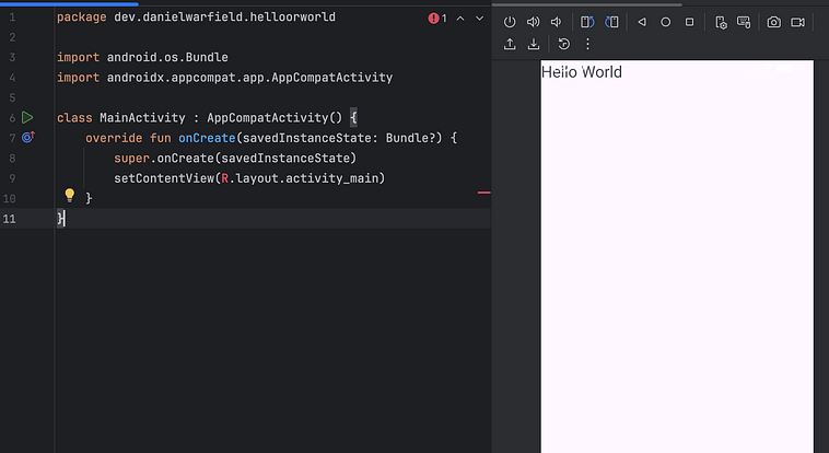
here, R is an index of resources that’s automatically generated by Android upon building the application. because we defined our layout in res/layout/activity_main.xml, we can reference it via R.layout.activity_main. It’s common in front-end development to decouple functionality, layout, and styling. This is how that’s done in native Android.
Alright, let’s make our app actually do something. We can adjust our template to have a text field and a button
<?xml version=”1.0” encoding=”utf-8”?>
<LinearLayout xmlns:android=”http://schemas.android.com/apk/res/android”
    android:orientation=”vertical”
    android:gravity=”center”
    android:layout_width=”match_parent”
    android:layout_height=”match_parent”
    android:padding=”24dp”>
    <TextView
        android:id=”@+id/definitionText”
        android:textSize=”20sp”
        android:textAlignment=”center”
        android:layout_width=”wrap_content”
        android:layout_height=”wrap_content” />
    <Button
        android:id=”@+id/switchButton”
        android:layout_marginTop=”20dp”
        android:text=”Switch”
        android:layout_width=”wrap_content”
        android:layout_height=”wrap_content” />
</LinearLayout>
and we can implement the functionality in our MainActivity to have our button swap between a screen that says “hello” and another screen that says “world”
package dev.danielwarfield.helloorworld
import android.os.Bundle
import androidx.appcompat.app.AppCompatActivity
import android.widget.Button
import android.widget.TextView
class MainActivity : AppCompatActivity() {
    private var showingHello = true
    override fun onCreate(savedInstanceState: Bundle?) {
        super.onCreate(savedInstanceState)
        setContentView(R.layout.activity_main)
        val textView = findViewById<TextView>(R.id.definitionText)
        val button = findViewById<Button>(R.id.switchButton)
        fun updateScreen() {
            if (showingHello) {
                textView.text = “Hello\n/həˈlō/\nA greeting or expression of goodwill.”
                button.text = “Show World”
            } else {
                textView.text = “World\n/wərld/\nthe earth, together with all of its countries, peoples, and natural features.”
                button.text = “Show Hello”
            }
        }
        button.setOnClickListener {
            showingHello = !showingHello
            updateScreen()
        }
        updateScreen()
    }
}
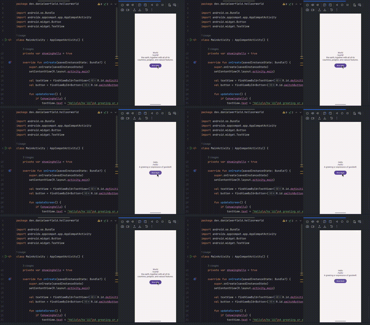
If we run it, it should look something like this:
Let’s unpack what’s going on here line-by-line. We’ll start with the layout, which itself starts with a LinearLayout
<LinearLayout xmlns:android=”http://schemas.android.com/apk/res/android”
    android:orientation=”vertical”
    android:gravity=”center”
    android:layout_width=”match_parent”
    android:layout_height=”match_parent”
    android:padding=”24dp”>
...
a LinearLayout is a “view group”, which is to say it’s a view (component) that can hold other views (components). Here, we’re saying:
android:orientation=”vertical”tells the content of the linear layout to stack verticallyandroid:gravity=”center”makes it so that the content of the linear layout centers in the middle of the screenandroid:layout_width=”match_parent”every view needs a width. This sets the width to inherit from the parent, which is the screen.android:layout_height=”match_parent”same aslayout_widthandroid:padding=”24dp”adds padding which the content of the linear layout must exist within.
There are plenty of other view groups if you want to check them out. This “LinearLayout” then has two views within it
<LinearLayout xmlns:android=”http://schemas.android.com/apk/res/android”
    android:orientation=”vertical”
    android:gravity=”center”
    android:layout_width=”match_parent”
    android:layout_height=”match_parent”
    android:padding=”24dp”>
    <TextView
        android:id=”@+id/definitionText”
        android:textSize=”20sp”
        android:textAlignment=”center”
        android:layout_width=”wrap_content”
        android:layout_height=”wrap_content” />
    <Button
        android:id=”@+id/switchButton”
        android:layout_marginTop=”20dp”
        android:text=”Switch”
        android:layout_width=”wrap_content”
        android:layout_height=”wrap_content” />
</LinearLayout>
These are more-or-less self-explanatory, except perhaps a few details.
an
idis assigned to each view. In Android, components in a layout can be referenced byid, both within the code and within the samexmlfile. the syntax@+id/means we’re creating a new id. We could reference already created ids within the same xml file with the@idkeyword. We won’t be referencing views in the xml for this example, but we will be referencing these in the code for the activity.wrap_contentmeans the width and height of the view will be big enough to contain the content, and no biggeryou might notice that the margin size for the button is defiled as
20dp, and the text size of the text is defined by20sp.dpstands for “density-independent pixels”. It’s customary to define images on a screen based on pixels, but depending on the resolution of a screen, 20 pixels can represent wildly different things.dpaccounts for this by representing1dpas one pixel on a160dpiscreen, or around0.006inches. If you have a high resolution screen,20dpcorresponds with more pixels, if you have a lower resolution, it corresponds to less. This keeps app size physically consistent on different screen densities.sp, on the other hand, stands for “scale-independent pixels”. Likedp, it assumes a160dpiscreen so, by default, a singlespis equivalent to0.006inches. However, it has the addition of a scaling factor for font size, which users can set based on their preferences in the accessibility settings of Android.
The formula for number of pixels based on dp is this:
px = dp × (dpi / 160)The formula for number of pixels based on sp is this:
px = sp × (dpi / 160) × fontScaleThat sets the layout of our code. To understand how it actually does stuff, we look at the code
package dev.danielwarfield.helloorworld
import android.os.Bundle
import androidx.appcompat.app.AppCompatActivity
import android.widget.Button
import android.widget.TextView
class MainActivity : AppCompatActivity() {
    private var showingHello = true
    override fun onCreate(savedInstanceState: Bundle?) {
        super.onCreate(savedInstanceState)
        setContentView(R.layout.activity_main)
        val textView = findViewById<TextView>(R.id.definitionText)
        val button = findViewById<Button>(R.id.switchButton)
        fun updateScreen() {
            if (showingHello) {
                textView.text = “Hello\n/həˈlō/\nA greeting or expression of goodwill.”
                button.text = “Show World”
            } else {
                textView.text = “World\n/wərld/\nthe earth, together with all of its countries, peoples, and natural features.”
                button.text = “Show Hello”
            }
        }
        button.setOnClickListener {
            showingHello = !showingHello
            updateScreen()
        }
        updateScreen()
    }
}
First, we set a variable called showingHello and tie it to the activity itself. This allows the activity to keep track of if the word “hello” or the word “world” is being rendered.
We then override the existing AppCompatActivity‘s onCreate function to define some new logic when the activity is created. This requires us to run
super.onCreate(savedInstanceState)first, so that the AppCompatActivity can do any of its required startup stuff, then we set the content of the Activity based on our xml file
setContentView(R.layout.activity_main)Previously, the elements we made were defined statically, but now we need to update the look of our app based on user interaction. To do that, we need to get references to our views out of our xml. We do that with the following code.
val textView = findViewById<TextView>(R.id.definitionText)
val button = findViewById<Button>(R.id.switchButton)
Here, we’re calling the findViewById function on the id defined in our auto-populated resources within R. The id’s, as specified in activity_main.xml are global, meaning all our ids across all our screens get squashed together into a single global namespace. On more complex apps you might want to adopt a more rigorous naming convention to account for many different screens.
After that, we’re defining a function that can swap between our different screens. In actuality, they’re the same screen, it’s just when showingHello is true, we use certain text on the text view and button. Otherwise, we show other text.
fun updateScreen() {
    if (showingHello) {
        textView.text = “Hello\n/həˈlō/\nA greeting or expression of goodwill.”
        button.text = “Show World”
    } else {
        textView.text = “World\n/wərld/\nthe earth, together with all of its countries, peoples, and natural features.”
        button.text = “Show Hello”
    }
}
We can then set a listener to a function that swaps the boolean, and then updates the scene. That way, every time we click the button our screen will change.
button.setOnClickListener {
    showingHello = !showingHello
    updateScreen()
}
This simple block of code gets more complicated the longer you look at it. We’re calling a function setOnClickListener, but we’re calling the function with { , rather than (. The reason for this is because of a quality of life feature built into Kotlin called a “Single Abstract Method (SAM) interface”.
If you’re in straight-up java, you might do something like this to replace a listener.
// how this would work in normal java
button.setOnClickListener(new View.OnClickListener() {
    @Override
    public void onClick(View v) {
        showingHello = !showingHello
        updateScreen()
    }
});
So, we’re creating a new OnClickListener anonymous class, which consists of the interface
public interface OnClickListener {
    void onClick(View v);
}
(An interface defines what a class can do, but not how it gets done. An anonymous class is a one-off implementation of an interface without giving it a name), and then passing that to the setOnClickListener of the button. This is a lot of boilerplate, which is problematic when you’re building an app and need to define about a billion buttons.
A SAM interface can be employed when the interface has exactly one method within it. If it does have one method (in this case, onClickListener has only one method, onClick) there’s no ambiguity around the function you’re trying to implement, so you can simply define the function. Kotlin takes care of the anonymous class stuff for you.
button.setOnClickListener {
    showingHello = !showingHello
    updateScreen()
}
Depending on your stylistic preferences, you might prefer the simple and explicit style of Java, or the more implicit style of Kotlin. I find Java to be longer, and also not exactly intuitive anyway. At least Kotlin is shorter.
Anywho, at the end of the onCreate of our activity, we call updateScreen to actually update the text when the app launches
updateScreen()and, with all that, our App works!
Virtually every tutorial on Android app development concludes with a functional yet incredibly ugly application, which is a shame. Visual appeal is a significant part of front end development. We just made our cool little “Hello or World” app, let’s make it look halfway decent.
There’s five core things working together to make this version of the app nicer on the eyes:
a better layout
some styling on the text
a fun translucent button
a background with an animated gradient
animated transitions between words
Let’s go through each one.
First, let’s adjust the layout to make the button occupy the bottom portion of the screen, and the definition occupy the top portion of the screen
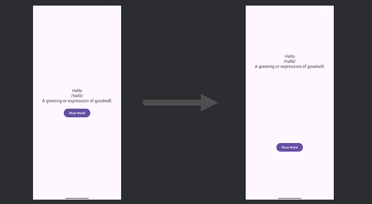
Often, doing layout work is an iterative process, consisting of making adjustments and seeing how they impact the end result. For the first approach, let’s try thinking of our layout as two views which take up the center of the top and bottom half of the screen.
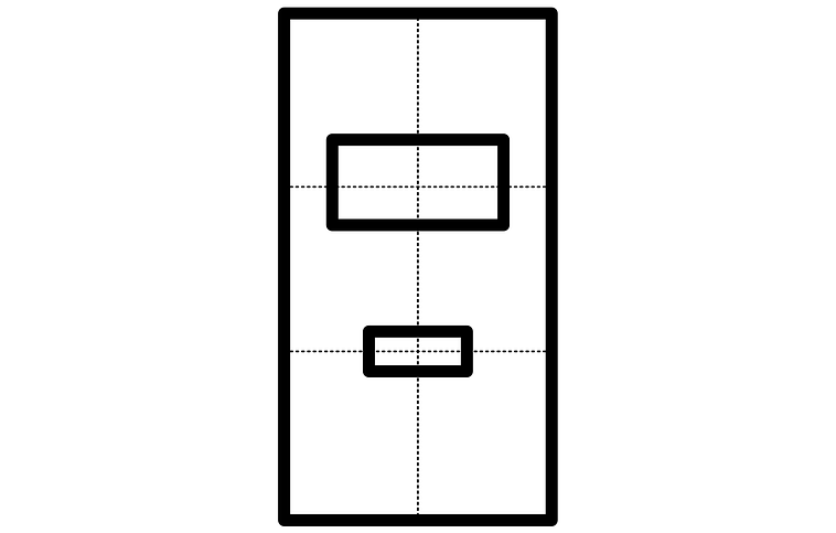
To do that, we might change this code, from our original layout
<LinearLayout xmlns:android=”http://schemas.android.com/apk/res/android”
    android:orientation=”vertical”
    android:gravity=”center”
    android:layout_width=”match_parent”
    android:layout_height=”match_parent”
    android:padding=”24dp”>
    <TextView
        android:id=”@+id/definitionText”
        android:textSize=”20sp”
        android:textAlignment=”center”
        android:layout_width=”wrap_content”
        android:layout_height=”wrap_content” />
    <Button
        android:id=”@+id/switchButton”
        android:layout_marginTop=”20dp”
        android:text=”Switch”
        android:layout_width=”wrap_content”
        android:layout_height=”wrap_content” />
</LinearLayout>
to this layout code
<?xml version=”1.0” encoding=”utf-8”?>
<RelativeLayout xmlns:android=”http://schemas.android.com/apk/res/android”
    android:layout_width=”match_parent”
    android:layout_height=”match_parent”
    android:padding=”32dp”
    android:gravity=”center”>
    <TextView
        android:id=”@+id/definitionText”
        android:layout_centerInParent=”true”
        android:textSize=”20sp”
        android:textAlignment=”center”
        android:layout_width=”wrap_content”
        android:layout_height=”wrap_content” />
    <Button
        android:id=”@+id/switchButton”
        android:layout_centerHorizontal=”true”
        android:layout_alignParentBottom=”true”
        android:layout_marginTop=”20dp”
        android:text=”Switch”
        android:layout_width=”wrap_content”
        android:layout_height=”wrap_content” />
</RelativeLayout>
First, the LinearLayout was replaced with a RelativeLayout . Linear layouts are designed to simply render things in a list, like a checklist, while relative layouts allow you to place elements relative to each other and to the parent. Just using a relative layout, we can see that our elements start to position themselves based on ratios of the screen, rather than as a pure list.
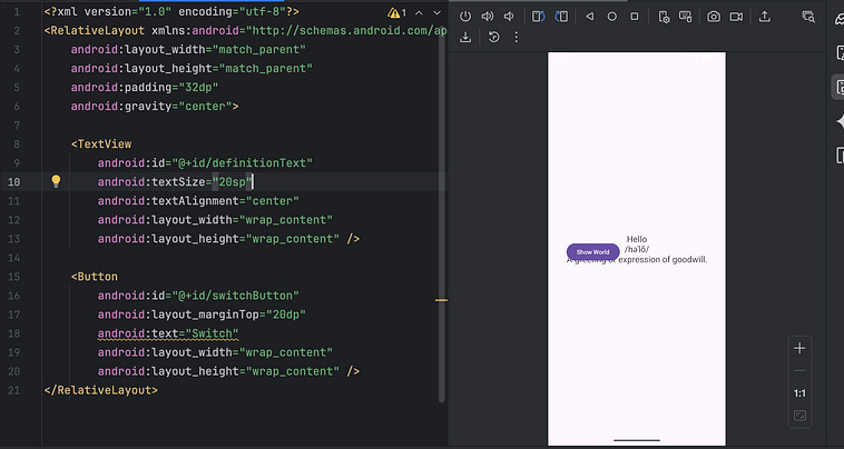
When we add layout_centerInParent=”true” that centers the element both horizontally and vertically within its parent. If we set both the button and the text to be centerInParent=”true”, they would stack in the center of the screen.
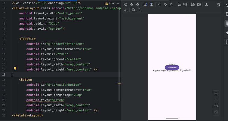
However, if we set one of them to layout center, the centered element will be placed in the center of the remaining space relative to the other element.
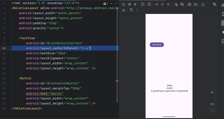
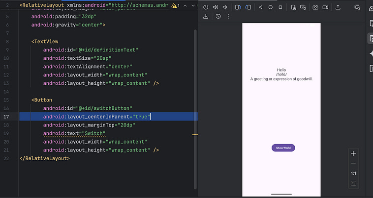
Either approach will work. For instance, with the first approach, where the button was on top and shifted to the left, we can improve its position by centering it horizontally and aligning it to the bottom of the parent (the RelativeLayout, which has a vertical height of match_parent, so the entire screen).
android:layout_centerHorizontal=”true”
android:layout_alignParentBottom=”true”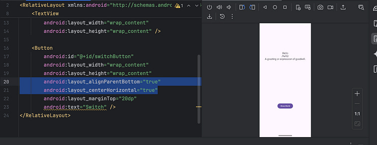
This layout is better than it was, but it has an annoying tendency to have the button jiggle up and down when the text changes.
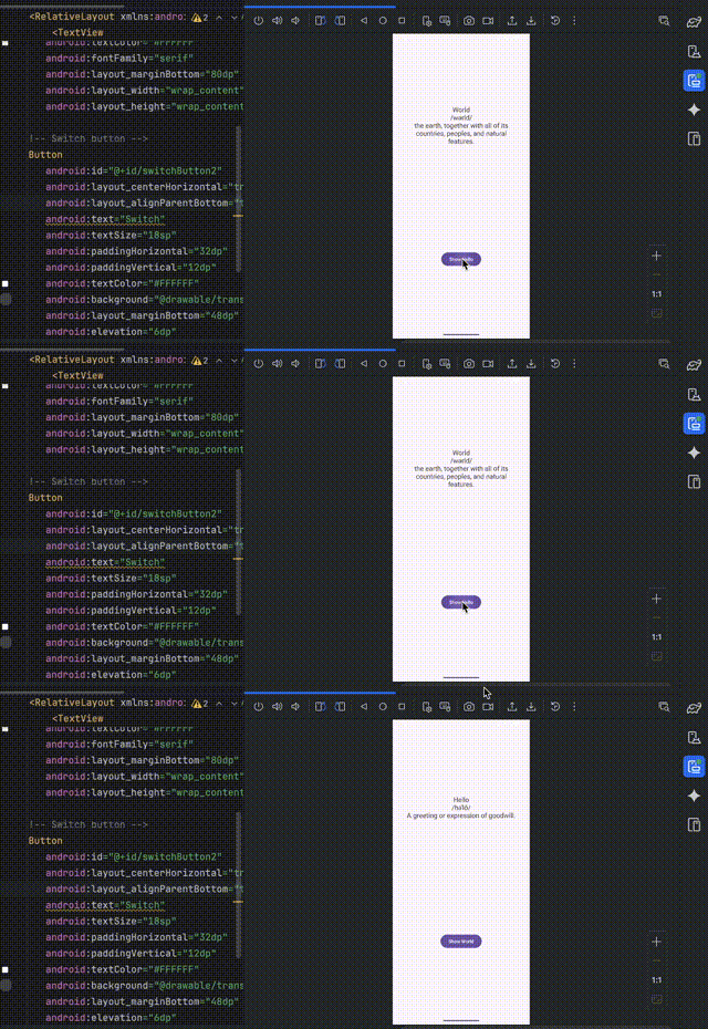
After a bit of playing around with different approaches, I concluded that it’s a fundamental issue with having the position of the button tied to the text box, which itself changes in size. I’m sure there’s some fancy way I could adjust the layout to get rid of the jiggling issue while following this general approach, but instead I decided to change how I thought about the layout itself.
Instead of defining the elements relative to each other, let’s try laying out the elements in the center horizontally, and relative to the top and bottom of the screen vertically.
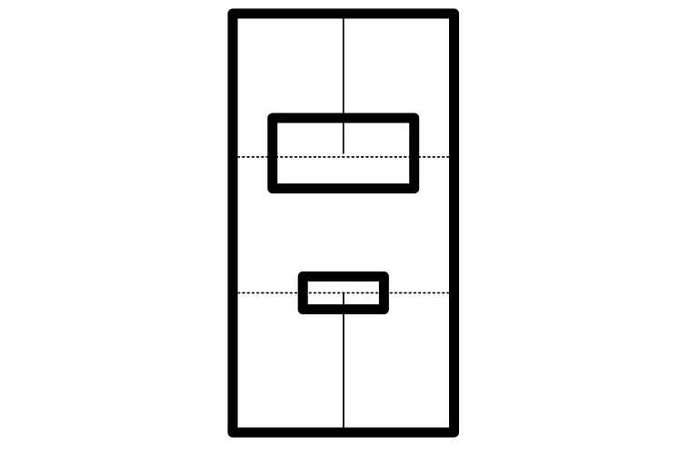
notice how the location of the views don’t depend on one another, but only in terms of their location within the view group.
The following code does that:
<?xml version=”1.0” encoding=”utf-8”?>
<RelativeLayout xmlns:android=”http://schemas.android.com/apk/res/android”
    android:layout_width=”match_parent”
    android:layout_height=”match_parent”
    android:padding=”32dp”>
    <TextView
        android:id=”@+id/definitionText”
        android:layout_width=”wrap_content”
        android:layout_height=”wrap_content”
        android:layout_alignParentTop=”true”
        android:layout_centerHorizontal=”true”
        android:layout_marginTop=”160dp”
        android:textAlignment=”center”
        android:text=”word”
        android:textSize=”20sp” />
    <Button
        android:id=”@+id/switchButton”
        android:layout_width=”wrap_content”
        android:layout_height=”wrap_content”
        android:layout_alignParentBottom=”true”
        android:layout_centerHorizontal=”true”
        android:layout_marginBottom=”160dp”
        android:text=”Switch” />
</RelativeLayout>
Here, both views are set to android:layout_centerHorizontal=”true”, meaning they’re centered horizontally, but the text view is aligned to the top (alignParentTop=”true”) and the button is aligned to the bottom (alignParentBottom=”true” ). We set a margin with respect to either the bottom or the top of the screen, and voila, our button doesn’t move when we click it.
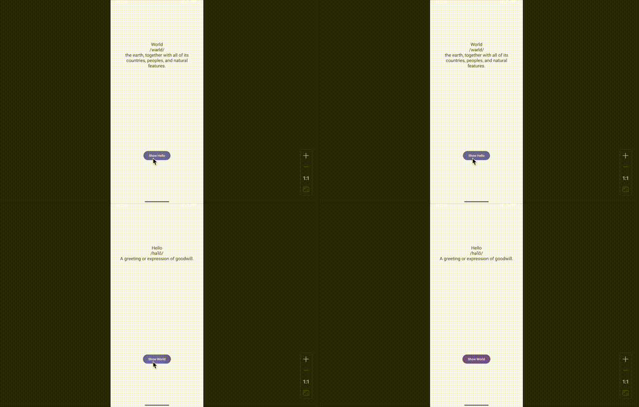
Which is great, except now our layout is much less responsive.
At the top right of our screen, when exploring a layout xml file, there’s an option to enable something called the “split view”.
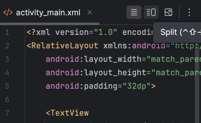
If we click that, we can see a dynamic preview of the layout we’re currently working on.
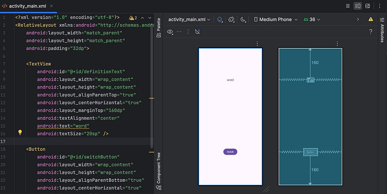
You might have noticed, I snuck in android:text=”word” into the TextView, that’s so it’s easier to see the element in the layout preview.
This looks great, but if we click and drag these diagonal lines at the bottom of the screen
We’ll find that some screen sizes result in a bad result, like the elements overlapping.
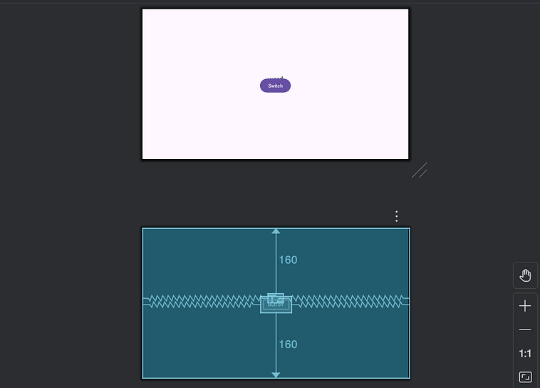
Depending on which devices you support, this may or may not be an issue. Generally speaking, I think it’s a good policy to make layouts robust to arbitrary screen sizes, but if you’re only developing for a Pixel 8 Pro, for instance

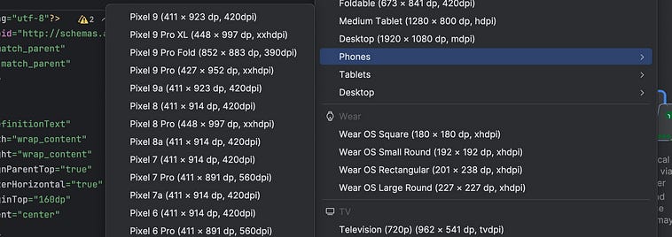
The “Device for Preview” button, named “custom” if you set a custom aspect ratio, lets you choose a specific device to preview with.
You can confirm that your layout works on that device.
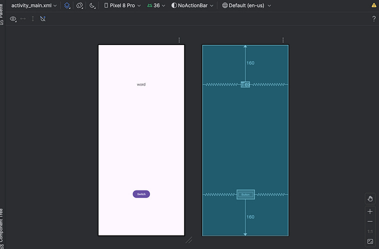
Well… At least if it’s in portrait mode.
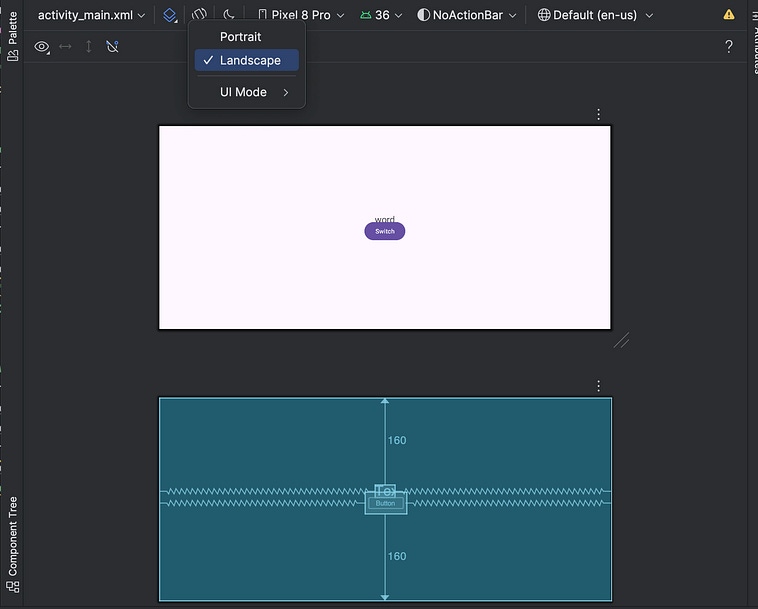
switching the phone to landscape mode reveals that the layout no-longer works.
Again, it’s a good idea to make your layouts generally robust. Let’s cut to something that actually works.
We’re going to use something called a ConstrainedLayout, which is a view group similar to the LinearLayout and RelativeLayout we discussed previously, except it has more robust features around setting constraints relative to the position of a view within the screen. Specifically, it has the ability to define a views position as a percentage of the size of the parent container.
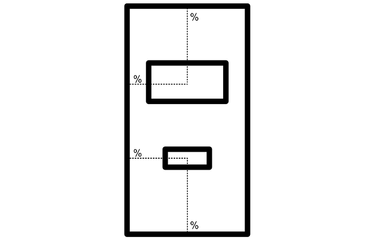
When the screen size doesn’t change, these elements will be locked in place. However, when the screen size does change (for different devices, or by rotating the orientation of the device) the locations will adjust in proportion to the screen size.
Here’s the code that makes that happen.
<?xml version=”1.0” encoding=”utf-8”?>
<androidx.constraintlayout.widget.ConstraintLayout
    xmlns:android=”http://schemas.android.com/apk/res/android”
    xmlns:app=”http://schemas.android.com/apk/res-auto”
    android:layout_width=”match_parent”
    android:layout_height=”match_parent”
    android:padding=”32dp”>
    <TextView
        android:id=”@+id/definitionText”
        android:layout_width=”wrap_content”
        android:layout_height=”wrap_content”
        android:text=”word”
        android:textSize=”20sp”
        android:textAlignment=”center”
        app:layout_constraintStart_toStartOf=”parent”
        app:layout_constraintEnd_toEndOf=”parent”
        app:layout_constraintTop_toTopOf=”parent”
        app:layout_constraintBottom_toBottomOf=”parent”
        app:layout_constraintVertical_bias=”0.25” />
    <Button
        android:id=”@+id/switchButton”
        android:layout_width=”wrap_content”
        android:layout_height=”wrap_content”
        android:text=”Switch”
        app:layout_constraintStart_toStartOf=”parent”
        app:layout_constraintEnd_toEndOf=”parent”
        app:layout_constraintTop_toTopOf=”parent”
        app:layout_constraintBottom_toBottomOf=”parent”
        app:layout_constraintVertical_bias=”0.85” />
</androidx.constraintlayout.widget.ConstraintLayout>
first of all, we swapped out our RelativeLayout with an androidx.constraintlayout.widget.ConstraintLayout , allowing us to use the constrained layout to set our layout based on percentages. Then, each view was constrained with the following:
app:layout_constraintStart_toStartOf=”parent”Android is designed to work both with languages that read left-to-right and languages which read right-to-left. Thus, sometimes in android, “left” and “right” are abstracted into “start” and “end”, where start could be either the left or right, depending on the language, allowing the UI flow of the app to follow the flow of the native language. This line says the “start” of this element should be constrained to the “start” of the parent. So, if you speak english, left side to left side.app:layout_constraintEnd_toEndOf=”parent”Same as the previous, but with the “end” of the view being constrained to the “end” of the parent.app:layout_constraintTop_toTopOf=”parent”There’s not really languages that read bottom up, so the top of a view is simply the top of the view. This constrains the top of the view with the top of the parent.app:layout_constraintBottom_toBottomOf=”parent”Same as previous, but with the bottom of the view being constrained to the bottom of the parent.app:layout_constraintVertical_bias= <some value>This value specifies how biased the view is to the top or bottom constraint. If0, the view is biased to the top. If1, the view is biased towards the bottom.
If we look at the layout of both elements, we can see that both elements are constrained to all four sides of the view group via squiggly lines.
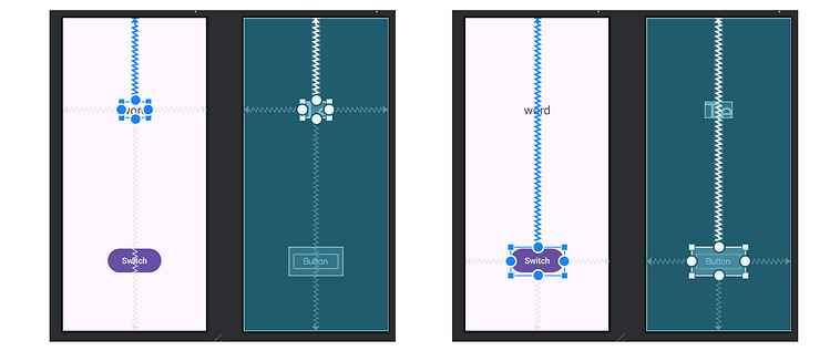
In Android, it’s common to think of constraints as springs, which pull each element into equilibrium. Because the horizontal springs are “pulling” with the same force, each element is centered horizontally. When we introduce a Vertical_bias, it biases the force of the spring, allowing the element to reach equilibrium either higher or lower down in the screen.
As you can see, this works well with a bunch of aspect ratios.
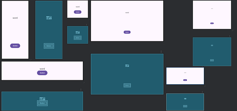
We could stop here, but let’s do one more adjustment to make this even better.
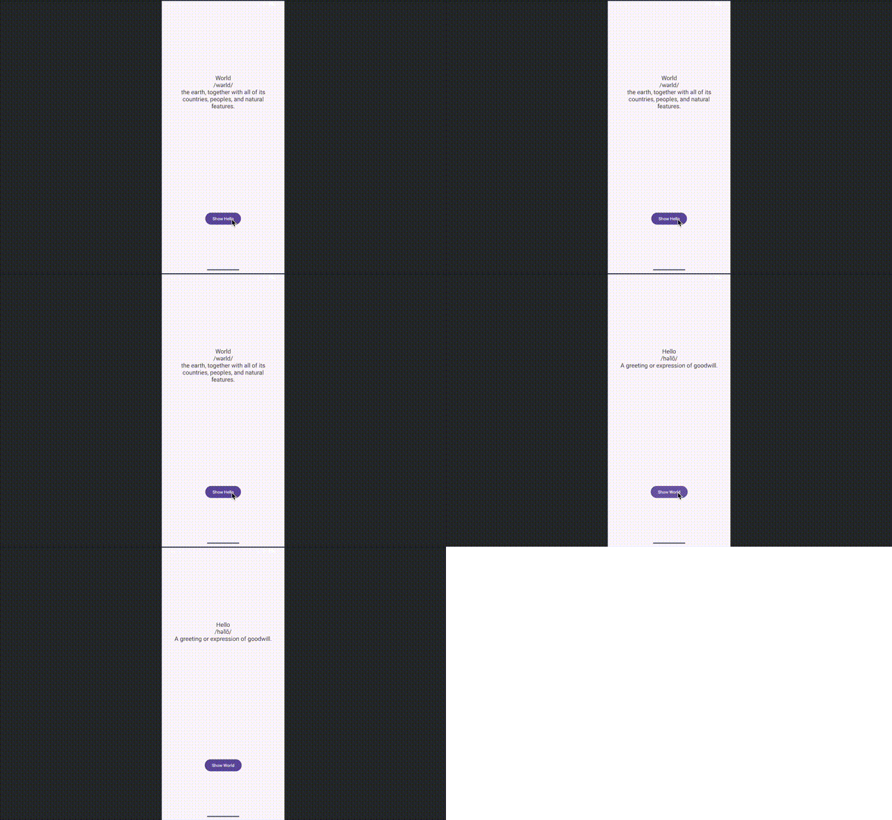
Constrained layouts do their constraining based on the center of a view. This locks our button in place, but it means our text shifts up and down based on the text length.
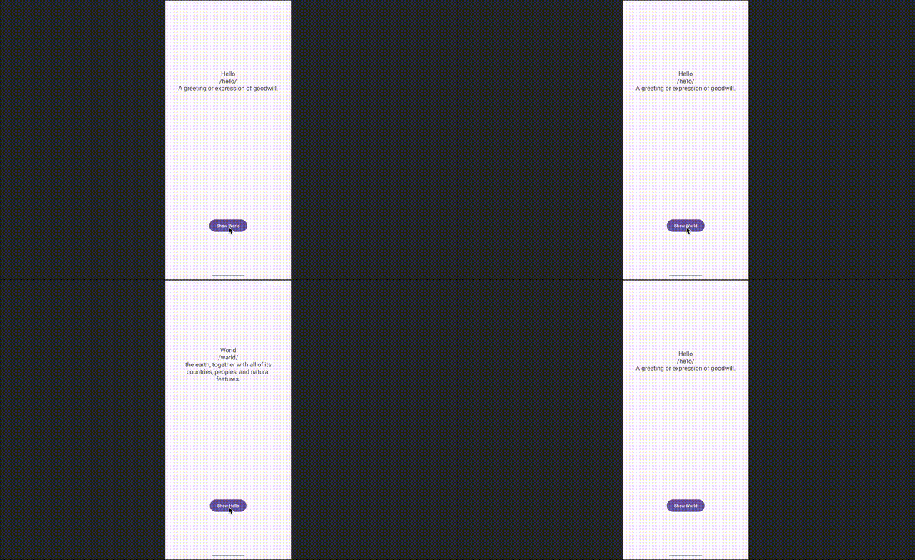
This is purely stylistic, but I would like for the text to appear fixed at the top of the text block. I think that would aid in readability, and make the application look cleaner and more professional.
To do that, I’m going to employ “Guidelines”. These are lines that you can place within a view group, which other views can be placed in respect to
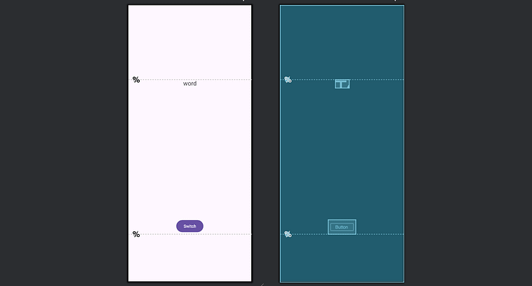
So, we can set these guides at some vertical location on the screen, then align our elements to those guidelines. That way we get the percentage based spacing of the constrained layout, with more consistent text alignment regardless of updating text size.
Here’s the code.
<?xml version=”1.0” encoding=”utf-8”?>
<androidx.constraintlayout.widget.ConstraintLayout
    xmlns:android=”http://schemas.android.com/apk/res/android”
    xmlns:app=”http://schemas.android.com/apk/res-auto”
    android:layout_width=”match_parent”
    android:layout_height=”match_parent”
    android:padding=”32dp”>
    <!-- 25% from top for the TextView -->
    <androidx.constraintlayout.widget.Guideline
        android:id=”@+id/topGuide”
        android:layout_width=”wrap_content”
        android:layout_height=”wrap_content”
        android:orientation=”horizontal”
        app:layout_constraintGuide_percent=”0.25” />
    <!-- 15% from bottom for the Button (i.e., 85% from top) -->
    <androidx.constraintlayout.widget.Guideline
        android:id=”@+id/bottomGuide”
        android:layout_width=”wrap_content”
        android:layout_height=”wrap_content”
        android:orientation=”horizontal”
        app:layout_constraintGuide_percent=”0.85” />
    <TextView
        android:id=”@+id/definitionText”
        android:layout_width=”wrap_content”
        android:layout_height=”wrap_content”
        android:text=”word”
        android:textSize=”20sp”
        android:textAlignment=”center”
        app:layout_constraintTop_toTopOf=”@id/topGuide”
        app:layout_constraintStart_toStartOf=”parent”
        app:layout_constraintEnd_toEndOf=”parent” />
    <Button
        android:id=”@+id/switchButton”
        android:layout_width=”wrap_content”
        android:layout_height=”wrap_content”
        android:text=”Switch”
        app:layout_constraintBottom_toBottomOf=”@id/bottomGuide”
        app:layout_constraintStart_toStartOf=”parent”
        app:layout_constraintEnd_toEndOf=”parent” />
</androidx.constraintlayout.widget.ConstraintLayout>
Here, we set up two horizontal guide lines, specify their height within the screen with app:layout_constraintGuide_percent= <some value> , assign them an id, like android:id=”@+id/topGuide” then constrain our views to those guides via app:layout_constraintTop_toTopOf=”@id/topGuide”.
You might notice how some of these attributes start with android: and some of them start with app:. This is a bit of a rabbit whole, which we’ll explore more when we implement our own custom views. We can briefly touch on it now, though.
In essence, there’s a build tool called AAPT2 (Android Asset Packaging Tool 2). This is responsible for turning your high level resources (like layout files, images, etc.) into a binary format that’s actually usable by an android phone. To deal with different libraries having potentially similar naming conventions, Android uses “namespaces” in the xml file to contextualize attributes via some unique identifier. xmlns:android=”http://schemas.android.com/apk/res/android" , for instance. This isn’t a URL, but a URI (universal resource indicator) that references the core SDK for Android, and assigns it to the namespace android.
xmlns:app=”http://schemas.android.com/apk/res-auto" is a special “auto resolving” URI, that auto-resolves based on where the attribute is defined, in this case androidx.constraintlayout.widget.ConstraintLayout. xmlns:app="...res-auto" binds the prefix app: to a special namespace that lets AAPT2 automatically resolve attributes to the correct library resource package. Unlike android:, which points to the Android framework, res-auto tells the build tools: “Find the attribute definition in whatever library provides it,” which is why custom attributes from ConstraintLayout (like layout_constraintTop_toTopOf) appear under the app: namespace.
Android Jetpack is an official Android library which greatly improves Android development with modern design principles. Jetpack exists under the library named AndroidX. AndroidX defines custom XML attributes that are not part of the core Android framework. When we set xmlns:app="http://schemas.android.com/apk/res-auto", we’re telling AAPT2 to automatically resolve any app: attribute to whichever library defines it. In the case of ConstraintLayout, its custom attributes like layout_constraintTop_toTopOf come from the AndroidX ConstraintLayout library, so AAPT2 resolves the app: attributes to that library’s resources.
I’m not stating these things so that you understand it, but that you’re aware that, in modern Android app development, it’s common to use several different namespaces simultaneously, and you may need to account for that when building views.
Back to the task at hand, though, we used a constrained layout, defined two guidelines, and set our text and button view positions relative to those guidelines. Thus, we have a layout that serves for our purposes.
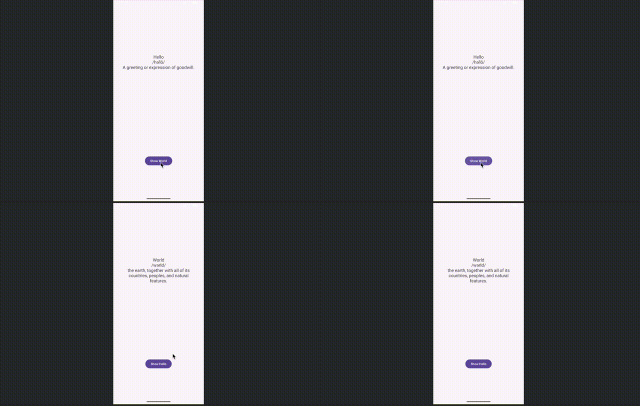
Now that we have a layout we’re happy with, let’s make the text look good. Recall that, on our improved app, we have a variety of fonts that we use for the main word, the phonetic pronunciation, the definition, and the font for the text.
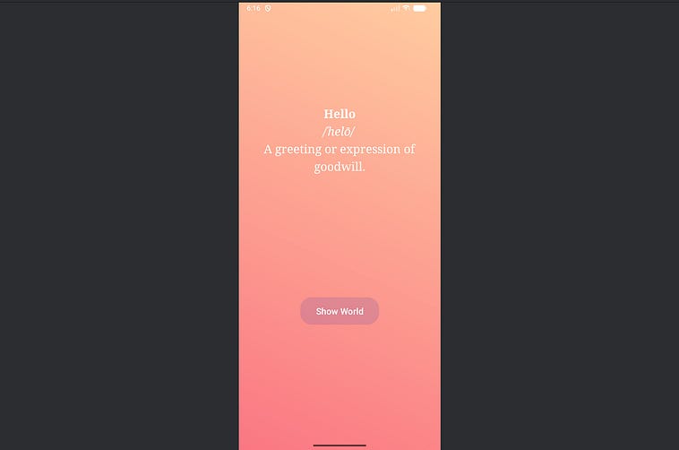
Where we want to end up, in terms of styling.
There are various ways we can achieve this effect. We’ll make a few adjustments in our layout file, and also make some adjustments in our activity code. Let’s start with layout adjustments.
Our original XML defines our text style as the following
<TextView
        android:id=”@+id/definitionText”
        android:layout_width=”wrap_content”
        android:layout_height=”wrap_content”
        android:text=”word”
        android:textSize=”20sp”
        android:textAlignment=”center”
        app:layout_constraintTop_toTopOf=”@id/topGuide”
        app:layout_constraintStart_toStartOf=”parent”
        app:layout_constraintEnd_toEndOf=”parent” />
Which we’ll change to
    <TextView
        android:id=”@+id/definitionText”
        android:layout_width=”wrap_content”
        android:layout_height=”wrap_content”
        android:text=”word”
        android:textSize=”24sp”
        android:lineSpacingExtra=”8dp”
        android:textColor=”#FFFFFF”
        android:fontFamily=”serif”
        android:textAlignment=”center”
        app:layout_constraintTop_toTopOf=”@id/topGuide”
        app:layout_constraintStart_toStartOf=”parent”
        app:layout_constraintEnd_toEndOf=”parent” />
We changed textSize to 24sp (24 scale-independent pixels, which is commonly used for fonts), to make it a bit bigger. We also set lineSpacingExtra to 8dp (density-independent pixels which is commonly used in layout to accommodate different screen sizes). This adds a small amount of space between each line which remains consistent across screens with different pixel densities. We also set textColor to “#FFFFFF” , which is hexadecimal for pure white, and we set the fontFamily to serif .
That will result in pretty text, which is difficult to see because our app currently has a white background.
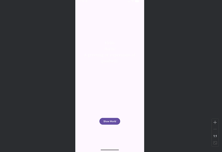
We can set our constrained layout to have a background of blue, allowing us to actually see the text.
<androidx.constraintlayout.widget.ConstraintLayout
    ...
    android:background=”#ADD8E6”>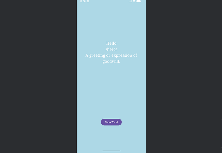
Already looking way better than before. Let’s give our button a bit of font treatment as well. We’ll keep the font family the same, but make the text bigger and set the font color to pure white.
<Button
        android:id=”@+id/switchButton”
        android:layout_width=”wrap_content”
        android:layout_height=”wrap_content”
        android:text=”Switch”
        android:textSize=”18sp”
        android:textColor=”#FFFFFF”
        app:layout_constraintBottom_toBottomOf=”@id/bottomGuide”
        app:layout_constraintStart_toStartOf=”parent”
        app:layout_constraintEnd_toEndOf=”parent” />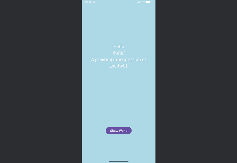
This doesn’t look quite as spiffy as our end goal, largely because we’re still missing our cool translucent button. We’ll get around to that later. Another minor difference is that the text doesn’t have italicization on the phonetic pronunciation, and bold for the word.
Recall where we want to end up, in terms of styling. Notice how the word is bold, and the phonetic pronunciation is italicized.
We can achieve that by using HTML rendering within our activity. For those not familiar with HTML, it’s a language used throughout front end development to structure content on websites and applications.
<p data-testid=”editorParagraphText” name=”0aa4” class=”graf graf--p graf-after--figure”>
  We can achieve that by using HTML rendering within our activity. For those not familiar with HTML, it’s a language used throughout front end development to structure content on websites and applications. The website you’re looking at to read this article uses HTML to build its own layout.
</p>
One of the most fundamental aspects of HTML is the “tag”, which is used to either encapsulate a section of text to have some styling, or inject some special component.
For instance, in HTML the <b> tag means to “bold” some text. We denote when a section of text auto to start being bold with <b>, then close out the tag with </b>.
<b>This text is bold!</b> This text is not!We can do something similar with italicization. html uses the tag <em>, which stands for “emphasis” to control italicization.
<em>This text is italicized!</em> This text is not!Some tags don’t require an open and a close. For instance, if we want to inject a newline in our sentence, we don’t need to specify anything “within” the newline, we just want to add a newline in a certain spot. To create a newline we can use the <br> tag, which stands for line break, and we can make is “self closing” by adding a slash at the end, a la <br/>
This text is on line 1<br/>this text is on line 2Using bold, italics, and line breaks, we can turn our text into an HTML equivalent within our activity. We can then use Androids HtmlCompat (a backwards compatible HTML processor) to process the html.
package dev.danielwarfield.helloorworld
import android.os.Bundle
import androidx.appcompat.app.AppCompatActivity
import android.widget.Button
import android.widget.TextView
import androidx.core.text.HtmlCompat
class MainActivity : AppCompatActivity() {
    private var showingHello = true
    override fun onCreate(savedInstanceState: Bundle?) {
        super.onCreate(savedInstanceState)
        setContentView(R.layout.activity_main)
        val textView = findViewById<TextView>(R.id.definitionText)
        val button = findViewById<Button>(R.id.switchButton)
        fun updateScreen() {
            val helloHtml = “<b>Hello</b><br/><i>/həˈlō/</i><br/>A greeting or expression of goodwill.”
            val worldHtml = “<b>World</b><br/><i>/wərld/</i><br/>The earth, together with all of its countries, peoples, and natural features.”
            if (showingHello) {
                textView.text = HtmlCompat.fromHtml(helloHtml, HtmlCompat.FROM_HTML_MODE_LEGACY)
                button.text = “Show World”
            } else {
                textView.text = HtmlCompat.fromHtml(worldHtml, HtmlCompat.FROM_HTML_MODE_LEGACY)
                button.text = “Show Hello”
            }
        }
        button.setOnClickListener {
            showingHello = !showingHello
            updateScreen()
        }
        updateScreen()
    }
}
Along with our current layout
<?xml version=”1.0” encoding=”utf-8”?>
<androidx.constraintlayout.widget.ConstraintLayout
    xmlns:android=”http://schemas.android.com/apk/res/android”
    xmlns:app=”http://schemas.android.com/apk/res-auto”
    android:layout_width=”match_parent”
    android:layout_height=”match_parent”
    android:padding=”32dp”
    android:background=”#ADD8E6”>
    <!-- 25% from top for the TextView -->
    <androidx.constraintlayout.widget.Guideline
        android:id=”@+id/topGuide”
        android:layout_width=”wrap_content”
        android:layout_height=”wrap_content”
        android:orientation=”horizontal”
        app:layout_constraintGuide_percent=”0.25” />
    <!-- 15% from bottom for the Button (i.e., 85% from top) -->
    <androidx.constraintlayout.widget.Guideline
        android:id=”@+id/bottomGuide”
        android:layout_width=”wrap_content”
        android:layout_height=”wrap_content”
        android:orientation=”horizontal”
        app:layout_constraintGuide_percent=”0.85” />
    <TextView
        android:id=”@+id/definitionText”
        android:layout_width=”wrap_content”
        android:layout_height=”wrap_content”
        android:text=”word”
        android:textSize=”24sp”
        android:lineSpacingExtra=”8dp”
        android:textColor=”#FFFFFF”
        android:fontFamily=”serif”
        android:textAlignment=”center”
        app:layout_constraintTop_toTopOf=”@id/topGuide”
        app:layout_constraintStart_toStartOf=”parent”
        app:layout_constraintEnd_toEndOf=”parent” />
    <Button
        android:id=”@+id/switchButton”
        android:layout_width=”wrap_content”
        android:layout_height=”wrap_content”
        android:text=”Switch”
        android:textSize=”18sp”
        android:textColor=”#FFFFFF”
        app:layout_constraintBottom_toBottomOf=”@id/bottomGuide”
        app:layout_constraintStart_toStartOf=”parent”
        app:layout_constraintEnd_toEndOf=”parent” />
</androidx.constraintlayout.widget.ConstraintLayout>
This results in the following
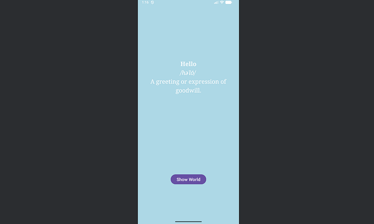
Which is getting awfully close to our desired output. Next, let’s make our button look a bit more fancy.
Recall where we want to end up in terms of styling. The button is larger, and has a transluscent quality which allows the background color to show through.
Views, like buttons, do a lot of things under the hood. They handle user interaction, logic, and how they render themselves on the screen. The actual visual part is a drawable, which you can think of as the logic within a view that is only relevant to how that view visually looks. In our resources folder, we can right-click drawable , create a new Drawable Resource File and call it translucent_button
Comments
Nothing yet. Say the first thing.
Sign in to join the conversation.