
60/40 did not fail in 2022. It did exactly what it was designed to do. The problem is that the world it was designed for disappeared.
For four decades, falling inflation and falling yields created a powerful tailwind for both stocks and bonds. Their negative correlation became so persistent that investors stopped treating it as a feature of a particular regime - and started treating it as a law of nature.
It was not.
2008: stocks ↓ bonds ↑ - the hedge worked
2020: stocks ↓ bonds ↑ - the hedge worked
2022: stocks ↓ bonds ↓ - the hedge broke
That was not an accident. It was the first visible consequence of a regime change that began in 2021.
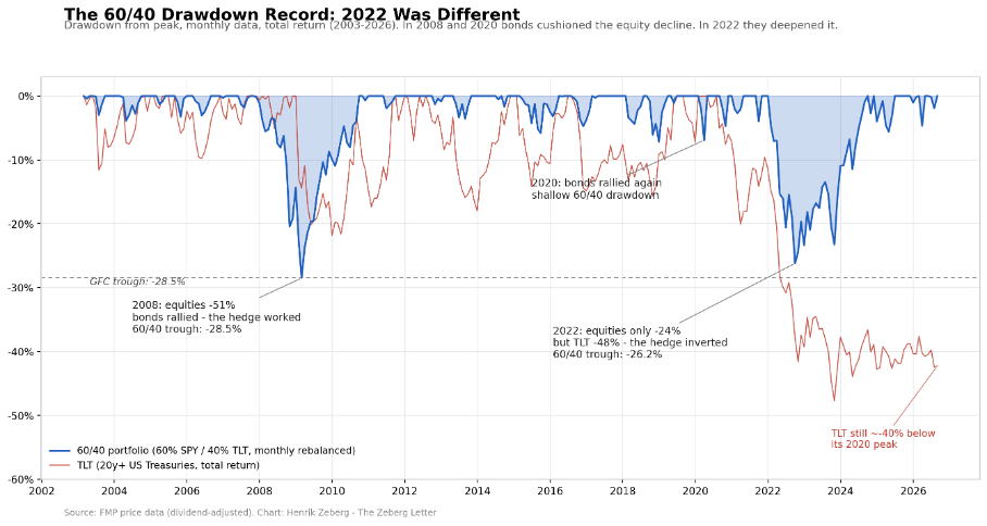
Chart 1: Drawdowns of a 60/40 portfolio (60% SPY / 40% TLT, monthly rebalanced, total return) vs TLT alone, 2003-2026. In 2008 and 2020 bonds cushioned the equity decline. In 2022 they deepened it.
Read the three episodes on this chart. In 2008, equities fell 51 percent - yet the 60/40 trough was contained at -28.5 percent, because Treasuries rallied hard into the crash. In 2020, the same mechanism produced only a shallow balanced-portfolio drawdown, recovered within months. Twice, the hedge worked exactly as designed.
Then 2022. Equities fell only 24 percent - a moderate, garden-variety bear market. Yet the 60/40 trough reached -26.2 percent, within three points of its Global Financial Crisis low, and took 33 months to recover against 35 for the GFC. A moderate equity bear produced a GFC-scale outcome for the balanced investor, for one reason only: the bond side collapsed alongside. TLT drew down 48 percent - the deepest decline in its history - and today, six years after its 2020 peak, it still sits roughly 40 percent below it. The equity side of 60/40 recovered long ago. The bond side never did.
This article explains what changed: what the new regime is, why it began in 2021, and what it means for the assets in your portfolio. And this is where the story gets uncomfortable: the next phase of the new inflationary regime will likely begin with falling inflation, falling yields and another period of tech outperformance. In other words, the first stage of the new regime may look remarkably like the old one. Understanding why that is not a contradiction requires two clocks.
Markets run on two clocks at once.
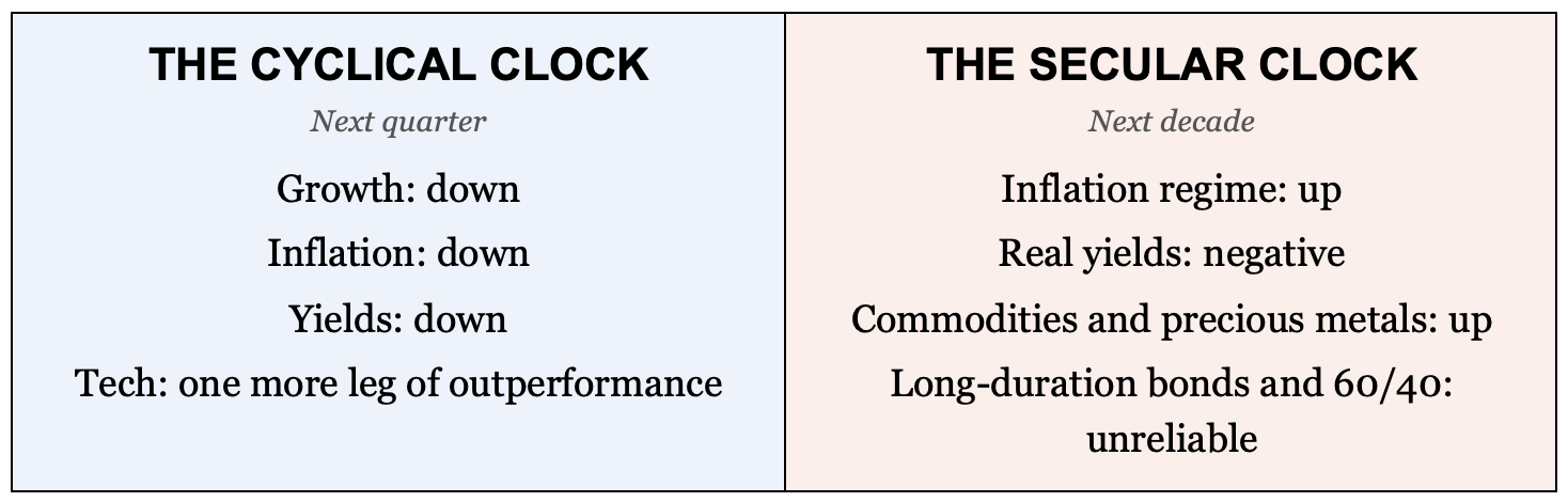
The cyclical clock is the business cycle: expansion, slowdown, contraction, recovery. On this clock, my models point down - toward a deflationary bust, with falling demand, falling yields, and falling inflation.
The secular clock is the multi-decade inflation regime: the backdrop against which every business cycle plays out. On this clock, the world turned in 2021 - from the deflationary regime that began in 1984 to a new inflationary regime.
Both clocks are true at once, and this is the intellectual heart of the matter: a secular inflationary regime can contain cyclical periods of disinflation - and even outright deflation. The biggest mistake investors can make today is confusing a cyclical decline in inflation with the return of the old inflation regime.
The cyclical clock tells you what comes next quarter. The secular clock tells you what comes next decade.
This is not a story told after the fact. It is a signal - and it has fired only three times in more than a century.
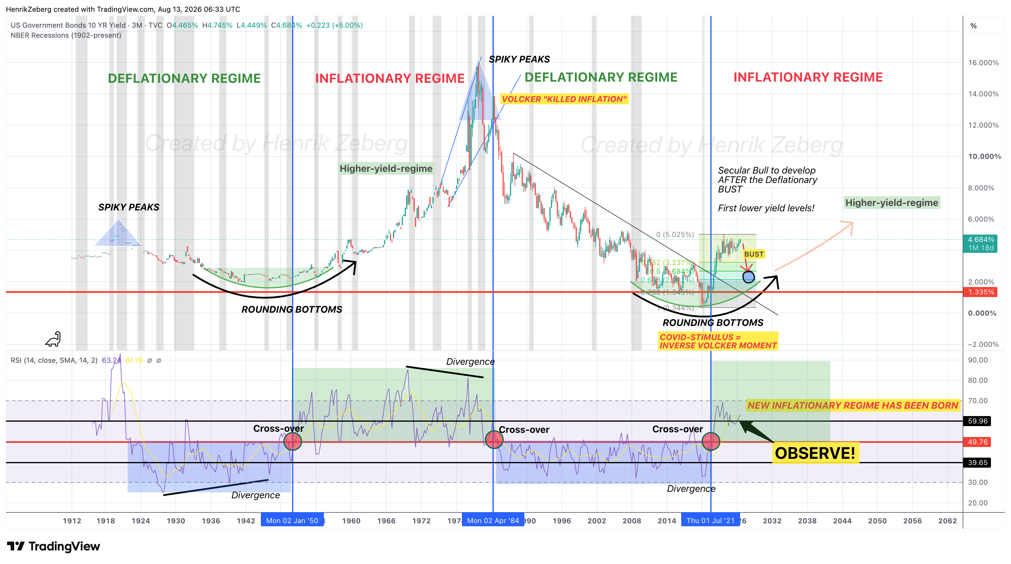
Chart 2: Maybe the most important chart in decades. US 10-year yield, 3-month candles, 1912-present, with NBER recessions. Secular regimes alternate between rounding bottoms (deflationary) and spiky peaks (inflationary). The monthly RSI cross-over of its own midline has marked each regime turn: January 1950, April 1984, July 2021.
Secular yield regimes do not turn quietly. Deflationary regimes end in long rounding bottoms; inflationary regimes end in spiky peaks. And beneath the price structure, the momentum regime turns first: the RSI cross-over of its long-term midline marked the birth of the inflationary regime in 1950, the birth of the deflationary regime in 1984, and - in July 2021 - the birth of the current inflationary regime. Here is the observable pattern: the signal, its previous occurrences, what followed each one, and the current occurrence. The reader can judge the structure directly on the chart.
Comments
Nothing yet. Say the first thing.
Sign in to join the conversation.