
Do you know what your brand colours mean?
Here’s a quick, handy guide (explored further below) to understand some brand colour associations:
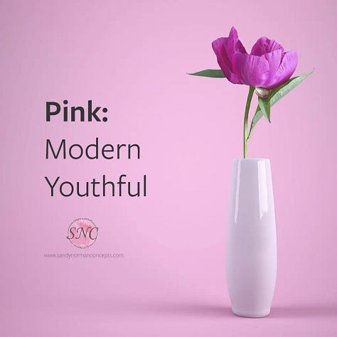
Modern
Youthful
Pink is often associated with femininity and gentleness, but I feel like that’s an outdated connotation. Pink is empowering, femininity is powerful.
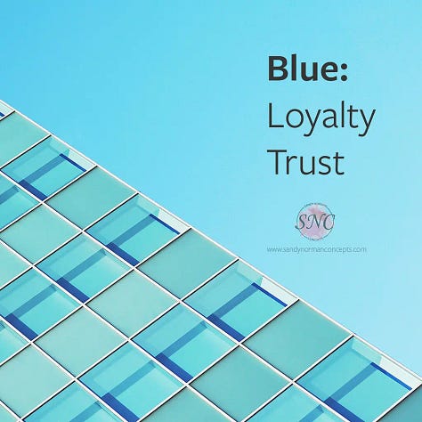
Loyalty
Trust
Blue is a soothing colour and can help instil a sense of calm. It’s no wonder that some of its meanings include loyalty and trust!
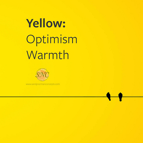
Optimism
Warmth
Warm like the sun, yellow can be a powerful pop of colour or a soft pastel shade for that feeling of happiness.
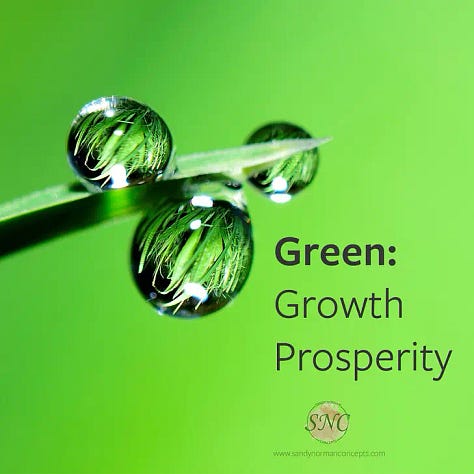
Growth
Prosperity
Green is the colour most associated with nature: luscious leaves, tall evergreen trees. It’s truly a colour that embodies growth.
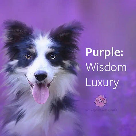
Wisdom
Luxury
Purple always seems to be associated with royalty, but the monarch is as outdated as gender stereotypes so I think it’s more fitting to reclaim the colour as one that is wise and luxurious. A colour you could swim in.
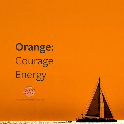
Courage
Energy
Orange teeters on the edge of a blood red and and warm yellow. It meets nicely in the middle with connotations of energy and bravery that embodies the combination of red and yellow.
Power
Elegance
Black is most often used for a modern, professional look. The power it exudes is often utilised in corporate businesses. But why not pair it with something softer to contradict the masculine energy it seems to have adopted?
Clarity
Simplicity
White is a good colour to offer contrast – it’s no wonder that most websites and notebooks are white. Text and graphics are easier to see and enjoy, and it centres the mind.
This is by no means all the info, but a good place to start if you’re curious.
Keep in mind that depending on your niche, the colours you choose may have different meanings. For example, orange is often associated with food brands as it’s believed to make people feel hungry.
No posts
Comments
Nothing yet. Say the first thing.
Sign in to join the conversation.