
In October 2026, the website BookDesignMadeSimple.com (founded by Fiona Raven and Glenna Collett) will be closing, and their co-written book will no longer be available for purchase.
While this is incredibly sad news, Fiona and Glenna have generously allowed me to archive their blog posts on Hadley House to avoid having them disappear with their website. You can find all of their archived posts here.
Fiona and Glenna have made a huge impact on my life, teaching me so much about book design and giving me the hope, motivation, and confidence to succeed in this field. I am eternally grateful. It is an honor to learn from them. I think you will feel the same <3
This is an archived post from Book Design Made Simple.
Originally Published: January 13, 2025
By: Glenna Collett
Every book needs a title page. Whether it’s in a printed book or an ebook, the title page shows the official title, author, and publisher that will go into the Library of Congress database—or the equivalent database in your country.
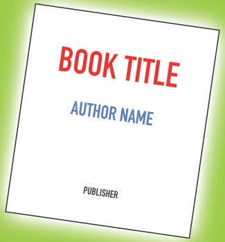
Also, it’s supposed to be the first, or almost the first, page that a reader sees. As such, it has the potential to set the tone for the rest of the book, and with a good design, add marketing value.
So here are some ideas, starting with the basics.
You must include the following, in this order:
Book title
Book subtitle, if any
Edition, unless it’s the first edition. This can appear either above or below the title (and subtitle).
Book author(s)
Book publisher or publisher’s imprint. Some self-publishers don’t have these.
You may add the following elements as well, if you wish:
Author’s affiliation (graduate degrees and/or university), if relevant to the topic
Publisher’s location
Publisher’s logo (sometimes called a colophon)
Illustration(s) or graphics
A frontispiece, which is an image that appears opposite the title page
And that’s it. This is not the place for marketing blurbs, quotes from inside the book, or anything else that will add clutter. Even children’s picture books, with illustrations everywhere, must abide by these rules.
But now that we’ve set out the rules—or maybe we should call them guidelines—let’s discover what folks really do.
These are the title page designs that you’re probably most familiar with. Just a few examples will suffice, but you’ll note a couple of minor variations on the guidelines.
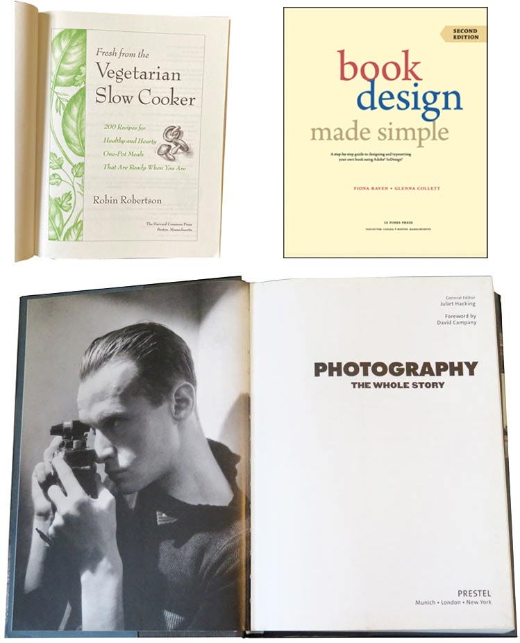
These are fine for novels and nonfiction, and not much more is needed or expected. Let’s move on to adult books with higher design ambitions.
The title page or spread in a coffee table book should draw the reader in and prepare them for the wonderful views in the rest of the book. Check out the creative designs below.
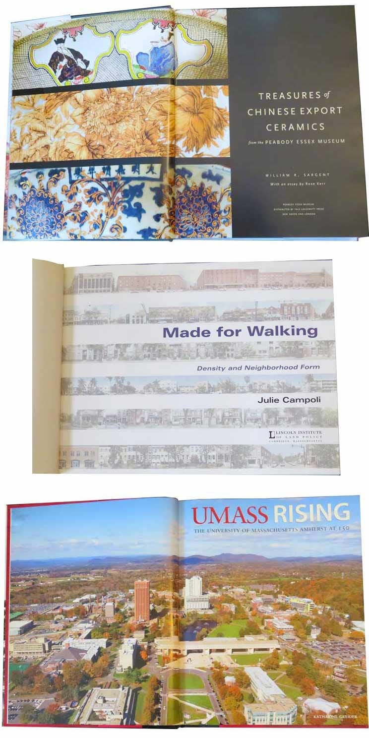
In some cases, the illustrations show something that appears later in the book, as in the middle example above. Sometimes the image is unique to the title page and is described in a caption on the copyright page.
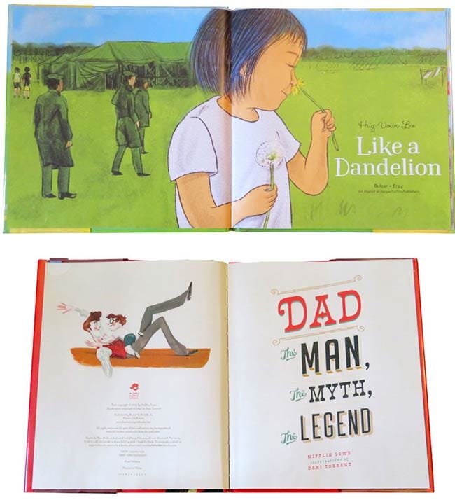
Here’s where the fun really begins. Variations are endless, but all of the required elements are included in every case. The number of book pages is limited, with 32 or 48 being the norm. Usually there’s not enough space to devote an entire page to the copyright, so it is often tucked into the left side of the title page spread, or on the final page or back cover or even the jacket.
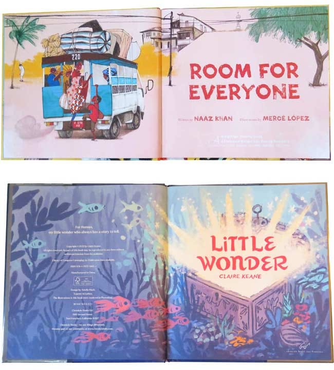
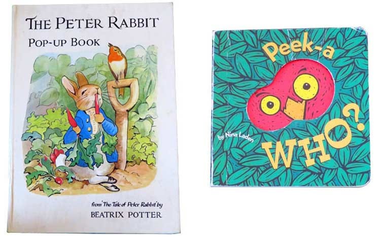
With a board book, the page count is usually 16 or 24, including the cover. These limits require some creative thinking about where to locate both the title page and the copyright notice. Sometimes the front cover acts as the title page, as shown below.
In all the books shown above, the title, author, and other elements are nicely balanced on the page or spread. Sometimes before you begin to design the page or spread, the empty space can seem intimidating. And sometimes there’s almost nowhere to fit the type in. (If this happens, ask your illustrator to create space for you.) Either way, use type, colors, and perhaps graphics or images from the overall book design—both the cover and the interior—so the page will lead harmoniously from the cover into the rest of the book.
We hope these examples will inspire you to do the most with your title page!
Comments
Nothing yet. Say the first thing.
Sign in to join the conversation.