
We’ve already covered Europe’s relentless summer drought on this Substack, even watching its footprint emerge from orbit in satellite imagery. Today, I wanted to push the data further: can we actually track the shifting colors of our landscape directly from space?
Armed with patience (and plenty of coffee), I calculated the average surface color 1captured by polar-orbiting satellites over London—one of the regions hit hardest by the dry spell. To keep the focus strictly on land and vegetation, I filtered out ocean pixels and heavy cloud cover.
Here is the result: a grid showing pixel colors every eight days, spanning from 2000 through just a few weeks ago.
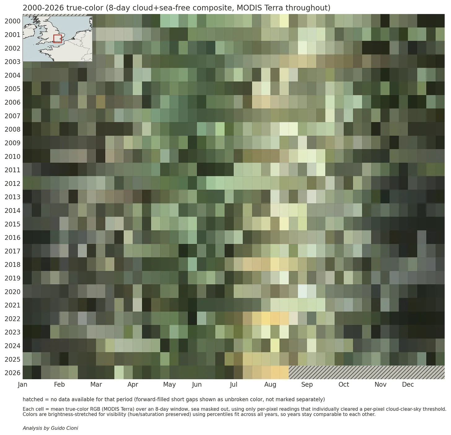
Even though my “smart” filtering was not able to get rid of all cloudy days, a seasonal cycle clearly appears in this picture, with the vegetation greening in spring/early summer and dying out in fall/winter. Look closer, though, and the anomalies jump out. Certain summers, including 2026, turn a distinct parched yellow across July and August. The current season is pacing right alongside 2022 and 2018, two of the driest years on record.
If we trade time resolution (moving from 8-day to 16-day windows) for precision, we can leverage a tool built specifically for this job: the Normalized Difference Vegetation Index (NDVI). NDVI monitors plant health by comparing absorbed red light against reflected near-infrared (NIR) light. The map below presents a refined “vegetation calendar” with far less cloud distortion.
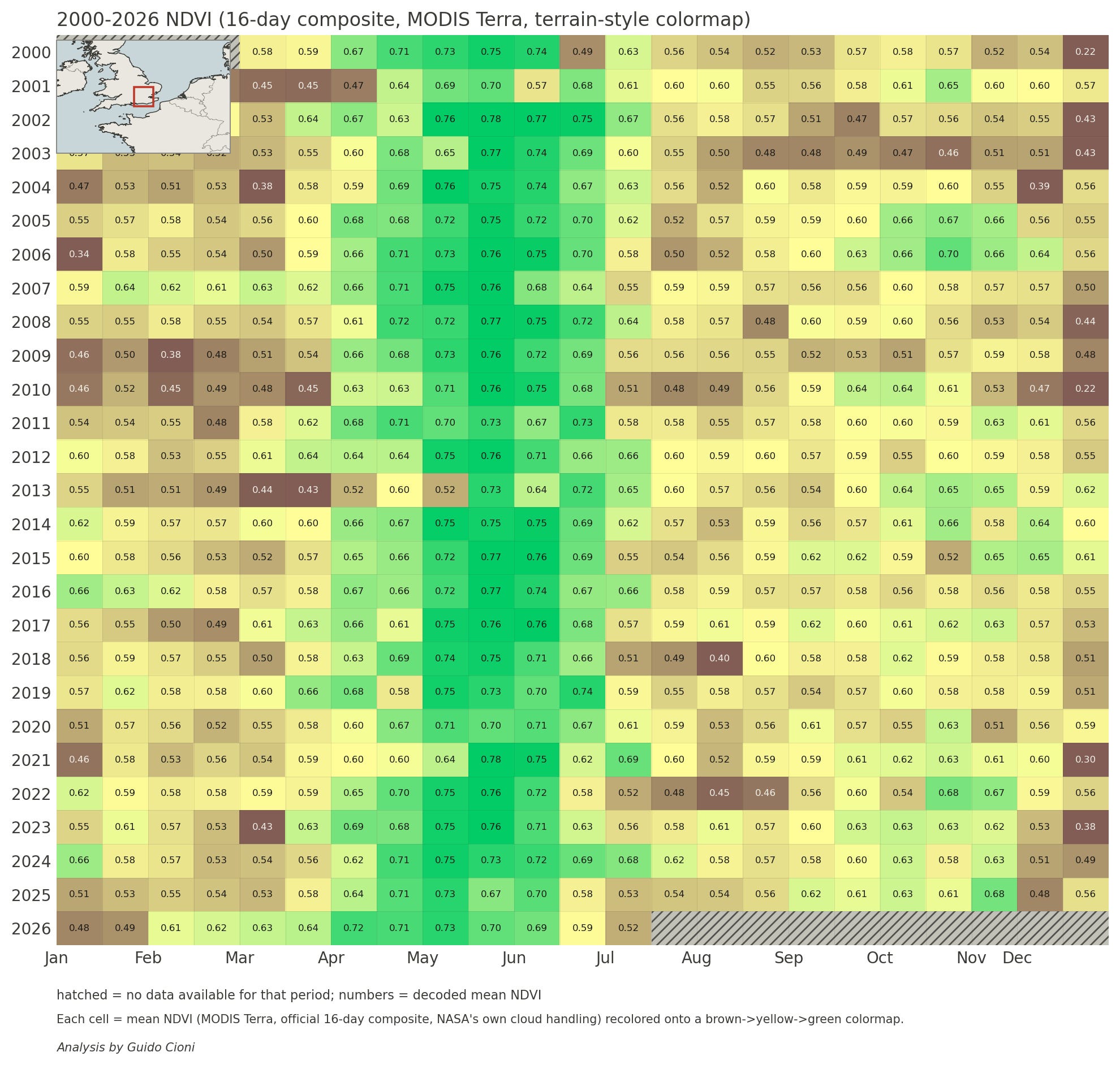
The findings are striking: the NDVI data closely mirrors my initial color model, which nicely validates my DIY coding attempt! Due to processing latencies, this dataset only runs through late July, but the trajectory is clear: 2026 is tracking dangerously close to 2018 and 2022.
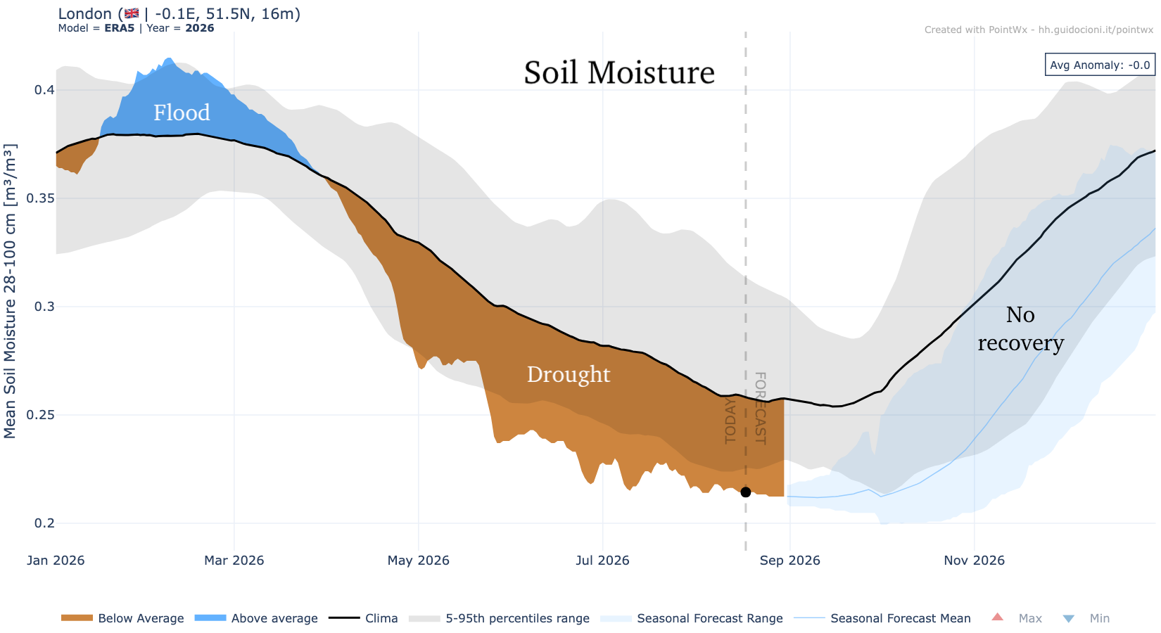
Here is the twist: rain shortages aren’t the primary driver this time around. Soil moisture data over London reveals drought conditions taking root as early as May.
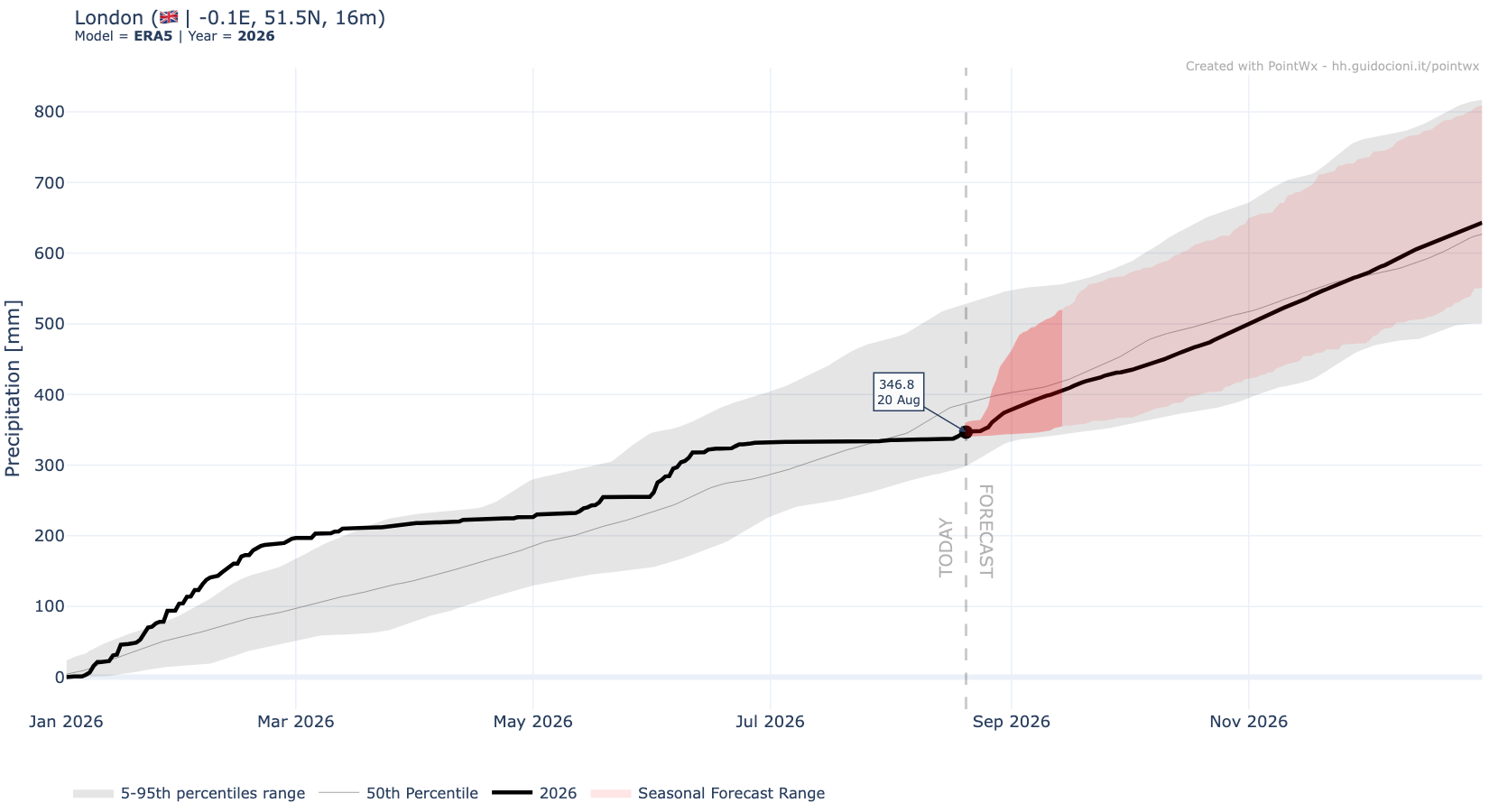
Cumulative precipitation data shows that total rainfall for 2026 isn’t historically low yet. Current totals sit near the long-term average and well above extreme dryness thresholds, thanks to heavy rains between January and March (which also show up in the soil moisture evolution).
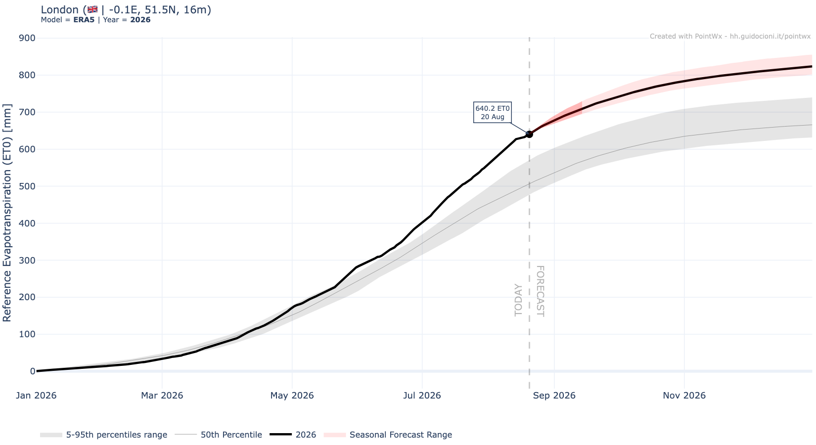
The true culprit shows up when we examine evapotranspiration: this includes both processes of bare soil evaporation and transpiration (through plants), which both contribute to move water from the soil into the atmosphere, thus lowering soil moisture. London (and much of Europe) has endured relentless heatwaves since late May. Extreme temperatures accelerate evaporation from bare soil and also increase plants transpiration (up to a certain tipping point where plants enter a stress-response mode by closing their stomata), rapidly draining soil reserves. This year’s evapotranspiration curve sits well above the 95th percentile, confirming that water is evaporating out of the ground at a historic rate.
You can generate these last plots using my app.
No posts
Comments
Nothing yet. Say the first thing.
Sign in to join the conversation.