
Hello and welcome to June’s challenge.
Each month I will be sharing a new post with a different theme and a challenge for you to go out and complete, should you wish to do so. The idea is to share some of your favourite images from the challenge on the chat page of my substack. Please feel free to post your images and comment on others so that we can build a supportive community around our shared love of photography.
This month the theme is ‘summer in black and white’.
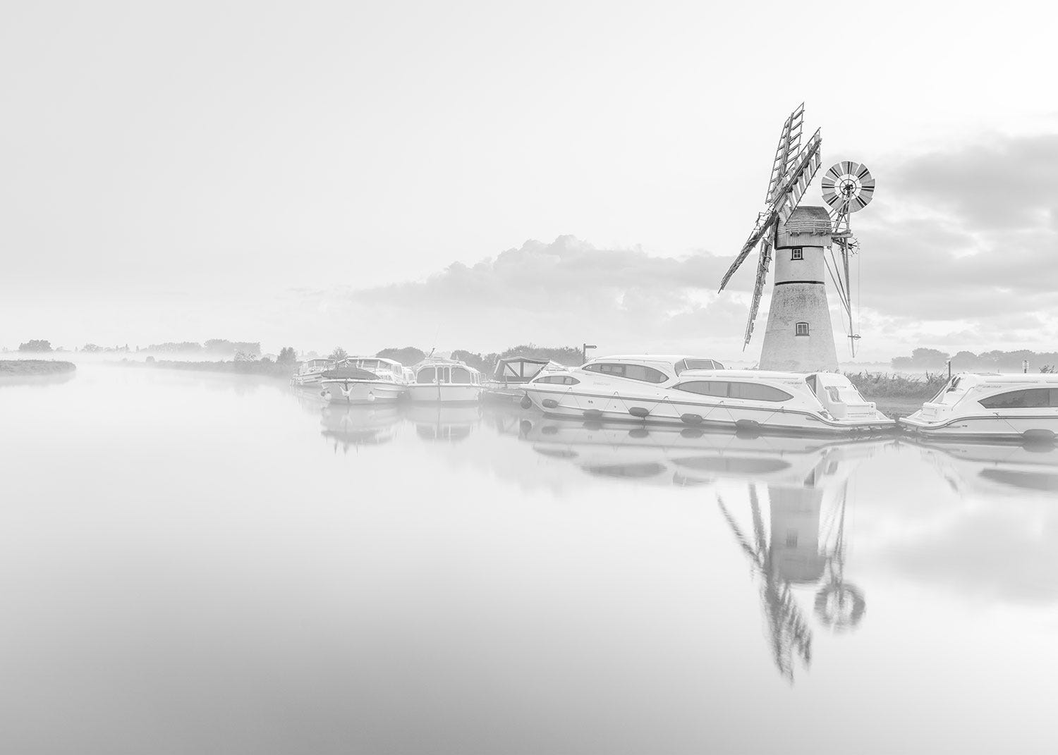
I would consider myself a colour photographer - I love the beauty of colour and the way it conveys emotion in an image, but sometimes colour can be a distraction especially in the summer when the skies can be blue and featureless. So this month I thought we would explore the idea of conveying summer in black and white. At first this may seem counter intuitive - after all the beauty of summer is often found in its colour and vibrancy.
Shooting in black and white is really good practice for improving our photography. It forces us to look at all the physical attributes of the landscape beyond the colour which can often be the first thing we notice out in the field. To create a compelling image in black and white we need to learn to see the landscape in shades of grey and familiarising ourselves with the building blocks of an image - namely lines, shapes, textures and areas of dark and light that make up a landscape.
Shoot in RAW
To take good black and white images it is best to go out with the intention of shooting in black and white rather than shooting generally and hoping something might work in black and white later. I suggest shooting in RAW as this gives the greatest dynamic range to play with in post processing. Some cameras have a monochrome setting in the menu which allows the photographer to see the world in black and white in the live view option. This can be a good way of visualising the landscape and gives an immediate idea of what works and what doesn’t. The monochrome setting will capture the image in black and white but if you are shooting in RAW all the colour information will be retained, giving the option to process the final image in a variety of ways.
Composition
Good composition is important regardless of whether you are shooting in colour or black and white. However you may find yourself making different decisions about your composition when shooting specifically for black and white.
Stripping away all the colour from an image will leave you with the basic building blocks of an image - shapes, lines, shadows, contrast, tones and texture and you will need to see these as the prominent features instead of seeing the colour in a landscape.
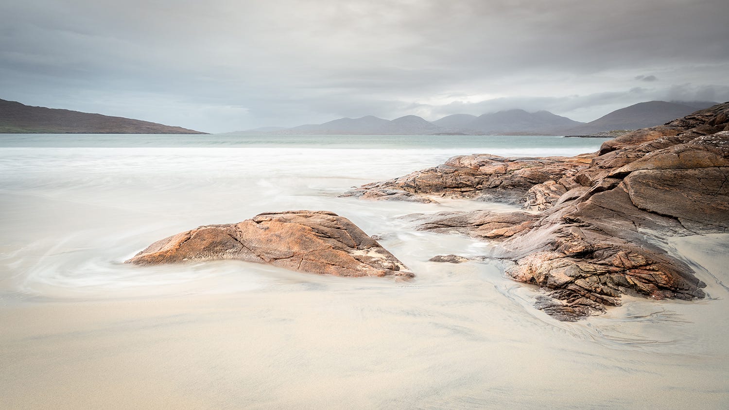
The following images were taken on the Isle of Harris. The first photograph shows my colour representation of the scene. For me the attraction was the colour and the subtle beauty of the landscape in the early evening light.
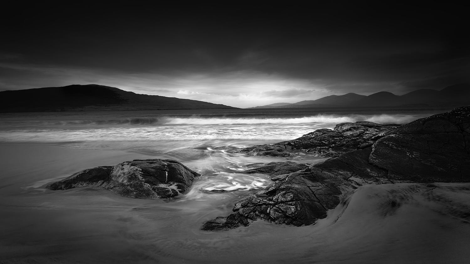
When I thought about converting my colour file to black and white I looked at it more closely in terms of light and shade. Instead of using the subtle tones that I have brought out in the colour version I wanted to highlight the contrasts within the image. I initially made the image darker across the whole frame and the brought out the whites in various areas - on the sea where the waves are breaking and in the sky where there is a small patch of light between the mountains. I worked on all these areas individually using masking tools in Lightroom. The images now have very different moods and atmospheres.
Shadow and contrast and tone
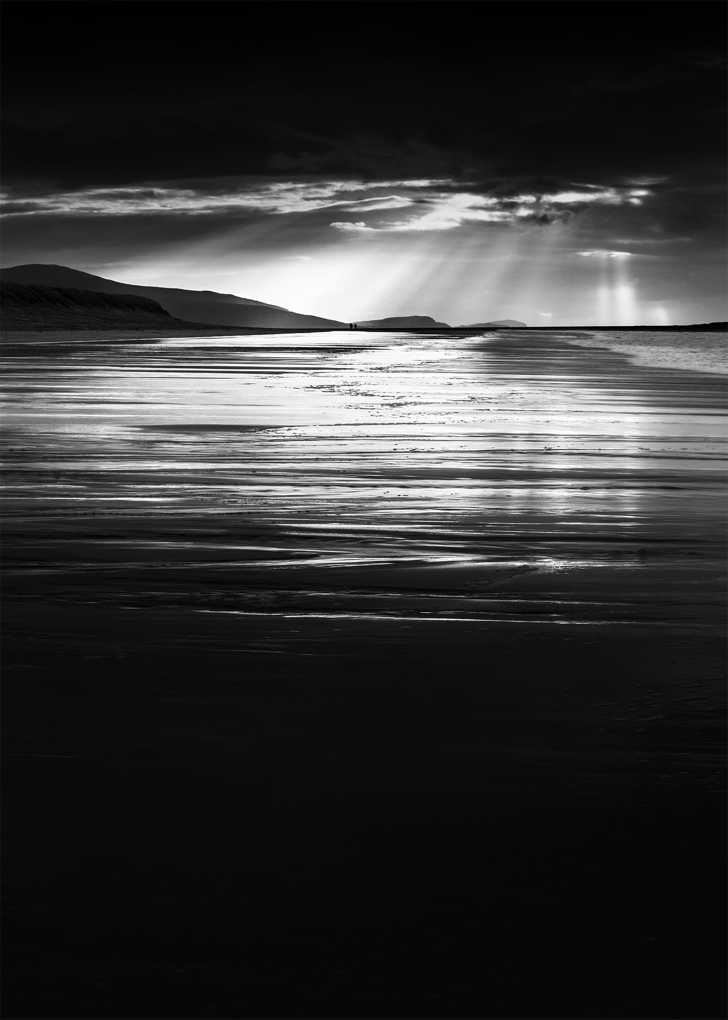
Shadows have a much greater importance in black and white photography than they do in colour. They are no longer just a darker area of the photograph, but instead can be a major part of the composition. They can be completely black or can contain some detail.
Contrast is the key to creating a moody image that really stands out. The success of this comes down to the proximity between the areas of contrast - ie the dark and light areas.
High key versus low key
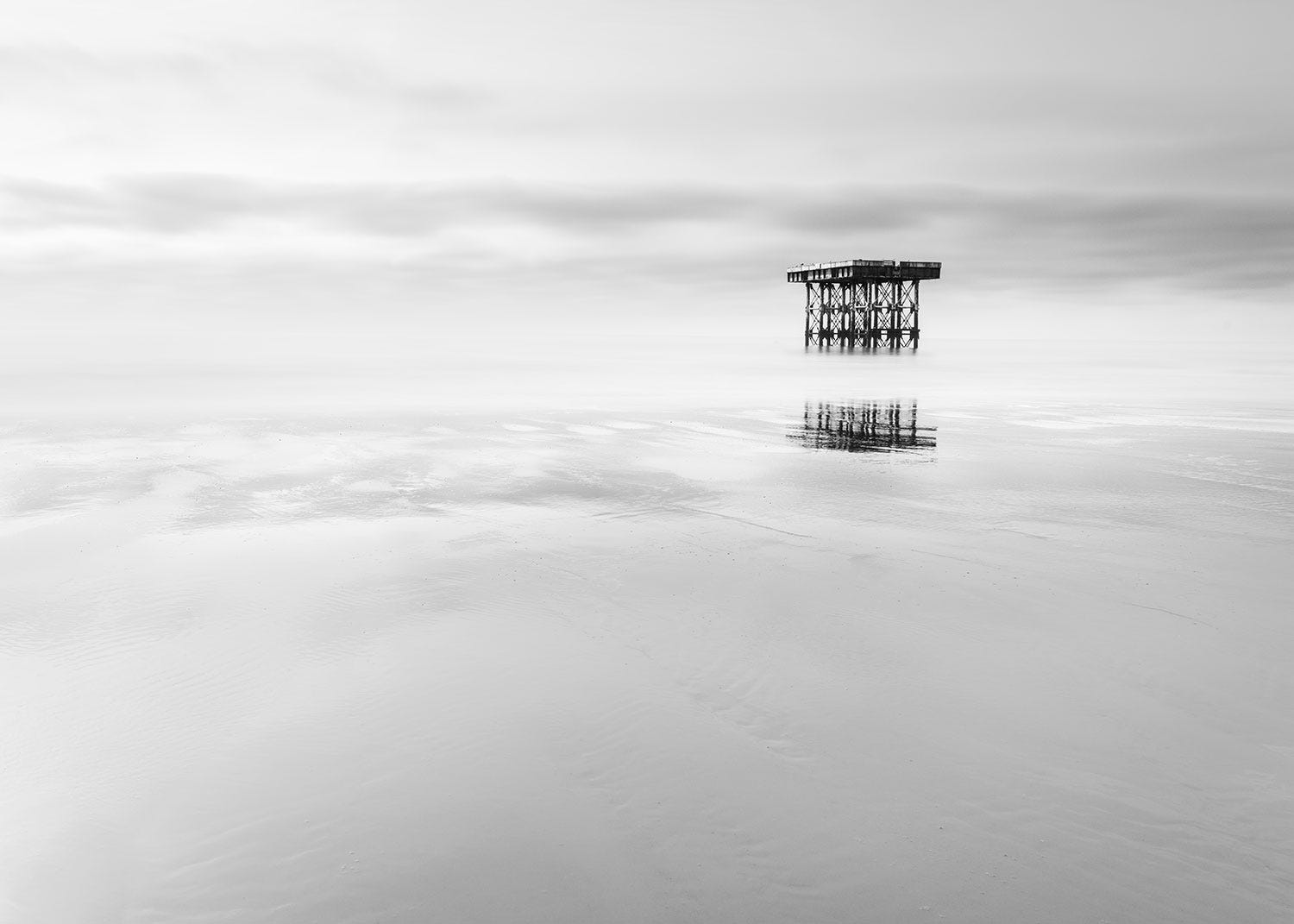
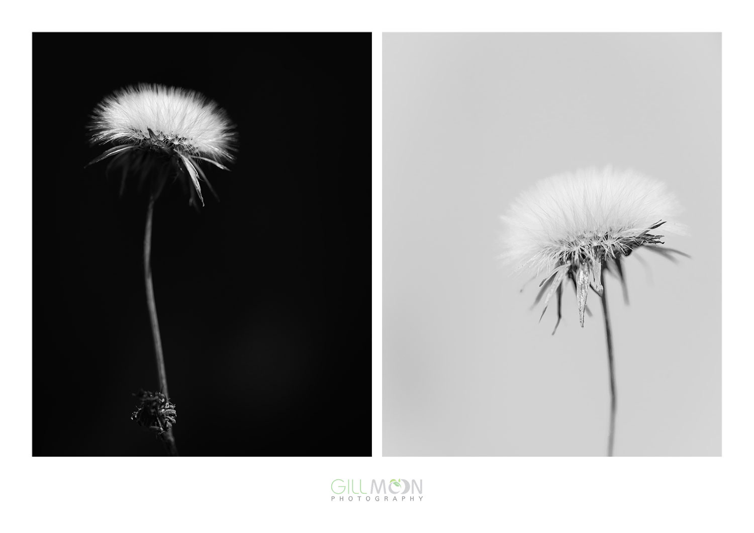
High key refers to images that are bright and contain very little shadow. They tend to have a soft dreamy feel to them. Low key images are ones that are darker and have a lot of shadow. They tend to be more dramatic and moody. Mist tends to help with high key images but it is not a requirement. Another way to achieve the same results is to choose a subject which is quite dark and then over expose the image by 1 or 2 stops.
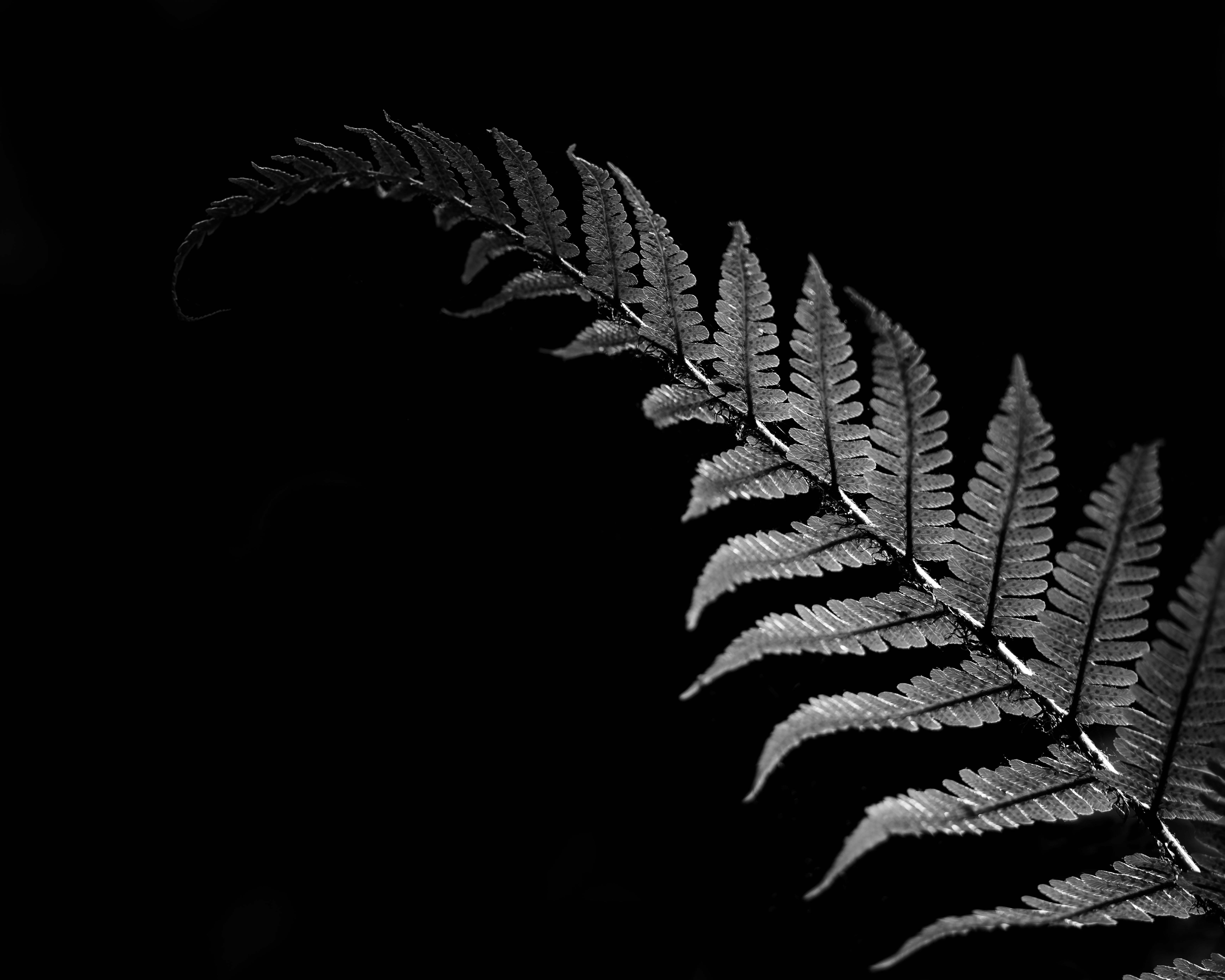
Low key images are much more moody, have more dark areas, more shadow areas as well as some pure white areas. This makes them more contrasty.
Black and white or monochrome?
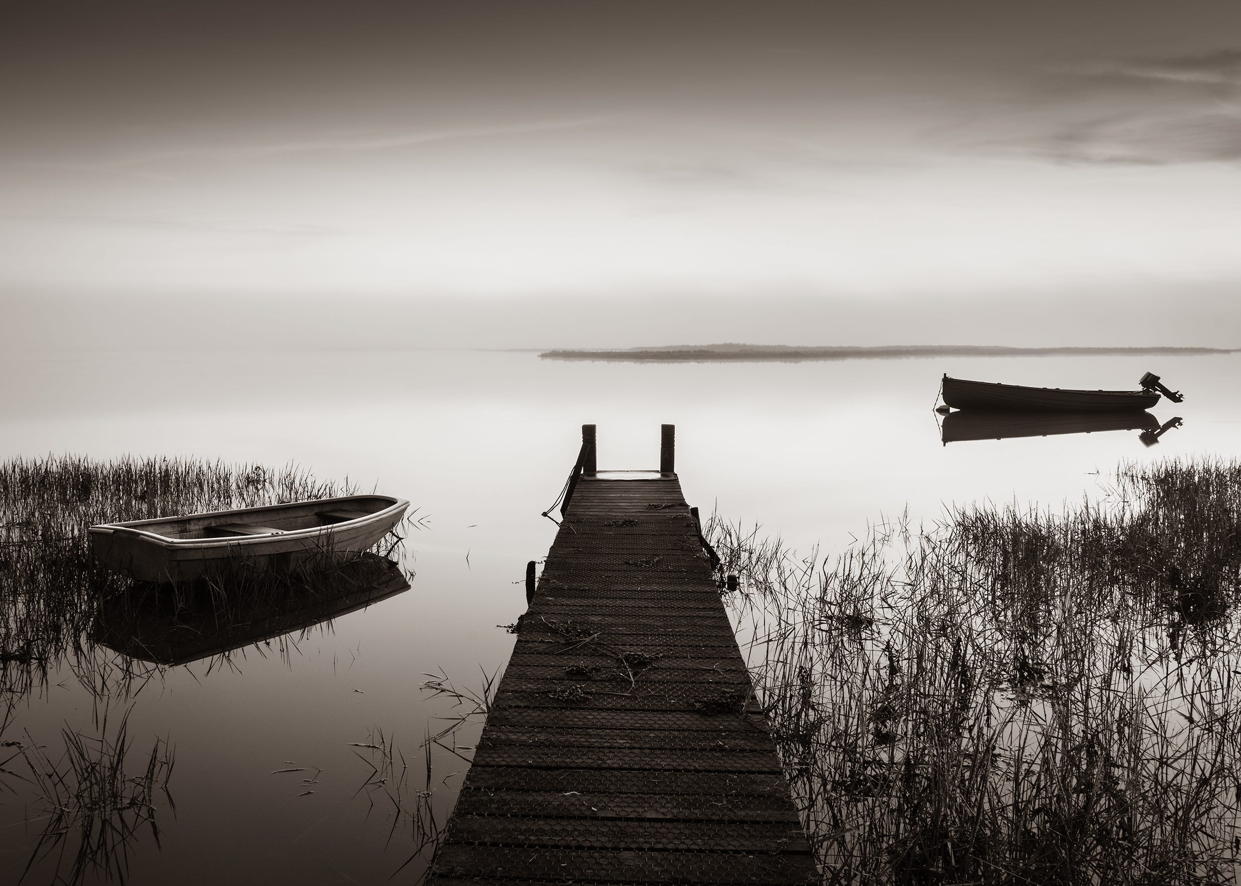
A monochrome image isn’t necessarily black and white. A black and white image has all its colour removed and consists of black, grey and white. A monochrome image has a colour tint for example a sepia image is monochrome and has a yellow tint.
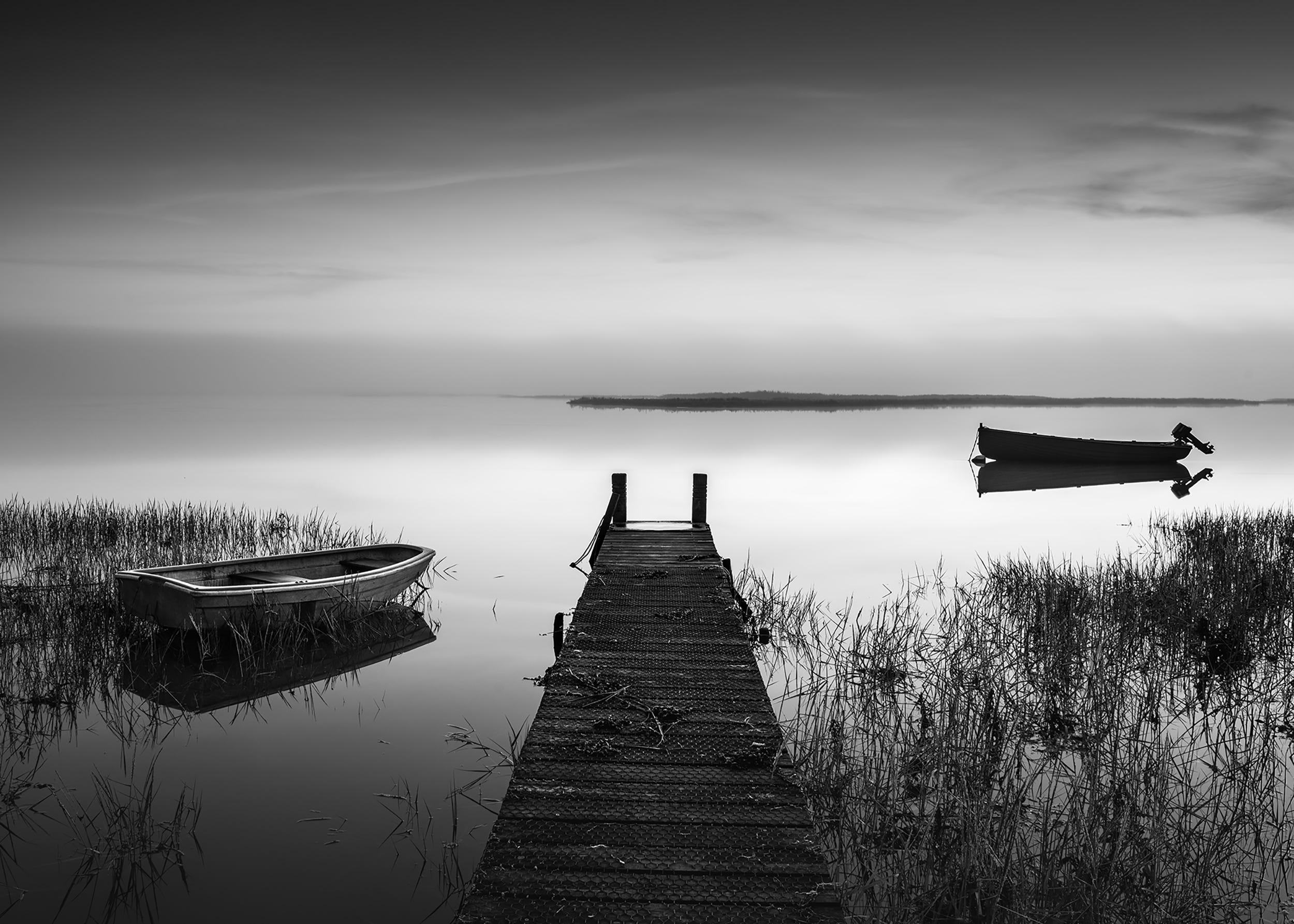
This is the same image with a sepia conversion applied. You will see that it has a very different mood to the straight black and white image.
Similarly a split toned image where the shadows have been coloured blue and the highlights yellow will give a different feel again to the same image.
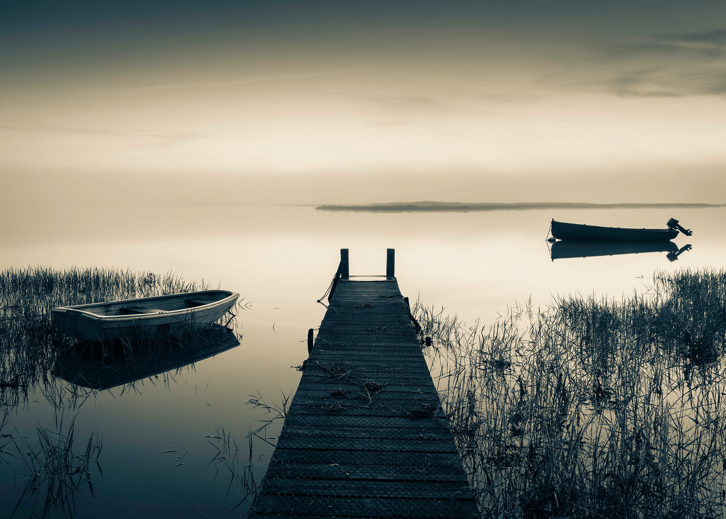
All these treatments create a different mood and feel to the image. So when you are thinking about how you would like your black and white file to look it is a good idea to think about what mood or story you are trying to convey.
Tips for good black and white images.
1. Shoot in RAW but set your camera to monochrome to make seeing in black and white much easier.
2. Concentrate on your composition, with the absence of colour strong compositions are essential.
3. Look for lines, shapes, patterns and textures and work hard to incorporate these into your images.
4. Dull, misty and drizzly days are perfect for black and white so don’t be put off by the weather.
5. Don’t miss out on the golden hours. Even though you are not shooting in colour the low angle of the light at the beginning and end of the day is perfect for black and white photography.
6. Using filters will make a massive difference to your photography. A graduated filter will help retain the detail in the sky which is so important for black and white landscapes. Using a 10 stop ND filter at the coast or by a river will allow you to create a contrast between the texture and tones in your image by blurring the water.
7. Know what you want your final image to look like and learn how to process accordingly.
Inspiration
I hope this article has given you some inspiration for summer in black and white (or monochrome). The aim of the challenge is to create some images that show summer using black and white, monochrome, high key or low key techniques.
I will discuss these ideas further in my weekly inspired posts, but in the meantime if you would like to take part in the challenge then please share your images to the chat and if you have any questions please leave them in the comments.
No posts
Comments
Nothing yet. Say the first thing.
Sign in to join the conversation.