
Hello and welcome to Inspired, a weekly email for my paid subscribers. In this series I want to explore topics which I hope might spark some inspiration for your own photography. I will talk about my thought process for creating images, both in the field and in post processing. The posts will be linked in some way to the monthly challenges, hopefully giving you all lots of food for thought.
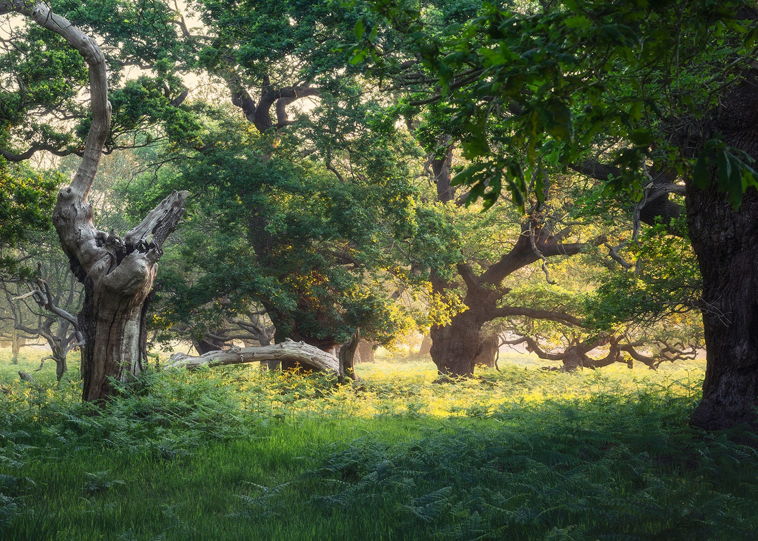
Last week I went out for a dawn shoot in an area of ancient oak woodland not far from where I live. I arrived before the sun had risen and the wood was cool and dark but alive with birdsong and rich in lush green foliage. I had gone there for photography, looking to capture the essence of the wood in summer.
I have heard many photographers mention that the woods are too green in summer and that they prefer autumn when the colours are more interesting. While I love autumn photography I also think that a woodland in summer has plenty to offer. However I am not always a fan of vibrant greens in my images so on this occasion I decided to experiment with some black and white photography. My idea was to use a high key processing style similar to infrared so that the foliage would recede into the paper and the trunks of the trees would stand out, a bit like pencil sketches.
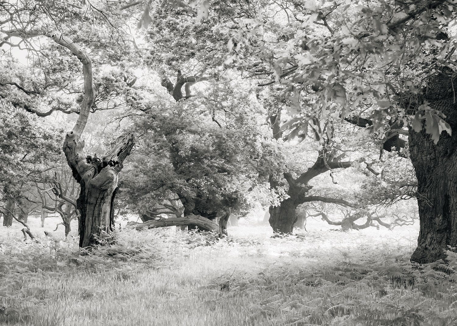
While I love the colour representation of this scene I feel that the individual character of the trees stands out much better in the black and white version. The leaves become less obvious and the gnarly shapes of the trunks and branches come to the fore.
I processed this image in Lightroom using the black and white mixer and the colour grading panels. The image isn’t true black and white as it has a hint of warmth (orange) in the highlights and cool (blue) in the shadows. You can see the conversion choices I made in the panel below.
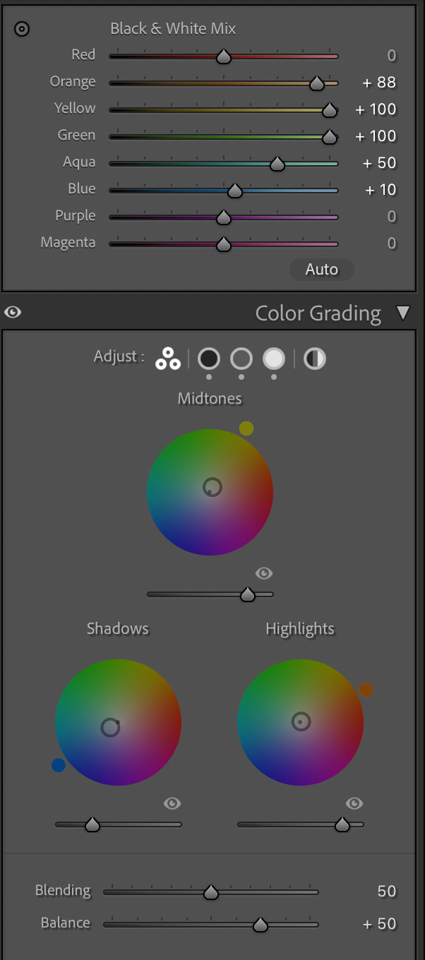
The black and white mix panel dictates how each colour is rendered when converted to monochrome. The closer to 100 the more white or bright the coloured area will appear. You can see that I have lightened all the foliage by pushing the orange, yellow and green sliders as far towards 100 as they will go. This has resulted in the foliage becoming less dominant in the scene.
When I was happy with the effect that I had created, I saved my settings as a Lightroom preset and used this to process a couple more images from the morning.
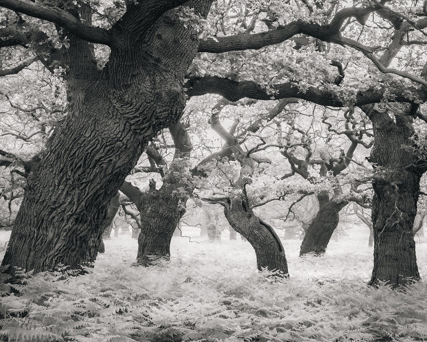
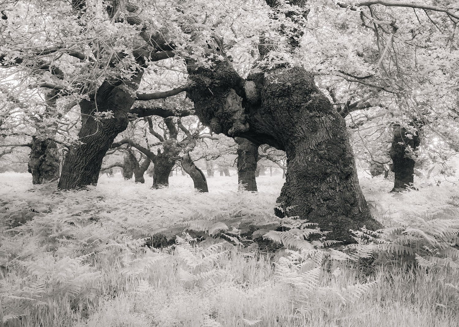
This processing technique definitely helps the shapes of the trees stand out from the foliage and as a result the character of the wood really comes across in the image.
Next I decided to see how this processing style carried over to a completely different landscape - one that wasn’t so dark and uniformly green.
I travelled to north Suffolk, to Mellis Common, where I was running a workshop and before the session I created a few images that I was really happy with in colour. I decided to see how they performed with a high key black and white conversion.
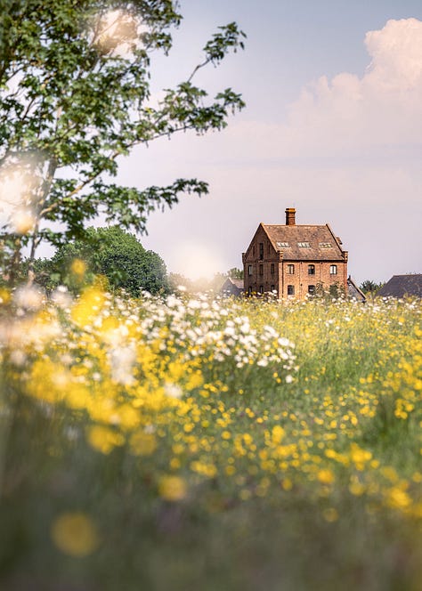
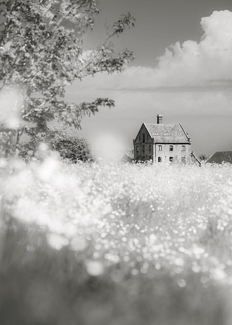
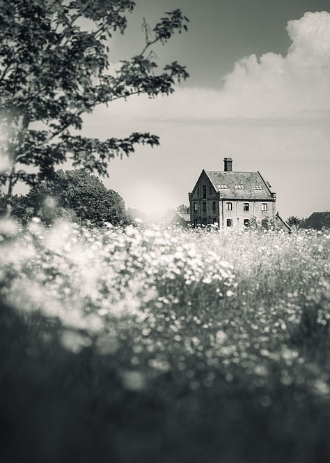
I also gave this file a more heavy black and white treatment giving it a more moody effect. Both monochrome images have some colour running through their shadows and highlights and I prefer this way of processing as I feel the resulting photos are less stark than straight black and white images.
Which image you prefer is really subjective, for me it would be the colour file. However I feel that the black and white images are quite successful at portraying summer mainly because of the subject matter and how well the flowers stand out from their background.
I hope this has given you some inspiration for creating your own black and white summer photography. If you would like to experiment with post processing then please share your images in the chat.
Thank you again for taking out a paid subscription and please chat or comment to get the most out of it.
Gill
No posts
Comments
Nothing yet. Say the first thing.
Sign in to join the conversation.