
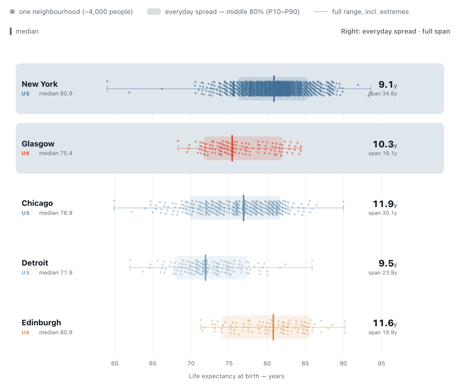
The UK and US publish life expectancy data for small areas: neighbourhoods of about 4,000 people. This allows insights into something that’s always interested me: inequalities within cities. I used to live in Glasgow where the east and west ends are worlds apart - the east was where my dad’s family grew up. When I went to university in the west end, this inequality fascinated (and appalled) me and I concluded that things were this bad not due to demographics but politics.
American cities have the racial element; with Brits the poor are overwhelmingly white middle class. Anyway, easy of these dots represents a neighbourhood of a city with population of 4k. we see New York surprisingly tight with a handful of wild extremes and a decent 80.9 year av; Glasgow is a steady sliding scale with streets where life expectancy falls a month every step you take and a 75.4 year average. Edinburgh, too, shows striking inequalities.
Comments
Nothing yet. Say the first thing.
Sign in to join the conversation.