
Your call-to-action buttons are magic. Done right, they turn a visitor into a customer in 3-5 clicks into checkout. Yet nailing the ideal CTA design, text and placement is a strategy that changes quickly. Why? Because brains.
My guide will break down exactly what makes a CTA click-worthy based on top design trends in 2025 and tease you with some of the science behind why we engage.
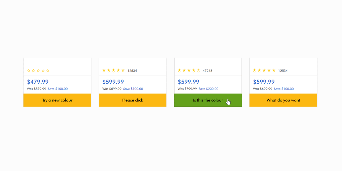
Notice how you don't see any of these gems anymore:
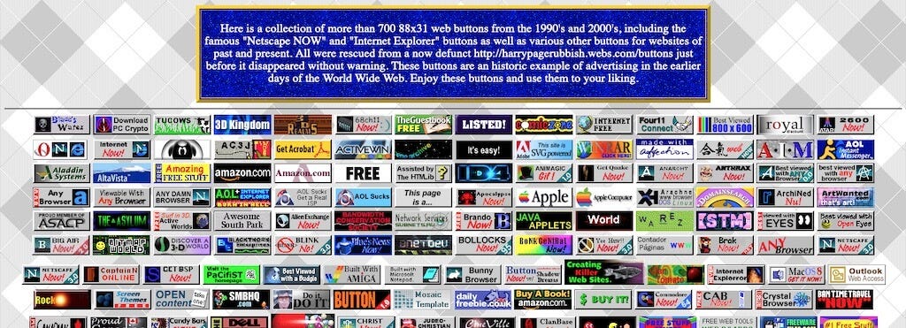
What worked before to grab attention doesn't anymore.
Yes, they’ve aged. Fundamentally they’re still flashy rectangles. Why don’t these exist today?
Let's skip making fun of the oldschool-cool era of internet and actually answer, why. Why do these no longer grab attention the way they used to?
Contrast,
clarity,
expected-action,
and most importantly - affordance.
A strong CTA button contrasts with the page in a way that draws attention. Early-internet webpages had less media than pages do today (not including your cousin’s GeoCities page, that was a hot mess) but many corporate pages were sparse.
A detailed, bright, flashy button with pronounced skeuomorphic 3D bevel edges was in its own way - a strong contrast from the flat, text-heavy main content.
Similarly, curiosity fueled clicks in the early days. “What’s this do?” was a valid motivator to click something. We as users had almost zero self-preservation sense, remember.
Today though — we need purpose. We need security and intention in a click. We want to know what’s coming next and how it’ll be delivered to us (a new page, a pop-up, an email sent, an app opening etc.).
No, not your budget. Affordance is a term popularized by one of my heroes, Don Norman, who authored The Design of Everyday Things, perhaps the most subtle under-sell of any published title ever. The book changed the internet. He is the godfather of user experience design and he was cool (still is) way before touchscreens were invented.
My favourite Norman-ism is his conviction that great design is invisible.
"Good design is actually a lot harder to notice than poor design, in part because good designs fit our needs so well that the design is invisible." - Don Norman, author of The Design of Everyday Things
We're in a very different mindset when we shop online today and the buttons we see are inherently extensions of our shopping interface.
His point is this — if a design element draws attention in an overt way (ie. you notice it) then it’s not serving its most useful purpose.
When, however — users gracefully complete their task (compare prices, filter a search, checkout) without every noticing the page elements — that’s Don’s idea of fluent design.
Most importantly, understand that we as users have almost generationally adapted how we interpret something’s usability online.
It's not a very big leap at all to argue that the cashier at a grocery checkout is the IRL interface of a checkout page on Shopify. We all learned this interaction.
We’ve had to learn how to interact with a cashier and we learn how to use the interface to order an Amazon delivery.
Just as kids learn to use their manners at the grocery store, hand an iPad to any toddler and see how they make sense of that interaction, too.
Keep labels clear, action-oriented, and benefit-driven.
Your words matter. Forget being cute or clever for the sake of it; clarity wins every time. Customers skim, so make it abundantly clear what they'll get when they click that button. Use verbs that imply action and deliver tangible benefits.
🟩 "Shop Now" - Direct, and you know what you'll do next.
🟩 "Get Relief Today" - Adds a benefit for immediate satisfaction.
🟩 "Start Building" - Encourages action with a creative twist.
🟥 Vague actions like "Submit" or “Start trial” or "Click Here." Why? There's no benefit or emotional trigger.
🟥 Being overly clever at the expense of utility. If users have to think about it, they’re gone. Treat attention like a resource.
Your CTA button color is more than just a design choice; it’s a psychological cue. The key? Choose a high-contrast, eye-catching color that aligns with your brand.
🟩 Use your primary brand color for consistency and recognition.
🟩 Match it against a contrasting, appealing background to make the button pop.
🟩 Add a hover state (e.g., the button lightens/darkens slightly) on desktop to suggest interactivity.
🟥 Don’t spend hours debating color. Quick reminder: A/B testing is your best friend. If it works, you don’t need to revisit it unless something changes.
Not every page needs a secondary CTA, but there are exceptions. On complex SaaS landing pages or catalog listings, secondary CTAs can help guide decision-making.
🟩 Use a secondary on product listings (e.g., "Add to Cart" = primary, "See Details" = secondary).
🟩 SaaS should use secondaries to catch explorers to differentiate between signup flow vs. signing up. Essentially your secondary is a funnel for users with discretion who need more evidence.
🟥 If you’re on a straightforward sales page, forget the secondary CTA. These distract visitors from the primary goal. They become an exit.
Your CTA needs to feel substantial enough to click while still fitting snugly within your design to feel invisible. Here are the rules:
🟩 Height - Based on the golden ratio (1 : 1.62) for balanced aesthetics.
🟩 Thumb-friendly size on mobile devices. Nothing kills conversions faster than hard-to-tap buttons.
🟩 Full-width to container for hero divs. Add margins for breathing room against borders.
🟩 Padding that feels proportional. Think "square," where the button corner radius fits naturally with its dimensions.
🟩 Oversized CTAs are trending, especially in footers. They demand attention amid cluttered designs. Personally, in this era of greyed-out CTAs and diminutive links I’m all for this hilarious trend.
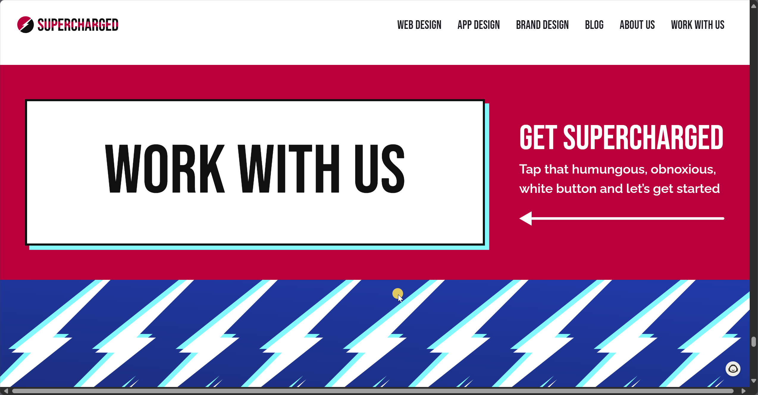
Adjacency matters. What’s right next to a CTA is the most direct support it can receive so be choiceful here.
🟩 Place sticky CTAs in a fixed navigation bar for maximum visibility.
🟩 Support them with trust badges or social proof (e.g., "100K+ successful purchases").
🟩 Support all CTAs with social proof, authority, directionality, all that good stuff marketers KNOW but FORGET. They don’t belong anywhere — they belong HUGGING your buttons.
🟩 Keep CTAs centered in the bottom-third of your hero div.
🟥 Forget under-thumb CTAs. Turns out we can’t see through our thumbs and end up ignoring them!
🟥 Only use animated CTAs sparingly. Flashing, wiggling, and popping buttons should be clearly tested. Go big or don’t bother.
Pro tip: Always integrate linear design cues (arrows, directionality, or images of people looking at your CTA) to subtly guide focus. Do this tastefully. Do this so Don Norman would call your design “invisible” and give you a gentle nod.
Great CTAs come with just the right amount of context. Microcopy under or near your button can boost trust while keeping the main message concise.
Guarantees: “Free shipping on returns.”
Details: “No credit card required.”
Bonuses or Disclaimers: Brief notes for clarity, e.g., "Limited-time offer, terms apply."
🟩 Add a "lock" icon on final payment CTAs to reassure customers about security. Use this literally nowhere else. It’s a trust signal to users that you’re anticipating them taking out their credit card and will treat the interaction with respect.
Note: a subtle tone change at checkout from your brand’s fun “buy our cool stuff” to “we completely understand how hard you work for your money” can help push nervous shoppers through. That’s what the lock icon is doing. It’s tone-setting.
🟥 Avoid emojis or common placeholders that break over time (e.g., a blank square in certain browsers).
It's not a very big leap to argue that the cashier at a grocery checkout is the IRL version of a checkout page on Shopify. We inherently expect a certain interaction.
Think outside the box and have fun with it:
🟩 Add cheeky CTAs to 404 error pages; humor lightens frustration and keeps users engaged. ("Lost? A fresh coffee might help. Check out our best-sellers.")
🟩 Include support-related CTAs even on off-domain knowledge articles (Zendesk, Helpscout, FAQs); guide users back to your brand.
Crafting the perfect CTA doesn’t just happen by accident. It requires a blend of design finesse, psychological insight, and a commitment to testing relentlessly. Done right, a CTA can be the difference between curiosity and commitment.
Want more data-backed advice to elevate your CTAs and CRO strategy? Book a free call today to start turning clicks into customers.
Comments
Nothing yet. Say the first thing.
Sign in to join the conversation.