
If you want to invest with confidence, you eventually need to understand the language of financial statements. Most people avoid them because they look complicated, dense, and technical.
But the truth is this:
You only need to understand a small set of concepts to make sense of a company’s entire financial story.
And one of my goals with Finorify is to make these concepts visual, intuitive, and mobile first.
Let’s break things down.
Every publicly traded company reports four core building blocks:
Income Statement – what the company earned
Cash Flow Statement – how cash moved
Balance Sheet – what it owns and owes
Financial Ratios – shortcuts that reveal quality and efficiency
Most websites throw hundreds of line items at you. Finorify focuses on the 10 to 20 that long term investors care about most, and presents them as clean, interactive charts.
Let’s go step by step.
Revenue (or net sales) is simply:
“How much money customers paid the company during that period.”
If Microsoft sells 100 dollars worth of Azure services, that’s 100 dollars in revenue.
Simple.
Why revenue matters:
It shows if the business is growing
It reflects real customer demand
It helps you compare companies over many years
Inside Finorify, the revenue chart gives you an immediate sense of trajectory.
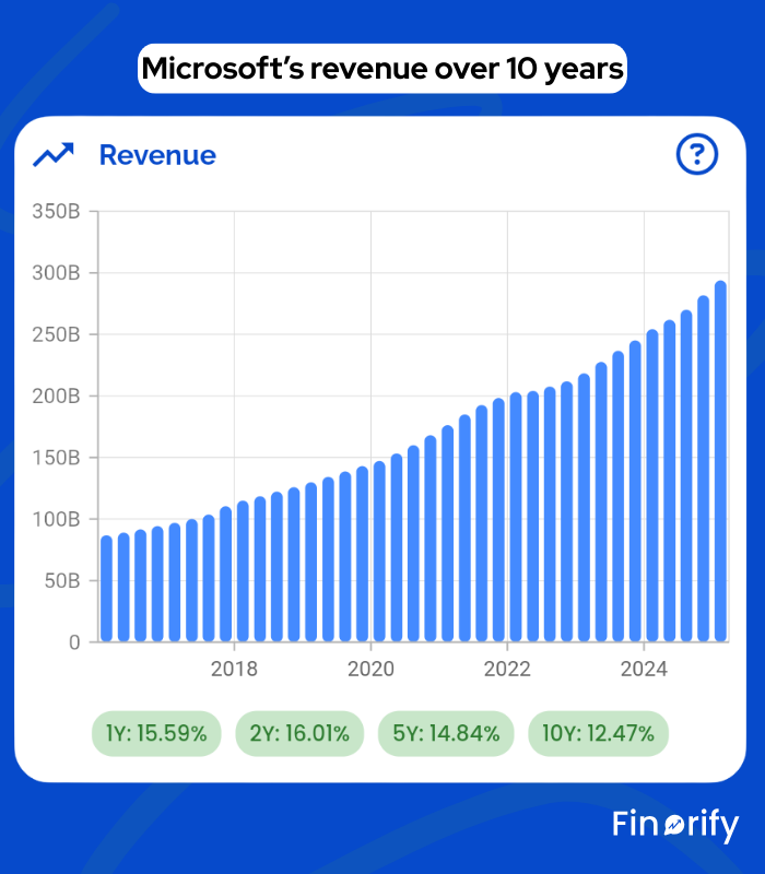
Look at Microsoft’s revenue over 10 years:
Consistent, steady growth
Clear upward trend driven by Azure Cloud, Microsoft 365, Gaming, LinkedIn, etc.
No major volatility or instability
This is exactly what long term compounders look like.
Total revenue is helpful, but segment revenue shows the engine underneath.
Visa breaks revenue into:
Services
Data processing
International transactions
Other
Client incentives (negative)
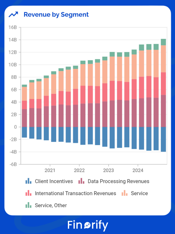
In Finorify, segment charts make patterns visible:
Services and data processing grow reliably
International revenue rises when global travel rises
Incentives fluctuate depending on spending behavior
You can instantly see what drives the business.
Segments show whether a company is diversified or overly dependent on one product.
EBITDA (Earnings Before Interest, Taxes, Depreciation, Amortization) sounds intimidating, but the purpose is simple:
“Ignore financial structure and tax tricks. How strong is the core business engine?”
In Finorify, EBITDA appears alongside revenue so you can see:
How the business engine grows relative to sales
How stable or volatile the core economics are
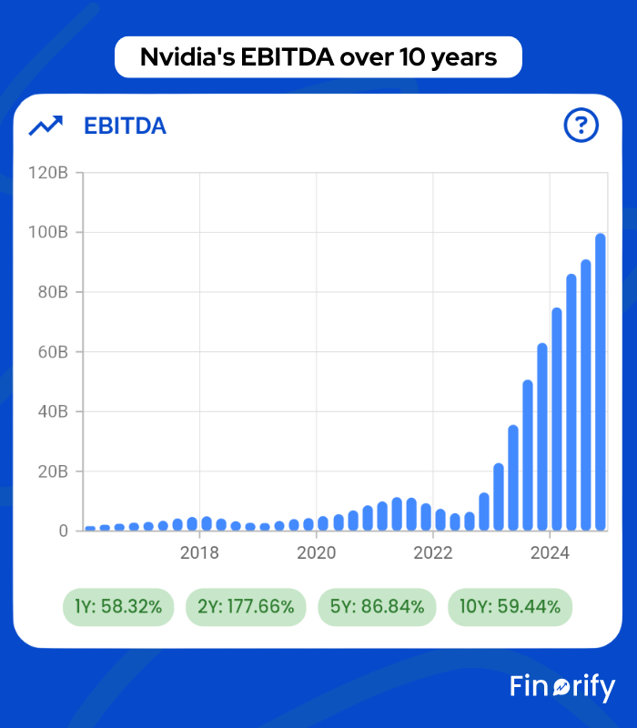
Nvidia – soaring EBITDA due to explosive demand for AI chips
Disney – fluctuates depending on parks vs streaming performance
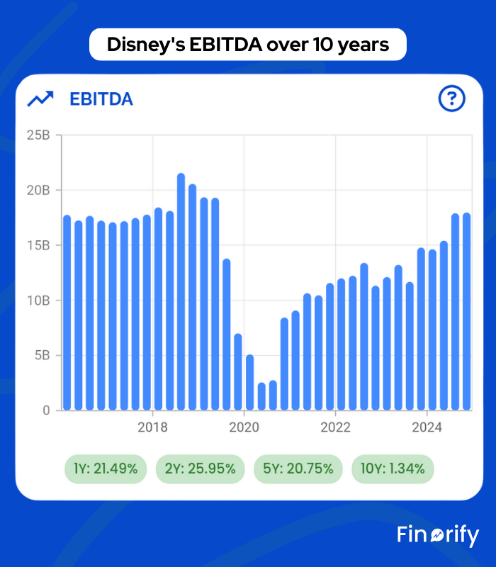
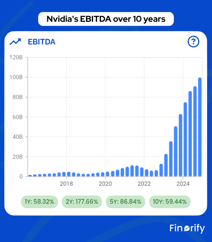
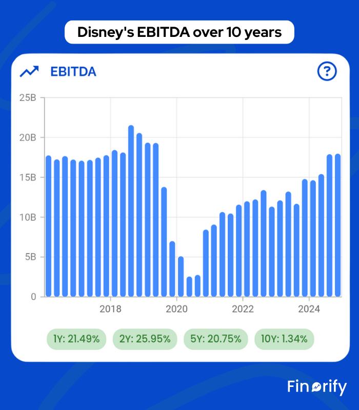
EBITDA gives you a clean view of business strength before external factors.
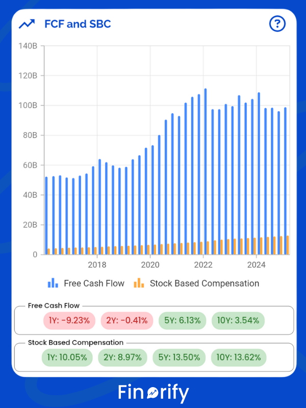
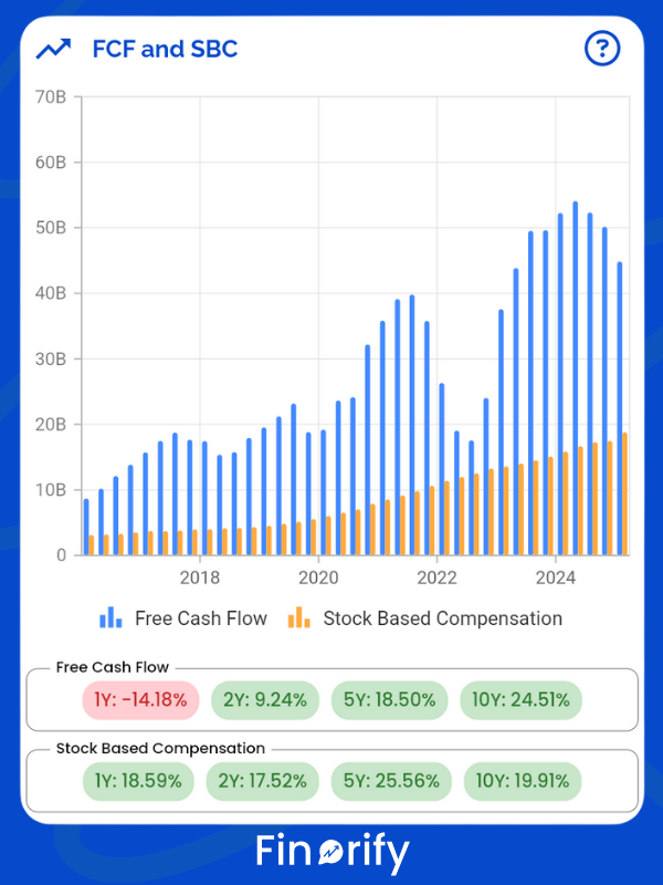
Free cash flow (FCF) is my favorite metric:
Free Cash Flow = Cash from operations − Capital expenditures
It shows how much true cash the business produced after paying for growth.
Finorify highlights:
FCF over time
Stock based compensation
FCF minus SBC (if you want the strict view)
Apple – one of the world’s largest FCF machines
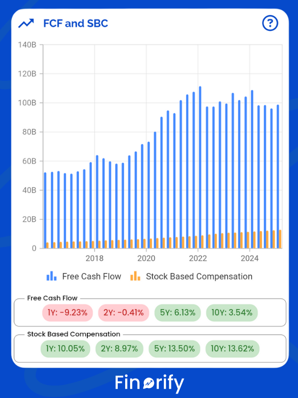
Meta – messy years followed by massive FCF rebound after cost cuts
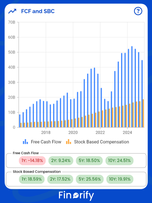
A company that produces large, consistent free cash flow can:
Pay meaningful dividends
Buy back shares
Build cash reserves
Reinvest aggressively
Free cash flow sits at the center of great long term investments.
If free cash flow is cash reality, net income is accounting reality.
Net income = revenue minus all expenses:
Operating costs
Interest
Taxes
Depreciation
Amortization
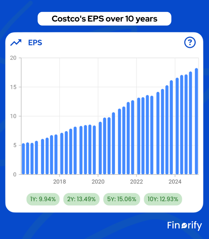
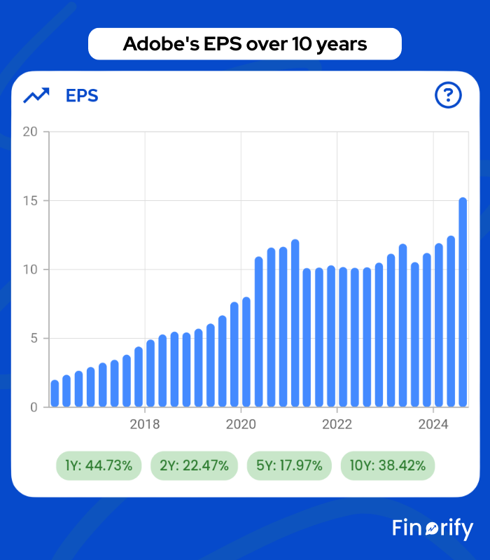
EPS is simply:
EPS = net income ÷ shares outstanding
Finorify shows:
Net income
Share count
EPS
EPS growth
This helps you see if:
A company is truly becoming more profitable
Buybacks are actually reducing share count
Dilution is eating into shareholder value
Costco – slow but very steady EPS compounding
Adobe – strong EPS boosted by buybacks
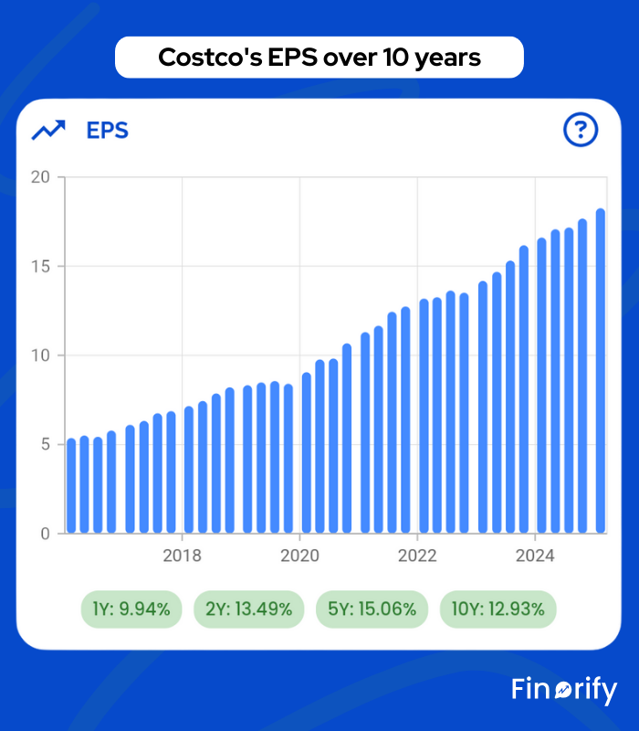
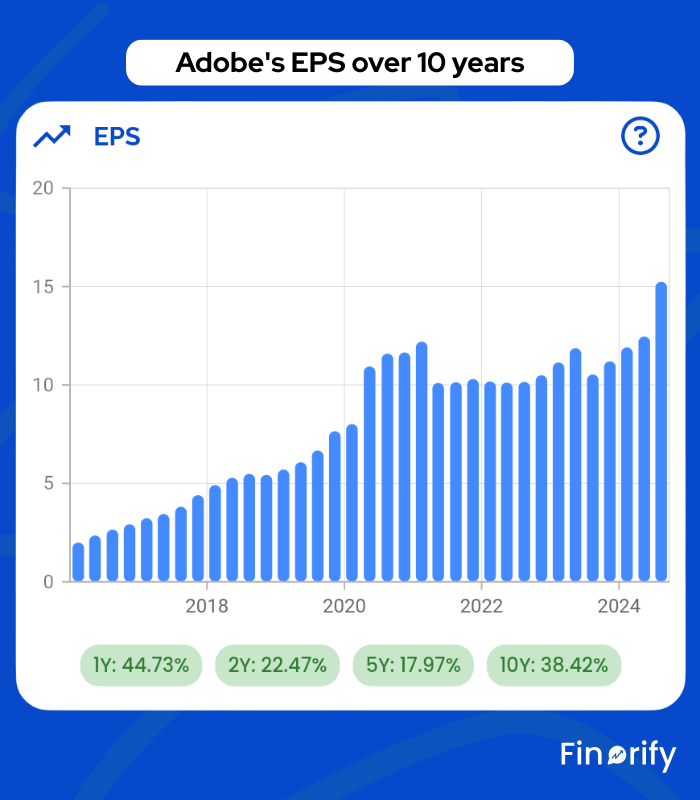
EPS growth is one of the easiest ways to spot winners vs laggards.
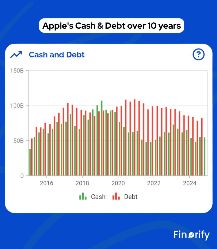
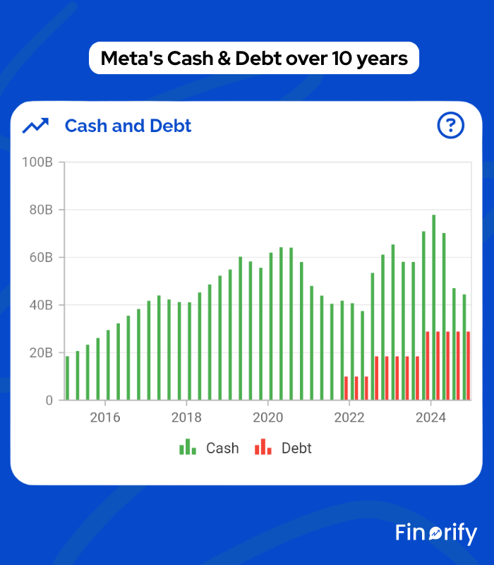
Think of cash and debt like your personal finances:
Cash = strength
Debt = obligation
Finorify’s Cash vs Debt chart shows:
Cash and equivalents
Long term debt
Net position trends
I prefer companies with more cash than debt, or at least very conservative leverage.
Apple – holds massive cash reserves and low risk debt
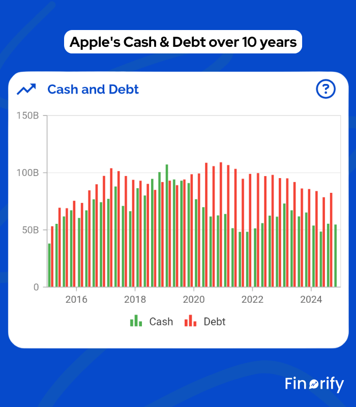
Meta – huge cash buffer, no debt (until AI boom)
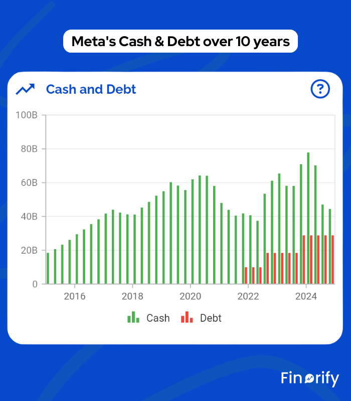
When things go wrong in the economy, balance sheet strength decides who survives.
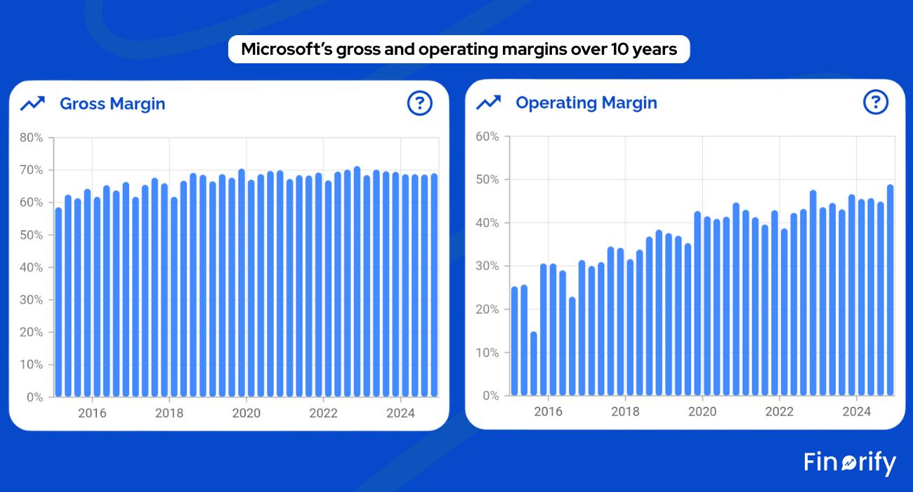
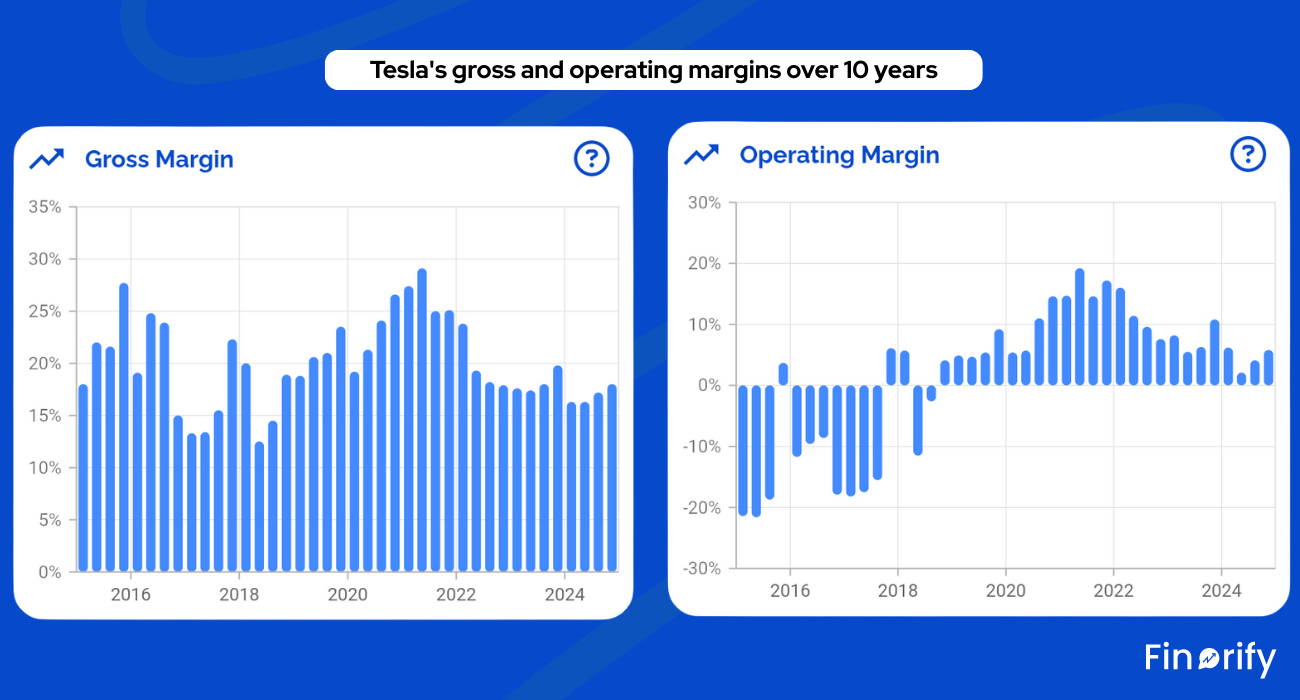
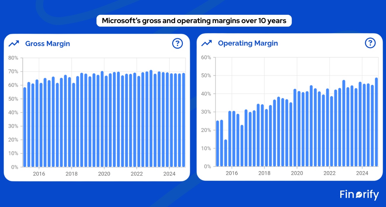
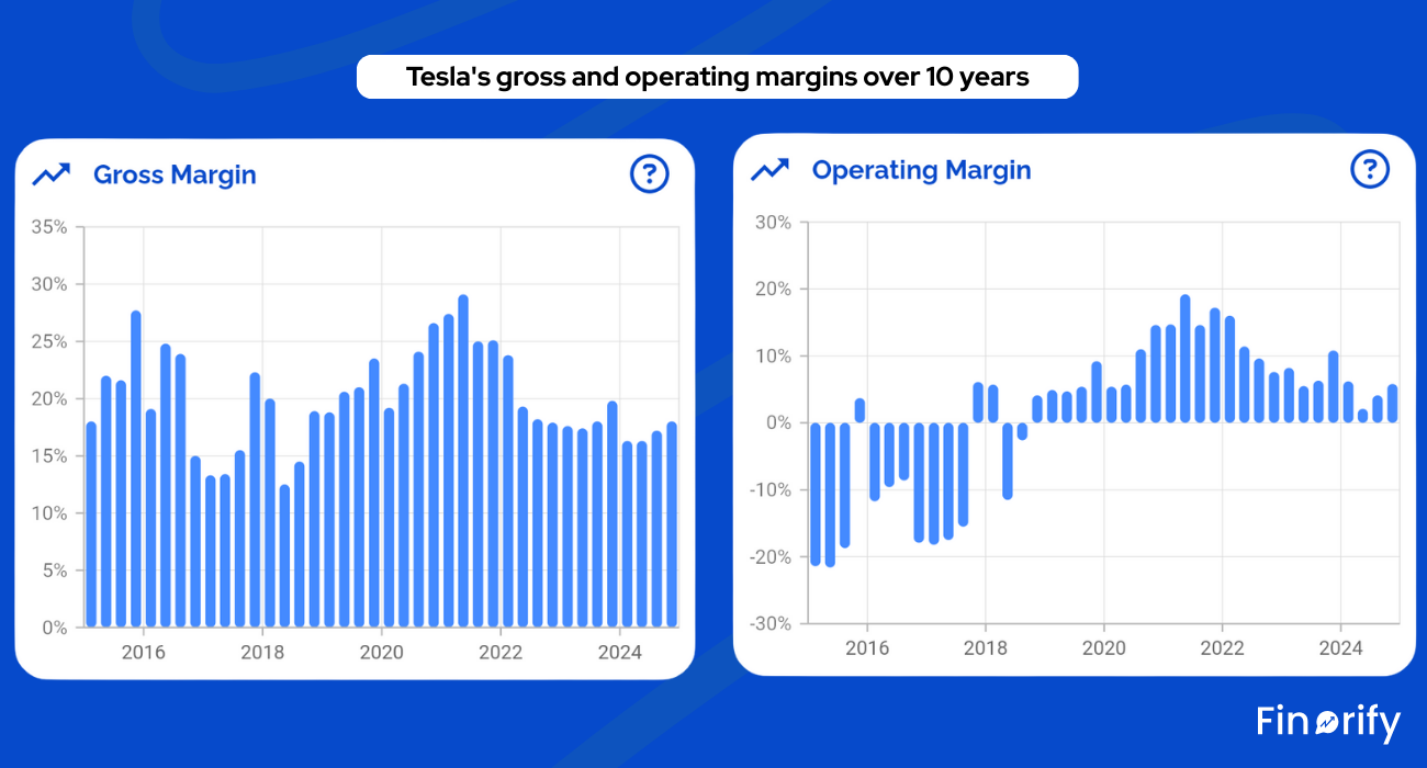
Margins show efficiency:
Gross margin – revenue minus cost of goods
Operating margin – gross profit minus operations costs
Net margin – final profit after everything
Finorify lays them out clearly over time.
Microsoft – high gross and operating margins thanks to software
Tesla – margins fluctuate heavily with pricing strategy and competition
Margins help you identify:
Structurally strong economics
Declines in power
Red flags like rising costs or shrinking profitability
When I look at a company inside Finorify, I am really asking five questions:
Revenue and segment charts make this obvious.
EBITDA and free cash flow show the business engine.
EPS growth and share count trends reveal this instantly.
Cash vs debt tells you how resilient the business is.
Margins show long term economic power.
You could do all of this manually using PDFs and spreadsheets.
Finorify simply makes the “fundamentals view” clean, mobile, and effortless.
If you want to practice, open the Finorify app on iOS or Android and examine:
Revenue & Net Income
FCF & SBC
EPS & EBITDA
Cash vs debt
Margins
After a few rounds, financial statements stop feeling like a foreign language and start feeling like the story of how a real business makes money, spends money, and rewards its shareholders.
No posts
Comments
Nothing yet. Say the first thing.
Sign in to join the conversation.