
中文版往下翻👇
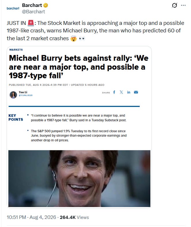
As always, the most important charts are at the bottom.
Let’s take a look at these things in today’s analysis:
1. The 1987 crash (and if we’re on the same cycle right now).
2. A historical pattern of the dot-com bubble in the 2000s.
3. What are the signals that could tell us a year-long bear market is near?
4. How long could this bull market continue?
The 1987 crash Michael Burry warned about
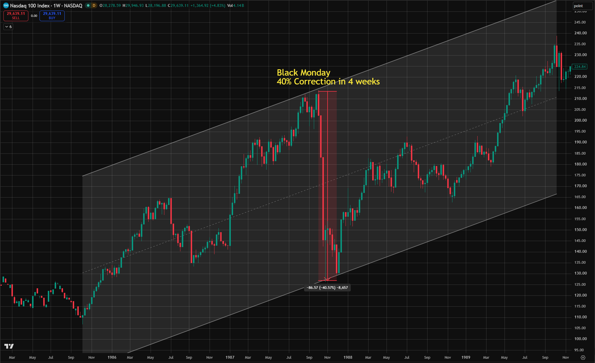
In 1987, the Nasdaq 100 rose 51% in nine months, from 141.41 at the end of 1986 to a peak of 213.81 on October 2.
On October 19, 1987 — Black Monday- it fell 15% in a single session, kept falling while the Dow bounced, and bottomed at 128.43 on October 26 — a 40% correction from peak to trough in sixteen trading days.
The index took nearly 20 months, until May 1989, to fully recover to the Black Monday high.
Now let’s take a look at a couple of crucial facts that Dr. Burry didn’t say:
Black Monday was not caused by a single event, but by multiple events that overlapped in the same time.
The causes: a market stretched by a year of rising interest rates was hit in one week by a bad trade-deficit report from the Commerce Department, a tax bill in Congress, and a public dollar dispute between the U.S. Treasury and West Germany — and computer-driven portfolio-insurance selling turned the decline into a cascade.
Could the exact same playbook run through our portfolio again in 2026?
NO.
Because the specific causes of Black Monday have been dismantled.
In 1987, the market had no brakes, so the selling ran from open to close without a pause. Because of that day, regulators created circuit breakers in 1988. Trading now stops for 15 minutes when the S&P 500 falls 7%, stops again at 13%, and ends for the day at 20%, so a one-day crash of more than 20% cannot happen again.
Portfolio insurance caused the crash, so it died with it, and the funds that replaced it sell into mandatory halts rather than a bottomless market.
Greenspan promised liquidity the morning after Black Monday, and that promise became permanent policy, making the Fed the market's last resort.
Now, let’s take a look at the Nasdaq 100 in recent years compared with 1987. The market from March 2020 until the recent pullback in July 2026: the Nasdaq 100 has experienced six corrections of more than 10%. Three of them were over 20%, and two of them were above 30%.
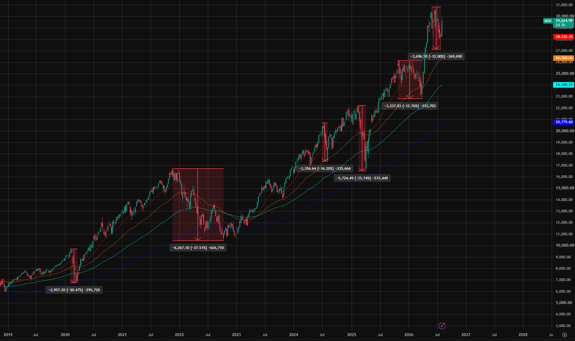
And now the pattern is clear. Every time the market surged significantly, it had a healthy, substantial correction. We just experienced a 12% correction a few days ago.
Could another 12% happen again soon? Maybe. Nobody can time the market perfectly, but the likelihood of a 1987-level pullback is extremely low.
Even if we take a hundred steps back and that 1987 crash happens again, look back at the 1987 chart: the trend was still bullish. It took more than a year to recover to the Black Monday top, but the recovery trend was strong. It was a dip of opportunities, not a multi-year trap.
So, in short, if that one really happened again, it would be a golden dip and would give you more than a year of a certain bull market.
The dot-com bubble type of bear market — The one thing that we should truly worry about.
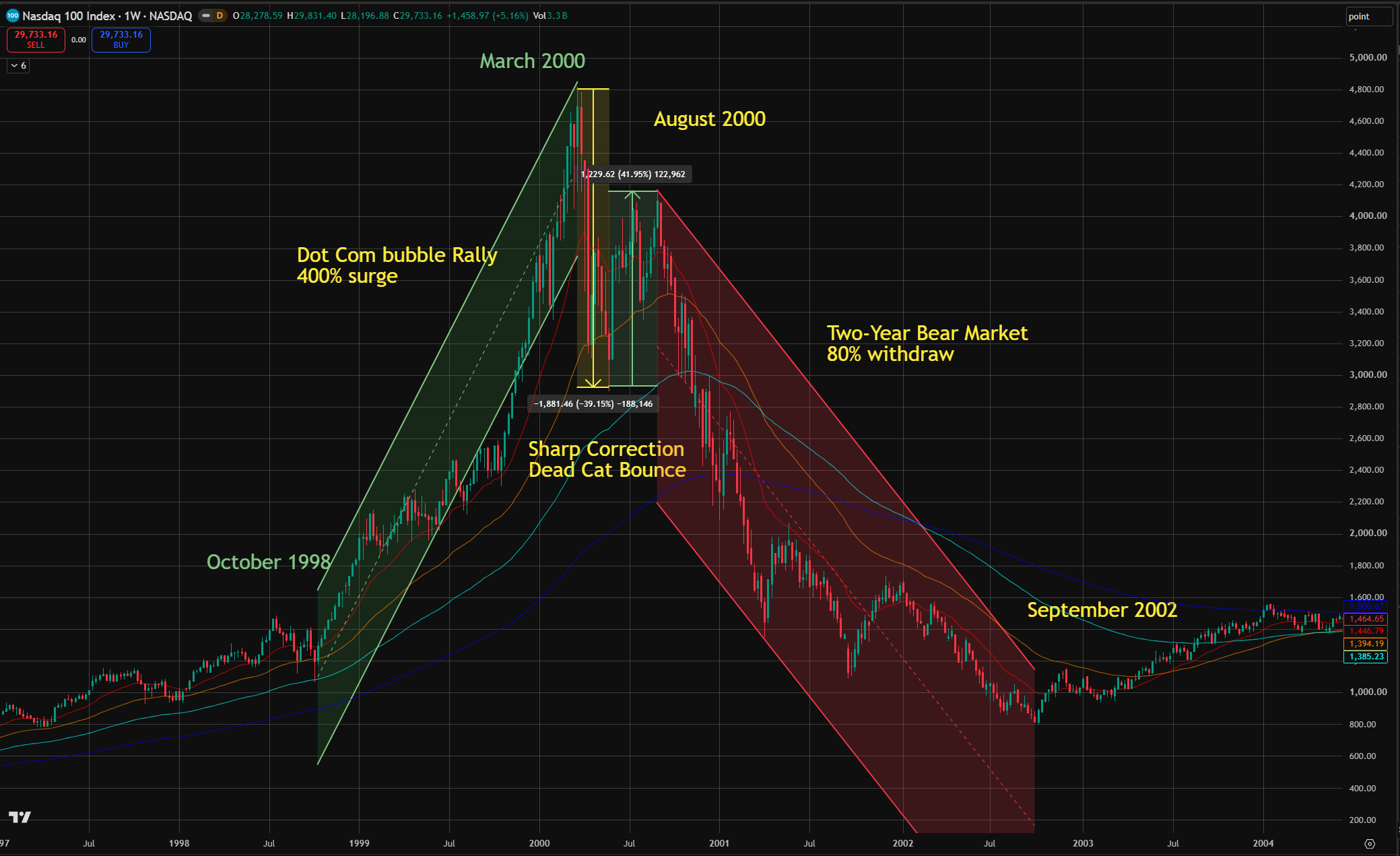
Before the dot-com bubble burst, the Nasdaq 100 rallied more than four times (400%) from its October 1998 low. It then experienced a textbook sharp correction and a dead-cat bounce before starting a two-year bear market.
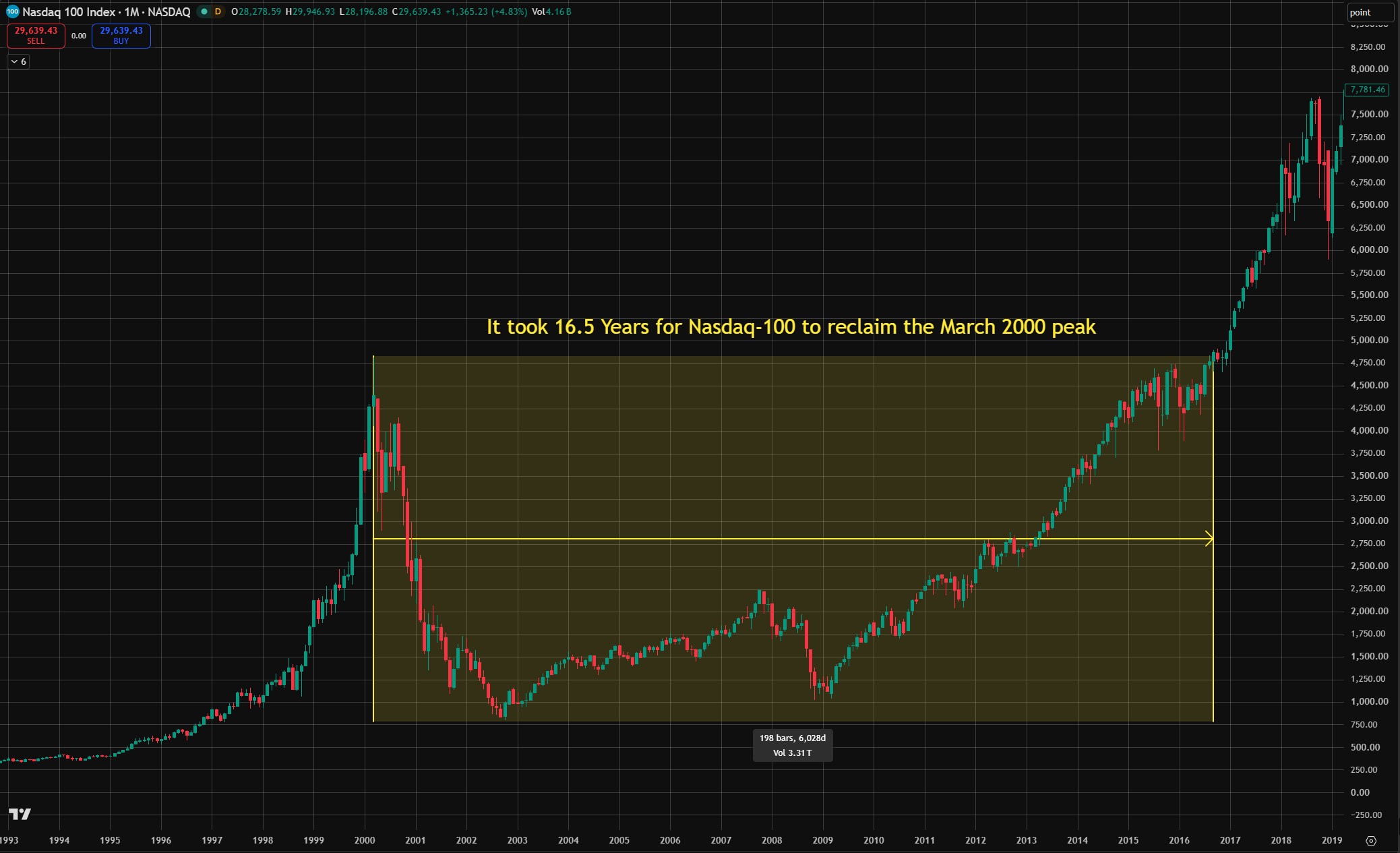
If we zoom out, we can see that the market did not recover to its March 2000 high until August 2016, a 16-year period.
This is the one thing we should really worry about: a multi-year bear market that takes more than a decade to recover. The last thing you want is to stand on the March 2000 top and wait 16 years just to get back to even.
Ask yourself: how many 16 years do you have in your life?
The possible signs for a year-long bear market
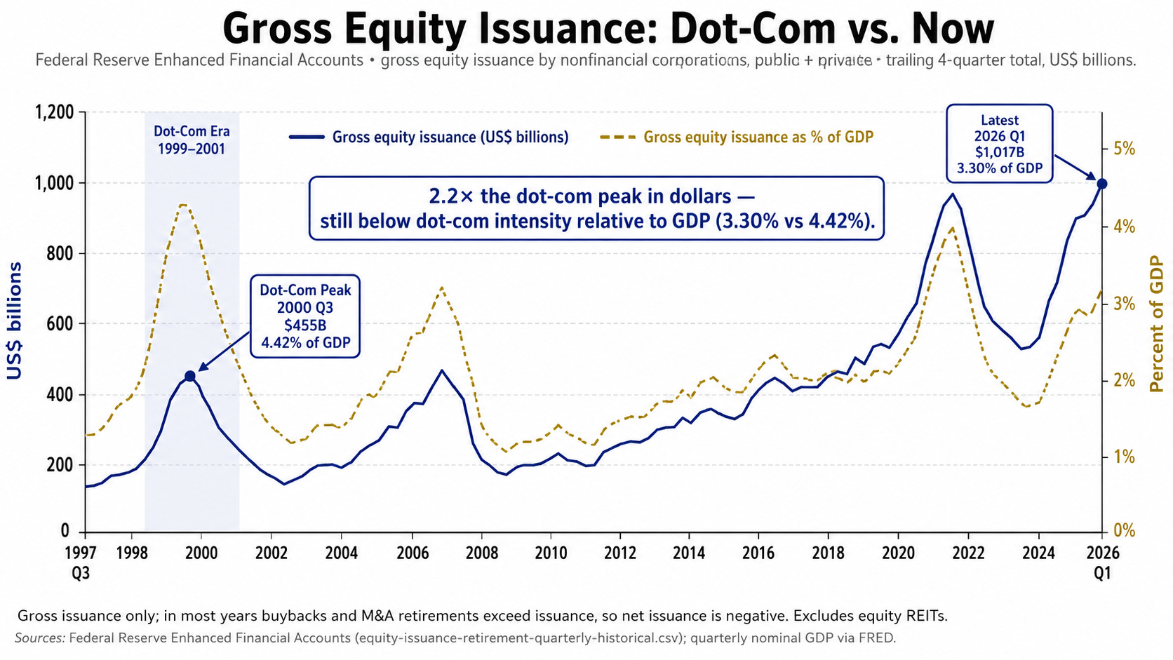
This chart shows the number of shares that US-listed companies are issuing on a quarterly basis, compared with the dot-com bubble period.
This doesn’t include IPOs.
Imagine you are a CEO of a US-listed company. Under what circumstances would it serve your best interest to issue more shares? The answer is obvious: when the stock prices are high.
And now, this is the case. US listed companies are issuing new shares like never before. More than doubled compared with the dot-com bubble peak.
But here’s the catch: if we compare it with GDP growth, equity issuance at the dot-com peak was 4.42% of GDP. Right now, it’s 3.3% of GDP.
This means economic growth has outpaced equity issuance.
But if the number of equity issuances keeps surging and reaches the dot-com peak, then we should start worrying.
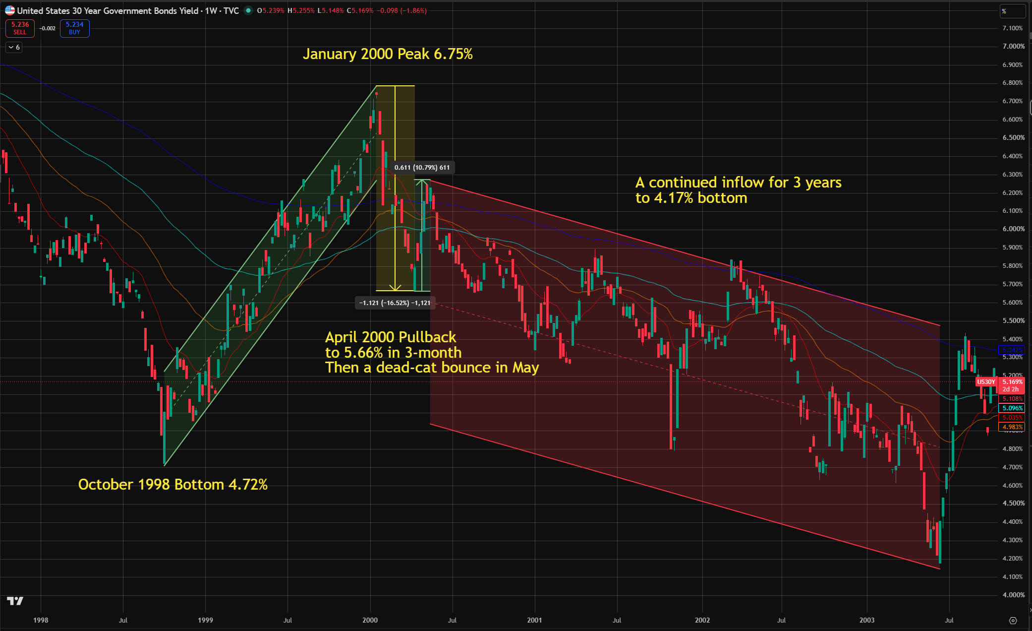
One pattern that has held for years is that the bond market always shows signs before the stock market has major moves.
This is a chart also within the dot-com bubble period. If you compare this one with the NASDAQ 100 index, you’ll find it incredibly similar.
The 30-year Treasury yield was surging before the bubble burst. This surging yield meant money was flowing out of bonds and into tech stocks until January 2000.
Then, it did exactly the same thing: a sharp pullback with a dead cat bounce, followed by a three-year downturn in yields. Within those three years, money kept flowing back into bonds.
But there’s a major difference as well.
The 30-year Treasury yield was two months ahead of the dot-com peak.
The simple fact was clear: bond investors helped blow the bubble to the peak. Then they pulled, took profits, created volatility, and then went back to the bond market, leaving retail investors on top.
And the 10-year Treasury yield also deserves the same amount of attention. I explained why the bond market is so significant for us in this article:
How long could this bull market continue?
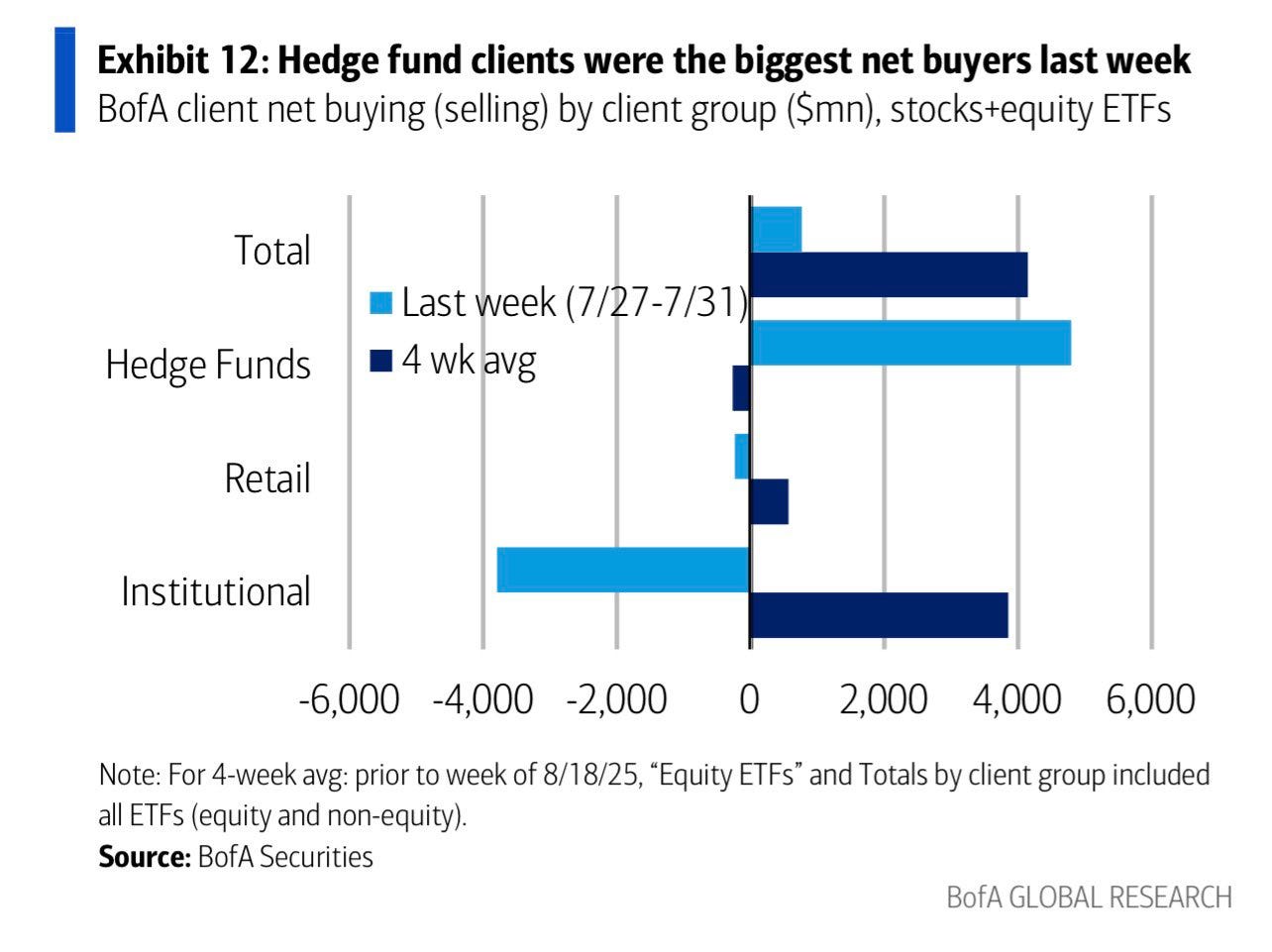
This is a chart from Bank of America. It shows that institutional investors were the biggest buyers for the July dip.
Those institutions are not the typical swing traders. When they allocate their money into the market, they intend to hold and let it gain—if things play out as they expected, of course.
On Sunday, August 2nd, in my weekly analysis, I said that, regarding the Iran war, we would be safe for 1 to 2 weeks. So far, things are moving exactly as I forecasted: there will be a peace deal soon, and things are moving in that direction. Check that article if you haven’t:
In general, the market appears optimistic over the next few weeks. Ideally, the volatility would remain relatively low until the September FOMC meeting.
But there is one thing that could overturn all of this: the restart of the Iran war.
Right now, we are expecting a peace deal or some new agreement to be reached. The United States has offered more friendly terms to Iran, including unfreezing a lot of their assets and allowing their airlines to fly again.
I will wait until Thursday or probably Friday to see if there’s gonna be an agreement. Then I’ll break down those policy files and bring you my analysis and forecast.
Stay tuned.
Disclaimer: The preceding content is informational only and based on the information available at the time of creation. It is not an offer or solicitation, nor is it financial or legal advice. It does not take your financial circumstances and objectives into account and may not be suitable for you.
Thanks for reading! This post is public so feel free to share it.
照例,核心图表均放在文末。
今天的分析将围绕以下几个话题展开:
1987 年股灾复盘:我们是否正处于同一周期?
2000 年互联网泡沫的历史规律
持续一年的熊市将至,有哪些信号可参考?
本轮牛市还能延续多久?
1987 年,纳斯达克 100 指数在 9 个月内上涨 51%,从 1986 年底的 141.41 点攀升至 10 月 2 日的峰值 213.81 点。
1987 年 10 月 19 日 —— 也就是 “黑色星期一”—— 该指数单日暴跌 15%;随后道指反弹之际,纳指仍持续下探,最终在 10 月 26 日触底至 128.43 点。短短 16 个交易日内,指数从高点到低点累计回调 40%。
指数花了近 20 个月,直到 1989 年 5 月才完全收复黑色星期一的失地,重回前期高点。
但有几个关键事实,伯里博士并未提及:
黑色星期一并非由单一事件导致,而是由多重因素在同一时间叠加爆发的结果。
具体诱因包括:持续一年的加息本已让市场承压,一周内又接连遭遇商务部公布的糟糕贸易赤字数据、国会推出的税改法案,以及美国财政部与西德公开的汇率争端;再加上计算机驱动的投资组合保险策略集中抛售,最终让普通下跌演变成了踩踏式崩盘。
2026 年,完全相同的剧情会在我们的投资组合中重演吗?
绝无可能。
因为当年引发黑色星期一的特定机制,如今已不复存在。
1987 年的市场没有 “刹车装置”,抛售从开盘持续到收盘,毫无停歇。正因这场股灾,监管机构在 1988 年推出了熔断机制:如今标普 500 指数下跌 7% 时,交易暂停 15 分钟;下跌 13% 时再次暂停;下跌 20% 则全天休市。因此,单日跌幅超过 20% 的崩盘不可能再发生。
当年引发崩盘的投资组合保险策略,也随着股灾一同退出了市场;取而代之的基金产品会在强制停牌阶段执行卖出,而非在无底线下跌的市场中盲目抛售。
黑色星期一次日一早,格林斯潘就承诺提供流动性,这一承诺后来成了永久性政策,美联储也因此成为市场的最后托底人。
我们再来对比一下近年的纳斯达克 100 指数与 1987 年的走势:从 2020 年 3 月到 2026 年 7 月的近期回调期间,纳指 100 经历了 6 次幅度超 10% 的回调,其中 3 次跌幅超 20%,2 次跌幅超 30%。
如今规律已经很清晰:市场每次大幅上涨后,都会出现一次健康且幅度可观的回调。就在几天前,我们刚经历了一轮 12% 的回调。
短期内会不会再出现一轮 12% 的回调?有可能。没人能精准择时,但出现 1987 年级别暴跌的概率极低。
退一万步说,就算 1987 年的股灾真的重演,回看当年的走势也会发现:大趋势依然是向上的。指数花了一年多才收复黑色星期一的高点,但修复势头强劲。那是一次机会型的下跌,而非持续数年的套牢陷阱。
简而言之,就算这种情况真的发生,也会是一次黄金抄底机会,后续还会有一年以上的确定性牛市行情。
互联网泡沫破裂前,纳斯达克 100 指数从 1998 年 10 月的低点累计上涨超 4 倍(涨幅 400%)。随后指数经历了教科书式的暴跌与死猫反弹,继而开启了长达两年的熊市。
把时间线拉长来看,指数直到 2016 年 8 月才重回 2000 年 3 月的高点,整整用了 16 年。
这才是我们真正需要担心的:一场持续数年、需要十几年才能回本的熊市。没人愿意站在 2000 年 3 月的高点上,苦等 16 年才勉强回本。
扪心自问:人的一生能有多少个 16 年?
这张图表展示了美股上市公司每季度的增发股份数量,并与互联网泡沫时期做了对比。数据不包含 IPO 首发。
不妨换位思考:如果你是美股上市公司的 CEO,什么情况下增发股票对你最有利?答案显而易见:股价处于高位的时候。
而当下正是如此:美股上市公司的增发规模创下历史新高,比互联网泡沫顶峰时期还高出一倍以上。
但关键在于:如果和 GDP 规模对比,互联网泡沫顶峰时的增发规模占 GDP 的 4.42%,而目前这一比例为 3.3%。
这说明经济增长的速度超过了股票增发的速度。
但如果增发规模持续攀升,达到互联网泡沫时期的峰值水平,我们就该开始警惕了。
多年来的一个规律是:股市出现大幅波动之前,债市总会先释放信号。
这张图表同样取自互联网泡沫时期,把它和纳斯达克 100 指数走势对比,会发现两者的相似度高得惊人。
泡沫破裂前,30 年期美债收益率持续飙升。收益率上行意味着资金不断从债市流出,涌入科技股,这一趋势一直持续到 2000 年 1 月。
随后债市也走出了和股市完全一致的行情:大幅回调后出现死猫反弹,接着收益率进入为期三年的下行通道。这三年间,资金持续回流债市。
但两者也存在一个关键差异。
30 年期美债收益率的见顶时间,比互联网泡沫的顶峰早了两个月。
事实很清晰:债券投资者助推泡沫吹到了顶峰,随后他们撤资止盈,引发市场波动,再转身回流债市,把散户留在了山顶。
10 年期美债收益率同样值得同等关注。我在这篇文章里详细解释过债市的重要性:
这是美国银行的一张图表,数据显示 7 月的回调中,机构投资者是最大的买入力量。
这些机构并非普通的短线交易者。他们把资金配置入市,目的是长期持有、等待增值 —— 当然,前提是行情符合他们的预期。
8 月 2 日周日的周度分析中,我曾提到,伊朗战事方面,未来 1-2 周市场会处于安全区间。目前事态完全符合我的预判:和平协议即将达成,局势正朝着这个方向发展。没看过那篇文章的读者可以去看看:
整体来看,未来几周市场情绪偏乐观。理想情况下,在 9 月美联储议息会议前,市场波动率会维持在相对低位。
但有一个变量可能推翻所有判断:伊朗战事重启。
目前市场预期双方会达成和平协议或新的共识。美国已向伊朗提出了更宽松的条件,包括解冻大量伊朗资产、允许伊朗航空公司复飞。
我会等到周四或周五,确认协议是否达成。届时我会拆解相关政策文件,给出我的分析与预判。敬请期待。
免责声明:以上内容仅作信息分享,基于发布时的公开信息整理,不构成任何邀约或招揽,亦不构成财务或法律建议。内容未考虑你的个人财务状况与投资目标,可能并不适合你。
感谢阅读!本文为公开发布,欢迎转发分享。
No posts
Comments
Nothing yet. Say the first thing.
Sign in to join the conversation.