
On a screen, mobile or desktop, you control the whole frame: size, position, exactly what the user sees. In AR you control almost none of that. Your user could be in a studio apartment or the middle of a park, sitting still or walking around. And the real world was there first. That lamp sitting exactly where you wanted your menu? The lamp wins.
You are no longer designing a picture. You are designing a place to inhabit.
Everything in AR is attached to something. The design question is always: attached to what? You've got three broad options:
Attached to a place (stays put in the world): world-locked / surface tracking, and location tracking (GPS).
Attached to you (moves with the person): head-locked, body-locked.
Attached to a thing the device recognizes (tracking): image/marker, object, body and face.
Let’s dig in and discuss each.
World-locked: pinned to a spot in the real world. A virtual vase that stays on the real table as you walk around. Feels physical and real. This is sometimes known as “surface tracking.”
Head-locked: stuck to your view like a smudge on your glasses. Follows you everywhere. This is where your flat stuff goes: logos, credits, UI instructions, game metrics. Use it sparingly, it can feel claustrophobic (especially in glasses). Also known as the "orthographic camera" in the Lens Studio universe.
Body-locked: follows you but lags gently, floating at a comfortable distance. Great for menus and tools you want on hand but not in your face.
I’ll go over these in more depth in the next lesson, but they are too important to not mentioned here. Also, repetition is good for learning! ;) Ok, let’s continue:
Image or marker tracking: pinned to a specific picture, logo, or poster (packaging, trading cards, museum labels).
Object tracking: machine learning recognizes a real object, say an apple or a car, and locks content to it wherever it appears.
Body (part & full) tracking: attached to hands, wrists, face, or the full body, for things like 3D attire or a virtual watch on the wrist.
Surface tracking (aka world-locked): the device detects real surfaces like floors, tables, and walls and pins content to them. A virtual vase stays on the real table as you walk around. Feels physical and real.
Location tracking: certain platforms allow you to attach experiences to GPS coordinates.
A quick heads-up on words: the industry has not settled on names for any of this. The same ideas get called anchors, markers, targets, or tracking depending on the tool and the day. When you meet a new term, ask what the content is attached to. That usually tells you which of these it really is.
Here is something that took me a while to actually feel: in AR, depth is not just where things happen to end up. Depth is a design tool. Your content does not live on a single flat plane the way it does on a screen. It lives in layers, and the layer you choose changes what the content is for.
The most useful way to think about it is near and far.
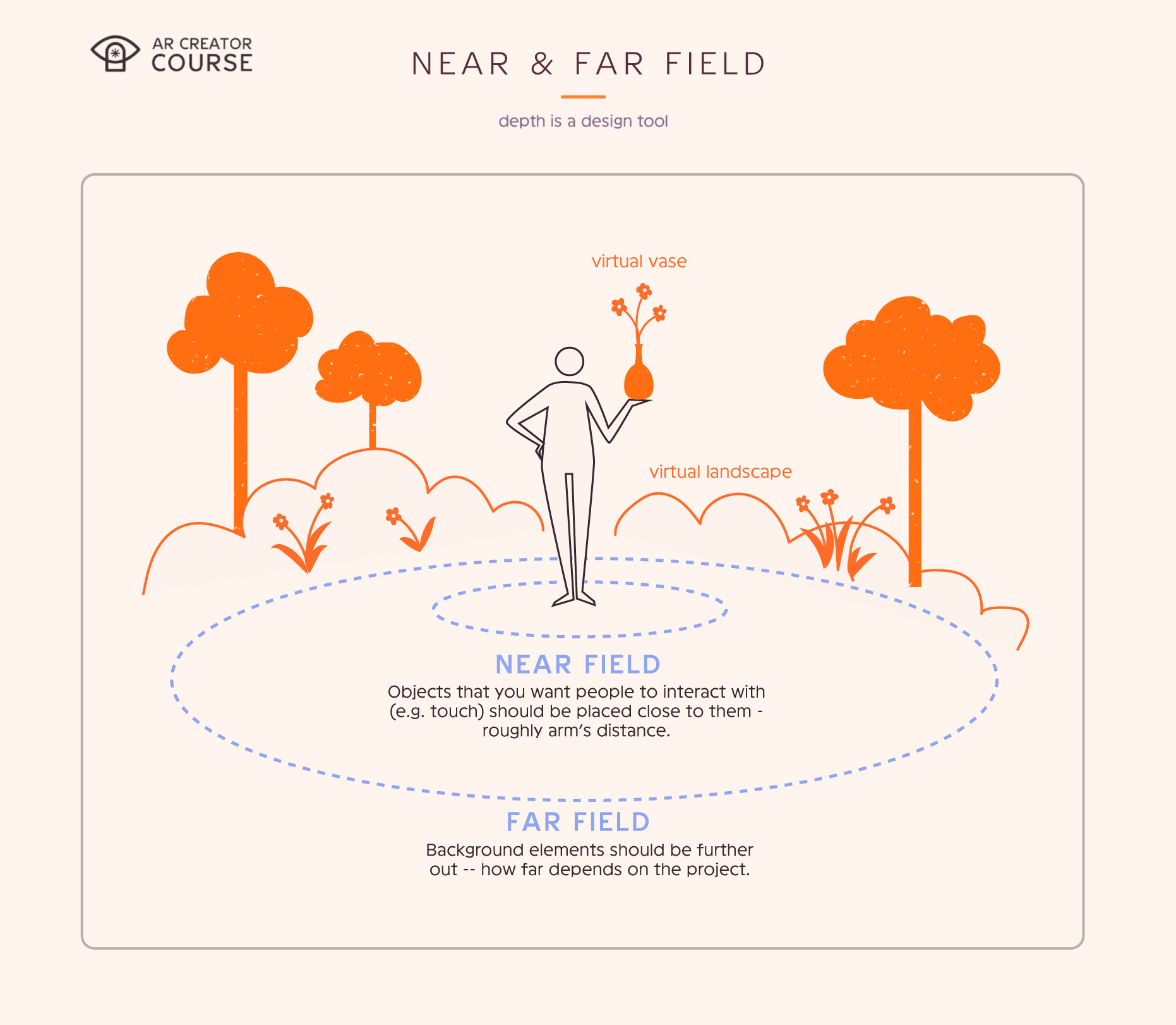
Near field is where your body lives, roughly arm’s reach (roughly 2-3 feet or 60 to 90 cm, for adults). This is the layer your hands can actually touch. If you want someone to reach out and grab a thing, press a button, or turn a dial, it belongs here. The trade-off is that the usable window gets smaller up close, and detail starts to feel cramped. So keep the near field simple: controls and quick glanceable info, not a wall of text.
Far field is the backdrop, from around 3 feet (~90 cm) out to a couple of yards/meters. This is where your bigger, richer world content goes, the stuff people settle into and take in over time. You are not reaching out to touch the far field, you look at it. It can afford to be large and detailed, because you have the room and because nobody is trying to poke it.
Rule of thumb: what people touch goes up close, what people take in goes further out. Do not bury interaction in the far field where no one can reach it, and do not park a whole scene six inches from someone’s nose.
The FOV, or field of view, is the window where digital content can appear.
On mobile, the window is the phone screen itself. People only see what the camera frames, so anything you place off to the side is off-screen until they pan over to it.
On glasses, the FOV is a hardware limit, a bit like looking through ski goggles. Anything outside it simply is not there. For Snap’s Specs this is a rectangle.
Do not scatter important things to the edges. They vanish.
Keep the good stuff near the center.
Big sweeping interfaces sound cool and mostly frustrate people. Design for the window you actually have.
Tip from the field: In my earliest projects I loved scattering content all around the user, and half of it went completely undiscovered. People had no reason to turn their heads, so they never did. If you place things beyond the immediate view, you have to earn the look. A few ways to lead the participant:
Sound: a chirp, a rustle, or a voice pulls the head toward its source.
Visual breadcrumbs: a trail of smaller elements guides the eye from one piece to the next, like stepping stones.
Movement: motion is magic. A butterfly that flutters off to the left will carry people right into the next part of your scene.
Uncomfortable AR gets abandoned. On glasses: they come off your face. On mobile: the phone goes back in the pocket. Either way, you lost them.
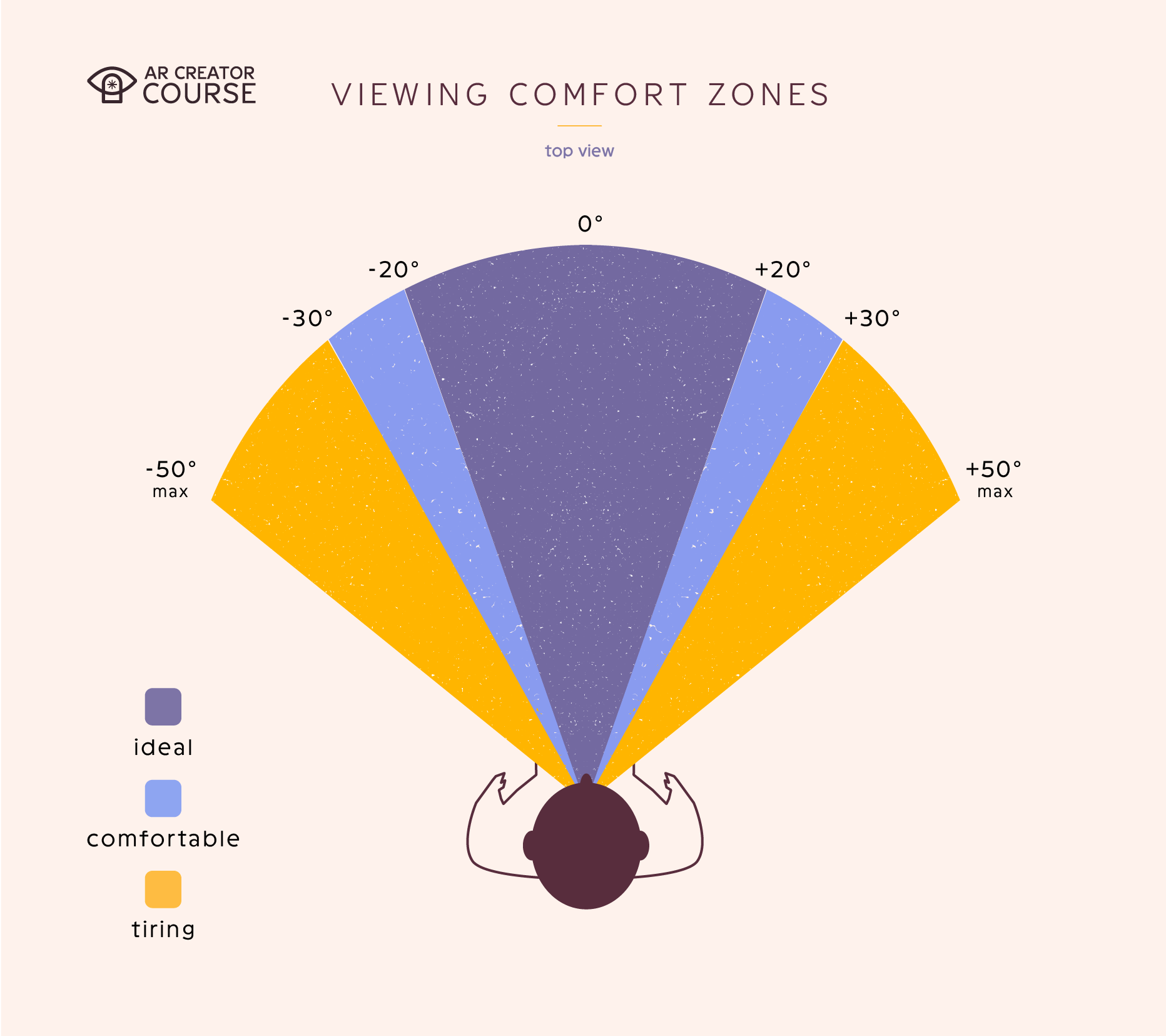
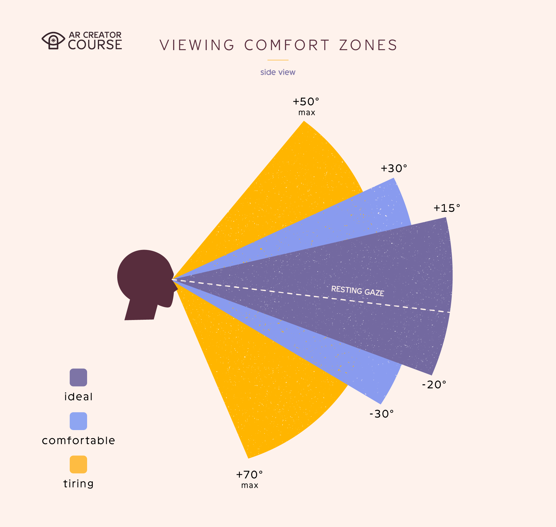
On glasses >
Necks turn left and right far more happily than up and down. Keep content near eye level, not on the ceiling.
Constant refocusing between near and far is tiring. Do not make eyes ping-pong.
Give people space. Do not park things six inches from their nose.
On mobile >
Holding a phone up to view AR is a small workout. Sessions are shorter by nature, so do not expect someone to hold their arm out for five minutes.
One hand holds the device, so a thumb or the other hand does the work. Consider this when designing interactions. For main interactions, keeping buttons at the bottom or top of the screen works well. It keeps the buttons out of the way, so the person can see the rest of the AR scene.
The user physically moves the phone to look around. Encourage gentle movement, do not require gymnastics or quick movements. They will quickly become disoriented.
On both >
Mind the distance. Content has a comfortable range: not so close that eyes strain to focus, not so far that detail is lost. Put anything people need to read or study around arm’s length to a few feet away, and keep the fiddly detail out of their face.
Bodies are not one size. Arm length, height, and hand size vary a lot, so content placed perfectly for you might be out of reach or above eye level for someone else. Keep things within easy reach and view for a range of people, and where you can, let content adapt or be repositioned. This is an accessibility win, not just a nicety.
Comfort is also about duration (aka length of time the project takes). In AR, short and sweet wins:
Attention spans are limited, same as anywhere.
Taking in the real world and a virtual one at the same time is a lot to process. It gets taxing faster than a normal screen does.
So edit ruthlessly. Cut each experience down to its essential essence. A tight, punchy moment beats a sprawling one that wears people out.
In XR, you design a place, not a picture.
Choose the right frame of reference on purpose.
Respect the FOV window and keep key content centered.
Comfort and legibility are not polish, they are survival.
Design for real bodies and real rooms: comfortable viewing distances, a range of reach and height, and spaces you do not control.
Keep it short. Taking in two worlds at once is tiring, so edit down to the essential essence.
Apple: Designing for visionOS. The depth and ergonomics notes are gold and mostly vendor-agnostic in spirit.
No posts
Comments
Nothing yet. Say the first thing.
Sign in to join the conversation.