
While I deeply appreciate Figma and its’ impressive tricks, I believe Balsamiq is still an unsung hero of the digital design world.
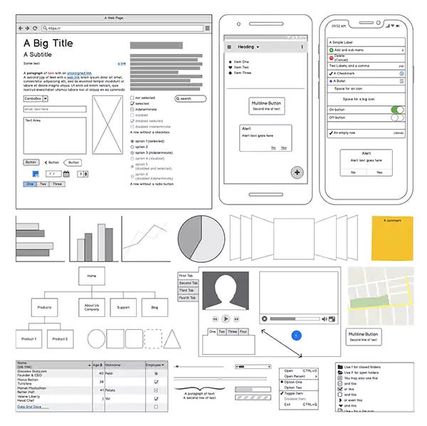
The daily tooling of digital experience design has come a long way from the days of pages managed in Photoshop or primitive symbols in Illustrator. We now have branch-able design systems with interactive components, tokens that sync with code, and movie-quality prototyping. In many ways, it’s a joy to see how our toolset has evolved over the years, giving validation to vocation.
Early on in my career, I worked on a team that pumped out wireframes using the Balsamiq app. (I believe we even used their default font.) It was an inelegant solution for document management, but it facilitated useful stakeholder conversations. Quickly drafting rudimentary designs, we could convey an idea to the customer for discussion and validation. No one needed training and pages were easy to modify. It was an efficient solution that gave us exactly what we needed. UI design? That came later.
Today, pulling a screen together is similarly effortless, but the resolution mightily different. Internal products with a plug-and-play library is like the Balsamiq starter library, come to life. Search the library, grab the component. Make a modification and move on to the next. The cross-functional team can even see the real-deal, so no more time spent managing exports.
It’s good that better tooling can help designers focus on more wicked problems. We spend less time making the sausage
But it’s created a bit of a strange curse. I’ve seen it numerous times with efficient designers; fast with their fingers, and savvy at optimizing their time. They get really good at sketching in Figma. And they forget that non-designers have different eyes.
Not that they’re creatures of the deep, but muggles don’t spend years of their lives staring at the proportion and relationship between negative and positive space.
It takes years for a designer to train their eye. A lot of staring at various shapes and objects while others describe what you’re seeing. A lot of peers pointing at hairline differences between two white spaces, emphatically calling out their value. It’s a weird little club, the visual arts. Though generally well-liked by its’ members.
Unfortunately, those design-trained eyeballs forget what it was like in the before times. The quick fingers efficiently produce real-looking, final designs with very little effort. And then, the magician goes out in search of feedback from the muggle community.
When written ideas are undone, often you’ll see bullet points. When a renovation is in-progress, it’s a mess and looks like it’ll never be finished. When a performance is in rehearsal, there are no costumes.
Most people have experienced ‘undone’ as visually distinct; noticeable from the final product. They trust that their eye will inform them when something is unfinished. But when a designer presents a full-resolution design, clickable experience, it’s easy to be tricked by slight of hand.
When a designer puts full-resolution designs in-front of non-designers, they need to acknowledge that ideas can appear more finalized than they truly are. The viewer’s eyes scream ‘done’, but they hear words that sound like an idea.
So we return to Balsamiq. Still available for quite a deal, with almost exactly the same feature-set it had a decade ago. Or, hell, use a wireframe library in Figma. Just don’t overlook the truism of choosing the right tool for the job. Design for the conversation you need to have, long before you design for the handoff. And sometimes, it can be fun to keep it casual.
No posts
Comments
Nothing yet. Say the first thing.
Sign in to join the conversation.