
Welcome to Designer, a place for designers, creatives, and the design-curious to explore graphic design styles, the history and future of design, and how art and design carry into the rest of life. In this article, we’re exploring the science behind logo design, discovering what makes a logo “great”. And get excited, because we’re learning about human psychology, the fundamentals of logo design, and more. Ready to dive in?
I’ve been super excited to research this topic because logo design is quintessential to many designers’ careers. As far as I’ve seen, before branching off into other areas of design, many graphic designers start their careers in logo design - I’ve been considering this myself for quite some time. However, here’s the thing: I find it quite difficult to create a “good” logo… but I want to keep learning and growing my design toolkit, so here we are!
So, to further deepen my knowledge, I’m writing this article, delving into the history and psychological impact powering a “great” logo. And WOW, let me tell ya, there is a LOT of content out there about this. Endless opinions, recommendations, and “rules” from “experts” telling you exactly what must be done. So, in this article, I’m going to try to condense all of the information into a much simpler format, then provide some additional resources at the end if you want to dive deeper. Sound good? Alright, let’s go.
A logo is essentially a visual symbol that represents a brand’s ethos - it’s the brand in its simplest form, primarily serving three purposes:
Brand recognition: It makes your brand recognizable.
Professionalism and trust: It gives a brand credibility. The opposite is also true.
Emotional connection: It triggers emotions through colors, shapes, and fonts, signaling messages to the viewers.
A logo designer’s job is to create a logo that encompasses all of those things above, with the hope of getting the viewer to associate positive values with your brand.
To begin understanding how this is possible, we first must understand the different kinds of logos, and then travel back… wayyy back to the beginning (not literally, but almost literally).
Understanding each of the main logo categories is important for understanding the various decisions designers should make. That being said, here are the four main categories:
Wordmarks: A mark made up of words, haha. But essentially, it’s like Google, Banana Republic, or other brands that use their name as the logo.
Abstract iconography: A logo mark that doesn’t necessarily have a meaning. The meaning is derived from the company. Think Microsoft, Pepsi, or Nike.
Pictorial marks: A pictorial representation of the brand. Think the apple used by Apple, or the bullseye used by Target. It identifies the name of the company.
The logo system: A combination of many design styles to create endless logos that all represent the same brand. Think of Google’s doodles on the home page - each day, they change, but they all represent Google.
There are further subcategories of each, but this should give you a good understanding of how the core principles of design might apply.
“Logos” (or visual icons representing an arbitrary idea) have been around for much longer than you might think. Since the beginning of time, humans have used symbols to represent various offerings, services, land, and much more. Think about the Christian cross (which appeared over 2,000 years ago), the Jewish Star of David (primarily in Medieval Europe and the 17th-19th centuries), family crests, and social class markings. For thousands of years, humans have used these symbols to represent a tribe or “in-group”.
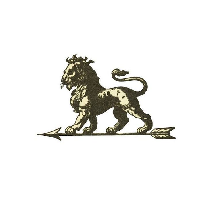
Some brands today have even taken inspiration from their ancient roots, such as the car brand Peugeot.

Moving into more modern times, the Industrial Revolution was the catalyst for modern-day logo design.
In the 19th century, Bass Brewery was the first registered trademark in the UK, thus marking the beginning of the formal logo and branding process. The brewery took a much different design route, leading the way for minimalist logos - where other logos looked like realistic images that described what the business did, Bass Brewery focused on simplicity and minimalism. They didn’t necessarily care if the logomark showed what the company did (more on this later).


From this point on, a more modern logo style was born. The masters of design in Switzerland and Germany, fueled by the idea that “form follows function”, further perfected minimalist logos and have informed many of the modern-day processes.
In the 21st century, we have much more nuance to manage in the logo creation process. Not only are there millions of logos around the world, but they’re no longer just the face of a business. Now, when we add the internet and digital globalization into the mix, a logo takes on a whole new meaning. Despite this, the fundamentals matter more than ever.
Alright! Now, to the fun stuff. “Good” logo design can be broken down into five core principles: simplicity, memorability, relevance, versatility, and timelessness. Essentially, a random person should be able to look at a logo and recognize it on a storefront, social media icon, and car decal, and understand (in a general sense) what it’s about.
With that, let’s explore these core principles a bit deeper:
Simplicity:
The logo shouldn’t be too complicated - it should focus on stripping away excess noise while keeping the brand ethos intact. Think: If someone sees the logo while scrolling quickly through the social media page (maybe 0.5 seconds if you’re lucky), will they be able to recognize it? If someone needs to decode your logo, you’ve likely already lost.As a quick test, pull up a Google search for “popular logos”, open the images, and scroll through them really quickly. Even though you’re only seeing them for a fraction of a second, you can recognize the brand, partly because they’ve mastered this principle.
Memorability:
Given that a brand may have 0.5 seconds of attention, the logo must be memorable. Whether it’s through a unique use of colors, sharp angles, or unexpected elements, the goal is for people to remember who you are based on a small icon.One way to achieve this is to strategically differentiate the brand from the competition. If you’re designing a logo for a new coffee company, stray away from dark brown, coffee mugs, and other expected elements. Try to differentiate in a way that makes the logo memorable.
Relevance/Appropriateness:
The logo should align with the audience, brand, and context in which the company lives. Here’s a challenge: A designer must make the logo memorable, as stated above, but it also needs to be relevant to the market and competition. It’s a push and pull that needs to be carefully considered.If you’re designing a logo for a medical center, you’re likely not going to pull inspiration from grunge and punk aesthetics. The logo should be memorable, but should also make sense in context so people know what feelings to associate with the brand.
Versatility:
The logo must be able to live and thrive in many different contexts. Nowadays, brands must consider the internet (including social media profiles, websites, and favicons) and physical spaces (including billboards, vehicles, business cards, hats, t-shirts, etc.), all while maintaining their ethos.As a tip for my fellow designers, perform a scale test to ensure the logo looks good at different sizes. If you lose certain parts of the logo when it’s scaled down, it may be worth simplifying.
Timelessness (vs. trendiness):
The logo should persist throughout time - it shouldn’t rely on current-day fads. As we see with social media, trends are out just as quickly as they’re in. Instead, a logo should focus on the fundamentals discussed previously.As a quick note, logos can evolve - many of them do over many years - and that’s good! However, these logos have already perfected the fundamentals and are now making small tweaks to further their mission.
Before moving on, I want to bring up something that’s been on my mind recently. With so many businesses, and therefore, logo designs, existing in the world, I’ve been wondering how we can keep coming up with new ideas. It almost feels like all of the ideas may already be taken…
However, there are two points I learned while researching this essay: First, that just isn’t true. There are infinitely many combinations we designers can use to create logos. I don’t think that we will ever run out of original ideas. Second, it’s not necessarily our job to re-invent the wheel. Instead, we should focus on applying the core principles in unique ways that represent a brand well and solve a problem. Every business, the people running it, and the designer’s own perspective are unique, which is why the same principles can be applied in an endless number of ways.
Alright, feeling good? Now that we have the core principles down, let’s learn about how we can apply them to evoke emotions in our viewers.
Design as a whole, and especially relating to logos, relates deeply to human psychology. A logo is a piece of visual language that’s built for a specific tribe - every color, shape, and typographic choice is designed to trigger some reaction in the viewer’s brain. It needs to be attractive enough that people want to own it, wear it, and show others that they have it. So, before designing a logo, you must understand:
Who’s the tribe?
How do they dress?
What aesthetics do they have on social media?
What brands do they already love?
What are they trying to signal to each other?
Understanding these in context will help make sure that your logo speaks to the audience on a psychological level - you’ll be able to fit your logo into their interests, creating a positive psychological response. To do this well, a logo must focus on three main areas: color, shapes, and typography.
On color: Color is often the first thing someone sees, and the colors a brand chooses communicate messages to the viewers. A beauty brand may use soft pastel colors while an activewear brand may focus on bright, neon colors. By utilizing certain colors in a logo, you’re communicating a message to the viewers.
On shapes: Shapes can signal excitement, growth, opportunity, or even danger. Sharp angles might represent power, excitement, and movement, while soft edges are associated with community and modernity. Each shape in a logo should be carefully considered based on what the viewer should feel.
On typography: Typography plays a large part in the perception of a brand - it can signal education and class, or stability, minimalism, and approachability. Typeface categories (serif, sans-serif, script, etc.) and font weight and size can immediately signal messages to the viewer. Consider how a law firm likely wouldn’t use a hand-written font, but a daycare might - each business can use typography to communicate its core message.
-
It’s also important to consider that one color won’t make someone feel something. However, a color, in combination with shapes and typography, can communicate the brand’s essence to the viewer - it’s psychology in action.
Now, there’s nuance to all of this. I can sit here and tell you the core principles, but that doesn’t give you the full picture. So, this section outlines some other considerations to keep in mind when creating a logo.
First, your first idea is usually the wrong one. Sorry, but it’s true. Try to push past the obvious answer to get more creative.
Next, start with context. Before you design, ensure you understand the market and the competitors’ logos and branding so you know who you’re designing for. The truth is that you’re not designing a logo for the brand - you’re designing it for the audience.
Finally, a logo does not need to depict what a brand does. A logo is a visual device that communicates a feeling to the viewer - it doesn’t necessarily need to communicate the entire offering.



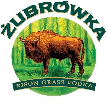
Can you tell which ones I like, and which ones I don’t? If you’ve been reading this publication for a while, you know that I’m currently in a “form follows function” phase. I want my designs to be beautiful, but I also want every element to serve a purpose.
The top three logos have a level of simplicity I admire. There aren’t more than 3 or 4 obvious design choices backing them, yet they’re memorable and versatile.
The bottom three logos are much harder to read, wouldn’t scale down very well, and contain a bit too much detail for my liking.
What are your thoughts on these logos?
There’s quite a bit of info contained within this article, and it may seem daunting if you’re at the beginning of your design career. However, if there’s one piece of advice I can offer to all designers, it’s to keep learning, trying, and doing. The best tool we have to future-proof our careers is to develop taste.
Here’s an important thing to keep in mind. Many brands know that they can go to AI and generate 20 logo options in 20 seconds. So, if you’re planning to be a logo designer who just designs a cool mark, you’re competing with a much less expensive and quicker solution. However, AI has blind spots - it lacks strategy, restraint, and nuance, and has little grasp of human psychology or the competitive market. This is where real humans can come in and be competitive.
So, as you continue on your design journey, remember the core principles and psychology that power a great logo. Doing so will help you move miles ahead of the crowd.
As always, thank you for reading and/or listening to this article! I’d love to continue the conversation with you in the comments and subscriber chat.
Comments
Nothing yet. Say the first thing.
Sign in to join the conversation.