

Creative Intelligence is a free monthly-ish newsletter about the art and business of color — from trend to strategy to design. Thanks for reading!
I once worked with a brand that hadn’t changed their color palette for years. Their line was huge (250+ products that came in 3-5 colorways each). Their market expected and loved newness and color. They promoted adventure and discovery. Yet, their palette mirrored none of this. It remained stuck.
They had invested in a big brand refresh several years prior that had included a palette redesign. For multiple seasons afterwards, they made zero changes. They populated the line, season after season, with the same colors.
Customers and retailers asked, but still the color didn’t change. The brand simply didn’t feel confident enough. They didn’t know how.
They continued to innovate and expand their products. They upped their company investment in growth and reach. They made big goals. But, their color stayed the same. Fear kept their color stagnant and uninspired. It didn’t grow along with them. It didn’t support all the awesome work they were doing everywhere else in their business.
And, as a result, they didn’t get the traction (or the sales and recognition) that they wanted. They lagged behind.
So, eventually, they decided to evolve the palette. They added several new colors.
Those colors they added? They were the exact Pantones from a trend company’s seasonal color forecast. No changes. No slight shifts. They didn’t filter those global, multi-industry color predictions through their unique and specific brand lens.
Instead, they accepted the color forecast as the color answer key for the season. It was too scary and unfamiliar to know how to add the “right” colors any other way. They didn’t consider how they merchandised with the rest of their palette or whether they made sense for their products, materials, or customers.
The problem? Those colors actually didn’t make sense for their product materiality, use, or lifespan. They translated weird and didn’t sell. The macro influences were relevant, but variations of those trend colors (or different colors altogether, but with the same meaning) would have worked so much better.
The other problem? Other brands did the same exact thing. Which made those “special seasonal colors”, not so special after all.
And yet another problem? These new colors were just added to the existing palette, increasing its already significant size by 25%. No existing colors dropped. No analysis was done on color performance. No color jobs or lifecycles were defined. The palette just grew - becoming more cumbersome and confusing to understand and use.
They had let fear make their color decisions. And, they had the dismal results to prove it.
This is not an uncommon occurrence. Other brands approach color similarly.
Fortunately, in this case, the brand got past the fear, and we designed a pretty awesome color strategy together.
You can do the same thing.
You can stop fear from dominating your color process and limiting your potential. You can use color more confidently.
Here are the guidelines to follow to do so:
Root all of your color decisions in the values and personality of your brand. Do not chase your competitors or your idols. Trust in who you are. Let your color reflect your individuality.
Each season, get clear on where your color opportunities are and what you need color to accomplish. Evolve your palette accordingly. Only adopt colors that meet these requirements.
Organize your color palette. Outline color lifespan, use, and purpose. In order to stay in the palette, each color needs to 1) have a defined job, and 2) that job needs to still be relevant to your brand.
Approach color intentionally. Being more confident with color does not mean your palette needs to change wildly every season. It means that the color changes that you do make need to matter. A lot.
Have people on your team with true color expertise. Entrust them with your color decisions. Do not hot potato your color choices to the unqualified but opinionated.
Use color trend forecasts as inspiration, not as your new color palette!
Understand your customers. Design your palette like you design your products. Create what you know will delight your people.
Make sure all your colors merchandise together. Remove any redundancies and outliers.
Remember, color sells. It is the first thing people notice, and one of the most important factors in whether someone buys (and loves) your product or not.
Don’t let fear keep you from making yours amazing.
You’ve got this!
Take care,
Dawn Rae
PS - Was this helpful? Let me know! Reply and send me a note or give this a like. It means a lot to me. Truly.
This month’s Mini Palette from Daily Life:
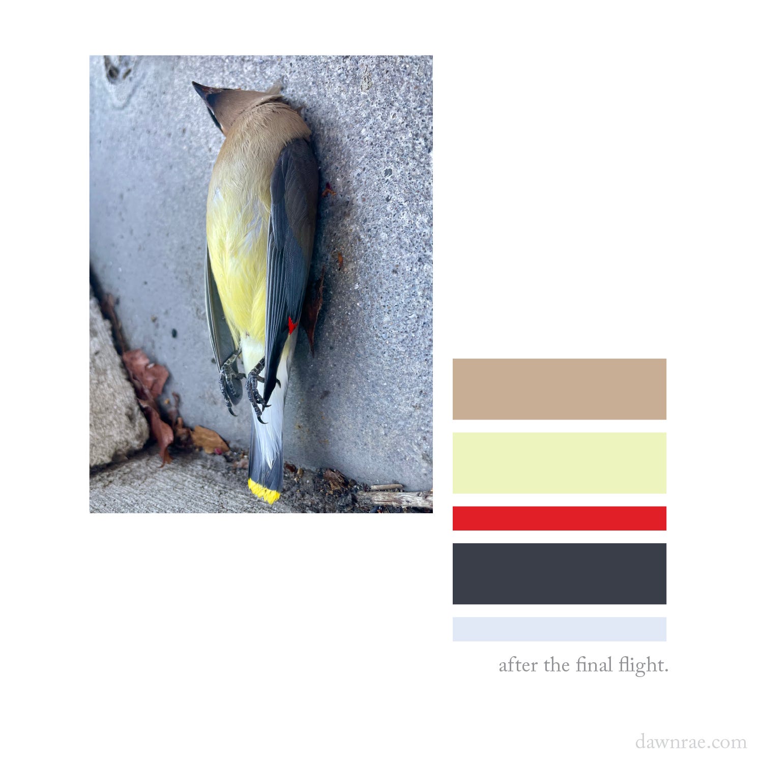
Found this little guy outside of my neighborhood bookstore. Unfortunately, too late in many regards.
I debated taking this picture (and later, creating this palette).
Was it morbid? Disrespectful? Off-putting?
But also - how exquisite is he? What a waste to not notice, to not make a record of his beauty.
The mechanics of those gnarled claws. The downiness of the feathers on his chest. The soft warm, perfect brown of his throat. The armor-like sheen of his wings. And those two delightful pops - the alarming red on his wing, the sunny yellow on his tail feather - appearing almost like they were created from calculated little dips into primary paint pots.
Fascinating and complex. Layers upon layers of color, texture, vulnerability.
Death, the grantor of rare, unhurried observation. Permission to see what maybe we’ve missed all along.
I help brands understand what their customers will love and value in the future, and I create the color design + trend strategy to get them there.
I design client-specific seasonal trend forecasts, color palettes, and color merchandising plans. Find a full outline of my services here.
If you are curious about working together, reach out: knoth@dawnrae.com.
website: dawnrae.com
socials: LinkedIn, Instagram, Substack
Creative Intelligence: all issues
Comments
Nothing yet. Say the first thing.
Sign in to join the conversation.