

In 1897, a book of poetry was published by Robert Browning. In it, he wrote a poem entitled “Andrea Del Sarto” about a 16th century painter expressing his emotions to his wife about his art. For some art history context, this is the time of the “big three”: Michelangelo, Raphael, and Leonardo da Vinci. You can only image how Andrea might have felt. Living while three towering figures dominated the art world, and here was little Andrea. But there’s a twist to this story: he was commonly called “the faultless painter” because he could produce the most technically perfect paintings with nuance and shading that nobody could match. And believe it or not, the “big three” were never known to be very technically proficient at all. Some even state they were inconsistent and sloppy. But they all demonstrated something Andrea never would: creative risk. Andrea’s work is like every recent Marvel movie or terrible Disney series wrapped into one: technically immaculate, creatively starved.
It is in this poem, where we see Andrea grapple with this truth. He hems and haws over the “lesser quality” work the “big three” make, but also accepts their work is greater than his own. It’s a paradoxical point in the poem where he expresses both judgement and jealously at the same time.
Well, Less is more, Lucrezia: I am judged.
There burns a truer light of God in them, in their vexed beating stuffed and stopped-up brain, Heart, or whate’er else,
than goes on to prompt this low-pulsed forthright craftsman’s hand of mine.
Their works drop groundward, but themselves, I know, Reach many a time a heaven that’s shut to me
This is one of the first instances where the phrase “less is more” shows up in English. Later on, the famous 20th century modernist architect Mies van der Rohe uses it as a quasi-catchphrase. He popularizes it as a sort of justification for why his white bare walls and empty spaces are better than expressive decor and architecture that engages with emotions. But he also turned the phrase “less is more” on its head. Before, Andrea used it to express that a less technically perfect but emotionally engaging work of art has more meaning to people. Mies used it to express that technical perfection is more important than emotional connection. Which certainly complicates the ancestry of this little phrase.
But I want to take a stand, if you’ll allow me to. We have already demonstrated that this phrase can be interpreted in many ways, but does that mean that all ways are even in value? If someone uses it to justify working less or putting less heart into a graphic design, that seems like a bummer. I can’t tell you how much it hurts to watch beautiful objects and brands in the world be stripped of personality and color:
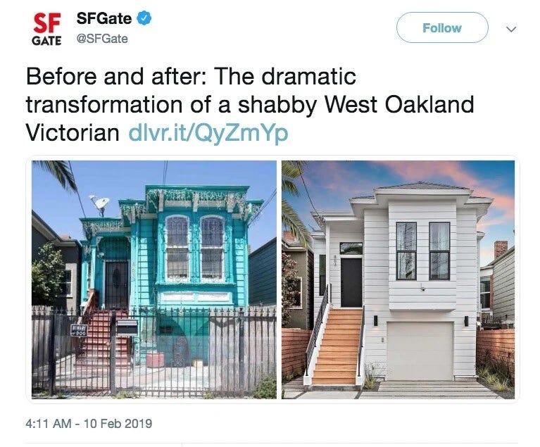
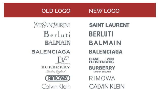

These examples are just a sample of what happens when aesthetics are treated like a nuisance. Now, I don’t want to argue for unstructured chaos or unintentional messiness, but that is exactly what I would caution against for the other end of the spectrum. “Less” does not automatically mean more. If you take away all the color and fonts of the old playstation website, it doesn’t automatically mean it’s a better website. The same rules apply for taste, functionality, and emotional engagement. And this is why I don’t much like this phrase “less is more”. I feel a more honest phrase should simply be “Less is Less & More is More”. Because nobody likes a phrase that feels like it’s smarter than you. So just say what you mean. And let’s all just appreciate real effort, real passion, real commitment, how it shows up can be done in countless millions of ways.
Comments
Nothing yet. Say the first thing.
Sign in to join the conversation.