
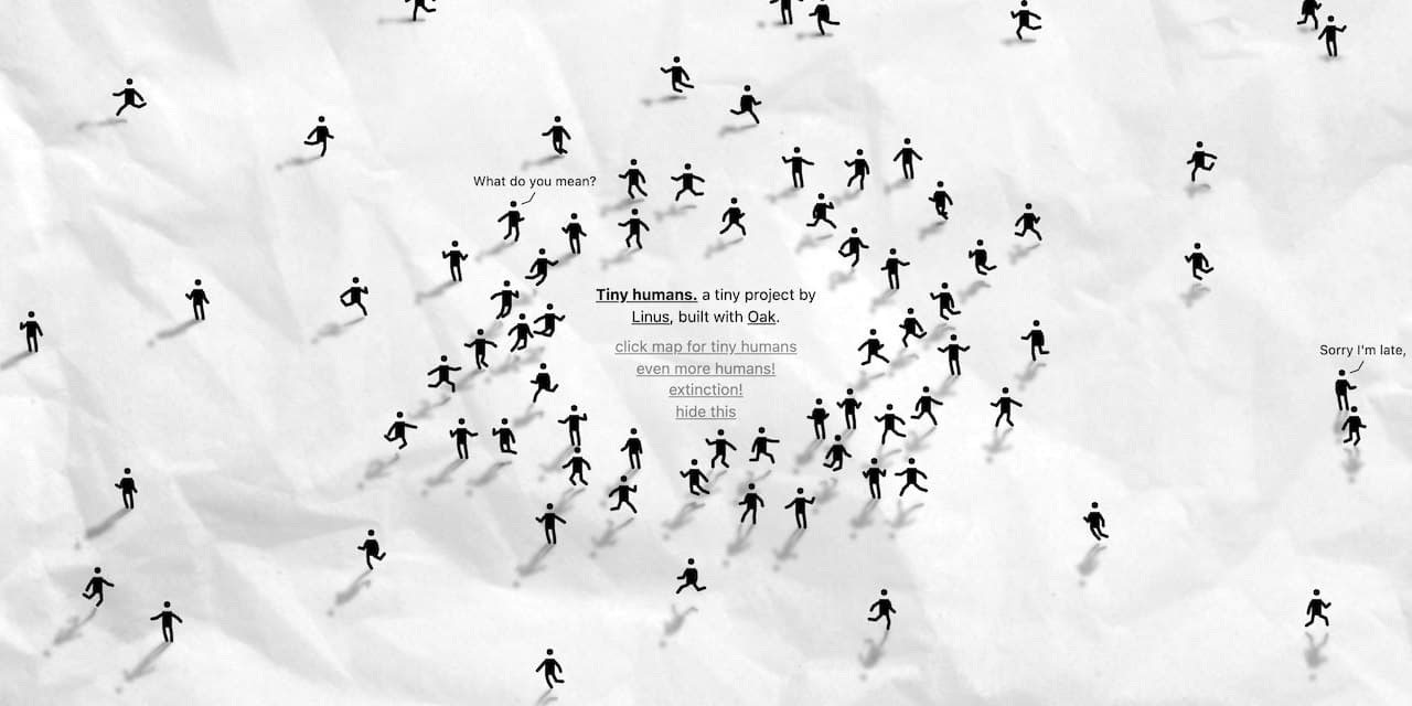
Tiny Humans by Linus, 一个小的交互sandbox,在一张纸上随机生成人形 #glyph,四处走动,里面有小人和他们的小对话 (source code) #fun
Cartogram of Pandora Papers - by Nicolas Lambert, 将国家面积与潘多拉文件中披露的受益人的数量相对应,投射到球体上,就会画出一个变形扭曲的世界 #map

Nicolas Lambert@neocartocnrs
Today in the newspaper @humanite_fr. #PandoraPapers #Dataviz #Cartogram @observablehq humanite.fr/evasion-fiscal…
8:25 AM · Oct 12, 2021
8 Reposts · 39 Likes
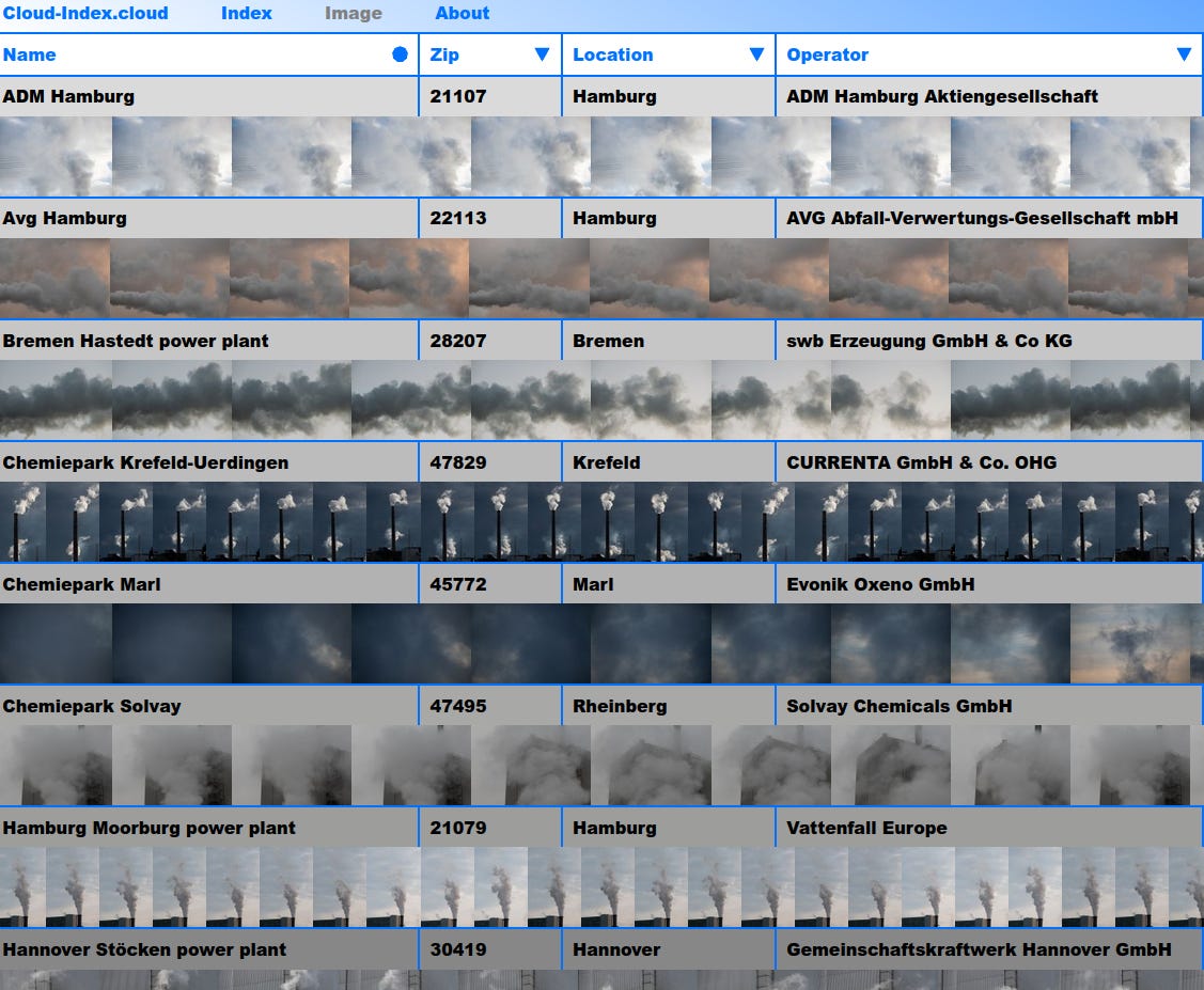
云指数 - 一个不断更新的在线档案,收集和展示德国各地化石燃料燃烧地点的云图像,艺术家 Jonas Fischer 自2020年9月以来一直在拍摄发电厂、工业设施和其他温室气体排放地的上空,他把这个项目看作是在一个关于气候变化及其后果的所有知识早已具备,但却很少发生根本性变化的时代的一个纪实观察。这一视觉贡献使本应看不见的破坏变得可见,将其置于事实的背景中,并提供了一种看待云层的新方式,将我们自己视为全球问题的一部分 #climate
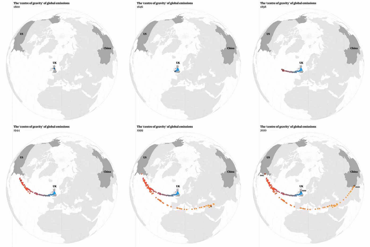
世界的碳 "重心" 是如何在200年里移动的 - 卫报的一份新的可视化,过去200年以来世界碳排放的地理中心曾经直接位于英国之上,然后被美国拉向西方,并因中国的崛起而回到东方。碳重心的计算方法是将每个国家的经纬度取平均值,按其年排放量加权 #map #climate
Niko Kommenda@niko_tinius
NEW: How the world’s carbon ‘centre of gravity’ moved over 200 years (also my last project for the guardian) theguardian.com/environment/ng…
12:18 PM · Oct 13, 2021
142 Reposts · 436 Likes
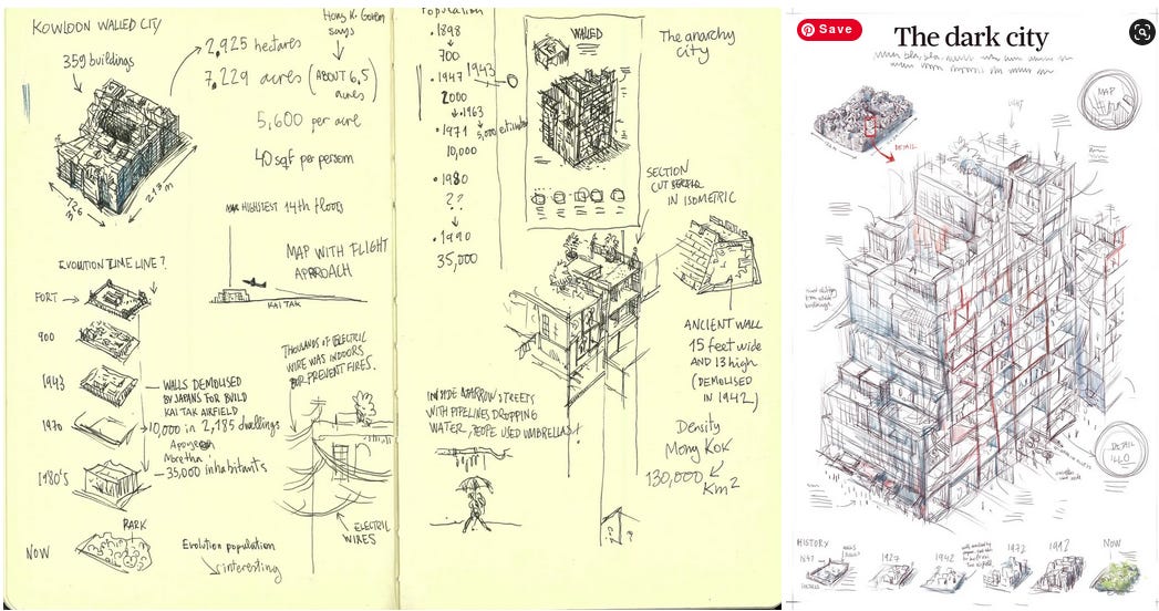
南华早报的Infographics团队受Data Visualization Society采访,详细介绍了那些经典的信息图表和视觉故事背后的制作过程,并分享了许多幕后草图 #infographics
日常性别歧视如何阻止女性获得职业晋升 (by NYTimes) - 即使一点点的性别偏见,随着时间的推移,几乎没有女性被留在最高管理层 #ddj
Yaryna Serkez@iarynam
🚨 Even with a tiny bit of gender bias, hardly any women are left in the C-suite over time. Here is how daily micro-aggressions could prevent women from getting a promotion. Today's story with @jessnordell nytimes.com/interactive/20…
2:19 PM · Oct 14, 2021
114 Reposts · 381 Likes
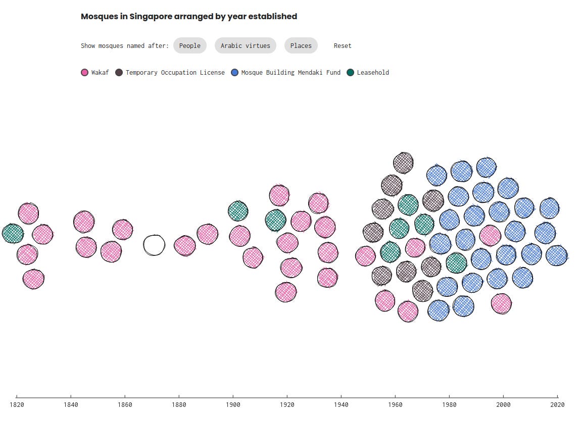
新加坡清真寺的名称和建筑背后有什么含义? - 来自Kontinentalist的开发者Aishah也是一位住在新加坡的穆斯林女孩,她制作了这个内容丰富的数据故事来寻找答案
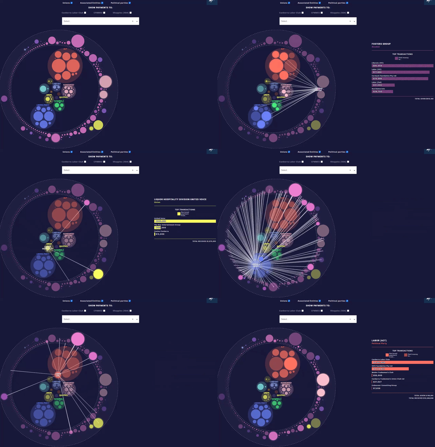
头奖:赌博业如何从政治捐款中获利 - 在过去的 22 年里,与赌博相关的捐助者向澳大利亚政党贡献了超过 8100 万美元 #ddj
Inga Ting@ingating
Follow the money and see who's connected to who via our interactive database
1:08 AM · Oct 14, 2021
2 Reposts · 10 Likes
美国产妇脆弱性指数 - 使用6个主题和43个相关指标探索美国哪些地区的孕产妇容易出现不良的健康结果 #healthcare
Daisy Chung@daisychungart
How do we solve the complex problem of #maternalmortality? Proud to work on the design+ #dataviz for @SurgoVentures Maternal Vulnerability Index site, identify not only where, but why mothers are vulnerable. Amazing work by Jordan Downey, Valerie Valerio & team. Code @paolocorti_
6:40 PM · Oct 20, 2021
6 Reposts · 41 Likes
2021年1月至 2021年9月全球火灾可视化 - by NASA #climate
NASA's Scientific Visualization Studio@NASAViz
This animated visualization represents fire intensities around the globe, Jan thru Sept 2021. The fires were observed by the VIIRS instrument onboard the NOAA/NASA’s Suomi-NPP satellite. ℹ️⬇️: svs.gsfc.nasa.gov/4945 #dataviz #SciComm #SciArt
3:06 PM · Oct 20, 2021
193 Reposts · 444 Likes
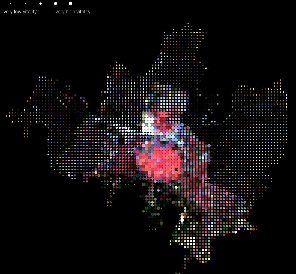
简·雅各布斯在天空中 - 研究人员通过 8,400 张卫星图像,找出意大利六个城市中最具活力的街区, 简-雅各布斯在《美国大城市的死与生》中指出街道活力的四个条件: 土地用途的多样性、小块面积、人口集中和经济活动的混合,为了衡量这四个指标研究人员通过卫星数据监测城市屋顶颜色,将城市解构为DNA条纹以及将DNA填充为点阵图来比较六个城市的活力值 #map
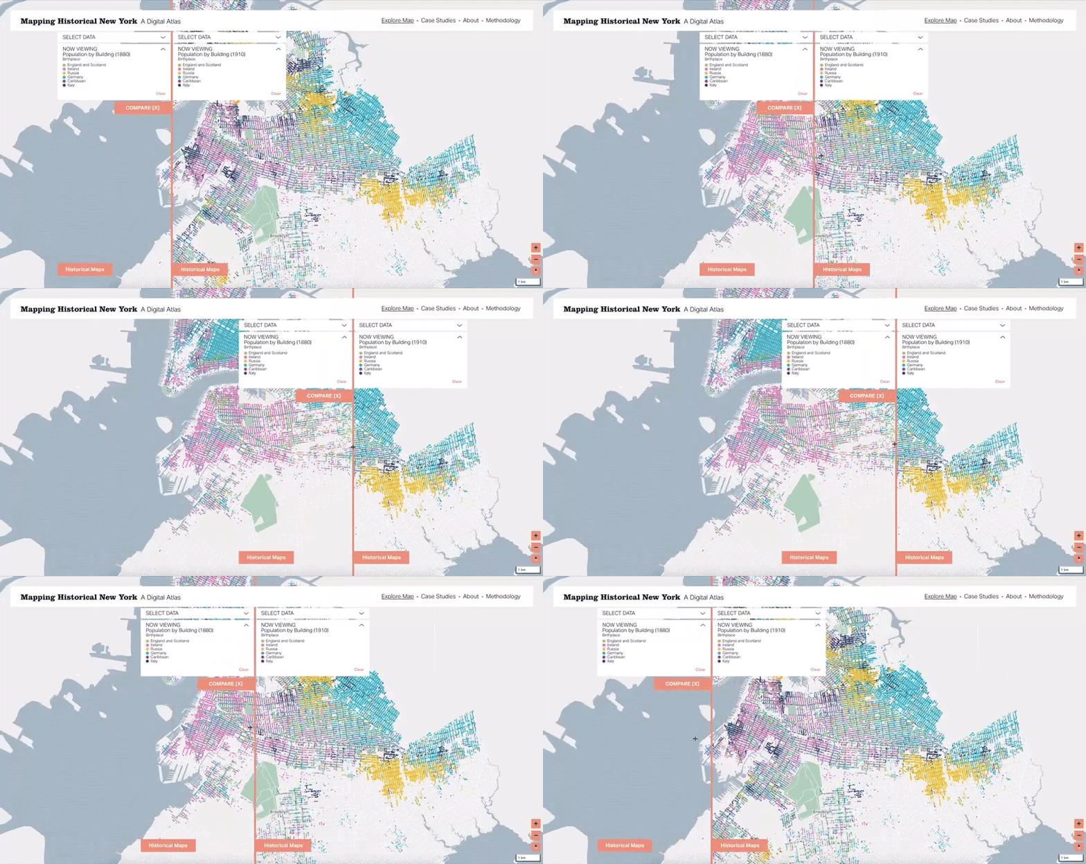
绘制历史上的纽约人口分布 - 纽约19世纪末20世纪初城市人口变化的数字地图集,根据1850年、1880年和1910年的人口普查数据,显示了移民、居住和职业模式是如何塑造这座城市的 #DigitalHumanities #map
Spatial Research@c4sr_columbia
Just launched! Mapping Historical New York: A Digital Atlas mappinghny.com. Three years of amazing work by @c4sr_columbia with @CUHistoryDept
5:43 PM · Oct 27, 2021
117 Reposts · 457 Likes
615种蘑菇自然颜色图集 #dataset #fun

刚刚结束的 #ieeevis 2021线上会议中一些 #arts #DigitalHumanities #storytelling #ddj #research 汇总
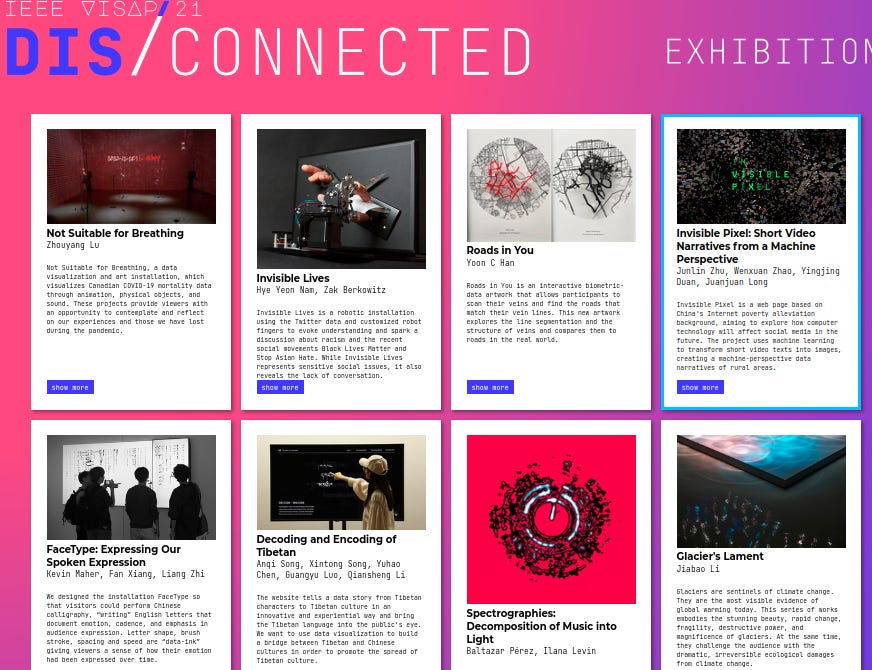
VISAP Exhibition: Invisible Pixel, FaceType, Wanderlust, A Data Art Based on the Books of Songs, An exploration of data narrative in Tibetan characters
VIS4DH: Visualizing Wonderland for many more Literature Visualization Techniques
Social Science & Journalism: Text Visualization and Close Reading for Journalism with Storifier, How Learners Sketch Data Stories
Data-driven Communication: Interactive Data Comics
No posts
Comments
Nothing yet. Say the first thing.
Sign in to join the conversation.