
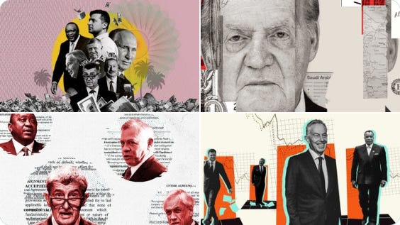
Pandora Papers 相关媒体报道 #investigation
2. 卫报
3. BBC
4. Le Monde
5. 华盛顿邮报
6. Inkyfata
10月4号 Facebook 前女雇员 Frances Haugen 在接受美国60 Minutes采访中揭露 Facebook 使用放大仇恨言论的算法谋利。为了提高用户参与度,Facebook发现最好的方式便是向用户灌输恐惧和憎恨。之前也是她向《华尔街日报》的系列调查报道 The Facebook Files 提供了了大量内部文件,之后 Facebook 发表了一篇博客文章,试图通过对 2,600 名青少年的调查来反驳《华尔街日报》的报道 #investigation
你的电动汽车有多环保? - “由于欧洲发电厂提供能源,电动汽车在其整个生命周期(从制造到行驶里程)的排放量比汽油和柴油汽车低 17-30%” , Financial Times 最新的视觉报道了回答了这个困扰了大部分人的问题

Sam Joiner@samjoiner
New: Meet the FT EV Mark 1. It looks a lot like your petrol-engine car, but under the bonnet it’s a very different beast Delighted to launch the Visual Storytelling Team contribution to a new @FT series on the electric car revolution sweeping the globe ⚡️ ig.ft.com/electric-car/

7:12 AM · Oct 5, 2021
28 Reposts · 61 Likes
西班牙为什么要垂直建造城市?- 在西班牙,有2/3的城市居民住在公寓里,这篇交互报告解释了背后的原因,开发团队通过分析1200万建筑地理数据来了解西班牙建筑的高度和建筑模式历史根源
Raúl Sánchez 📈@raulsanchezglez
1) 🏙️ En España vivimos en pisos. Hoy publicamos en @eldiarioes un proyecto con los datos catastrales de más de 12M de edificios para explicar por qué hemos construido nuestras ciudades en vertical. Un curro a cuatro manos con @lalalia. Se viene hilo 🧵 especiales.eldiario.es/espana-vive-en…
6:55 AM · Sep 30, 2021
429 Reposts · 1.16K Likes
美国的富家子弟正在纽约一些最令人向往的街区悄悄地进行房地产交易,利用为低收入人群提供的税收减免 (by Bloomberg)
Mira Rojanasakul@rjnskl
The children of America’s wealthy are quietly scooping up real estate deals in some of New York’s most desirable neighborhoods, using tax breaks meant for low-income people bloomberg.com/graphics/2021-… w/ @CalebMelby

1:45 PM · Oct 8, 2021
79 Reposts · 153 Likes
从农场到餐桌,供应链的每一步都存在减少食物浪费的机会 - 设计师 Valentina D'Efilippo 为 Scientific American 最新一篇报道 制作了 #infographic,可视化更健康的饮食和更可再生的农业生产如何减少“食物印记”——更少的浪费、更少的排放和更清洁的环境
Valentina D'Efilippo@defilippovale
🍎🐄🤯🤯 In my last collaboration with @sciam I've learnt that an astonishing 40% of food is wasted. But the bright folks at @ProjectDrawdown show that it doesn't need to be that way. October issue out now: scientificamerican.com/article/massiv… 🙏Thanks to @markfischetti & @ChristiansenJen!
10:54 AM · Sep 30, 2021
13 Reposts · 66 Likes
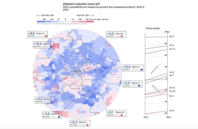
美国郊区在 2020 年转向民主党 - 美国郊区在过去十年里逐渐变蓝、种族更加多样化以及人口增长,这些都会决定民主党是否能保持其微弱的众议院席位 #ddj
Covid19对迪拜航空枢纽的影响 - 意大利的 The Visual Agency工作室 通过收集从2020年1月开始20万个进出迪拜航班数据,为2021迪拜世博会制作了数据驱动项目,2015年他们也为米兰世博会制作过infographic
The Visual Agency@thevisualagency
🇮🇹 Expo 2015 Milano → Expo 2021 Dubai 🇦🇪 📜 Static → Interactive📱 In 2015 we created a static visualization for @La_Lettura that illustrated the connections of Milan airports. In 2021 that visualization became interactive. 🛫 Explore Dubai Airports: bit.ly/DubaiAirports_…
10:07 AM · Sep 30, 2021
2 Reposts · 2 Likes
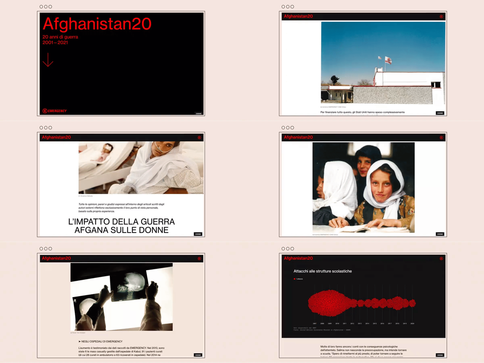
Afghanistan20 - 意大利在阿富汗的急救医疗组织EMERGENCY发布了数据报告,回顾了20年来阿富汗各地医院治疗的数千名战争受害者数据,Accurat 工作室为其制作了可视化 #ddj
Accurat@accuratstudio
More on #Afghanistan20. Read about the partnership -- the first we've taken on as part of a charitable commitment to work on programs with NGOs, non–profits, and other types of organizations that speak to our company values and #datahumanism. On Medium: buff.ly/3mwaW92
11:00 AM · Oct 8, 2021
10 Reposts · 17 Likes
corona memories - UCLAB Potsdam 与爱丁堡大学的研究人员推出了一个 crowdsourcing 项目,试图收集过去600天的匿名个人经历,以各个国家的新冠病例曲线图为背景,在日期周围填补数据点,可视化背后的个体故事 #covid19
UCLAB Potsdam@uclab_potsdam
We are launching a visualization that is a kind retrospective on the pandemic: ➜ uclab.fh-potsdam.de/coronamemories/ Please, help our research by exploring and participating! w/ @tobi_vierzwo @benjbach @nrchtct
1:34 PM · Oct 7, 2021
8 Reposts · 28 Likes
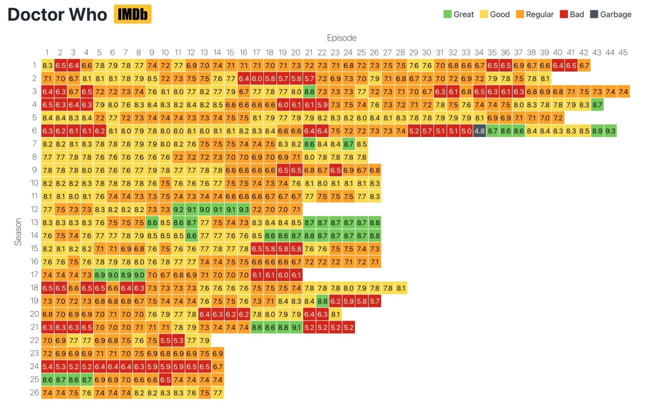
SeriesHeat - Jim Vallandingham 使用 IMDb 数据创建一个电视剧评分热图,搜索电视剧即可查看每集的收视率 #fun
Stipe Press - Stripe为其出版的商业和技术书籍制作了全新交互网站,虚拟书架的视觉效果突出 #inspiration
Nick Jones@narrowd
Today we put books back in 3D, where they belong! press.stripe.com
6:10 PM · Oct 5, 2021
90 Reposts · 748 Likes
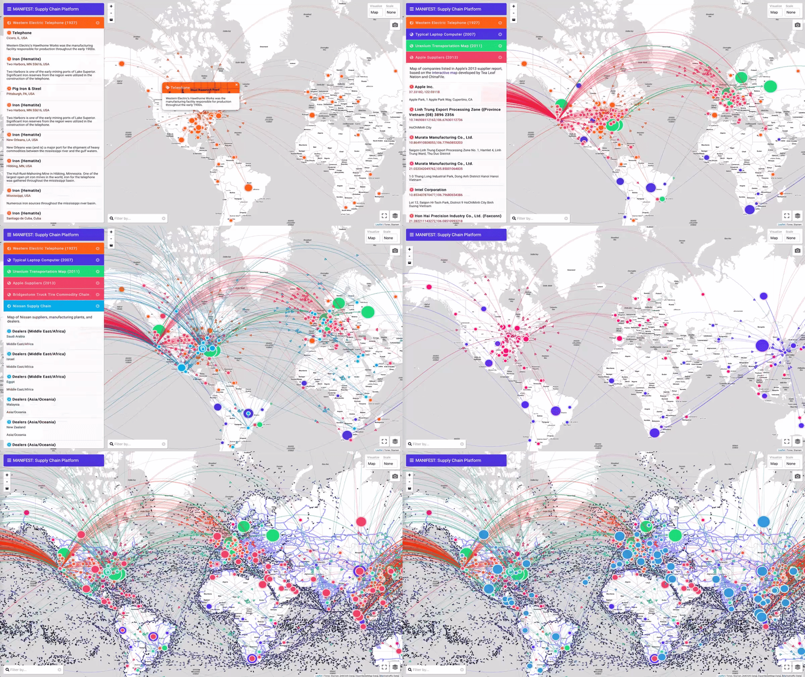
Manifest - by Matthew Hockenberry 一个记录全球供应链、生产线和贸易网络的数据调查工具 #tools #investigation #dataset
Matthew Hockenberry@hockendougal
Sharing my summer homework: Manifest is "an investigative toolkit for researchers, journalists, students, and scholars interested in visualizing, analyzing, and documenting supply chains, production lines, and trade networks." supplystudies.com/manifest/
3:11 PM · Sep 3, 2021
326 Reposts · 1.31K Likes
Observable团队推出的时间序列数据分析指南,使用能源数据集,通过提出不同问题呈现不同发现和可视化 #tutorial #observable
Observable@observablehq
Working with data that changes over time is tough. Our team created this amazing resource & is hosting a webinar on 10/21 to discuss the topic. 🕰 observablehq.com/@observablehq/…
observablehq.com
Analyzing Time Series Data

1:01 PM · Oct 5, 2021
39 Reposts · 173 Likes
文学水文地图 - 用页数展示的书籍深度 #map
Clara Dealberto@claradealberto
📚🗺️🌊 « Carte hydrographique de la littérature » Cette carte MAGNIFIQUE de @ThierryFetiveau publiée aux éditions Bouclard présente les différents niveaux de profondeurs des livres exprimés non pas en mètres mais en nombre de pages. Quelle idée de génie.
7:47 AM · Oct 8, 2021
31 Reposts · 175 Likes
ExploreThrees.SG 3D - 开发者 Chee Aun 用Mapbox制作了类似 iOS 最新地图的新加坡城市树木数据的3D地图,source code
台湾与大陆流行音乐的前世今生 - by Chaoyang Trap,“台湾对华语音乐的影响,它是如何塑造中国流行文化的,即使它的起源被故意掩盖/否认”,以及spotify歌单
No posts
Comments
Nothing yet. Say the first thing.
Sign in to join the conversation.