
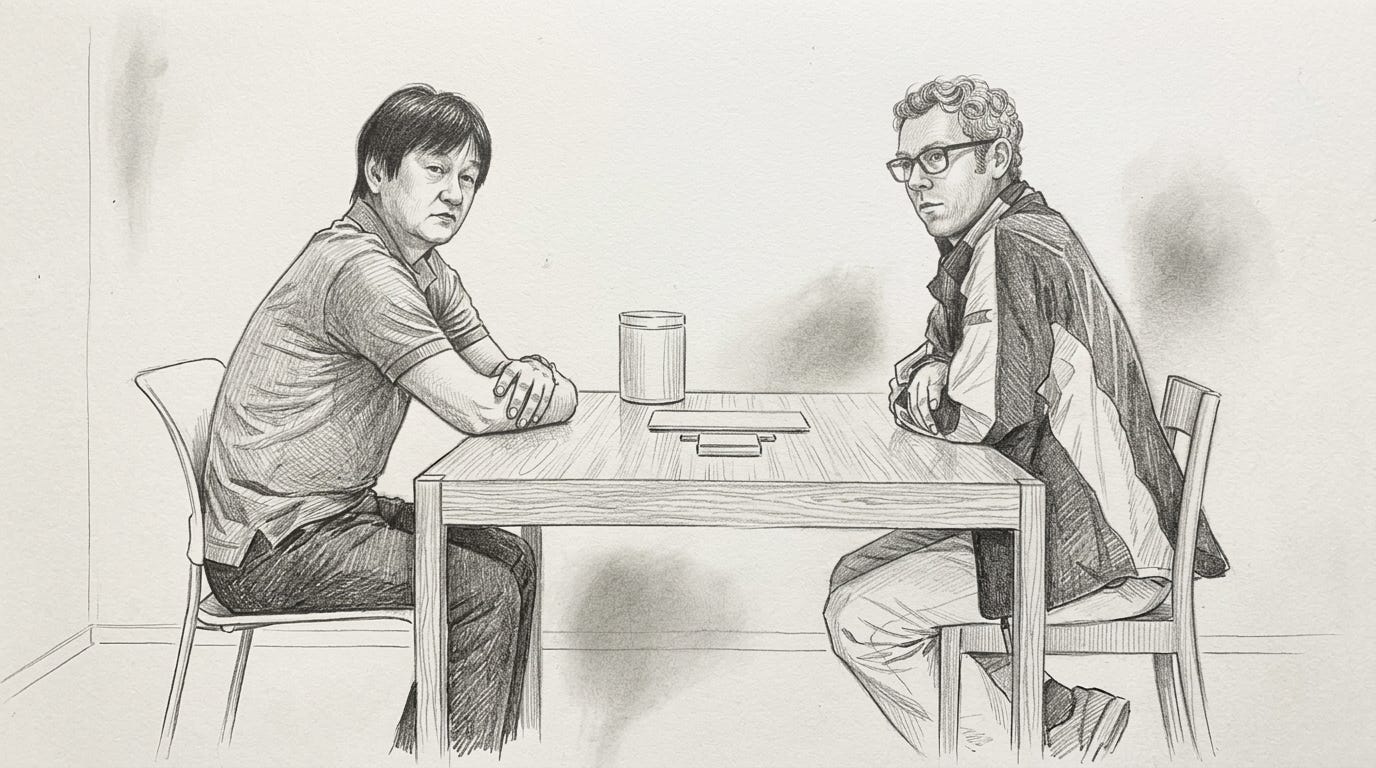
A concept that I was recently introduced to and have found quite enamoring is of Super Normal Design. Coined by Jasper Morrison and Naoto Fukasawa, known for their work at MUJI as well as many other places, they argue that the best designed objects are not the ones that demand attention but rather the ones you do not notice. They become normal in some sense, with the design becoming so normalized that only the form and function remain.
It is a concept that I think matters more in 2026 than it ever has, because the cost of producing flashy, high fidelity output has basically collapsed. Anyone with Claude Code and a few hours can ship a landing page that looks great, anyone with a Figma file and an evening can mock up an interface that looks like it cost a designer ten thousand dollars to build.
Visual fidelity is no longer really a signal of anything, since everyone now has access to it, which means the actual signal of quality, the thing that is genuinely hard to fake in this environment, ends up being restraint, the discipline of knowing what to leave out.
You can see this play out across almost every level of the startup stack, and landing pages are probably the most visible place to look. YC runs a series I really enjoy where they sit down with a lead designer and go through the design flaws of batch startups’ landing pages, they started doing it about two years ago, and what has been interesting to watch is the evolution of the critique.
In the beginning it was mostly about poor structural choices or thin content, the kind of thing where a page was just not doing enough work, but today the criticism has flipped almost entirely and is now about pages doing far too much.
Too much visual fidelity, too many animations, too many components stacked on top of each other in ways that feel impressive in isolation but get in the way of anything actually getting communicated.
The tools have gotten so good that they have started to make the underlying judgment worse, founders ship pages that look beautiful but no longer do the basic job, which is to help someone understand your product, see the value, and get started.
It shows on what we focus on as founders. The ones who lead with the UI, the design system, the animations, the new metaphor they invented for showing something on a screen, those are usually the ones who have not actually figured out the underlying product yet. The ones who lead with the workflow, what they are replacing, what friction they are removing, the boring use case nobody else wanted to spend any time on, those are usually the ones who have.
It took me a while to start seeing this because the flashy founders end up looking like the ones doing more, when in reality I think a lot of them lean on the interface because they are afraid of being seen as just normal, afraid that two years of work is going to look like nothing because it does not announce itself visually.
The flash ends up being a kind of coping mechanism for not yet having a product you can quietly hand to a user and watch them actually use.
What people often get wrong about Super Normal Design is the assumption that it is about stripping things down, less features, less interface, less of everything in some kind of minimalist exercise. That is not really what Morrison and Fukasawa were pointing at.
The classic example designers cite when they want to show what super normal actually looks like is Dropbox, the entire pitch of which Drew Houston basically reduced down to the idea of a folder that syncs.
On the surface it was completely familiar, you drag files into a folder on your computer the way you always have, the same icon, the same drag and drop, the same right-click menus you already understood, but underneath the folder was syncing those files across every device you owned and storing copies of them in the cloud, which at the time was a genuinely new model. The novelty was real, it was just not on the layer you looked at, it was on the layer the folder was operating on.
That is what Super Normal actually is. Not minimalism, not stripped down design, just innovation that lives underneath a surface that has stopped trying to impress you.
Dieter Rams was making a similar case decades ago in his ten principles, and the one I keep coming back to is the fourth, good design is innovative. People tend to forget that one is even in the list, because they associate Rams with the more famous tenth principle, good design is as little design as possible, which gets repeated as a kind of minimalist mantra. But Rams was always clear that innovation belonged in good design, just not innovation as posture, innovation in service of the user.
The rule that comes out of holding those two principles together is something like, restrain everywhere by default, innovate only in the places where the existing language is genuinely failing the person trying to use the product. Most AI native products end up doing this exactly the other way around, they innovate on the layer the user can see, the surface, the metaphor, the input modality, and they leave the underlying capability roughly the same as their competitors, which is roughly the opposite of what good design would suggest.
The way I have started to think about it is that the products that survive long enough to look obvious in retrospect are the ones that were willing to look unimpressive for a while. There is no version of building something that lasts that does not require sitting in the awkward middle period where you look like you have not done enough, and most founders cannot stomach that, they would rather look like they tried than have someone underestimate them. The products that end up sticking around through this wave will probably be the ones built by people who could stomach it, the ones who were willing to look completely normal on the outside in exchange for being correct on the layer that mattered underneath.
Eventually their products stop being recognized for their design at all, the design just falls away in use, and what is left is something that has become Super Normal in the way Morrison and Fukasawa meant it from the start.
Check out this Podcast Episode!
You can also listen on Spotify, Apple Music, and Google Podcasts
In this episode of Building Blocks, we sit down with Emre Ertan, co-founder and co-CEO of Cenoa, a borderless super wallet revolutionizing how people in emerging markets access digital dollars.
Previously the CPO/CTO at Getir where he scaled the engineering team from 80 to 400 people, Emre shares his journey from a small town in Turkey to Silicon Valley, and how that experience shaped his vision for democratizing financial access globally.
He discusses Cenoa’s explosive growth in Nigeria (50K+ signups in first month), their innovative approach to simplifying blockchain technology for everyday users, and his perspectives on building compliant fintech products across 40+ markets.
Thanks for reading,
Daivik Goel
Comments
Nothing yet. Say the first thing.
Sign in to join the conversation.