
I’m deep enough into this project for a few things to have occurred:
I’m in the disgusting middle section where I’m tired from the work I’ve already put in, overwhelmed by the amount still to come, and disappointed in the progress to date. The ugly goggles are on.
I’m seeing patterns.
I’m seeing evolution.
I’m fighting a desire to go back and “fix” old pieces as I learn things in newer pieces.
Let’s discuss.
As discussed in previous posts, I’ve used this project to test a bunch of new techniques and rendering styles. It’s been fruitful and informative. It’s also resulted in a hodge-podge collection of finished pieces that was starting to wear me down. I didn’t love the stylistic variation from piece to piece because I felt like it was hurting the set. I intend to offer them as a collection so I need them to feel like they relate to one another.
I was also feeling like all of this experimentation was pulling me away from what makes my art unique to me. Where is the cross hatching? Where are the lines? Where is the black??? I certainly don’t like when my black line work skews too much toward cartooning, but without it, I felt like I was missing a core piece of my identity.
So I set out to bring it back.
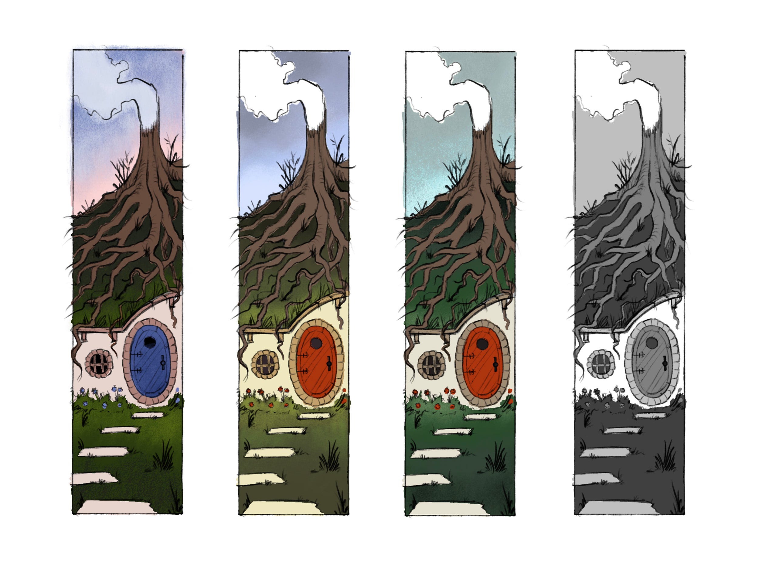
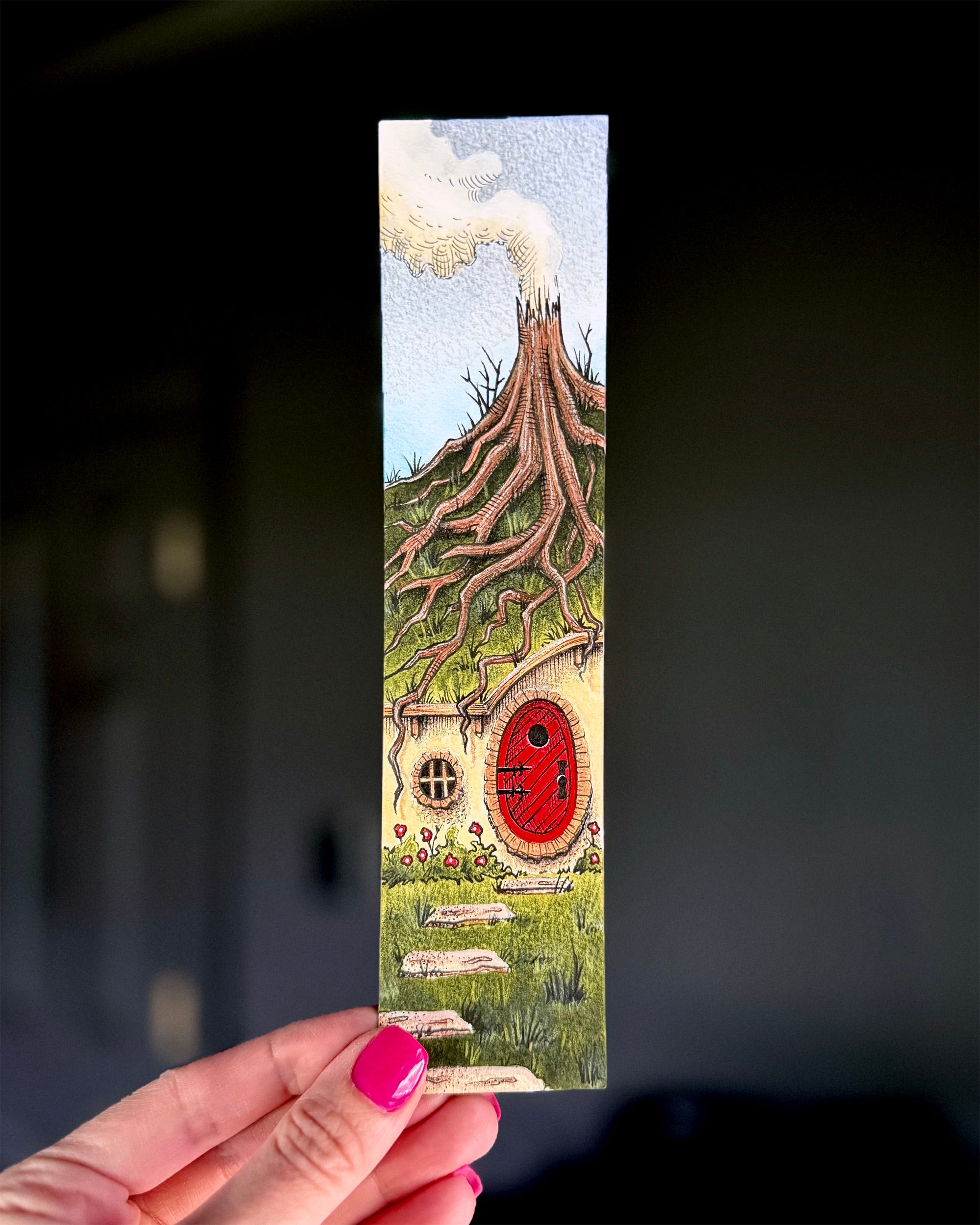
Six pieces into this project, my definition of “dwelling” was getting stretched. I’m running out of ideas. My initial concept for “underground” was to show a cut-out view of a burrow. I eventually decided against it because I don’t have interior views in any of the other pieces so it felt like too much of a departure. I opted for a hobbit-style house instead and started with some sketches.
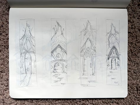
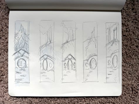
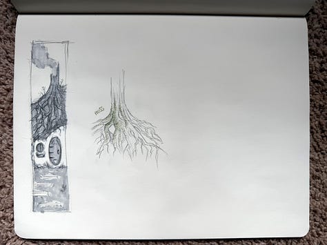
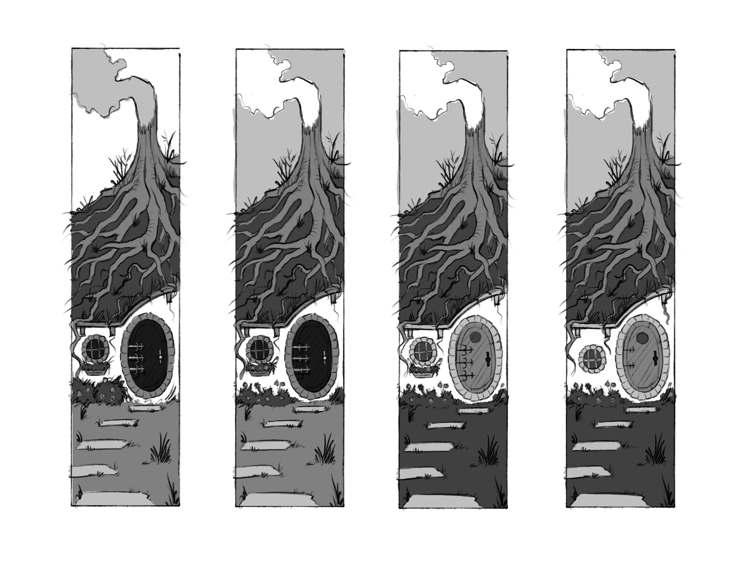
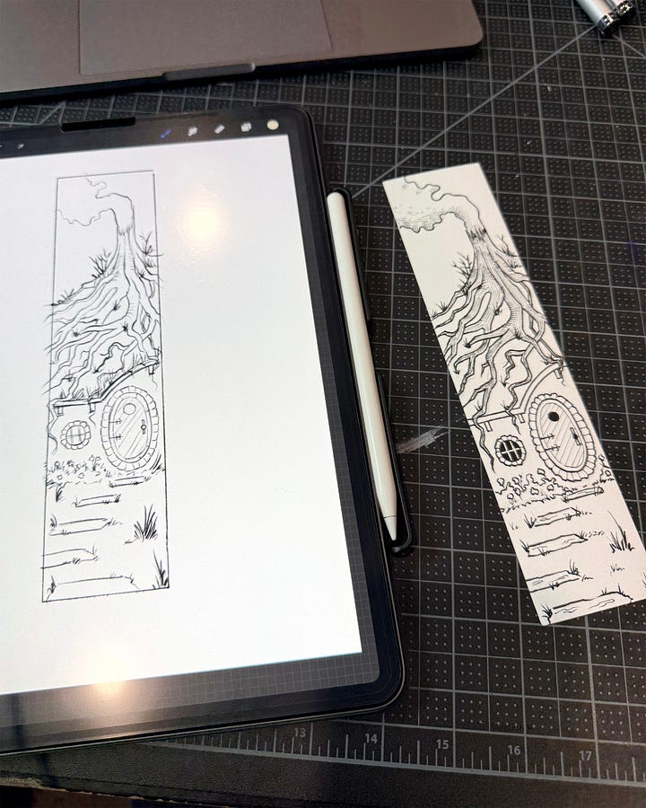
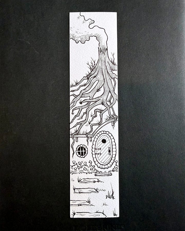
This is where the line work came back. Instead of ballpoint pen, ink wash, or watercolor, I started the rendering with Copic multiliners. I planned to rely more heavily on cross hatching than painterly techniques for shadows and texture. Planned. I planned to.
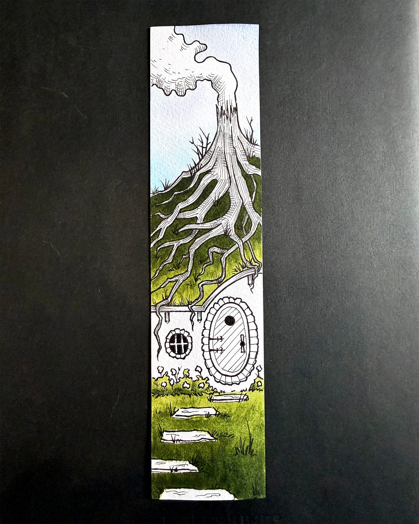
This is where things got dicey. It started off well enough with some watercolor washes.
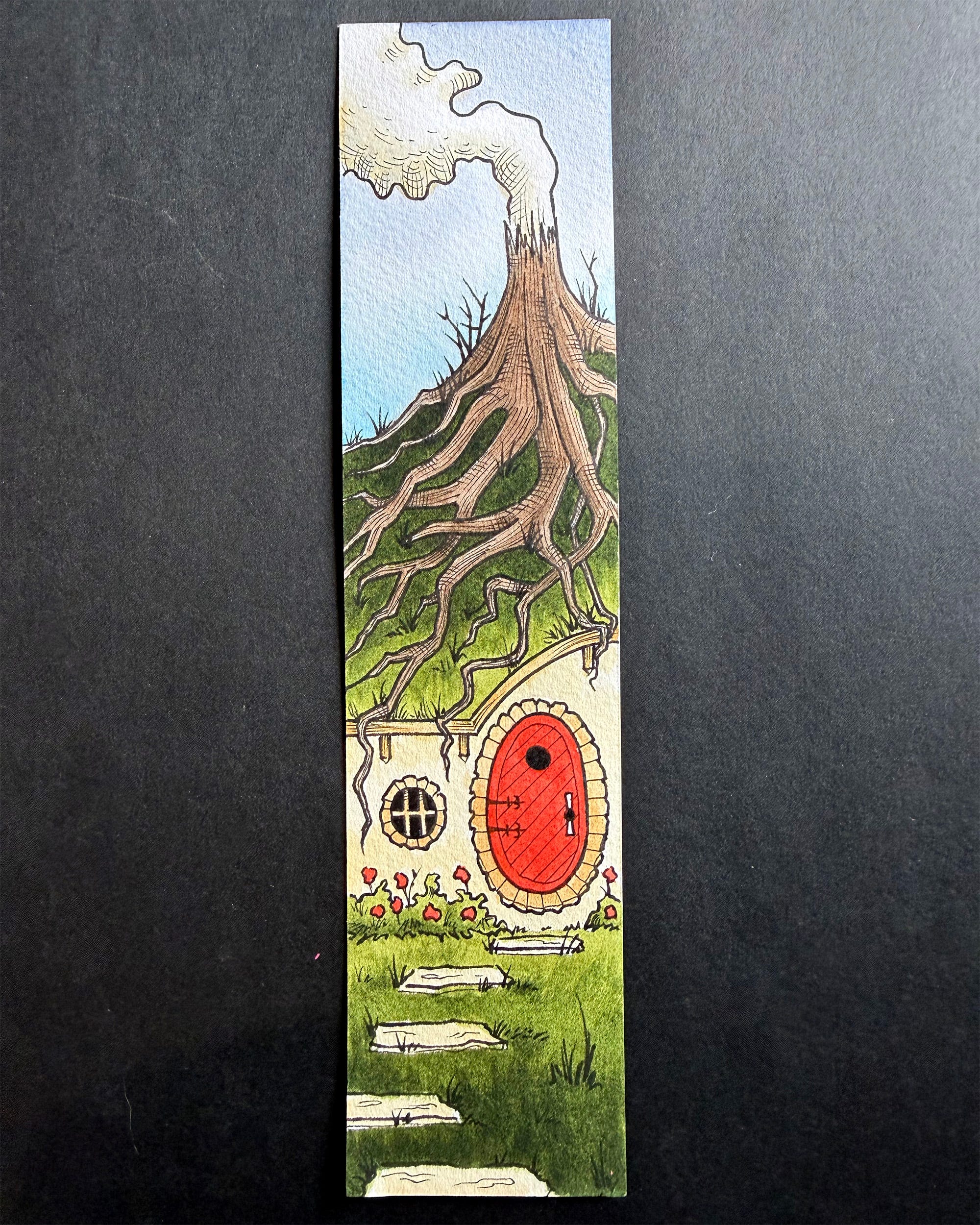
But then I added shadows, highlights, and details… and started hating it. I “finished,” or so I thought, and took a look at the final product. It wasn’t… bad… necessarily, but it wasn’t what I had in mind. The thick black outlines were reading super cartoony. I thought I’d avoided that but I didn’t. The whole thing felt heavy handed and a little too cute. The textures I created with cross hatching were disappearing under layers of watercolor and pencil. It was simultaneously too much ink and not enough ink. The concept worked a lot better in my head. I almost threw in the towel and decided to move on to the next one.
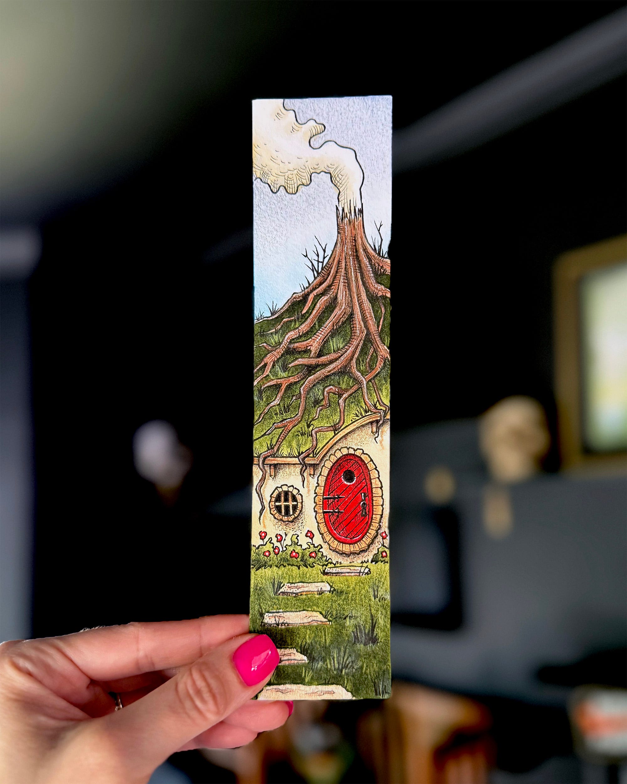
At 11pm one night, I decided to “save” it. 11pm is definitely the hour for such decisions. I figured I’d go in with some thick white gouache and knock back the most distracting black outlines. The goal was to introduce some soft/lost edges to make it feel a little more realistic and match the rest of the set. I didn’t know what to expect and, frankly, had pretty low confidence in the strategy but it ended up working! I was never going to completely reinvent the piece with a tiny bit of white gouache but I managed to make it slightly less offensive. Here is a before/after view.
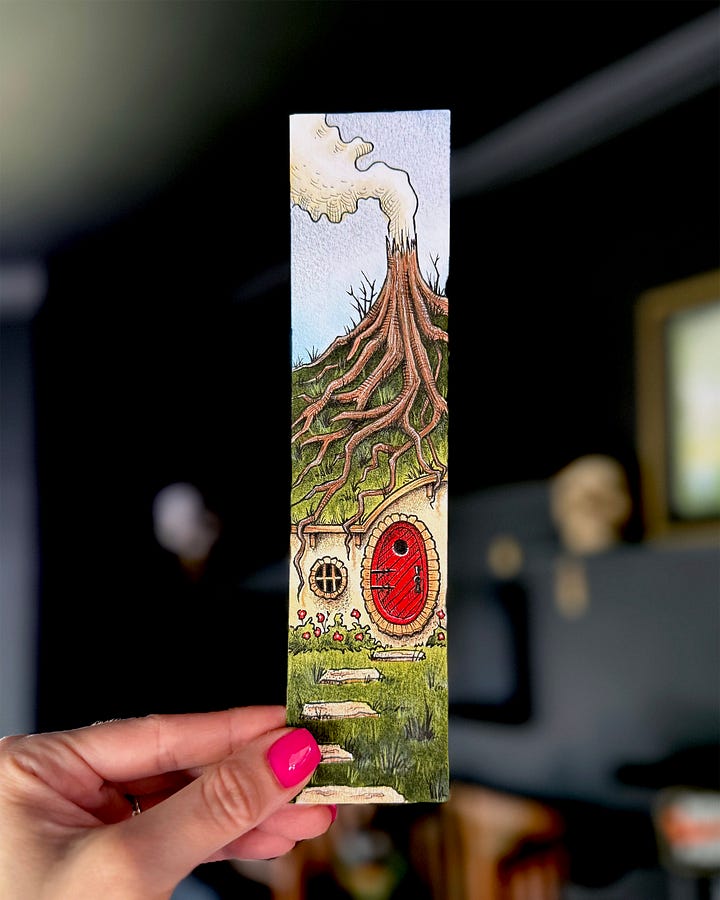
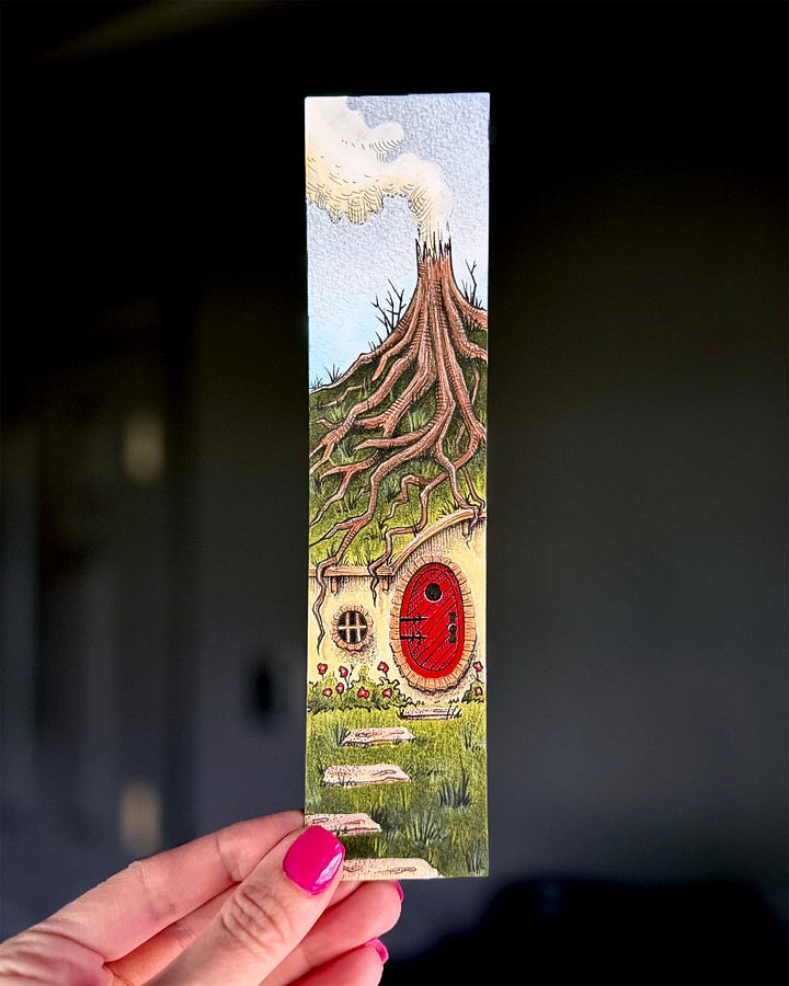
Did this one piece fix all of my style issues? Abso-clucking-lutely not (my toddler is learning to talk, I need to practice alternative cursing). This was an exercise in knowing approximately where I wanted to go but being unable to get there safely. That said, I learned a lot.
Some things I’ll take with me into the next one:
I cannot blindly start inking with thick contour line. It always ends up cartoony. I’ve learned this lesson infinity times and have yet to heed the warning.
For a piece this small, I need a thinner pen nib.
I should look for less saturated color palette references.
I need to keep up the pace. At this rate, it’ll be 2085 before I finish this series.
That’s all for today folks! Hopefully the next post hits your inbox a little sooner!!
Comments
Nothing yet. Say the first thing.
Sign in to join the conversation.