
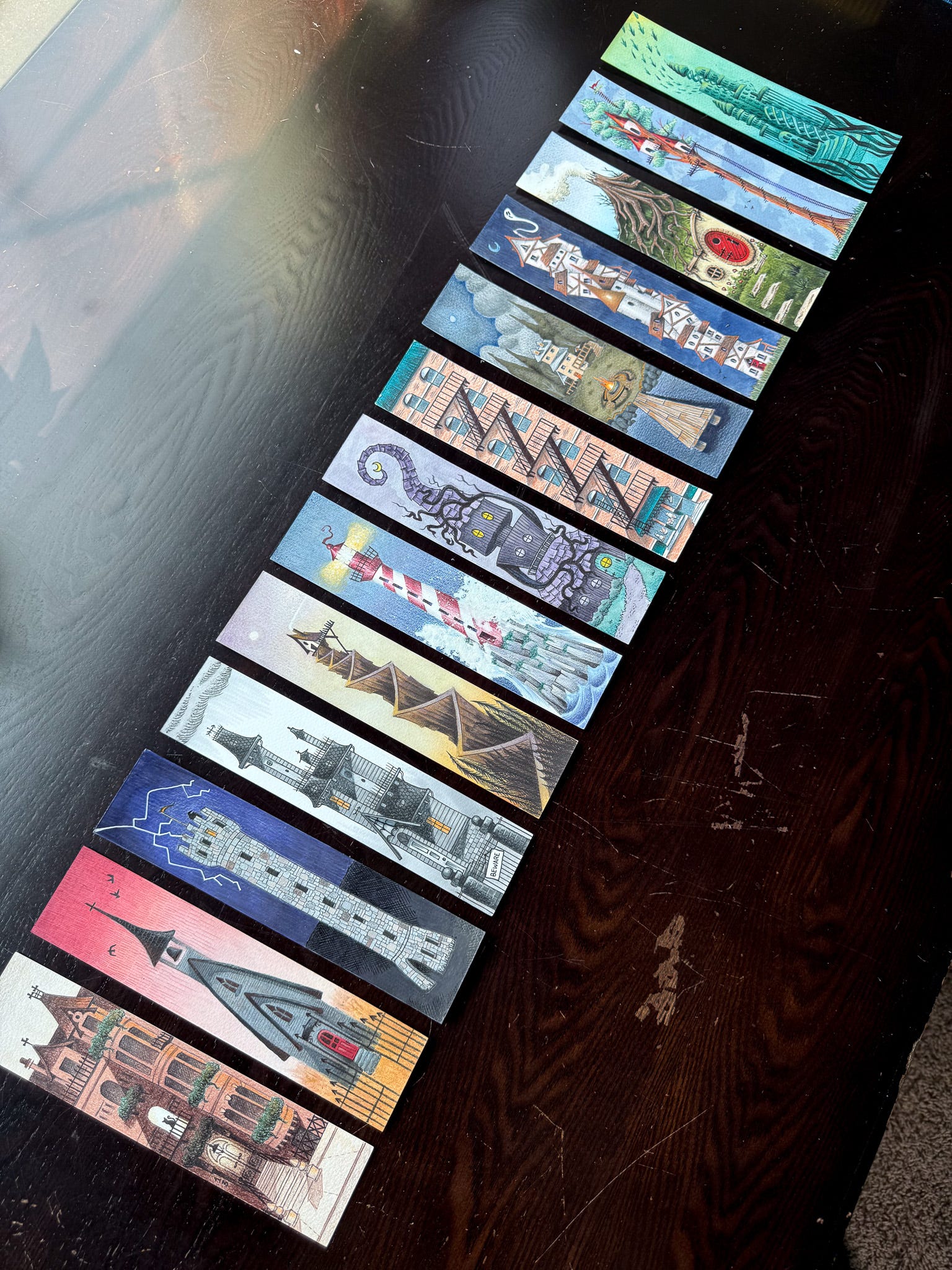
At the end, I guess. After approximately a full calendar year, I finally finished the 13 Dwellings bookmark series.
Do I feel like that took too long? Yes.
Am I pleased with the outcome of every piece? No.
Am I proud of myself for finally finishing a longer-term project? Hell yes.
In the time since I last wrote:
our 13 year old cat was diagnosed with inoperable lung cancer and I’ve been driving him an hour and fifteen minutes each way every 2-3 weeks for chemo treatments.
our daughter ended up in the ER with a fever/gnarly ear infections that necessitated ear tubes. [Insert a collection of pediatric specialist appointments for that whole journey.]
I interviewed for a job that I didn’t get.
I landed a tattoo apprenticeship! (more on this later)
I started playing around with leather working and have become strangely prolific. (more on this later as well)
I tabled at a horror convention that, unfortunately, had super low attendance.
I went to two Phillies games (we won both!) and will be going to a third this weekend that I am sure we will not win given recent performance.
we hosted friends and family for various weeks/weekends.
we had a death in the family.
and, despite all this, we still had to figure out dinner every damn night. Why is dinner always a thing?!
I’m tired.
But I felt determined to finish this series. I’ve abandoned a lot of personal projects like this in my life. I guess I was finally tired of giving up on myself.
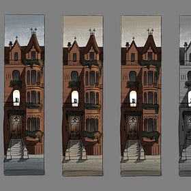
I was forced to simplify. Back in the blissfully cold, boring days of winter when the only thing we had to worry about was daycare sniffles, I spent a long time planning, concepting, and pre-working all of these bookmarks (see example below).
13 Dwellings: Brownstone
·
Feb 2
I quit my job at beginning of the year. I needed a break from corporate politics to recover from burnout and take care of things at home. And yet, somehow, all this extra “time” I supposedly have each day doesn’t feel like very much.
The results are certainly nice. This brownstone bookmark continues to be a bestseller… so in some ways, all this pre-work paid off. But for the price point I offer these and the amount of other things I want to do with my time, it is mostly cost-prohibitive. I had to be less precious about it.
The last eight bookmarks were all completed much faster. I don’t love all of them but I don’t necessarily blame that on the speed. I suspect that in a series like this, one always has favorites and not-so-favorites.
There were two pieces of pre-work that I kept with me. The sketch phase and the 5-value phase. I figured if my values were strong, the piece would work. I was correct about that. Here is what that looks like in practice…
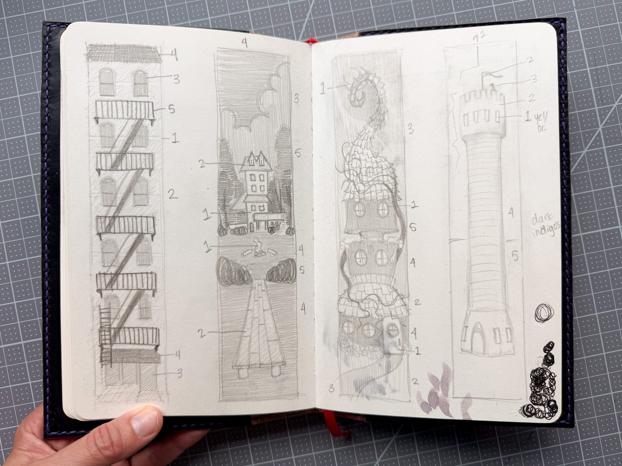
After landing on the general composition/structure of the piece, I’d plan out the values on a 5-value scale. Even when I didn’t shade it in on the sketchbook page, I’d designate each of the five values with numbers (like the tower design on the far right). For the most part, I stuck with the plan. As a result, of all the things I dislike about the last eight bookmarks, values are not among them.
The rendering is what killed me. I kept messing around with different strategies. Pen, pencil, marker, fine-liner, watercolor… those were the media of choice. But the order and manner in which I applied them varied pretty dramatically from piece to piece. These stylistic variations are obvious when you look at them together. That bothers me. I plan to sell these as a set and I don’t want them to lack cohesiveness. I don’t see how I would have done it differently, though. This project was an evolution in so many ways.. the manner in which I made each piece was no exception.
I’m speaking in generalities. Let’s talk specifics.
When I think about my own artwork, I think about black lines and cross-hatching. They’re not always present, but they usually are. At around bookmark number 7 or 8 in this series, I looked down started thinking that these didn’t feel totally like “me.” At first, I couldn’t put my finger on it. Maybe they’re not creepy enough. Maybe it’s the absence of characters. Maybe it’s all the architecture… and then I noticed that none of them had black line or cross hatching. On one hand, I appreciated that because it gave them a bit more dimension and realism. On the other hand, I felt like ‘I’ was missing.
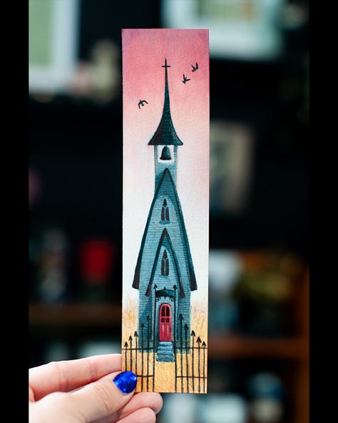
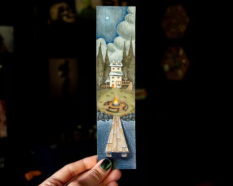
So I started adding it back in… and kind of hated it. For whatever reason, I struggled to maintain both the linework that I’ve come to accept as my identity and the more realistic rendering I’m able to achieve with heavier ballpoint pen or watercolor usage. Super annoying. Like, I don’t want to live in the world of cartoons but I also don’t want to lose the line. I never managed to solve that dilemma before I hit the end of the project. If anything, it felt most problematic in the final two designs (the Witch House and the Gothic House).
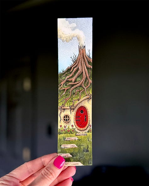
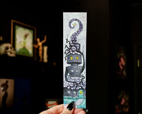
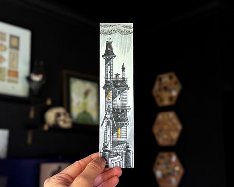
I think I’m going to have to go back to heavier use of hatching again. If I look back to some of my earlier bookmarks (before this series), I relied far more heavily on pen work and only applied color at the very end. I spent far less time on those designs and I like them better overall.
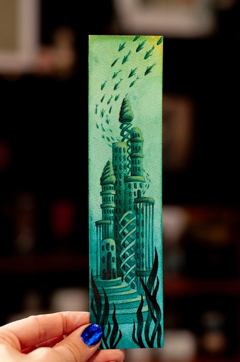
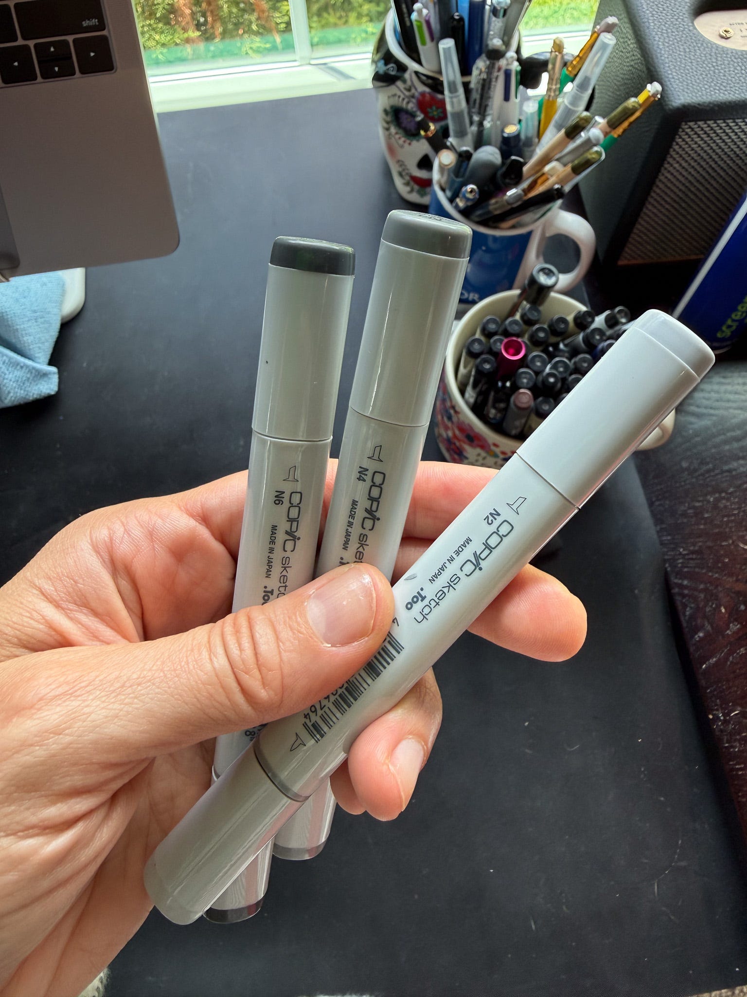
At the very end (for bookmarks 11-13) I started blocking in the values with Copic sketch markers to get a fast, definitive value range in place before I started rendering. I liked this. Instead of fighting with colored pencils or ballpoint pens to get the value depth I needed, I knew I already had it in place and could color on top when I was ready. I wish I took process photos of that but I didn’t so here’s a shot of the markers themselves followed by the bookmarks in which I used the technique.
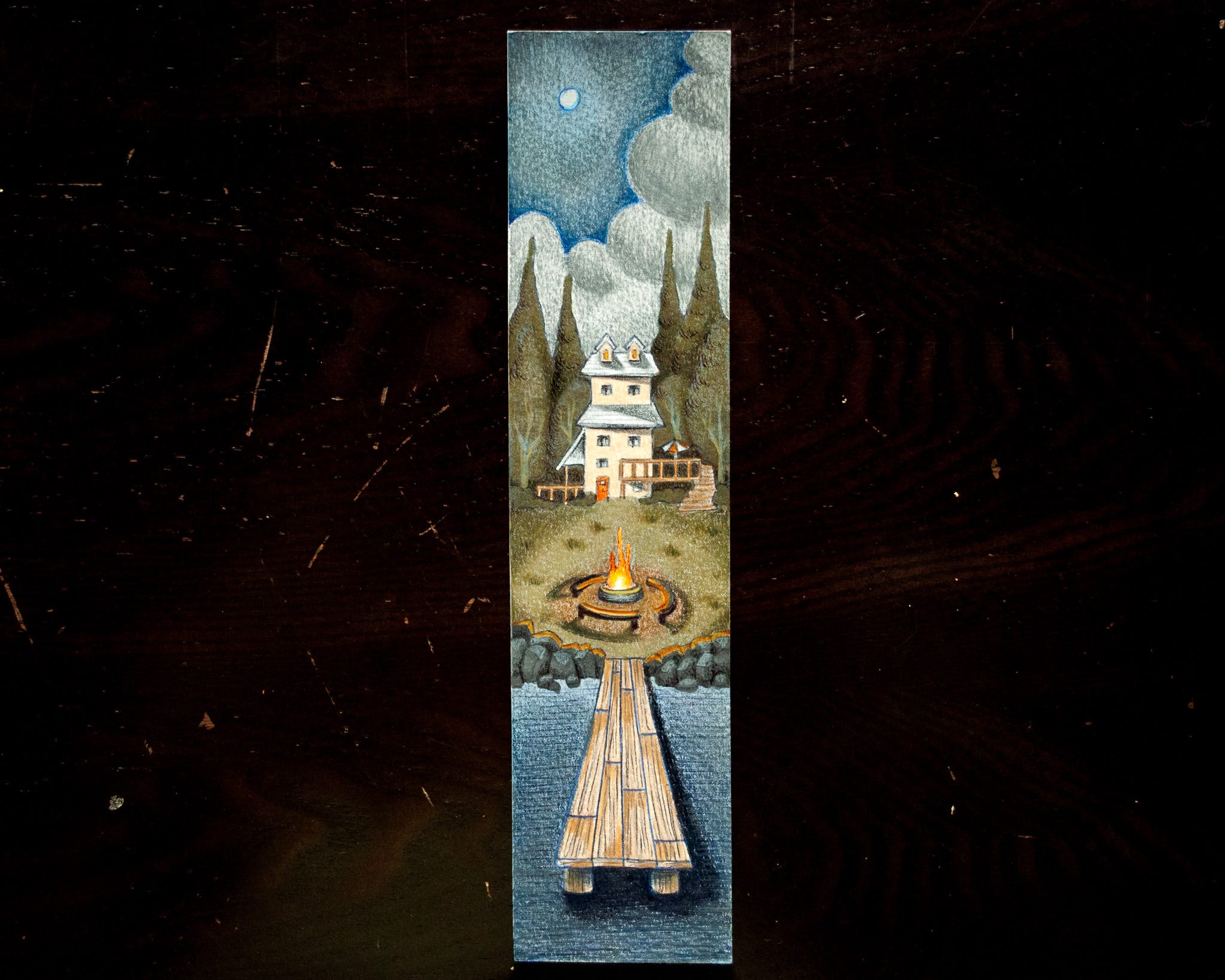
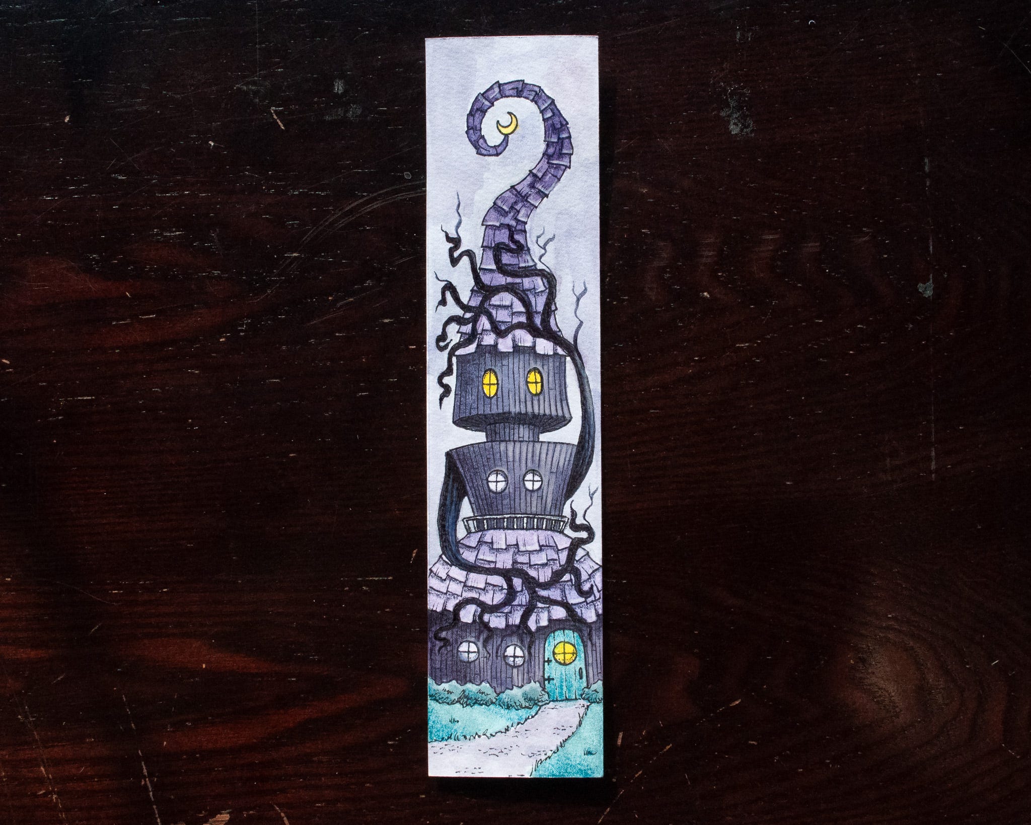
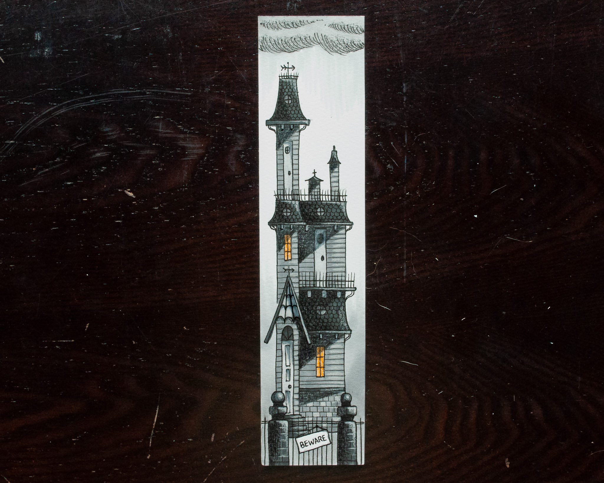
(Note: The Lake House did not use black outlines while the Witch House and the Gothic House did.)
I don’t know, man. These 13 bookmarks are sort of a hodge-podge of ideas and styles. I have been secretly harboring the desire to do another 4-part bookmark series featuring face cards that I’d try to lock into a more consistent style. After completing this series, I’m of a few conflicting minds.
Do I want to become the bookmark guy? Maybe. Could be an interesting niche.. though it’s really hard to market them.
I’m tired.
I want some stylistic redemption.
I have other projects I want to do and a tattoo apprenticeship to prepare for.
Basically, I don’t know where I’m going from here.
But, damn, it does feel good to finish something…
Comments
Nothing yet. Say the first thing.
Sign in to join the conversation.