
The first time I ran an accessibility scan on one of my own sites, I braced myself.
I’d been doing digital accessibility work professionally for years by then, helping companies make their digital content work for everyone. But my own author website was a different story. That site got built in evenings and weekends, layered over with plugins and theme updates over the course of years. I added the tool to my browser, clicked the button, and the report appeared in the sidebar with more than a few errors highlighted.
My first reaction was the one I want to talk you out of today. Even though I expected to find errors, I still had a wave of dread wash over me because it was confirmed that I’d been making my site more difficult to engage with for some people.
First of all, don’t beat yourself up based on what your first scan reveals. You’re taking action now and that’s what counts.
An accessibility scan also isn’t a test you pass or fail. It’s a flashlight. It shows you a few things you couldn’t see before, and that’s worth a lot. What it doesn’t do, and can’t do, is light up the whole room. Knowing the difference is what turns a scan into something genuinely useful, instead of something either scary or falsely reassuring.
Whatever issues might be revealed, it also doesn’t mean that your site is completely inaccessible. A scan can reveal things that might be blockers for some as well as things that might be best described as a speed bump. It’s good for you to understand what’s here though so you can make decisions on what and how to fix things.
An accessibility scan is an automated check. You point a tool at one of your pages, and it reads through the underlying code looking for specific problems it knows how to recognize. It does this in seconds, and for a certain kind of problem, it’s very good.
Here are some of the things a scan can call out:
A linked image that has no alt text
An image that has no alt attribute
Text that has poor color contrast
A link with no words in it
A button with nothing to announce itself
A page that never declares what language it’s written in
A heading left completely empty
A heading order that isn’t logical
These are real problems, they’re common, and a scan catches them without you needing to read a single line of code.
A scan turns “I have no idea whether my site has problems” into “here is a specific list of things to look at.” That’s knowledge you can use.
You don’t need to buy anything to start. Two free tools cover most of what a creative entrepreneur needs.
WAVE is a free tool from WebAIM, a nonprofit based at Utah State University that has been doing accessibility work for a long time. You add WAVE to your browser, visit any page you want to check, and click its icon. It then lays its findings right on top of your page, with little icons pinned to the exact part of the site where there’s an issue.
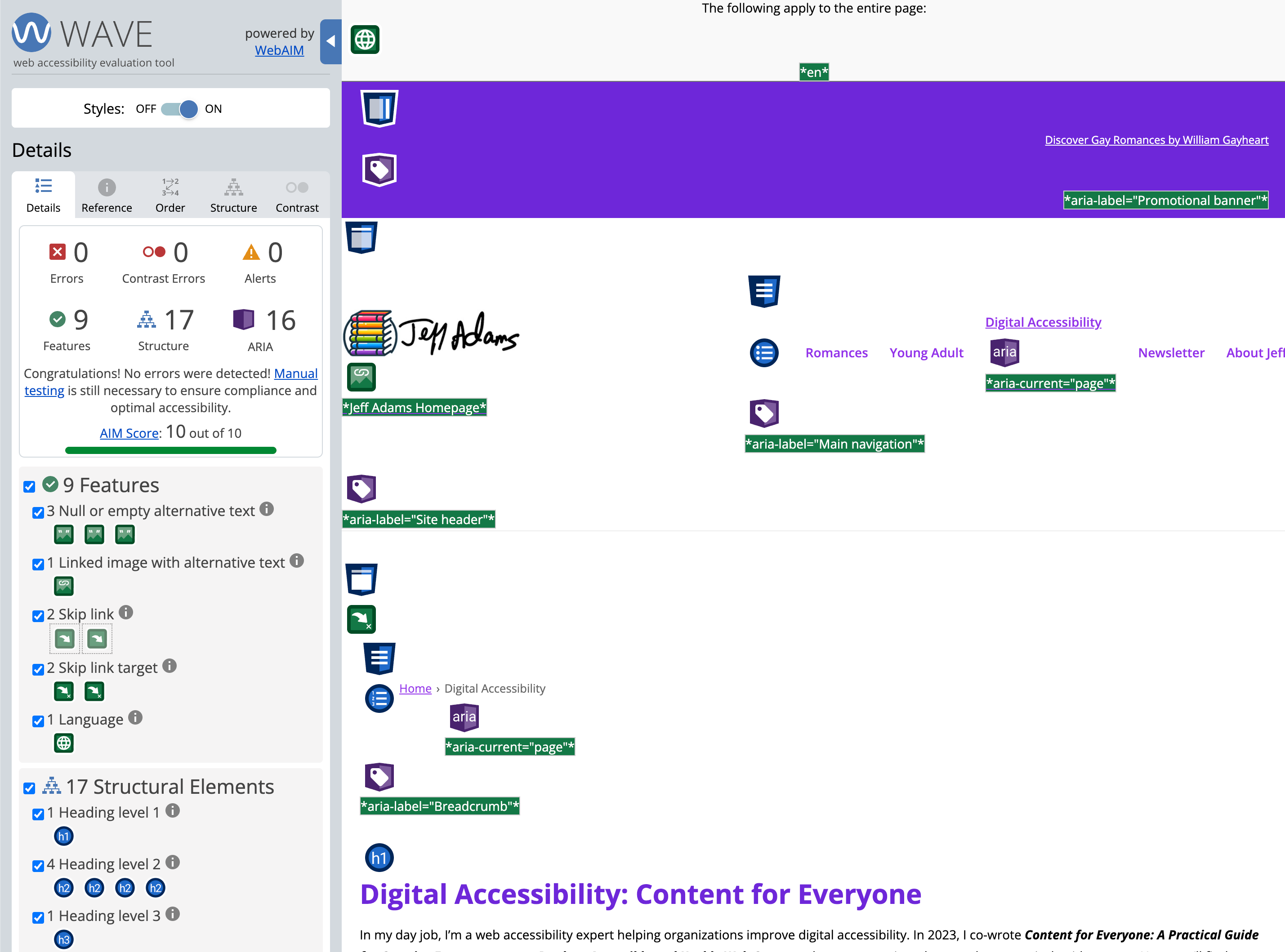
In this WAVE example from my website, the panel on the left side is its default view. The areas you’d pay attention to are the “errors” and “contrast errors.” Ideally you’d get those to zero. If you do have errors, you’d see red marks on the page to help you see where the issues are, plus you’d get details in the left panel about the findings.
Lighthouse comes built into the Chrome browser, so there’s nothing at all to install. It sits a few clicks deeper than WAVE, inside Chrome’s developer tools. It will give you an accessibility score and a list of issues for any page you’re on. If you use Chrome, simply do a right click on your mouse from anywhere on a webpage, select “Inspect” from the menu that appears, and select “Lighthouse.” (If you use a keyboard, you can hit F12 to bring up the dev tools.) Lighthouse can also give you reports about your site’s performance, best practices, SEO, and agentic browsing on both desktop and mobile.
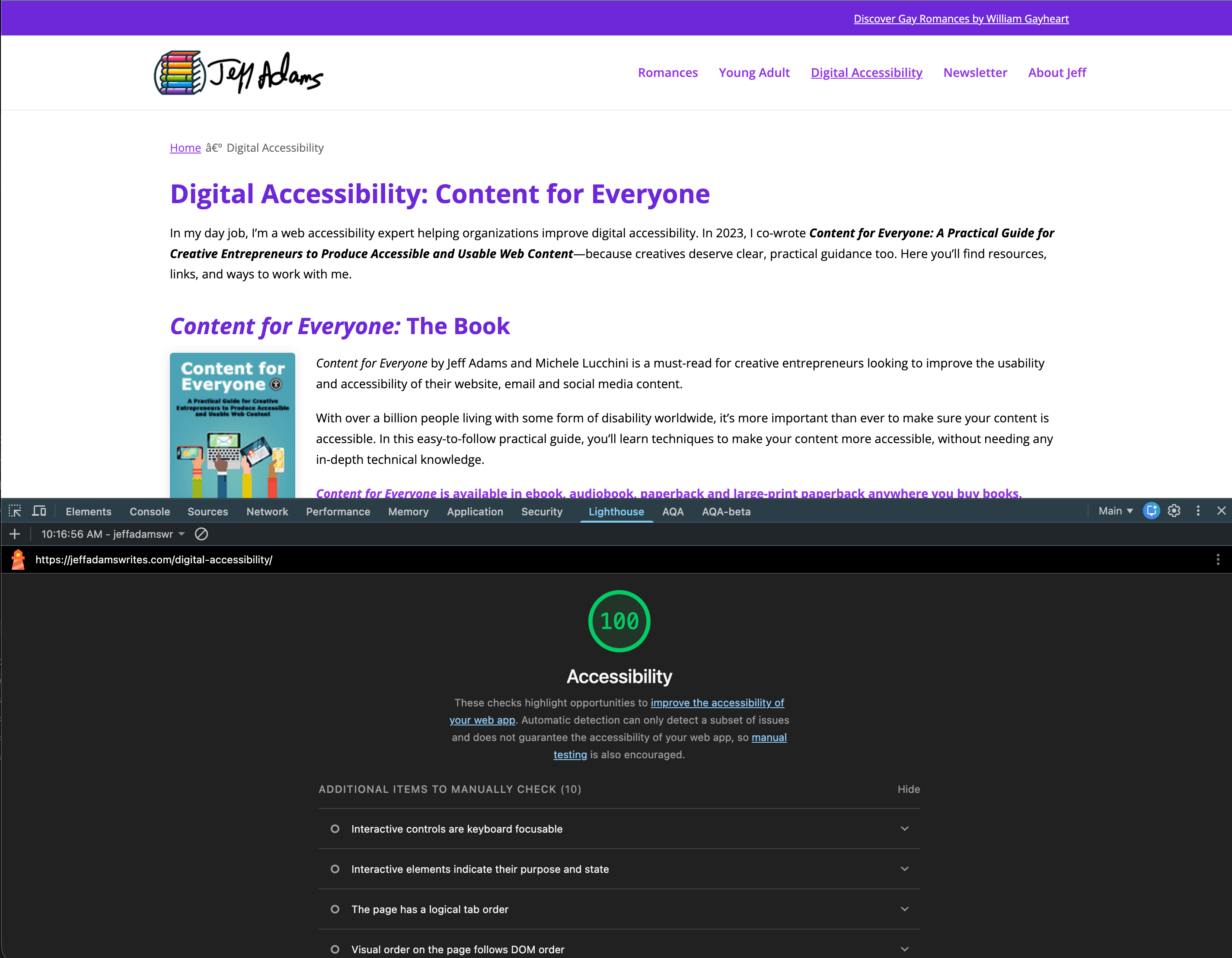
For this Lighthouse example, the report appears in the developer tools which I have docked under the website. In this case because I’ve got the 100 score, it gives me some things I can check manually since the automated scan can’t do those checks. If I had issues, under the score the list would appear with details about what the scan found so I could understand what needed fixing.
Keep in mind you don’t need both of these, you simply need to pick the one you like working with best.
Run your first scan and you’ll probably see a number of issues, and the number might be big. Before you spiral, a few things are worth knowing.
A scan usually sorts its findings into a few groups. Tools differ a little, but the pattern is roughly the same.
There are errors, the things the tool is confident are wrong.
There are alerts, the things it wants a human to look at.
There’s usually a category of good news, items that appear to be done correctly.
The errors are your starting list. But pay attention to the alerts, because this is where people get tripped up. An alert is not a failure. It’s the tool saying “I can’t judge this one, so you’ll have to.” A scan can see that an image has alt text. It cannot understand if that alt text is any good in the context of the page. So it flags the image and asks you to check. That’s not the tool falling short. That’s the tool being honest about its limits.
It also helps to remember that a scary number is often not as bad as you think. If you have a gallery of 20 images and none of them have alt text, that shows up as 20 issues. But that’s really one thing to review and maybe make fixes. If the images need alternative text because they carry important information, you fix all 20 in one go and make a note that if you add another image, it needs alt text. If the 20 images are decorative, you make a note that you can ignore that issue because having no alt text is correct.
And if your scan does light up, you are in the same place many people and companies are. WebAIM runs an automated scan of the top million homepages on the web every year, and in the most recent one, about 96 percent of those pages had detectable accessibility failures. The busiest, best-resourced sites in the world mostly don’t come back clean either. This is not a you problem. It’s a found-it, now-fix-it situation, and finding it is the hard part you’ve already done.
Here’s what matters most, and what the tools themselves are upfront about.
An automated scan catches roughly a third of accessibility issues. The rest needs a human looking with intention. A scanner works by checking the things that can be checked mechanically, and a great deal of what makes content accessible simply isn’t mechanical.
I mentioned above what a scan can tell you. But here’s some of what it can’t identify:
If alt text actually describes the image, or whether you typed something generic just to fill in the alt text box.
If the captions on your homepage video are accurate.
If your headings outline the page in an order that makes sense.
If someone can move through your whole site using a keyboard alone.
If your writing is clear.
Every one of those, meaningful alt text, accurate captions, a sensible heading order, keyboard navigation, clear writing, is something a person has to check.
The scan and the human review aren’t competitors. The scan is fast and easy, and it tells you a lot of things so that you can focus on the things only a human can find. And don’t worry if you don’t know what to look for yourself, I’ll continue to talk about those in future posts.
So here’s how I’d recommend for you to proceed.
Run the scan. It takes only a few seconds, and it will teach you something about your site today. Fix what it finds for the errors and contrast errors. Treat the alerts as a to-do list of things to look at with your own eyes.
And if you can’t fix something, that’s fine too. Depending on what it highlights, you might not be able to fix something because of the platform you use or because you’re not a developer. And that’s fine. The goal is to fix what you’re able to.
But don’t mistake a clean scan for a finished job. No automated issues (so zero errors on WAVE or a 100 from Lighthouse) means the machine-checkable things are in good shape. It does not mean your site works for everyone. It means you’ve cleared the first third of the room, and now it’s time to walk the rest of it with the flashlight in your hand.
Don’t be discouraged by this. The scan gets part of the job done, and it’s okay to parse out the rest. This is all a process. As I’ve said many times… progress over perfection. Running the scan and fixing what you can from the report is progress.
Pick the page that matters most on your site. Your homepage, or whatever page gets the most traffic. (You could also do this on one of your emails if your email platform allows you to open the message in your browser.) Add WAVE to your browser, open that page, and click the icon.
Then look at just two things. Find one error, the tool will point you straight at it, and see whether it’s something you can fix in the next few minutes. Then find one alert, and actually do what it asks: look at the thing with your own judgment and decide whether it’s fine or not.
One error fixed, one alert reviewed. That’s an improvement to your site. Now continue to work through the errors to fix them, and review more of the alerts when you have time. Repeat this exercise on other pages, and on any new pages you add, so you’re consistently making things more accessible.
Next Thursday (August 6): Why I Don’t Trust Accessibility Overlay Widgets, a look at a very different kind of automated tool, the plugins and widgets that promise to skip all of this and make your site accessible on their own, and why that promise doesn’t hold up.
See you next Thursday.
— Jeff
Digital Accessibility – Content for Everyone is a free weekly post from Jeff Adams about making your digital content—your site, your podcast, your newsletter, your social media—usable by everyone who shows up to it. Built on the foundation of Content for Everyone, the book Jeff co-wrote with Michele Lucchini. Companion site: contentforeveryone.info.
No posts
Comments
Nothing yet. Say the first thing.
Sign in to join the conversation.