
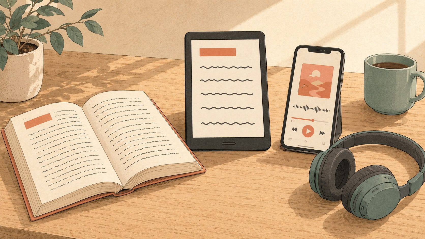
I’ve got a bonus article for you today because earlier this week, an episode of the Publish & Prosper podcast caught my attention. The show comes from Lulu, a print-on-demand and publishing-technology company that helps indie authors create, print, and sell their books in print and ebook formats. The podcast helps authors make sense of publishing, technology, and marketing, and how all of those mix together.
This particular episode was called “Making Your Books Accessible to Every Reader.” Co-host Lauren Vassallo, Lulu’s Content and Community Manager, was joined by Paul Hobday, their Senior Content Marketing Manager, and the two of them dug into book accessibility. The conversation wasn’t just about ebooks either, as they also talked about print and audio for reading. I was excited to see it land in my feed, because you don’t often hear a podcast like this one talking about accessibility.
One point Lauren and Paul kept coming back to is one I love: as an author, you want the work you’ve created in front of the broadest audience possible. And accessibility lives right inside that goal, because reaching the broadest audience means offering your material in the format that works best for them.
For some readers, that’s an ebook where they can change the font and its size, adjust the spacing, adjust a dozen things on the device to make reading easier, even lean on the built-in text-to-speech technology to have the book read aloud. Plus, it means they can carry around as many books as they want in a compact device.
For others, it’s print. Plenty of people simply prefer a printed book, and offering it in both standard print and a larger-print edition can be the difference between a comfortable read and a difficult one.
Then there are audiobooks, which are wonderful for people who’d rather read with their ears than their eyes. That may be because they’re blind and rely on audio, or perhaps they understand better when listening. For others, audio allows them to listen while doing other things. There could be many other reasons why audio is a reader’s preference.
It runs the other way, too. Some people may find the information doesn’t stick as well coming in one format as it does another. None of these formats is the “right” one. The right one is whichever one meets a given reader where they are.
Here’s something I think the episode missed, though: it never really framed how large these audiences are.
I dug into this in an earlier post, The Audience You Might Not Realize You’re Creating For, so I won’t rehash all of it but the short version is that the number of people living with a disability is enormous.
In the U.S., roughly one in four adults lives with a permanent disability, and that one-in-four figure tends to hold true around the world.
Add everyone navigating a temporary, situational, or episodic disability—a broken arm, a noisy room with no earbuds, a migraine that comes and goes—and you’ve added roughly another one in four.
Put it together, and about half your audience benefits from accessible content at any given moment. The readers you reach by offering more formats aren’t a small number. They’re a big slice of every readership.
And the formats aren’t interchangeable. They each do different work for different people.
Large print helps readers with low vision.
Audiobooks open the door for readers who are blind.
Print and ebooks serve readers who are deaf and can’t use an audiobook at all.
Cognitive disabilities cut across all of it, shaping how a given person processes audio versus text and what helps them actually understand and hold onto what they’re taking in.
Having the full range of formats can make the difference in someone choosing your book or picking another.
I say all this as an author who hasn’t pulled it off across the board myself. I’ve got a single large-print title and only a handful of audiobooks. But I know it’s something I need to do, and something my readers can benefit from.
This is progress over perfection in action: you don’t have to do all of it at once. You just have to start and try to be consistent with it.
One of my concerns with the episode was how Lauren and Paul tied these various formats to an author’s professionalism.
There is a real time and monetary cost to produce these elements that can be a lot for an indie author, especially one starting out.
Many of us are under tight budgets and tighter schedules. I’d never want those constraints used as an excuse to skip accessibility because it matters too much for that. But you can’t ignore that the constraints are real. This is another point where progress over perfection comes in: it’s about how you roll these formats out and how you fit them into your time and cost budgets.
Let’s look at some of the constraints indies may face:
Take an ebook and turn it into a print edition, and suddenly you need a full cover that wraps around the spine and back, not just the single front image your ebook uses. So you’re either paying a designer or, if you can do it yourself, spending the time to make it happen.
A large-print edition usually runs longer than the standard print version, which widens the spine and means reworking that cover wrap all over again. That’s more time and expense.
Audio is even less forgiving. Producing an audiobook is far from cheap. AI narration is starting to bring that cost and production time down, but there can be stigma around producing that way, so it may not be an avenue some authors are ready to consider.
With so many formats to consider, and so many ways to produce each one, it’s fair for an author to take stock of what actually fits their business right now.
Another area the episode didn’t touch on that I think really matters is the images inside your book.
This shows up most obviously in an ebook. As you format it, you have to think about how each image comes across to someone who can’t see it or may not be able to perceive and process the information from an image. Are you adding alt text, and writing it well? The same alt text rules I covered in Four Questions to Help You Write Meaningful Alt Text apply directly to how you handle images in an ebook.
But there’s a second layer beyond alt text. Are you explaining your images enough in the first place? I’ve read plenty of books, especially nonfiction, where a complex image/chart/illustration is doing a lot of the explaining, and the author has assumed the reader will see it and just get it. For some readers though, there isn’t enough information around the picture for someone to understand everything. This can be an even larger problem if someone is listening to the book through their e-reader’s text-to-speech functionality where an image, and all of its information, might just be skipped over because it’s not in alt text or the page text.
The same holds for print: make sure an image is supported by text on the page, because not everyone processes visual information as readily as they do words. And it comes back around with audiobooks, too. You want to be sure you’re adequately describing any image that needs it within the narration.
Fiction is its own judgment call. What needs describing can vary wildly, and a lot of it comes down to one question: is the image decorative, or does it carry information the reader needs in order to get the complete understanding?
Lauren told a great story about her father. She found him reading a nonfiction book with a print copy open in front of him, a highlighter and a notepad beside it, while he listened to the audiobook and followed along. It’s a perfect example of someone reaching for the mix of formats that helps them engage with the material most fully. Paul likened it to turning on captions while you watch a TV show—you can hear it and read it at the same time.
Captions are a useful comparison for another reason. On television they’re required by law for accessibility, and for video published on the web, accessibility guidelines call for them too.
But here’s the part people tend to miss: study after study shows that a large share of the people using captions aren’t deaf or hard of hearing. They turn them on because that’s simply how the information lands best for them. It doesn’t matter why they choose to have them on. They want to use the captions, so they do. (Want more on captions? I have a deeper dive coming in an upcoming post.)
And that loops right back to why having our books in different formats matters so much.
The episode spent some time on dyslexia-friendly editions, and specifically on using a dedicated dyslexia font and formatting a print book around it.
I have to disagree with the recommendation. There’s a deep body of research on readability (some of which I’ll get into in next Thursday’s post) and what it tells us is that the font someone reads best with is highly individual. Not every dyslexic reader actually reads more easily with a so-called dyslexia font. There’s more than one of those fonts out there too, so there’s no single standard.
Where most of the recommendations actually point is toward fonts with broadly accessible characteristics with the big one being that each letter be distinct. A capital “I,” a lowercase “l,” and the number “1” shouldn’t all look the same, for instance.
So rather than spend the time and money to produce a separate edition set in a dyslexia-specific font, an author is often better served choosing a font that’s considered accessible in the first place. It tends to be a better use of your effort, and it serves a wider range of readers.
I agree wholeheartedly on the idea of supplemental material. Lauren and Paul talked about adding illustrations or graphics to help explain what’s in the book, and there’s real value there. Taking a complex topic and offering an infographic, a chart, or an illustration that reworks information you’ve already put in words can help it click for a reader in a way the text alone might not.
That ties straight back to what I said earlier about images: those graphics still need alt text, and the right words around them, so the picture isn’t left doing all the work on its own. But with images and text working together, I’m all for it. Presenting the same idea a second way, through a well-chosen image, can help someone perceive and understand more clearly. It’s exactly the kind of thing worth doing.
Supplemental downloads can be just as valuable, particularly for nonfiction with a workbook or some other downloadable that lets a reader engage with the material in yet another way, whether that’s taking notes or working through small activities. I’m a fan of that idea.
At the same time I have a cautionary note, and it’s about PDFs. PDFs can be genuinely difficult to get right from an accessibility standpoint. I’ll be honest: even with my background, I’m cautious with PDFs, because I know how many pitfalls there are in producing one. So it’s a format I tend to steer people away from unless you can be confident it’s actually accessible. You don’t want your reader frustrated by downloading something they can’t use easily.
In a lot of cases, I’d lean toward putting that information on a web page instead, one a reader can choose to print for themselves, rather than handing them a PDF that might trip them up. That’s especially true if you already know the basics of creating accessible web content, which is something covered in Content for Everyone and here on Substack as well.
They also raised the idea of using QR codes to send readers to your web details. QR codes can be handy and they serve some people well, but they come with a catch: not everyone can use one. Some readers can’t operate a camera, and some won’t have a phone on hand at all. So if you do use a QR code, make sure to print the actual web address the code points to. That supports the people who can’t scan, and it’s a nice safety net for the times a QR code gets distorted and won’t scan correctly anyway.
Before I wrap up, I want to talk about two important distinctions.
The first: creating an ebook does not, on its own, make it accessible. A lot of the formatting tools we use (like Vellum, which is what I use) will produce a reasonably accessible ebook more or less by default, though you still have to do your part with things like creating meaningful alt text. But if you’re formatting outside a tool like that, such as working in InDesign with a lot of custom design elements, it’s entirely possible to end up with an ebook that isn’t accessible. It might not play nicely with an e-reader’s screen reader, or your formatting doesn’t carry through correctly. The ebook format alone is no guarantee.
The second: being accessible isn’t the same as being available in many formats. More formats absolutely help, but each format can still be produced in a way that shuts people out.
An audiobook that never describes the images from the ebook leaves listeners missing part of the information.
A print book with busy page backgrounds that obscure the type can be a struggle to read.
Offering multiple formats is a real step forward, but every one of them has to be designed and produced with accessibility in mind.
All in all, I really enjoyed this episode, and I was glad to hear Lauren and Paul putting accessibility information into the hands of authors. I hope Publish & Prosper comes back to it from time to time because authors need to know about this.
Plus, there’s a marketing angle worth its own episodes. The same thinking applies to an author’s whole digital presence: their website, their emails, their social media, and any video or audio they create all carry their own accessibility considerations (as you already know since you’re reading this Substack).
Open one of your own books and find a single image inside it. A chart, a diagram, a character illustration, anything. Now ask yourself two quick questions:
Does it have meaningful alt text?
Do the words around it still carry the meaning?
If the answer is no, fix that one image and others that may be like it in that book. Then republish it on the ebook platforms it’s available on.
You don’t have to do your whole catalog right now. Just the one book to get started.
That’s progress over perfection in its smallest, most doable form, and it’s exactly how this work gets done: one small, finished piece at a time.
Next Thursday, I’m digging into readability and the research behind the fonts and formatting choices that actually help people read.
See you then!
— Jeff
Digital Accessibility – Content for Everyone is a free weekly post from Jeff Adams about making your digital content—your site, your podcast, your newsletter, your social media—usable by everyone who shows up to it. Built on the foundation of Content for Everyone, the book Jeff co-wrote with Michele Lucchini. Companion site: contentforeveryone.info.
No posts
Comments
Nothing yet. Say the first thing.
Sign in to join the conversation.