
When I started making my websites accessible, one of the first things I wanted to tackle was how someone would navigate if they didn’t use a mouse, trackpad, or similar device.
I knew my sites had a problem, but I needed to see how bad it was, so I brought up my homepage and pressed the Tab key.
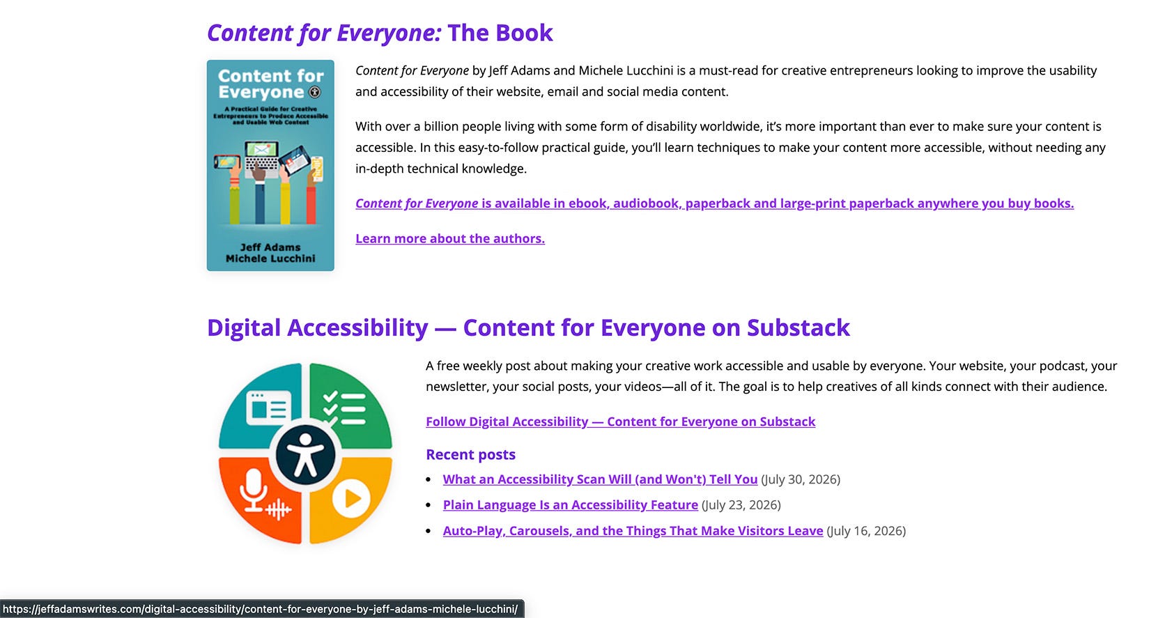
I was navigating, but I only knew that because of the small text in the lower left corner of the browser that shows the URL a link goes to (such as in the screenshot from my website below). Navigation should be a lot more obvious because you don’t want people to have to struggle to get where they want to go. My WordPress site, using the Divi template, didn’t show me where I was when I navigated by keyboard. No outline. No highlight. No underline. As I tabbed, nothing on the screen changed except that small text at the bottom.
I’d been doing accessibility work professionally for years at that point, but I hadn’t fixed this fundamental issue on my sites.
This is the check nobody thinks to run on their own website. It takes about five minutes, and it will tell you something an automated scan never can.
The Tab key moves what’s called focus from one interactive element to the next. A link, a button, a form field, the controls on a video player. Shift plus Tab moves you backward. When focus is sitting on a link, pressing Enter activates it. When it’s sitting on a button, Enter or the Space Bar presses it. (There are even more keyboard functions available, and you can get a rundown of those on the Content for Everyone website).
Think of focus as the cursor in a word document. It’s where you are on the page, and it’s what your next keystroke is going to act on.
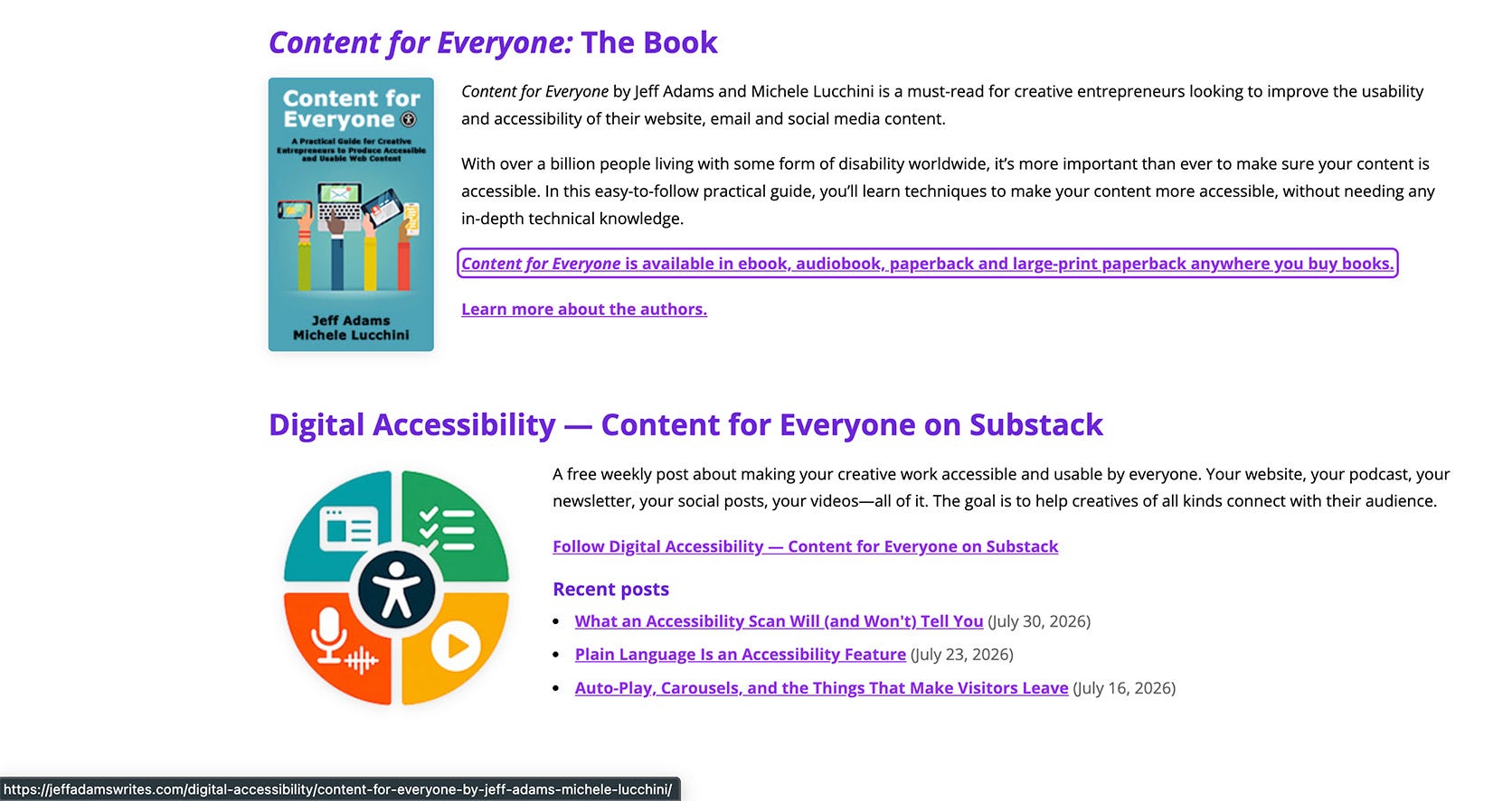
Two things have to be true for that to work. Every interactive element on your site needs to be reachable with the keyboard. And you need to be able to see which element you’re on. That visible marker—usually an outline—is called the focus indicator (the screenshot below shows the focus indicator around the Content for Everyone link).
Focus indicators are one of the things I find missing from a majority of websites.
In my post about accessibility scans I mentioned that no automated tool can tell you whether a person can move through your site using a keyboard alone. This is why. A scanner reads code. It can’t press Tab, look at the screen, and notice that nothing visibly changed. Only you can do that.
More people than you’d guess, and not all of them for the reason you’d guess.
People who are blind. Screen readers are driven by the keyboard. If your site can’t be navigated by keyboard, it probably can’t be navigated by a screen reader.
People with low vision. Following a small pointer around a screen is often more difficult for someone with low vision. Tabbing from element to element is often easier, as long as the focus indicator is visible enough to find.
People with motor disabilities. Arthritis, tremors, repetitive strain injuries, limited fine motor control. A mouse needs a precision that some hands can’t reliably give. Switch devices operate the page through that same keyboard interface, and many voice-control setups lean on it too.
People with attention or short-term memory difficulties. The focus indicator is a place-keeper. It answers “where am I?” without making them re-read the page.
People with no disability or a temporary one. A dead trackpad, an injury preventing mouse use, someone’s personal preference to move through a page. Keyboard navigation is one of those accessibility practices that makes the site better for everyone.
Open the page on your site that matters most. Your homepage, a page about what you create, or wherever you send people first. Then don’t use your mouse or trackpad. Instead, press Tab, slowly, one press at a time, and work your way down the page.
One setup note if you’re on a Mac. Safari won’t stop on links with Tab unless you tell it to. Open Safari’s settings, go to Advanced, and turn on “Press Tab to highlight each item on a webpage.” Without that, you’ll conclude your site is broken when what’s actually happening is that the browser isn’t stopping on links on purpose. Chrome and Firefox behave the way you’d expect out of the box.
Now tab, and ask yourself four questions.
This is the big one. After every press of Tab, something on the screen should visibly change—a ring around a link, a box around a button or form field. If you’re pressing Tab and the page looks exactly the same as it did before, you’ve found your first issue, and it’s the most common one there is.
Tab through the whole page and take inventory. Your navigation menu. Your dropdown submenus. Your search box. The buttons in your header. The controls on your embedded video. The fields in your newsletter signup. Anything a visitor can click or interact with, a visitor should be able to reach with Tab. If your fancy mega-menu opens on hover and never appears for the keyboard, it won’t exist for some of your site’s visitors.
Here’s one more thing to keep in mind, especially in menus that open on hover. Sometimes you’ll tab through the sub-menu items even when you can’t see them. Watch the focus indicator as you go. It’ll sit on a menu item, then disappear for a few Tab presses, then reappear on the next item you can see. If the number of those blank presses matches the number of items in the hidden sub-menu, that’s where your focus went. That’s the kind of problem you probably can’t fix on your own (fyi… it’s one I wouldn’t be able to fix either), but you should make a note of it.
Focus should move the way you read: left to right, top to bottom. If you have columns, it should work down the leftmost column and then move to the next one. What you don’t want is focus leaping from your header to your footer and then back up to the middle of the page. That’s disorienting for anyone, and for someone who can’t see the page, it’s difficult to recover from.
If you have pop-ups or other elements that overlay the page, does focus go into them when they open, or do you end up navigating the page behind them? Or, if you have a pop-up, do you tab inside of it, but then end up outside of it without actually closing it?
Both of these are more advanced issues that are also likely beyond your technical ability to fix. It’s good for you to realize that’s happening, and this is something I’ll write more about in a future post.
That’s it. Four questions, five minutes, no tools, no code.
Every browser gives you a focus indicator for free. Chrome, Safari, Firefox, and Edge all draw a ring around whatever element has focus by default.
There are two problems with these:
Themes and templates often turn it off.
Even when the default indicator is present, it often has poor color contrast, making it hard to see.
There’s a one-line piece of CSS that removes the focus ring, and it’s placed into templates because a designer decided the ring was ugly. So when you tab through your site and nothing lights up, that’s usually what happened. You didn’t break anything. You inherited it.
Then there’s the contrast problem. Sometimes the indicator is technically there and practically invisible—a pale gray outline on a white background, or a thin ring in a color that vanishes against your header image. A focus indicator has to have enough contrast against its surroundings to actually be seen, which is the same principle I wrote about in the color contrast post, applied to a box instead of to text. If you have to squint to find it, it isn’t doing its job.
You are probably not going to fix a missing focus indicator yourself, and that’s fine. Here are some actions you can take.
Check your theme’s settings first. Some themes and page builders have an accessibility section with a focus-indicator option sitting right there, switched off.
If you’re on WordPress, a purpose-built plugin can help. When I was on WordPress, I used WP Accessibility. It’s a free plugin from the WordPress plugin directory that does a handful of specific, well-understood things—one of them is adding a visible focus indicator to your site. Its creator, Joe Dolson, is a web accessibility consultant and a member of the Make WordPress Accessible team, so this is a plugin I feel good about recommending to you.
Ask your theme or platform’s support. This is more powerful than creators realize, and you don’t need technical language to do it. “When I press Tab on my site, I can’t see which link is selected. Can you tell me how to turn on a visible focus indicator?” That’s the whole email. If enough people send it, themes get fixed.
If your site was custom built, go back to your developer. Focus indicators and focus order are squarely their responsibility, and this is a reasonable thing to ask for.
Don’t reach for an overlay widget that promises to fix everything for you. Adding a focus outline is actually one of the few things one of these might do. However, it’s not worth dragging in everything else that comes with it, especially when a plugin or your theme can add the same indicator cleanly. I lay out the full case against these widgets in a post from a couple of weeks back.
And if the answer today is “I can’t fix this right now,” make a note about it in your accessibility statement and move on. Naming a known issue honestly is worth more than pretending it isn’t there. Progress over perfection.
And let me take a moment to practice what I preach. This article is on Substack’s platform, and its focus indicator is inconsistent—sometimes it shows, sometimes it doesn’t—and I haven’t found a setting anywhere to fix it. It’s out of my hands. So I’m doing exactly what I just told you to do: naming a known issue instead of pretending it isn’t there.
Open your homepage. Move your hand off the mouse.
Press Tab ten times.
After each press, look at the screen and answer one question out loud: can I see where I am? Keep a tally, yes or no. That’s it. Ten presses, ten answers.
If you got ten yeses, that’s great news. Now, go tab through your contact form or newsletter signup next, because forms are where this tends to fall apart. If you got a string of nos, you now know something about your website that you didn’t know before, and you’ve got some options to try to fix it.
Either way, you’ve done the check that no scanner is going to do for you.
Next Thursday (August 27): Page Titles, the First Thing Screen Readers Read. It’s a small piece of text most creators don’t think about, and it’s doing more work than you’d expect—for assistive technology, for browser tabs, and for search engines.
See you next Thursday.
— Jeff
Digital Accessibility – Content for Everyone is a free weekly post from Jeff Adams about making your digital content—your site, your podcast, your newsletter, your social media—usable by everyone who shows up to it. Built on the foundation of Content for Everyone, the book Jeff co-wrote with Michele Lucchini. Companion site: contentforeveryone.info.
No posts
Comments
Nothing yet. Say the first thing.
Sign in to join the conversation.