
As always: my writing is my own, not AI generated. Those em-dashes below are something I’ve always used, long before there was a ChatGPT to abuse them. Genuine content will be increasingly rare in the era of AI-slop: If you appreciate my work, please consider being a paid subscriber to keep the human creators able to do what we do.
So let’s talk about the North Pole.
I have been following the so-called “ECDO” hypothesis (Exothermic Core-Mantle Decoupling – Dzhanibekov Oscillation hypothesis) originated by Ethical Skeptic (TES) for some time now.
Recently, AI has allowed me to move from being merely curious to being an armchair geodesy data analyst as I study this topic from my own point of view.
This ECDO concept has also caused me to conceive of something relating to AI and robotics that I call the “Ark Hypothesis” - the idea that AI and robotics may have arrived just in time to help us prepare for, endure, and recover from a coming catastrophe.
At the beginning of May, I’ll be attending a session in the Colorado Springs area to hear Ben Davidson and Ethical Skeptic debate their individual theories about the general subject of “Earth’s Disaster Cycle”.
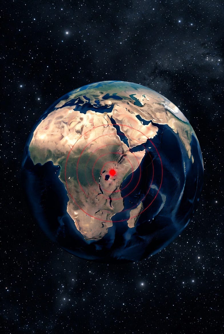
In essence, these related theories of catastrophism have to do with the motion of Earth’s physical poles—in particular, the claim that at times, the Earth’s asymmetrically-shaped solid core sometimes “detaches” from the mantle and crust, with the result that the crust “slips” relative to the denser and heavier core, swapping the current physical North Pole with another region (theorized to be a point in southern Africa that TES calls Np' - Np meaning North Pole and the prime symbol meaning “alternate position”) before moving back to its prior location after some period of time.
When the shift happens, it will likely result in massive floods, ferocious winds, and earthquakes during the event. The floods stories of the bible and other civilizations including ancient Sumer and China may find their origins here (great thanks to Craig Stone for this compilation.)
Einstein himself entertained the idea of “crust/core decoupling” and wrote the foreword to a famous book by Charles Hapgood on the subject: Earth’s Shifting Crust: A Key to Some Basic Problems of Earth Science (1958, Pantheon Books). It’s co-authored/collaborated with James H. Campbell.
To understand the mechanics of how and why this crust/core decoupling happens, you’d need to read and grasp the ECDO paper—with the warning that it is fairly dense work written far above an 8th grade reading level.
Have a few hours or days set aside, use Grok to help explain the more difficult parts to you, and have a few cups of coffee handy.
On X, there is a small group of interested researchers who discuss findings relating to this topic (Craig Stone aka @nobulart; Ethical Skeptic a.k.a. TES a.k.a. Roger Cunningham aka @ethicalSkeptic; @junhobtc; @zachariasPro; Tami Camarata, aka @kitsuneInVA and a few others.)
This group, inspired by TES, have been creating simulation models and studying the research papers for evidence that is scattered across geophysics, archaeology, geology, physics, history, and celestial mechanics relating to True Polar Wander.
Among these, I find Craig Stone’s work seeking to confirm or refute the ECDO hypothesis most striking and admirable—particularly this recent article.
The short story: there appears to be evidence that the physical north pole indeed experiences “True Polar Wander” (TPW) at some periodic interval over time. That interval could be at 6,000 or 12,000 year intervals, according to some estimates.
A similar but somewhat distinct theory is advanced by Ben Davidson (@SunWeatherMan on X). TES’s work finds particularly striking evidence that nearly 80 ancient monuments located across the globe were built to align with Np’ (that is, they were built to “face north” at a time when north meant a different spot on the globe than it does today.)
In addition to “True Polar Wander”—which has to do with the motion of the physical “point” that is the North Pole—there is also a geomagnetic component: the Earth’s magnetic north and south poles sometimes “wander” as well, at times exchanging places (magnetic north and south swapping positions on the globe.)
Since the year 2000, magnetic “North” has moved from about ~81°N, 110°W to ~86°N, 139°E, more than 1,000 miles away when measured on a great circle path.
Your average man on the street is totally unaware of this striking fact—though most pilots are—because navigation charts based on magnetic north have had to be updated frequently in recent years. Also aware are the Geese that fly overhead as they migrate northward to breed, using their internal compasses to guide their flight.
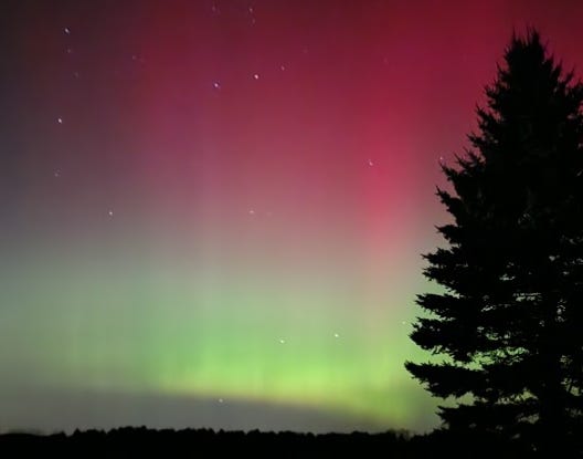
If you saw the Aurora Borealis over the past few years even in far southern latitudes like Florida—you too saw direct evidence of the Earth’s changing magnetic field. This is what we saw several times here in Michigan, something that we should have maybe seen a few times over a few decades, but instead saw three or four times since 2023:
The magnetic pole didn’t move in a straight line, but instead meandered this way and that, covering a much greater cumulative path length. The distance moved, and the recent speed of movement (34-55 km/year) is shocking.
While this sounds wild to the uninitiated, the fact is that our own Sun regularly flips its north and south magnetic poles every 11 years. There is copious evidence in things like sedimentary rock (which can sometimes contain iron in various formations) showing that the north magnetic pole of ferro-magnetic iron particles aligns with “physical north” in some layers of sediment but aligns with “physical south” in others.
Which means that “magnetic north” was not fixed and moved between the times that those layers were deposited.
This suggests that the Earth, too, experiences magnetic pole reversals, just like the Sun. Whether magnetic pole motion correlates with, precedes, or lags “True Polar Wander” is not yet known. But we’re starting to worry a bit.
As I have been following this topic, I had been reviewing charts produced by official scientific organizations like this one: Earth Orientation Center. I had taken an interest in viewing the “Polhody” chart (below), which charts the movement of the north pole on a daily basis.
Inspired by the work of @zachariasPro, who was suggesting that 2026 may already be showing early signs of “decoupling”, I wanted to see for myself the movement over the pole over a roughly six-month period.
I happened to choose Sep 3, 2025 as an arbitrary starting point. But it grew tiresome every day having to choose the chart options each time to keep that anchor point, and I wanted to see other details on the chart that I thought would be more helpful.
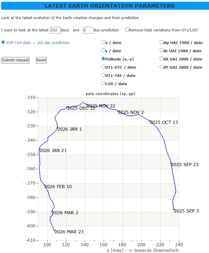
So last Sunday, at 5:00pm, I sat down at my home office desk and turned to Claude Opus 4.6, my trusted AI coding agent. I gave it the URL of the chart above to examine as a starting point, and then I give it instructions to improve the graphs according to my interests.
One of the things I was curious about was this: I knew that every day, the north pole moves a few inches this way and that, making a rough circle about 30-50 feet in diameter over the course of a year. But I wanted to see how much a given day’s movement was in comparison to other days, over time: I knew that sometimes it moved more, and sometimes less, and I wanted to see if there were any interesting patterns.
So, I gave the instructions to Claude, and in 30 minutes, my website was done. A task like this would have taken me and a few other programmers months to do in the recent past; but now, it took less than 30 minutes.
This direct link takes to you my version of the “polhody” chart shown below, which automatically anchors the start date at 9/3/2025 and advances each day, saving me time. I also used color to mark the months, and I added a ‘first day of the month’ marker for visual clarity.
Here’s my new improved chart:
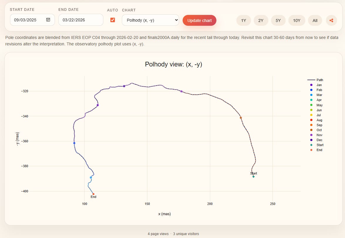
What I found with these new charts was fascinating, particularly the one below —and it caught the interest of Craig Stone and others because of the clarity of what it showed.
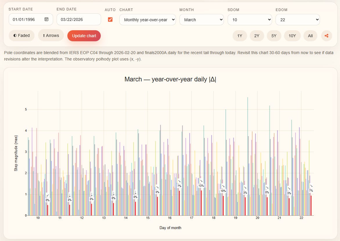
Here’s what is cool about the new bar chart above that I commissioned Claude to create. Each vertical bar shows the extent of the “step” on a given day of March over the entire window selected (in this case, over 30 years from 1996 forward.) Some days, the pole moves 10x as far as it does on other days.
The red bars are the days of March in 2026; the faded bars to their left are how far the pole moved on that same day in prior years.
I added a marker to show the “percentile rank” of this year’s daily bars, relative to the others. “0%” means that 2026’s bar is the lowest in the entire 30-year window. The small arrow above the numbers also gives a rough indication of which “direction” the pole was moving from one day to the next.
There may be revisions to this data in the next month that might change these results, but for now they show something remarkable: several days in March of 2026 show the lowest step sizes in 30 years.
When I set the start point to 1976, I saw that several days in March of 2026 also have lower step sizes than even the previous 50 years. What makes my charts even better is that I can share a direct link that sets up the chart options exactly the way needed for you to reproduce my view.
Here’s the upshot:
There is reason to believe that these changes in polar motion, magnetic pole position, and rotational dynamics might account for the unusual behavior of this winter’s polar vortex—which led to a brutally cold winter in some parts of the US.
Here’s another chart that fascinated me:
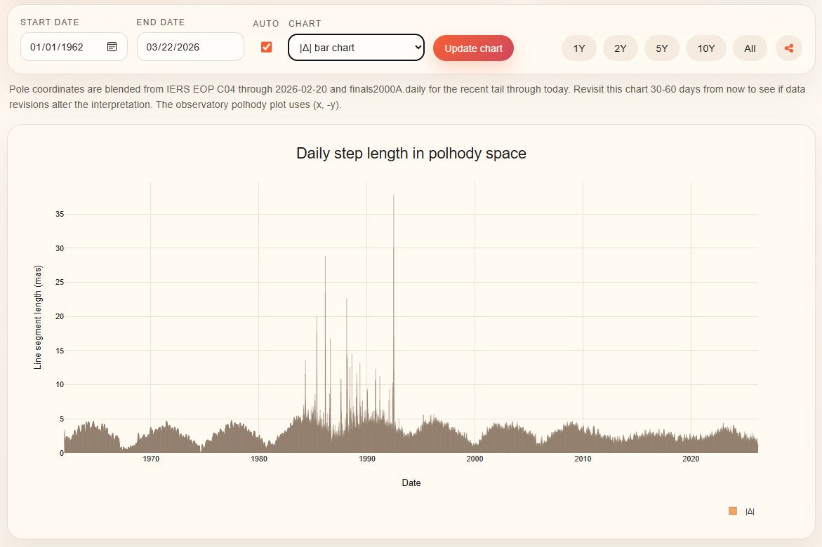
When Claude built the website for me, it just decided that I might want to click buttons to look at 1, 2, 5 and 10 year slices of time, as well as the whole data set; and Claude was right, I loved that feature. When I clicked “All” to see the whole data series, I noticed something remarkable.
There is a cycle to the distance the physical pole moves.
Every day, the pole moves a little or a lot, but there is (or at least, there was) a curious pattern to these movements; if you look from the left of the chart, over a period of roughly 6 to 7 years, the pole moved a lot (3-4 units of measure) during the “peaks” whereas in the minima, it moved only about 0.4 units of measure each day: 10 times less during the ‘quieter’ times.
Something strange also happened in the 1990’s (assuming those spikes weren’t instrument error.) But then notice what has happened since 2010: the peaks/valleys have smoothed out. There is less variation in movement. Studies suggest that the earth’s core has “slowed” in rotation, and perhaps even “reversed direction” since 2010.
I had read articles over the last few years making these claims, but now I have my own way of visualizing the effect of this transition. I can independently visualize something that supports the claims.
Before I leave this topic, I want to go back and emphasize something truly remarkable: with advanced AI like Claude, I can now create— in a matter of minutes— websites that do a better job of visualizing scientific data than the Universities and agencies own departments. By myself.
Just think about how AI is going to revolutionize the method of research and science: curiosity led me to ask questions, and AI helped satisfy that curiosity in ways never before possible. You, too, can become an armchair data analyst.
CognitiveCarbon’s Content is a reader-supported publication. To receive new posts and support my work, consider becoming a paid subscriber.
No posts
Comments
Nothing yet. Say the first thing.
Sign in to join the conversation.