

Recently, epimetheus brought a paper by White et al. on Excess all-cause mortality in Norway in 2024 (publicly available pre-print version here) to my attention (see his reports here and here). I will discuss the paper along the lines of the following little Excess Mortality 101:
Do not just stare at absolute numbers of deaths (through time) because populations may grow or shrink. Compute mortality rates (numbers of deaths divided by population size), and compare these.
Age, of course, is the single most important influence on mortality rates. Dive into age groups, and make them as fine-grained as possible. Even if the total population remains constant, age composition may change. If you want an overall picture, apply mortality rates to a fixed reference population.
There is no fixed definition of excess mortality. Use one that is simple (or even better, use several, and discuss the different results you get). Do not overuse statistical tools just because your software package is making it so convenient.
Be careful when to use absolute and when to use relative figures.
If you are interested in all-cause excess mortality, stick to it. Do not link excess mortality to your pet cause without evidence. In particular, causes of excess mortality may be very different for different age groups.
My verdict is that White et al. did a reasonable job on the first two points, were a bit weak on the third and fourth, and completely lost the plot on number five.
Statistics Norway provides decent data, at least on an annual basis. Deaths by one-year age groups are available in table 10325, and corresponding population sizes in table 20211. Note that both tables also distinguish by sex, which would be the second most important influence on mortality rates in point 2. above, but which I will neglect for the purpose of this short note.
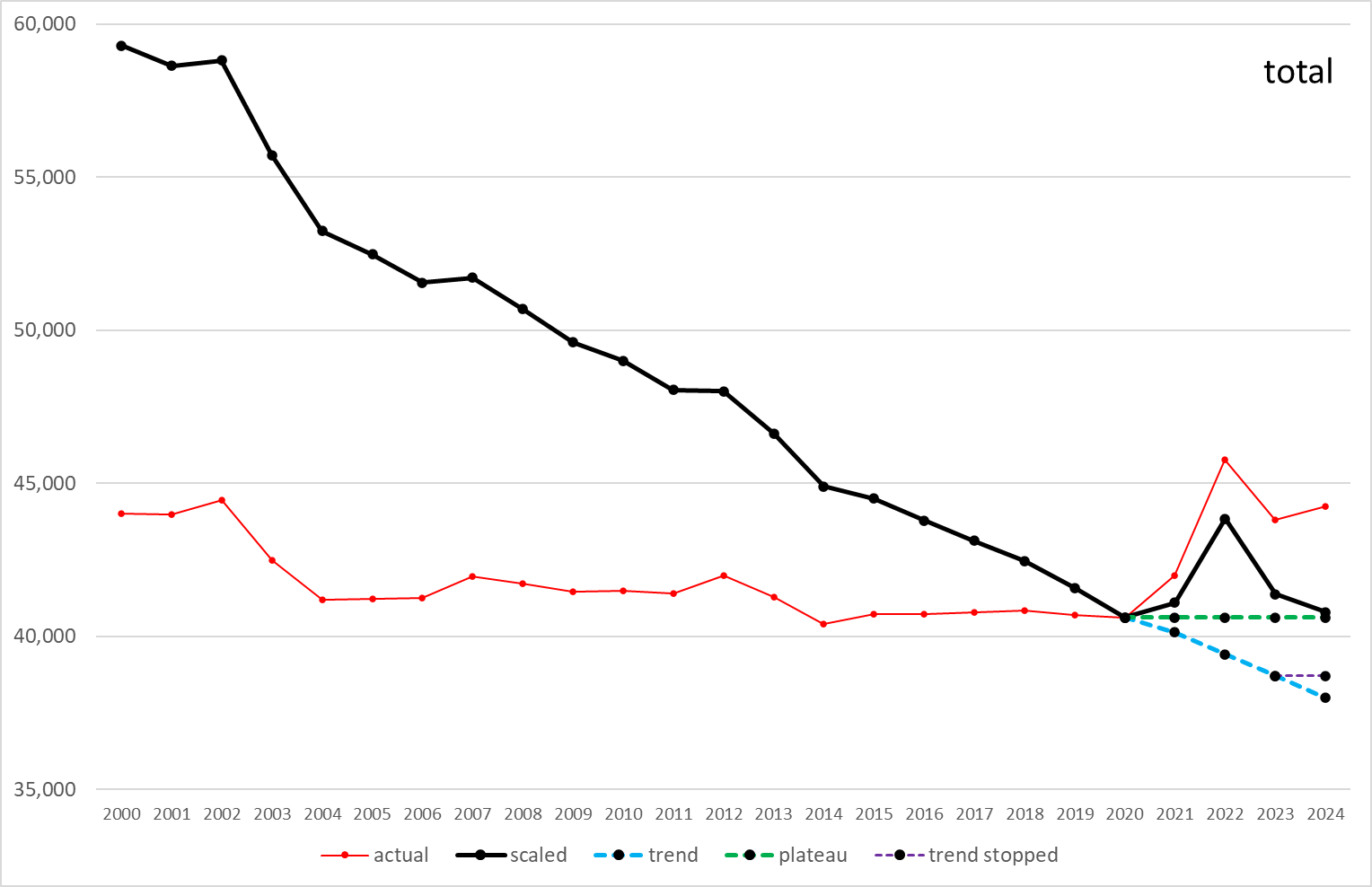
Total numbers of deaths have been fairly constant since 2000 (red curve in the following diagram), but something seems to have started in 2021, gotten worse in 2022, and still not stopped in 2024. But might that be an illusion? By computing mortality rates per age, scaling to population as of 2020, and adding back up (that is, by carefully observing points 1. and 2. above), we get the black curve (we will come to the colorful dashed stuff later). So the real story seems to be more one of steadily declining mortality rates (of course we all must die, but life expectancy has been rising), with some backlash since 2021 (not 2020, which was the first official year of the dreaded Covid-19 virus).
OK, so what’s next? Diving into age groups, of course. White et al. had their reasons for grouping (comparison with official figures by the Norwegian Institute of Public Health, or NIPH), and I will follow them here.
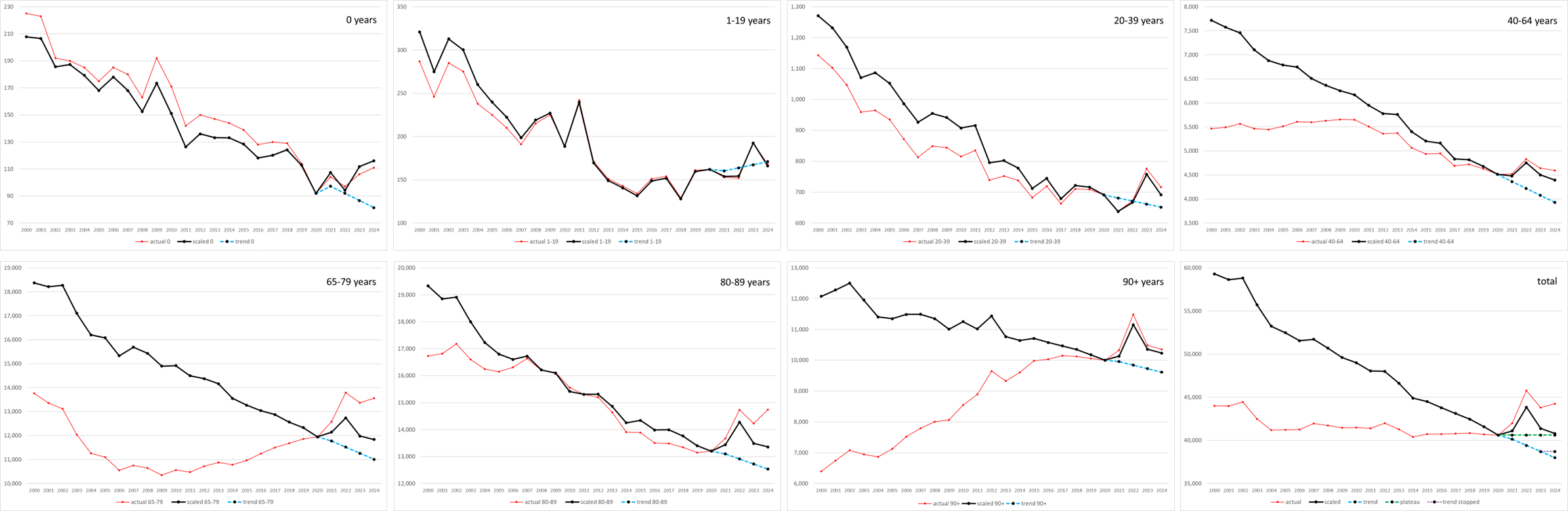
The very different trajectories of the red curves (absolute numbers of deaths) indicate that indeed the age composition of the population has changed. The black curves (mortality rates scaled to the population as of 2020) show a general downward-sloping behaviour.
All of this is known to, and has been reported by, White et al. Take figure 2 from the paper:
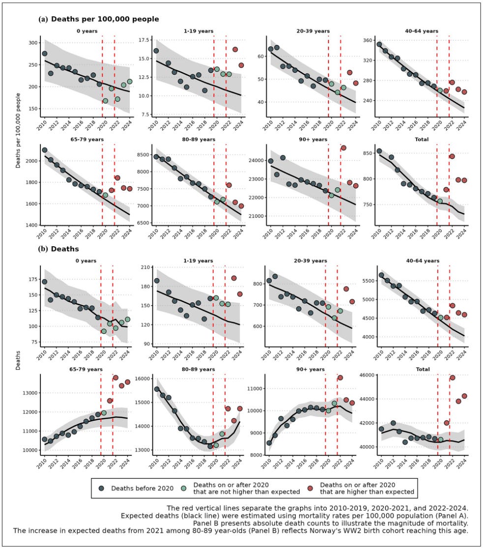
The dots in the diagrams in the two top rows correspond to our black curves, and the dots in the diagrams in the two bottom rows to our red curves. But what about the following intimidating section in the paper?
We fitted a Bayesian negative binomial regression model to 2010–2019 mortality data, excluding 2011 for the 1–19 age group due to the July 22 terror attack. Deaths were modeled with a three-way interaction between year, age, and sex, using a population offset and age-specific dispersion parameters. Minor modifications were made to the default priors from the R-package brms (17–19) to improve convergence.
The purpose of these statistical spells is the conjuring of the black curves, and of the grey bands around them. The black curves indicate expected deaths (or mortality rates), and the grey bands are model-implied confidence bounds. For the younger age groups, where absolute numbers of deaths are small, these bands are of course wider. But apart from that sanity check, and maybe apart from instructing White et al. which circles to paint green and which red, their usefulness is limited.
Given the data at hand, with mortality rates that were almost perfectly following a downward-sloping line between 2014 (or even earlier) and 2020, there is no need for advanced statistical machinery. When it comes to excess mortality, the main questions are:
Should we have expected the trend to continue until 2024?
If not, when should we have expected the trend to stop?
If we should have expected the trend to stop somewhere, what would have happened next? Stagnation or rising mortality rates?
In fact, White et al. basically propose answers to these questions via their two approaches:
(1) a conservative approach where the prediction for 2023 was carried forward to 2024, so that 2024 predictions assumed the 2010–2019 declining trend plateaued in 2023.
(2) A non-conservative linear extrapolation to 2024.
I will show similar approaches by zooming into the above “total” diagram (skipping years from 2000 until 2009). I used a slightly different model (linear trend 2014-2020) but by playing around with the parameters you may convince yourselves that this is not the issue):
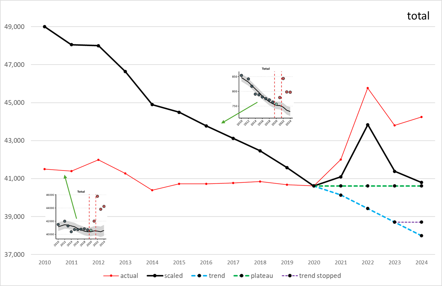
The dashed blue curve corresponds to approach (1) of White et al.: we assume that the historical trend should have continued until 2024. Their approach (2) is something like start with blue, then turn left onto the purple road (no further gains in mortality rate expected for 2024). They have their reasons for this approach (the NIPH claiming no excess mortality in 2024 because they included all years until 2023 in their baseline) but it is clear that no big difference in excess deaths is to be expected between the two approaches. If you want a radically different approach, take the green road, and assume that somehow in 2020 Norway had reached peak medicine, with no further improvements in life expectation possible (but at least stagnation at that level).
At this point, White et al. start to throw around excess deaths figures, both in relative and in absolute terms. Approach (1) gives 3,650 excess deaths for 2024, approach (2) only 2,898. For comparison: my “trend” (black minus dashed blue) amounts to 2,802 excess deaths in 2024, my “trend stopped” (black minus dashed purple) to 2,088, and my “plateau” (black minus dashed green) to 184. Whether there are excess deaths or not in 2024, and how many, depends completely on your assumptions.
While I understand that White et al. are directly aiming at the NIPH, I consider 2024 to be much less interesting than 2022 and 2023. Whatever your assumptions, you will not be able to explain away excess mortality in 2022. However, this excess mortality seems to have affected only the older age groups. For the 1-19 and 20-39 age groups, the maximum mortality rates were actually reached in 2023. What is the point in stating, as White et al. do, that there has been “significant excess mortality in age group 1-19 (45 deaths; 36.6% excess)”? The numbers are so low (thank God) that if one was really interested in cause, one (as in “a rich and advanced country like Norway”) could compile complete case reports. For example, the 10-19 age group saw 37 suicides in 2023, compared to only 24 in 2022. In addition, Google AI told me, there were 89 deaths by drowning in 2023, compared to only 65 in 2022 (and I guess that drowning mostly is a problem of boys and young men).
White et al. do not consider all of that. Instead, they attribute (with caveat, of course, but still confidently) all excess deaths to Covid running free since 2022 (you know, that 2022 when the Covid vaccination rate for adults in Norway was above 90%), after discontinuation of all containment measures. The data are sound, the first steps from Excess Mortality 101 are taken with care, but then it goes off, first into the numerical and statistical weeds, then into the morass of alleged cause.
No posts
Comments
Nothing yet. Say the first thing.
Sign in to join the conversation.