
Sometime around 2018, climatologist Ed Hawkins created a graphic to illustrate the progression of global warming he called “warming stripes.” The image consists of a left to right series of vertical bars, one bar for each year, where each bar is colored a shade of red or blue according to the year’s relative warming with respect to the 1961-2010 (50 year) average. In the image, blue is “less than” the 1961-2010 baseline and red is “greater than” the baseline.
According to the Wikipedia page on warming stripes, they have become an international sensation.
In less technical contexts, the graphic has been embraced by climate activists, used as cover images of books and magazines, used in fashion design, and projected onto natural landmarks. It has been used on athletic team uniforms, music festival stages, and public infrastructure.
And then as another part of the warming stripes story, each year the Summer solstice (usually June 21st, sometimes June 20th) has been declared to be “Show your Stripes” day. Saying the obvious, it’s a day when all the climate cult believers proudly and collectively wave our warming stripes, turning up our community virtue signaling knob to eleven.
Hey! That’s today!
Here are the latest stripes, downloaded from the website showyourstripes.info covering the period 1850-2025, where the stripes are colored based on their difference from the 1961-2010 (50 year) average.
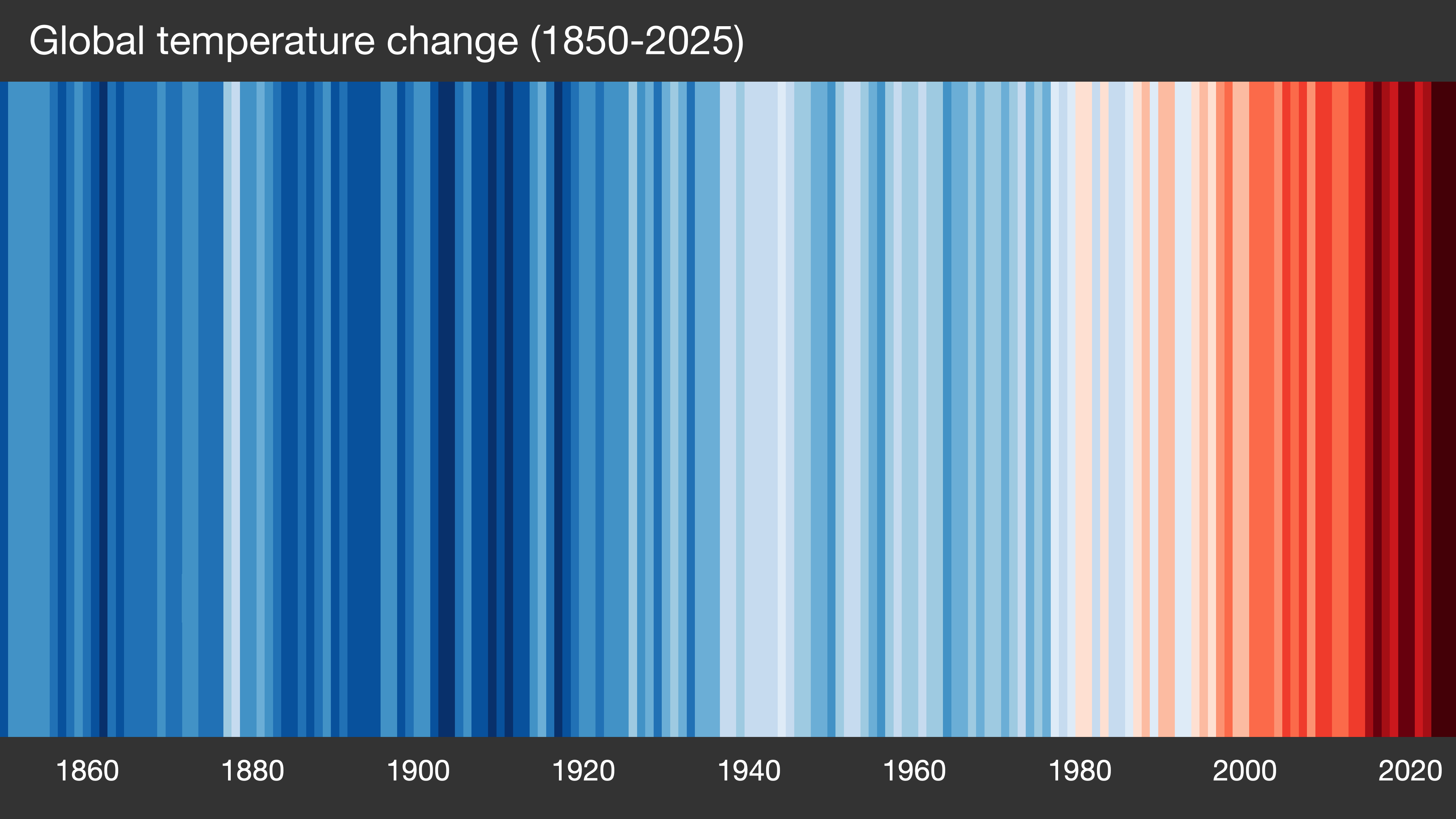
Here are the stripes with a scale included:
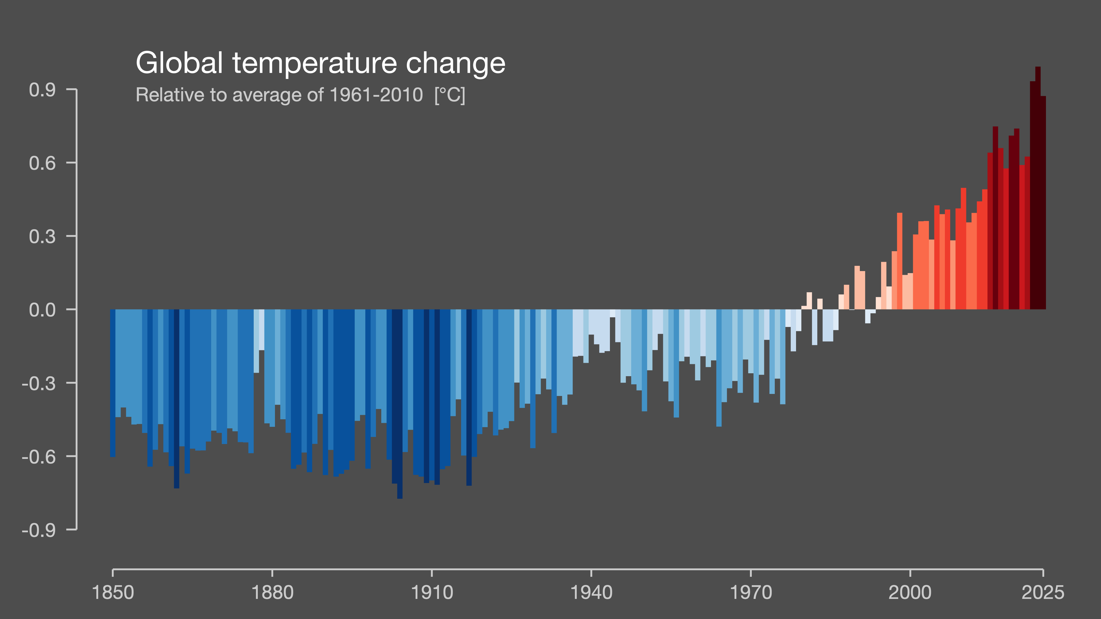
Years ago, when I first looked at these stripes, it seemed to me that more information could be included. For example, a scale that matches color to temperature, so that we could tell from the color roughly what the anomaly for that year was. And using bar heights as in the second graphic leaves a lot of territory empty, territory that could be conveying useful information. Also, a single vertical bar for a whole year misses day-to-day information that some might find interesting. Finally, there are more color choices besides shades of blue and red.
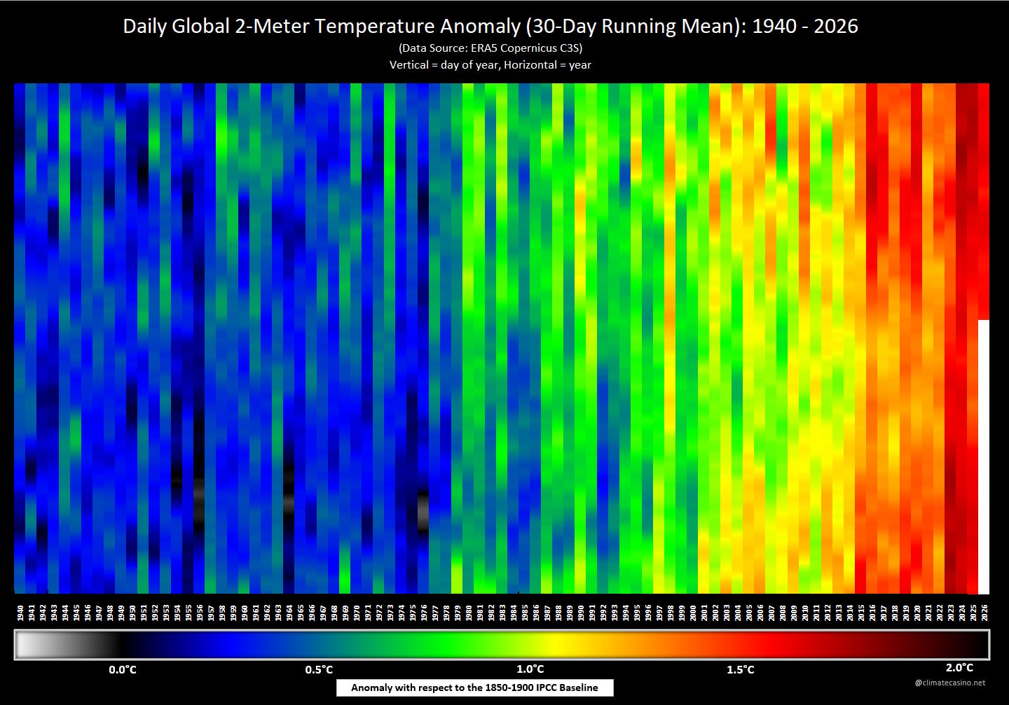
And so, I went about updating Hawkins’ warming stripes with these points in mind. Of course, I didn’t have day-to-day information back to 1850. My data comes from ECMWF (ERA5) and dates from January 1, 1940. I treated each vertical bar as a calendar year, where the top of the vertical bar is January 1st of that year and the bottom of the vertical bar is December 31st of the same year. Also, so that the bottom of the graphic isn’t jagged, I ignored the data from February 29 in leap years. By using the 1850-1900 baseline, I computed each individual day’s anomaly and used those daily anomalies to choose a color for each of the 365 segments for each year, top-to-bottom.
If you’re counting, 1940-2025 is 86 years. With 365 days per year, that gives 31390 days. And don’t forget the 170 days so far in 2026. That gives a total of 31560 separate days to color. That was too much to do by hand. I somehow managed to write VBA code in a macro-enabled Excel spreadsheet to get the job done. The program used a formula that assigned a color to each location based on the temperature anomaly for that day.
Unfortunately, when I colored each of the 31560 days according to its specific anomaly, the result was a total mess. It turns out that day-to-day data is just too variable and masks some very subtle patterns. So instead, I decided to color each day of the year by the average anomaly for the trailing 30 days. This gives a data value for each day while smoothing out the noise.
Also, just to answer the two obvious questions before they are asked:
The color for each day January 1 to January 29, at the top of each bar is colored using data from December of the previous year as part of the trailing 30 days. That’s true for January of every year, 1941-2026.
January, 1940, on the other hand, doesn’t have any data from 1939 to use to get a trailing 30 days. I just did what I could there, using the available data. So, for example, January 19, 1940 is colored according to the average anomaly from January 1, 1940 to January 19, 1940. I think you get it now.
My first few attempts were widely panned for their color choices, but eventually a color scheme was chosen that was intuitive and seemed to satisfy the critics. And so, here they are, my “daily warming stripes” for the period January 1, 1940 - June 18, 2026.
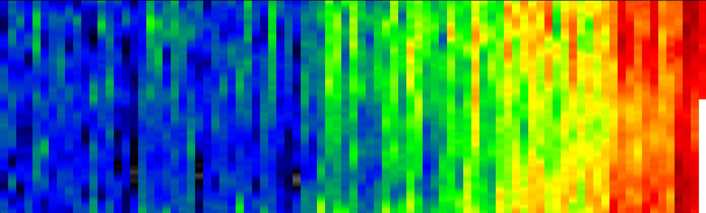
And here is the same image in a form that can be used as a social media banner (you may need to re-size it):
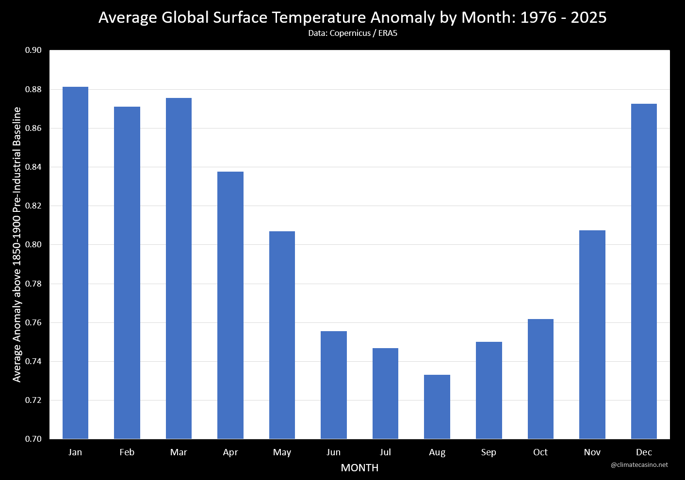
If you look closely, you can see the seasonality of temperature anomalies. Global temperature anomalies tend to be larger during late-Fall/Winter/Spring than they are during Summer/Early-Fall. Here is a graphic that plots the average anomaly by month:
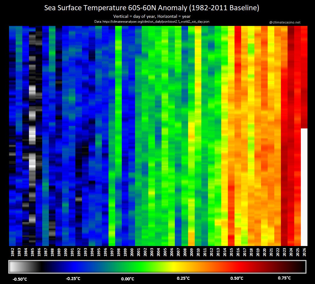
Anyway, back to the main topic of this post. Once the colors and layout were at hand, I realized I could apply it to any data where daily information is available and a historical average can be computed. For example, here are the daily warming stripes for global sea-surface temperatures:
Better yet, here are the daily warming stripes for Nino 3.4 sea-surface temperatures:
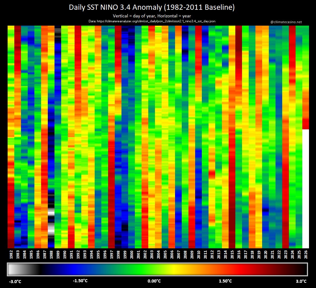
Can you spot the powerful 1988-89 La Nina? How about the 1982/83, 97/98 and 2015/16 El Ninos? Also, like global temperatures, you can see the strong signal of seasonality of ENSO events. You can also see that El Ninos tend to be short-lived, whereas some La Ninas have persisted for more than two years.
Of course, this is a doom substack, so I need to mention a ‘moment of doom’ here that pertains to these daily warming stripe graphics.
The Nino 3.4 graphic above has a color scale that ends at 3.0°C above the 1982-2011 baseline with the colors going full-black. The latest El Nino forecast includes the possibility of a few days over 4.0°C in late October / early November.
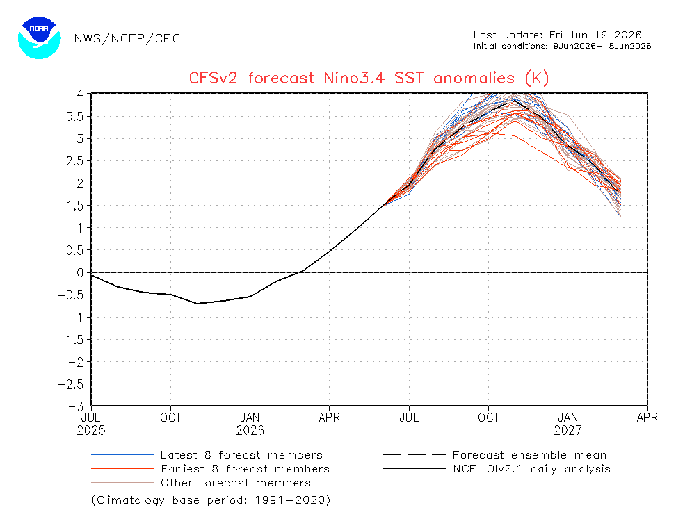
That’s just long enough that I may need to extend the color bar to 4.0°C or even beyond that. So, question, what’s beyond black? Do I need to use infrared? How about microwave colors? Maybe even radio waves?
I’ve got a month, maybe two, to figure it out, so stay tuned!
Comments
Nothing yet. Say the first thing.
Sign in to join the conversation.