
Over the last ten days, my article “The Start of Doom to Come” has notched over 12,400 reads, making it by far the most read essay I’ve posted to Substack. Yes, it was a bit over-the-top doom porn. But also, no, the worst-case scenario it paints has not yet been ruled out. In particular, it was remarkable to watch Daniel Swain discuss ARkStorm 2.0 in his latest “Ask me anything” from June 16, 2026, which I highly recommend.
The question … whether there's a specific realistic worst case scenario event scientists are worried about and trying to warn local authorities about in advance that would specifically be the ARkStorm scenario.
In the last week, many other scientists and journalists have come forward to echo the potential shitstorm ahead. It’s not a certainty, the worst case is not even the most likely case, but not being able to exclude the worst case is rattling more and more folks.
For example, from NPR yesterday,
FOURNIER: El Nino is happening on top of a lot of human-caused warming already. A lot of the impacts are on steroids.
TEGEL: That could wreak havoc on the global food supply, on top of the economic disruption already caused by the war with Iran. Peru has the world’s largest anchovy catch, supplying around 40% of the world’s fish meal, a key input for animal feed. But the government has just suspended the fishery to prevent the anchovy population collapsing.
And from the article “Not Just Another ‘Super’ El Nino Article”
Following a barrage of forecasts and warnings from global meteorological services, the media has woken up to the looming threat, deploying terms like ‘super’ and even ‘Goliath’ El Niños as model predictions venture off the charts. They are right to do so. If you live in an area heavily influenced by these shifts—such as the Western US, Amazonia, Australasia, South America, the Western Pacific, or sub-Saharan Africa—preparations for the latter half of this year should be made with haste.
In this essay I’m going to post some updates about where things are today and where they may be heading. What’s true today is that Godzilla is still in diapers. His impacts are starting to be felt here in Southern California by way of increased humidity and coastal flood alerts. The heat should be here by July. But we are still a few months away from the mega-fuckery a full-grown Godzilla El Nino can bring to this part of the world.
This may become a semi-regular post as the fuckery grows this year, so please be sure to subscribe to my substack if you like this content.
Global sea-surface temperatures continue to be at record high levels for the day. The latest update for June 17th showed the 16th consecutive daily record high.
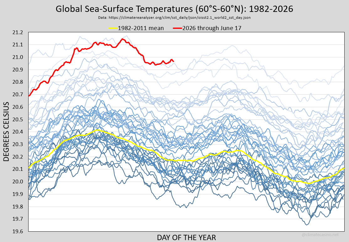
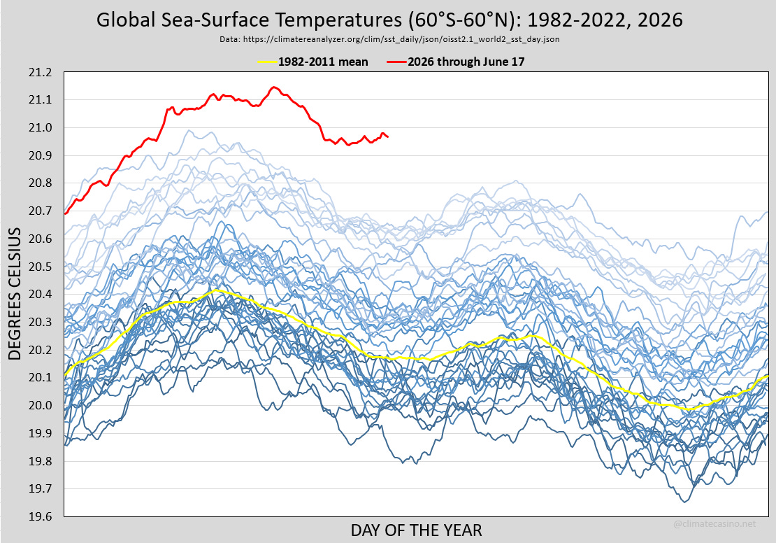
This graph doesn’t really tell the full story. Temperatures jumped in 2023, 2024 and 2025 in a way that normalizes just how crazy 2026 really his. Normalcy bias is a real thing. Here is the same graph with 2023, 2024 and 2025 removed:
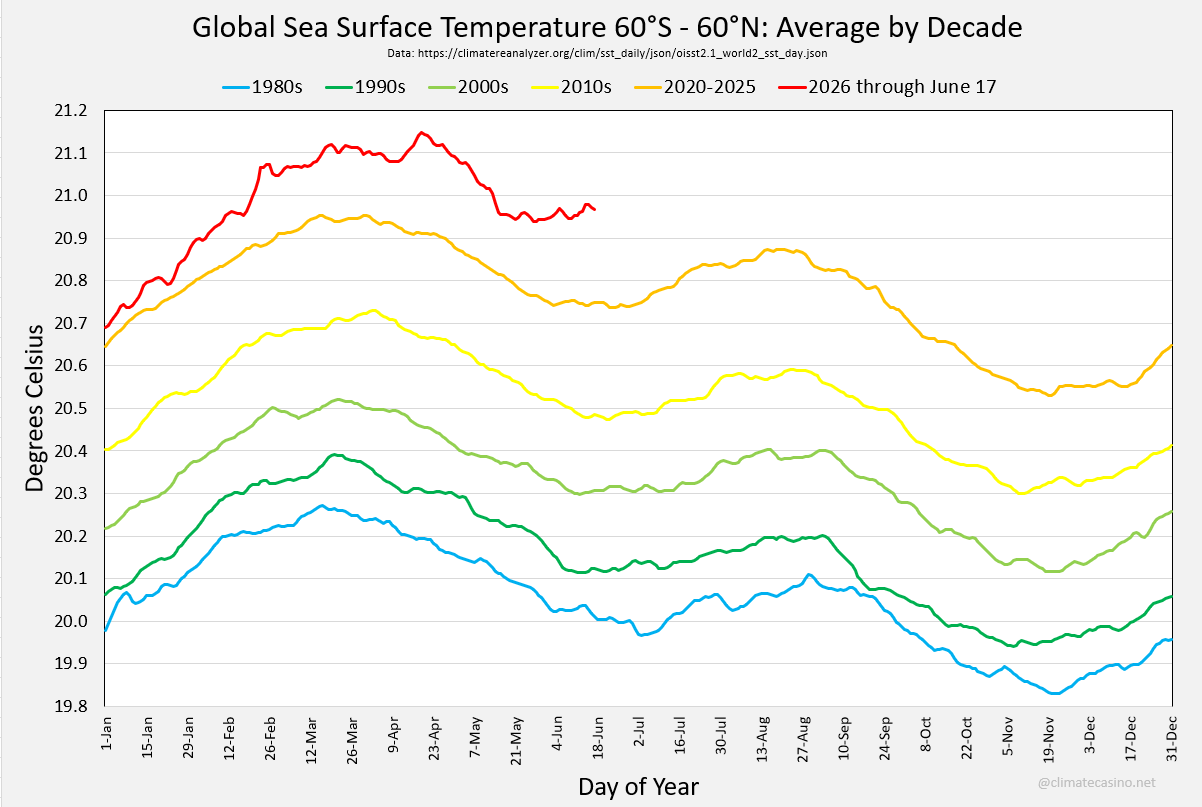
Here’s a decadal breakdown of this data. For the 2020s, I’ve separated the average for 2020-2025 from 2026. This is the one that really shows how nuts 2026 has been.
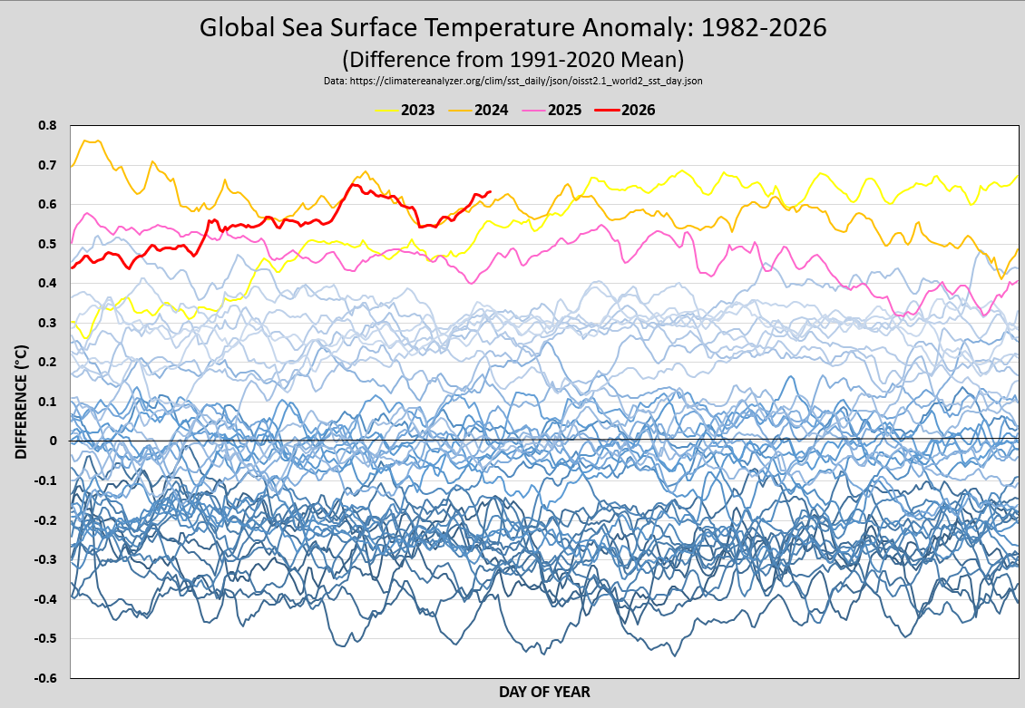
And finally, here’s an anomaly graphic for global sea-surface temperatures that shows how each year compares to the 1991-2020 baseline.
The part of the ocean that is watched most closely for the development of El Nino is called Nino 3.4. Google (or AI) is your friend to find out where that is in the Pacific ocean and why it is considered the most important indicator for measuring the strength of El Nino. There are all sorts of meteorological organizations around the world that are tracking the temperature for this region and forecasting where it will end up later this year. Among those is NOAA’s CFSv2, which is described by NOAA as follows:
The CFS version 2 was developed at the Environmental Modeling Center at NCEP. It is a fully coupled model representing the interaction between the Earth's atmosphere, oceans, land and seaice. It became operational at NCEP in March 2011.
Because El Ninos take time to develop, mature and disperse, it is typical to consider the average temperature in the Nino 3.4 region over three-month periods and not by any specific month or day. There are twelve of these three-month periods, denoted, as you might expect, by JFM, FMA, MAM, AMJ, MJJ, JJA, JAS, ASO, SON, OND, NDJ and DJF. So, for example, “OND” means “the three-month average temperature for October, November and December.”
Here is the latest update from CFSv2 on the development of El Nino through JFM, 2027:
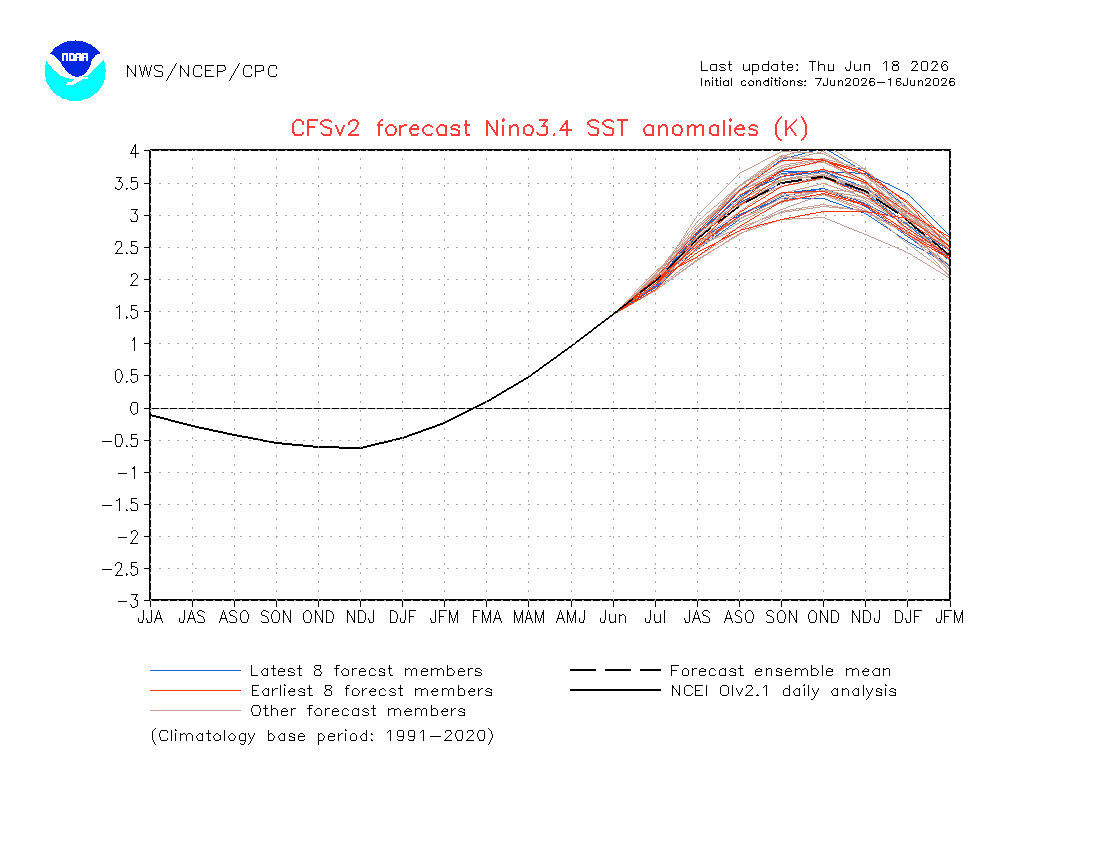
In particular, this forecast shows that the anomaly stays over 3.0°C from ASO all the way to DJF. The forecast also shows a potential peak anomaly of 3.5°C over the 1991-2020 baseline in the OND time period later this year. Hang on to that number, I want to show you a graphic that will tell you just how nuts that is. First, I need to explain a bit about what I’m going be showing you.
The available data starts on January 1, 1982. What I did was to figure out the anomaly with respect to the 1991-2020 baseline for each of the twelve different three-month periods, for each such period from JFM, 1982 through DJF, 2025. This gave a total of 528 data points.
So, for example, the largest positive anomaly in the data was 2.5°C in OND, 2015. This happened in the middle of the massive 2015/16 El Nino. The most negative anomaly recorded in the data was -2.2°C in OND, 1988 during a record La Nina.
I then counted up how many times each anomaly in the range -2.2°C to 2.5°C happened among the 528 data points. For example, I found that the most frequent event was an anomaly of -0.1°C, which was the average temperature in 29 different three-month periods.
And now, for the big reveal. Below is the bar-chart that shows the number of times each anomaly occurred between -2.2°C and 2.5°C. This data creates an image that looks a bit like the well-known “normal curve” only skewed to the right. That skew represents climate change. We are more likely to have an extreme event out far to the right than far to the left. And it’s only going to look more skewed as time goes on. (Many thanks to Jeff Berardelli on X for the idea to create this graph.)
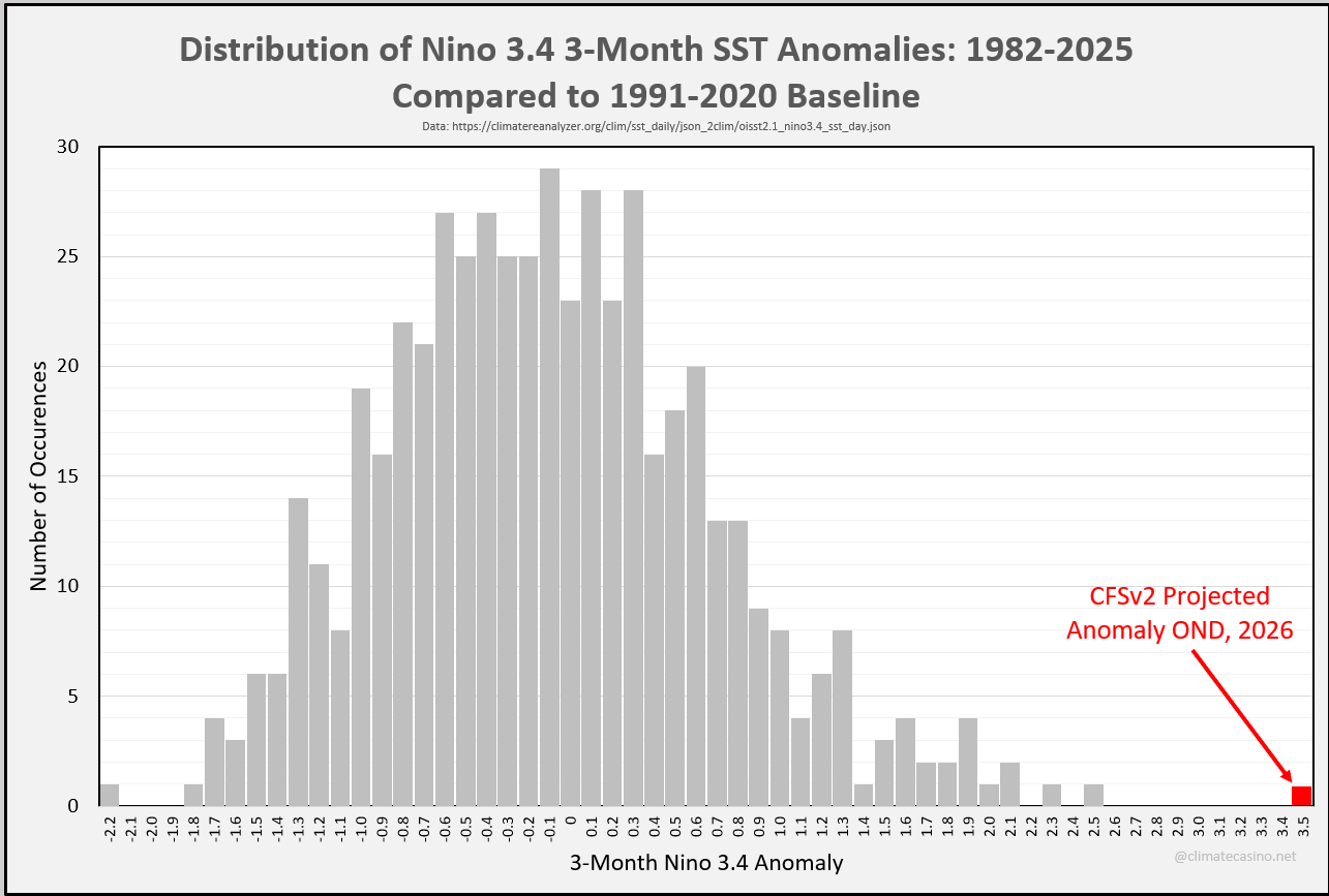
Along with plotting the historic data, I’ve also extended the x-asis to include the forecast OND 3.5°C data point. Of course, that data point won’t stand by itself. By the end of the coming El Nino, there will be a whole mass of data points out along the right-hand tail of the distribution beyond 3.0°C. It’s crazy just how “skewed” things are going to get.
How crazy? That’s where the “standard deviation” comes in. If I focus on just the OND data and nothing else, then a 3.5°C El Nino peak represents an event that is about 3.28 standard deviations from the 1991-2020 mean, which has odds of happening purely by chance (assuming a non-warming planet) of about 1-in-1940. In other words, an El Nino of this strength should happen purely by chance about once every 2000 years in the absence of climate change.
But, of course, there is climate change. And this Godzilla El Nino is being powered by climate change to the point where you will hear climate scientists using something called “RONI,” the relative oceanic nino index, rather than the 1991-2020 baseline. The intention of RONI is to get the skew out of this distribution by accounting for climate change at every step of the way. Again, Google (or AI) is your friend.
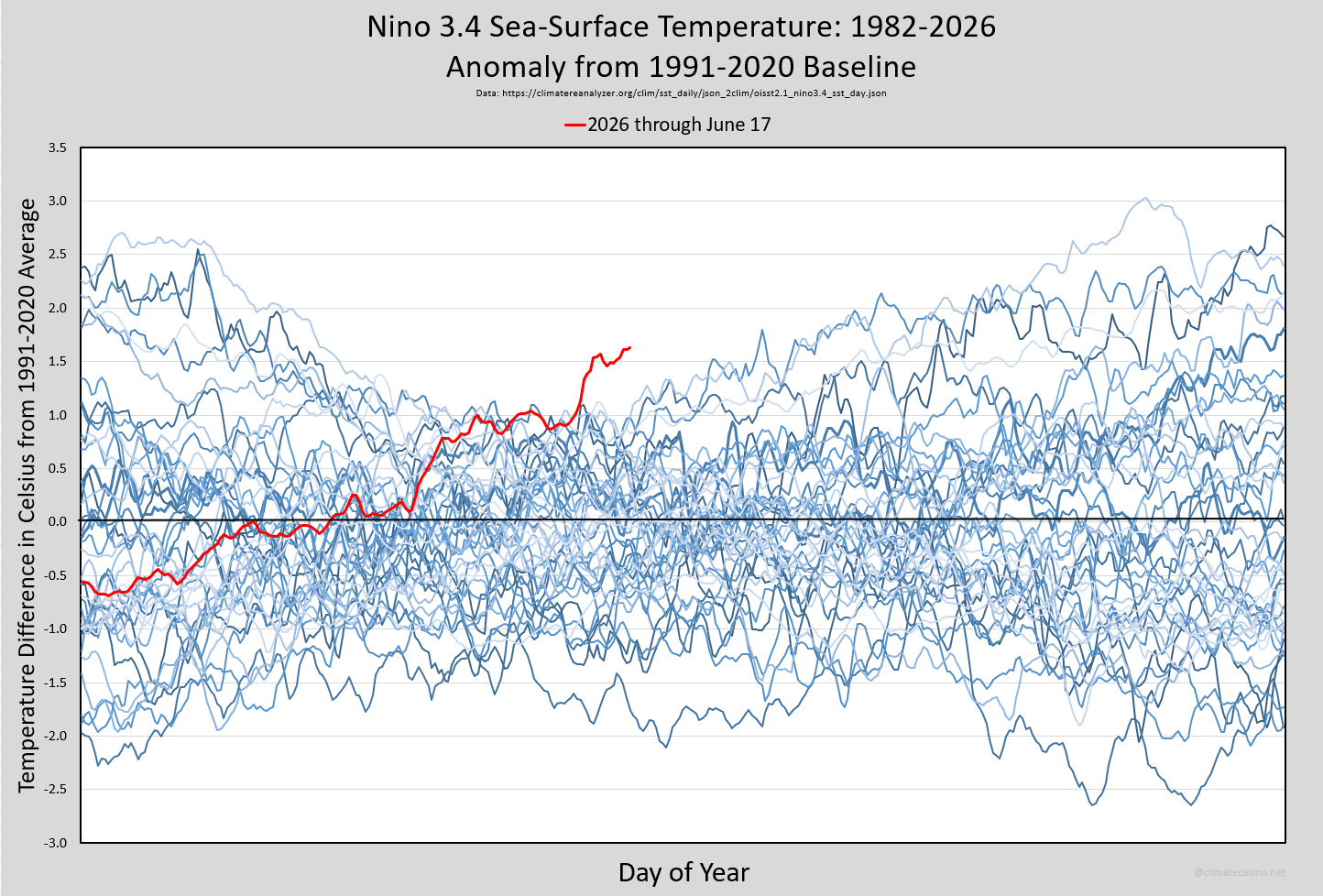
As with global sea-surface temperatures, Nino 3.4 sea-surface temperatures continue to be at record high levels for the day. The latest update for June 17th showed the 19th consecutive daily record high. Look at that red line. That’s this year! Godzilla indeed!
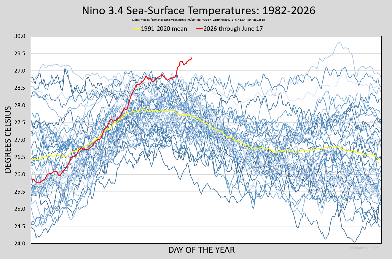
On an anomaly basis, the current Nino 3.4 sea-surface temperature is already over 1.5°C above the 1991-2020 baseline, with many months of warming ahead. By early December, the y-axis on this graph will likely need to be extended to 4.0, maybe even higher.
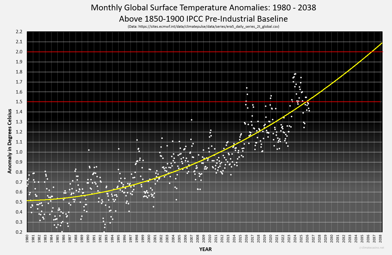
As everyone who’s not living under a rock knows, the Paris Agreement to hold long-term warming below 1.5°C is officially history. We’ve passed that benchmark. This assertion comes from looking at daily, monthly and yearly data from ECMWF (ERA5) and drawing a quadratic trendline through various representations of that data. Quadratic is the appropriate trendline to use because it echoes the widely accepted view that global temperatures are accelerating.
For example, the graph below plots the monthly anomaly above the 1850-1900 pre-industrial baseline for every month from January, 1980 through May, 2026. The graph shows that 1.5°C was passed earlier this year, and 2.0°C will be broken by 2037.
The question everyone wants answer is, what will Godzilla El Nino’s impact be on global temperatures in 2026 and 2027?
As you may recall, there was a moderate El Nino that began in late 2023 and went into 2024. Even though 2023 started with La Nina conditions, it came very close to breaking the Paris limit, at 1.48°C over the pre-industrial baseline. And as you may recall, 2024 blasted through the Paris limit, a full 1.60°C above the 1850-1900 pre-industrial baseline, with a temperature that was heavily influenced by the heat released from the ocean during the El Nino.
It is reasonable to compare 2026 to 2023. Both started with La Nina conditions. Both will end with El Nino conditions, although 2026’s El Nino will be far stronger than the one in 2023. Here’s the side-by-side comparison of the average global surface temperature for the period January 1 - June 16 for each year:
2023 averaged 1.294°C above pre-industrial.
2026 averaged 1.455°C above pre-industrial.
Thus, through June 16th, 2026 is about 0.16°C ahead of 2023. Everything else being equal, we would expect 2026 to end the year at 1.48°C + 0.16°C = 1.64°C above pre-industrial, a new record. Moreover, all things being equal, 2027 is on track to see an annual temperature of 1.60°C + 0.16°C = 1.76°C above pre-industrial.
That’s what the simple math says. 2026 will be around 1.64°C and 2027 will be around 1.76°C. I don’t believe it. That’s just too much, too fast. Some buffer is going to kick in. Something is going to happen to slow it down a bit. For example, climate scientist Zeke Hausfather puts the probability of 1.64°C or higher this year at about 5%.
And so, in the spirit of being the Climate Casino, I’m going to give 50/50 Over/Under lines for 2026 and 2027 as follows:
2026 Over/Under 1.60°C.
2027 Over/Under 1.72°C.
Yikes!
One final comment. Typically global surface temperatures tend to drop after an El Nino is over. Global temperatures usually drop between 0.1°C and 0.2°C from their El Nino peak. What that means in practice is that 2025, with it’s global surface temperature of 1.47°C above pre-industrial, was likely the last full year any human will ever see below 1.50°C.
We never really had Paris, did we? Or, as Sam Mitchell AKA Hambone Littletail, often says, we are so fucked.
Comments
Nothing yet. Say the first thing.
Sign in to join the conversation.