
So far this month, we’ve already run a few posts covering the latest on Chicago’s pensions. In short, while we had a pretty good year, we’ve still got a long journey ahead of us.
To help visualize that journey, we built what I think is a pretty cool dashboard covering all four of the city’s pension funds.1 It pulls together data that’s currently scattered across actuarial valuations, city budget documents, and academic datasets, and puts it in one place with plain-language explanations, real charts, and a scenario tool that lets you model the future yourself. You can look at the funds individually or as a combined whole, and every number is sourced and shown on the page it appears. You can check it out here, at pensions.acitythatworks.org:
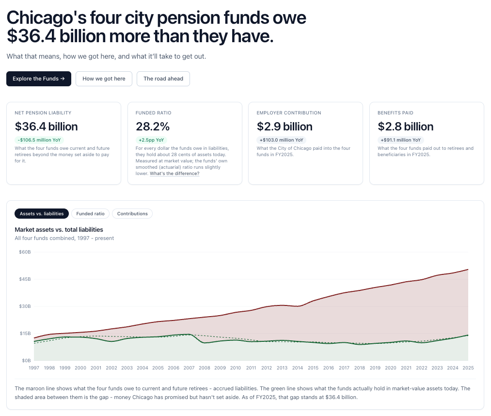
The easiest place to start is the history tab, which shows the last 30 years of assets, liabilities, contributions and funding rates for all four funds. It’s really worth remembering that in 2000, we were still 83% funded overall - but then our liabilities just began a steady climb upwards while our assets treaded water. Particularly striking to me is the fact that as of 2025, our pension systems had around $14.2 billion in assets - which is still lower than what they had in 2007.
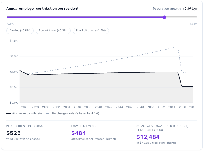
I also try to translate these numbers to a per-person basis on the impact tab. Nearly 80% of City of Chicago property taxes go towards pensions - that works out to roughly $1,210 per household in the city. The unfunded pension liability works out to around $31,000 per household or $13,000 per resident. As always, it’s useful to remember that because these liabilities are fixed, growing our population faster will help bring down those figures. The difference between 0% and 2% population growth per year is around a 50% reduction in per-resident liabilities by 2058.
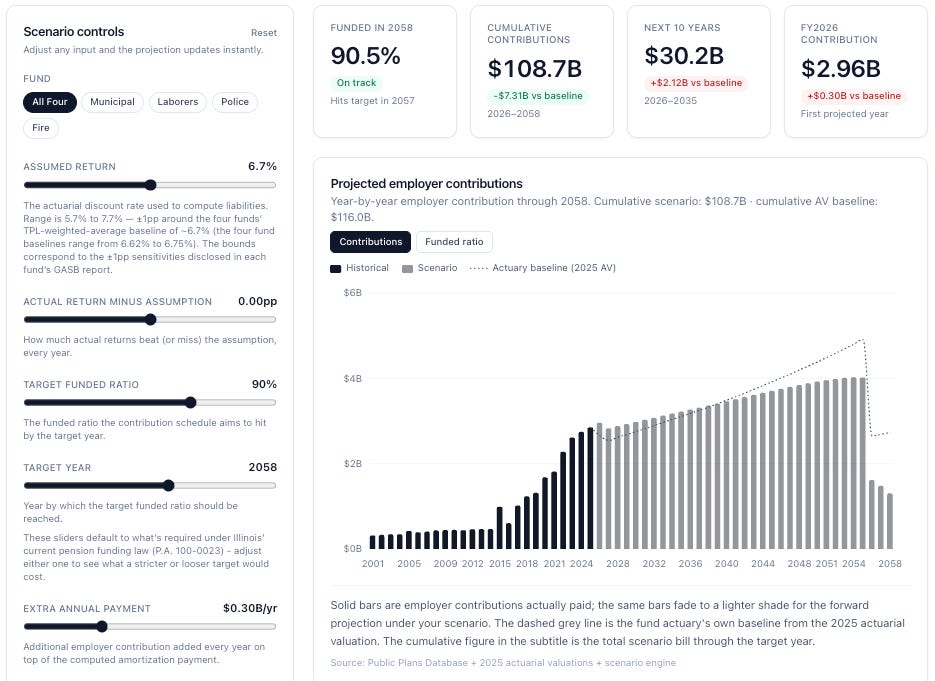
Probably my favorite part of the dashboard is our scenario modeling tool. The pension funds’ actuarial reports project out contributions every year from here to the 2050s. This takes that as our baseline, and then allows you to adjust assumptions about how well our returns do, whether we want to change our 90% target or the target deadline year, or whether we should keep making supplemental payments to the system and see how that impacts things.
A couple things stood out to me from building this. One is that we’ve done the hardest work already - between 2011 and 2025, annual pension payments jumped from $440 million to $2,85 billion dollars per year. On average, that meant that every year the city had to find another $170 million in annual funding. On a go-forward basis, we’re not forecasting any huge jumps in annual contributions; it’s just a steady 2 to 2.5% (or roughly $60-70 million) climb each year. It’s a long climb, but it’sabsent any further legislative changes or major recessions, the steepest bit is behind us.
That 2 to 2.5% growth is also a useful reminder of why growth should matter. Throughout the 2010s, the population of Sun Belt cities like Austin and Fort Worth grew by around 2% per year; if we can achieve the same, our contributions per-capita would be basically flat: in short, the average Chicago taxpayer wouldn’t have to dig any deeper to bail out our pensions. Unfortunately, we haven’t managed this in recent years - during the 2010s, Chicago’s population grew at a rate of just 0.2% per year.
Finally, because that target is set in law, what’s really at stake isn’t whether or not we hit the 90% target - it’s how much we’re going to have to pay each year to get there. In a baseline scenario we’ll have about $116 billion in contributions into the four systems between now and 2058. If we’re willing to make an extra $300 million supplemental payment each year going forward, the compound interest of money getting into the funds earlier means that our total contributions drop to under $109 billion - and we start seeing lower annual payments by 2040. For context, that’s about the same impact on cumulative contributions as us earning an extra 40 bps per year (e.g. earning 7.1% instead of 6.7%).
I think it’s also useful to point out the many things this doesn’t do. Start with the scenarios modeling; this is all a fund-level tool. I built this to take the funds’ actuarial projections and scale them up/down based on what the actuaries report at a portfolio level. It’s also not a probabilistic model - while you can simulate a one-time shock, there’s no year-to-year volatility to the returns baked in, which oversimplifies the math on our contributions. If you asked me, for example, how to bake in what happens if you change benefits based on an even larger Tier 2 sweetener, or how to simulate the impact a pension buyout plan could have on our math, I’d have a pretty hard time.
I also don’t have anything included to cover exactly where our liabilities came from, or how to calculate an individual retiree’s annual benefits. I think that’s worth doing and I’ll try to expand on that in a future iteration of the dashboard.
Finally, while I’m not aware of any errors in the dashboard (and I have cross-checked this with a few knowledgeable experts), there’s still plenty of room for error. If you find any mistakes, please let me know! I’d love to correct them wherever possible. And if you have any other feedback, suggestions, or ideas for ways to improve the dashboard, please feel free to reach out as well. This was fun to build, but I really do hope it’s useful to help people understand our challenges - and I’m happy to keep improving it to make it more useful however possible.
The Municipal Employees’ Annuity and Benefit Fund (MEABF), Laborers’ Annuity and Benefit Fund (LABF), Police Annuity and Benefit Fund (PABF), and Firemen’s Annuity and Benefit Fund (FABF).
Comments
Nothing yet. Say the first thing.
Sign in to join the conversation.