
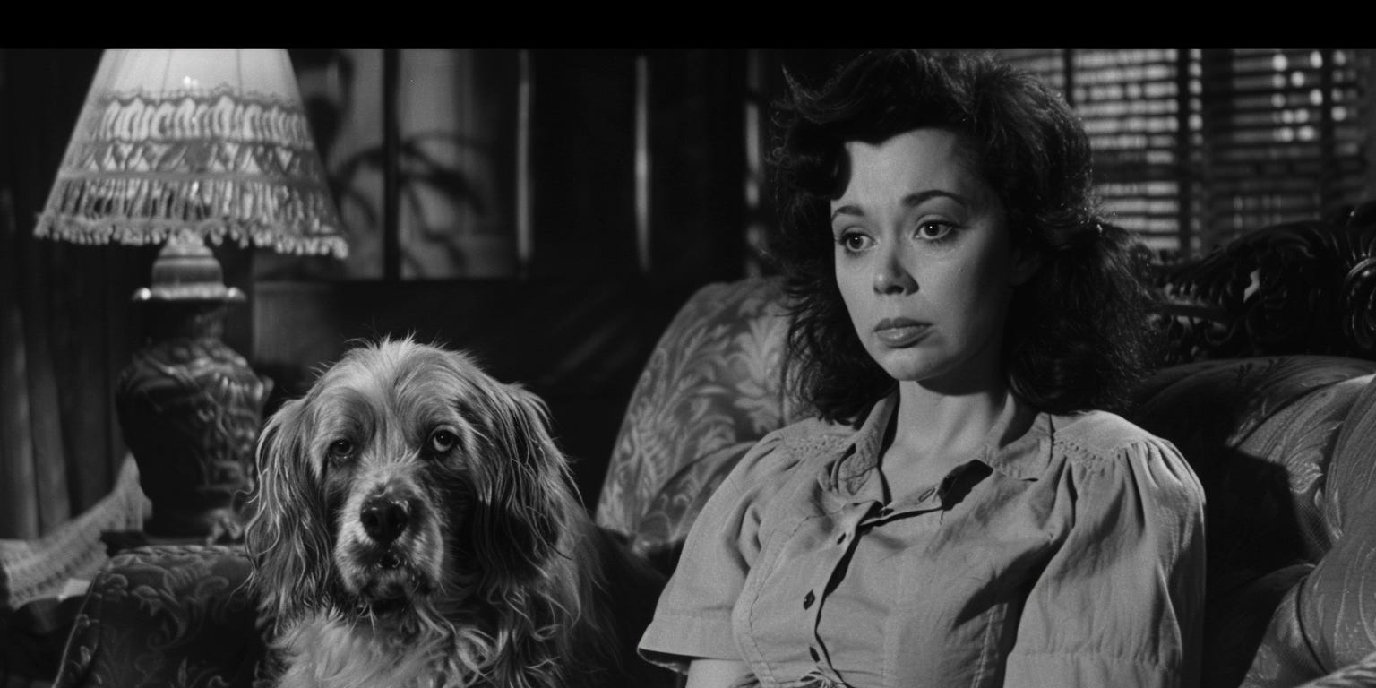
Y'all know how infomercials usually start with someone struggling with a basic product that’s failing them, but like, over-struggling? A big flailing performance of that struggle, possibly shot in black and white with a focus on the mess made while a person in the background dramatically holds their head in absolute disgrace?
That’s kind of how my first designs of our quote screen performed in usability testing.
Seriously doubting the intellect of your customer is a natural phase of product development, but I was actively wondering if our testers were pranking me. If they were actually infomercial actors hired to make me question my place in this world.
The same can be said of the cost calculators I helped design at Amino. What could go wrong trying to give people the tools they needed to better understand the estimated cost of a medical procedure they were considering?
Well, when you ask the average American to manually input an insurance-word salad of numbers like their deductible, copay, coinsurance, out of pocket maximum, and then show them the stickershock-inducing price that their procedure might cost, with 37 asterisks communicating the numerous ways in which that number might actually be higher, you both kind of want to cry — Product designer and product tester, just openly weeping at the beginning of an insurance infomercial.
I paint this picture because I just really want to make sure you know that the quote - the part where prices are next to the insurance products, that is really hard to design well. It’s where the untangled version of whatever spaghetti-monster lives in the policy documents is presented in some simple, summarized way - but it comes with a bunch of new labels and new questions for your customer to deal with.
Put yourself in their mind;
The quote is when the insurance buyer is suddenly presented with casual internal questions like “How much do I really love my dog?” and “How many times has my roommate actually left the door unlocked?” and “Is our data secure enough?”
“Do I really trust my cofounder?”
“Can we even afford to start fertility treatments this year?”
“How much would my family need to cover expenses if I die?”
Really. Death. Your insurance product might prompt your customer to consider their own mortality. (Talk about a design challenge.)
It’s a lot. A lot of new words, a lot scary thoughts, a lot of money to pay. And before we move into the design implications of that muchness, for the second time in this series I think we’d be better suited to take a minute and just commiserate with the insurance buyer.
If you’re insurance-avoidant and reading this series to see if you might be insurance-curious, this is probably the part where you also consider abandoning insurance. But I do have some tips to help make insurance quotes feel approachable, and some lessons learned after those horrific usability testing sessions.
More on those in the next part of the series.
Carrie
On to Part 9!
Why Insurance Coverages Continue to Have Weird Names
·
March 7, 2024

So we’ve finally made it to the part of the series where we are talking about insurance quotes. In the last post, we whined a bit; both about how hard it is to design quotes, and how hard they are for a customer. So many new labels, new questions, but also new products - maybe coverages they’ve never heard of - and today, we’re talking about those unfam…
Comments
Nothing yet. Say the first thing.
Sign in to join the conversation.