
As an author, I am obsessed with reading about the creative processes of other authors.
Talk dirty to me about your book tour, your writing routine, your media coverage, your social media strategy — ALL OF IT. There is no detail too boring. And please show me lots of photos!
So I thought it might be fun to take you guys behind the scenes of some of my creative process.
Yesterday I found myself going down memory lane looking at photos from the book launch party for my last memoir, Don’t Do Anything I Would Do. It’s the most honest, unhinged, raw book I’ve ever written about my dating life in my early 40s. Dating app disasters, toxic situationships that I just couldn’t let go of, embarrassing lows, the complete chaos of trying to find yourself when your birth certificate says you’re 40 but in your mind you’re still 27.
It’s funny and it’s cringe and it’s the most vulnerable thing I’ve ever written. But I am so glad I did because I still get messages from women who thank me for writing the reality of what it’s actually like to be so desperate to find love while feeling like it’s the thing you are the absolute worst at.
As I looked through my camera roll I found the book cover concepts I was considering before deciding on the final one. It was so wild to imagine how different the book could have looked. And although I love what I landed on, I’m now battling the slightly insane idea of changing it one year later. Because I simply cannot leave well enough alone lol.
Here they are. Dying to know what your favorite is! And please tell me if you enjoy these kinds of posts. I have plenty more where this came from.
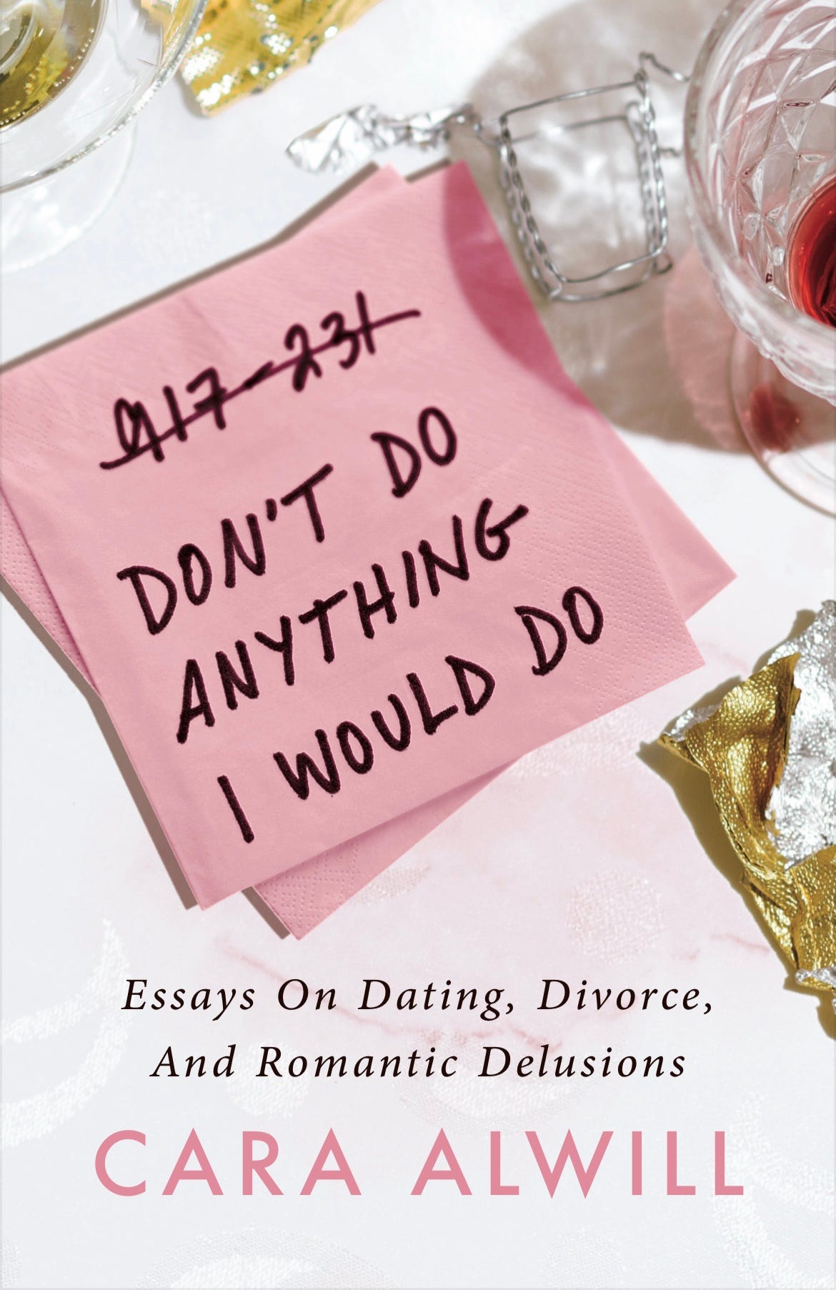
Concept #1. This was the one I almost went with. I still love it so much! Fun fact: those are the first six digits of my actual phone number. Please don’t prank call me.
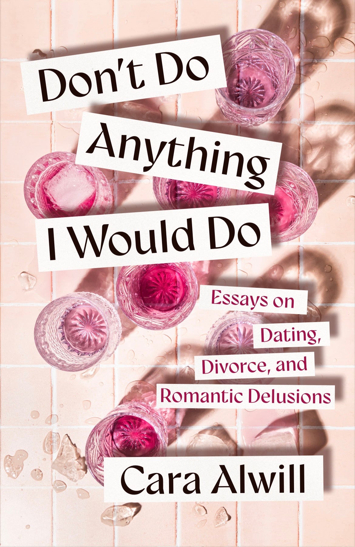
Concept #2. I loved this one too, but I didn’t want people to see all that wine and slip me the phone number to my nearest AA meeting. Although wine is basically the main character in this book so I might not have blamed them haha.
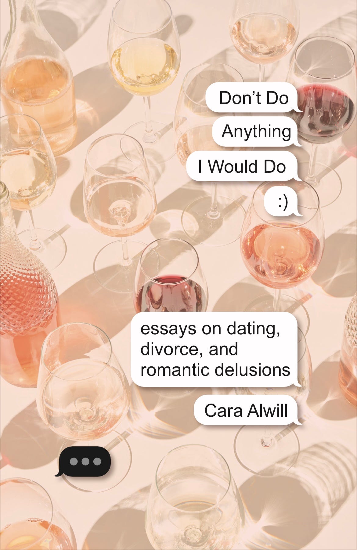
Concept #3. This one was fun and was meant to be a play on dating app culture, but it didn’t feel strong enough as a cover to me.
Concept #4. This is the closest to the final version. I came up with the idea of crossing out the letters in Wouldn’t. The pink was just a little too subtle for the story itself.
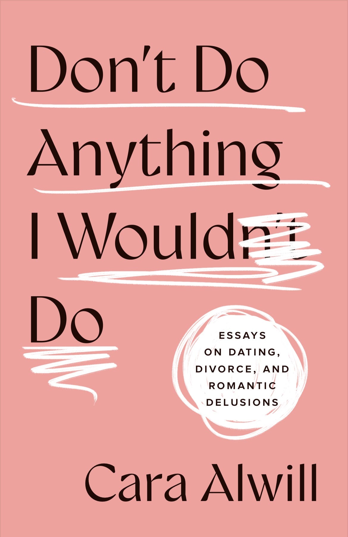
The final version. I needed this cover to pop. I think my exact words to my designer were: “We have to go as Barbie pink as possible.” I also loved the idea of using red as the ink color that crossed out the letters because I felt like it conveyed the feeling of making a huge mistake — which, if you read the book, you’ll know I did. Repeatedly. LOL.
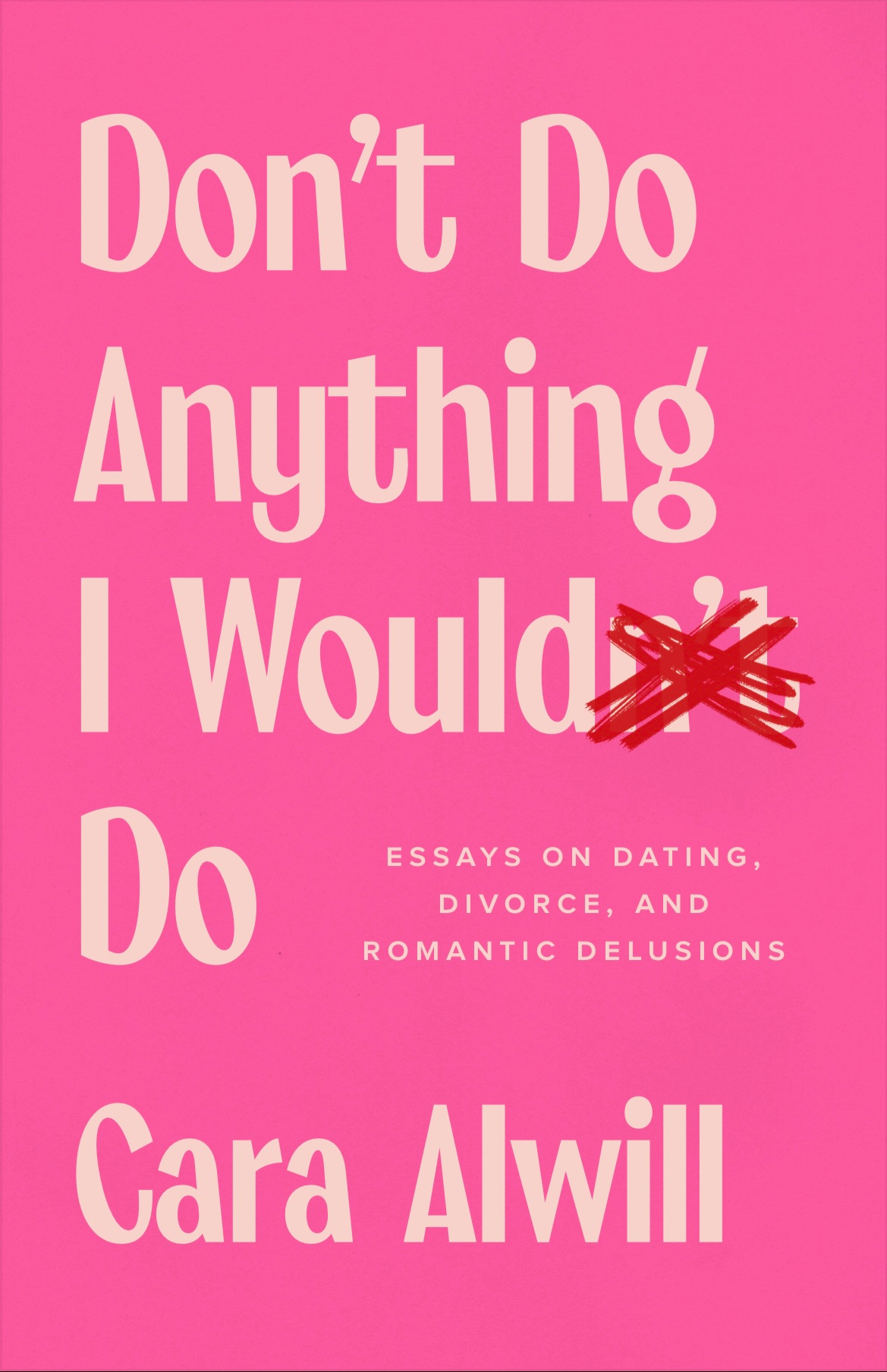
So…did I make the right choice!? If you haven’t read the book yet, you can pick up a copy here. And let me know in the comments, which one would you have picked?
want more author gossip?
Comments
Nothing yet. Say the first thing.
Sign in to join the conversation.